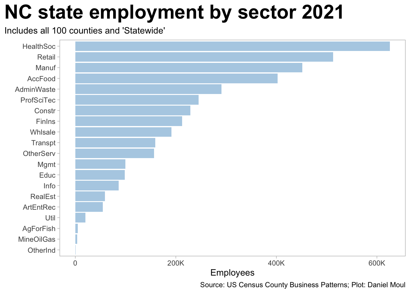
Figure 1.2: NC employment by sector compared to USA 2021
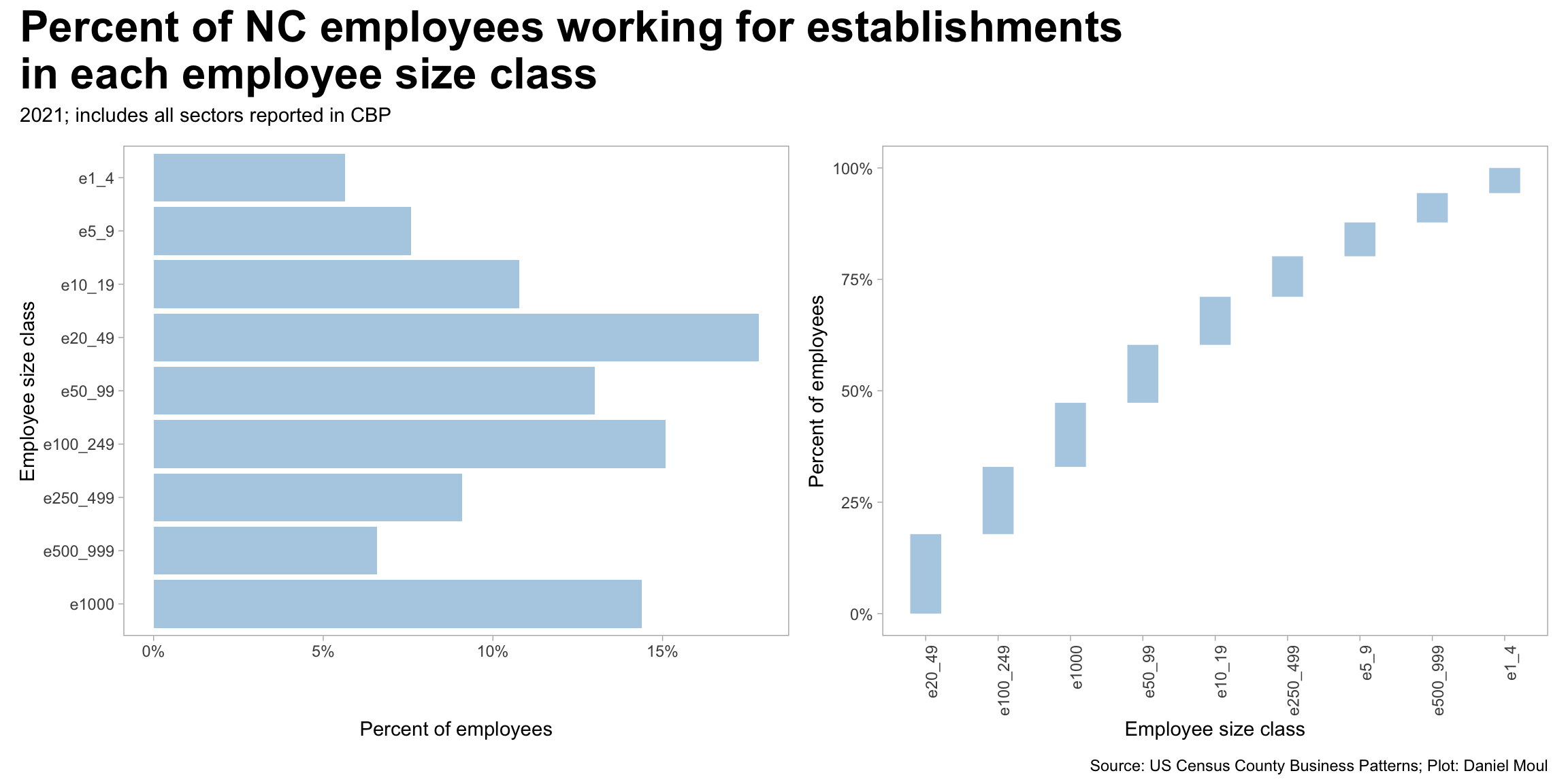
The CBP state data includes employee counts categorized by employee size class. The range is embedded in the name. For example, e1_4 includes a count of employees working in establishments with 1-4 employees. Let’s assume that the average number of workers in each employment size class is about the midpoint of the class, and for e1000 (“1000 or more employees) that the midpoint is 2000.
Then we can answer the question: from the perspective of workers, what are the most common employer size classes? Or asking another way: if one randomly selected a NC worker what is the probability the person would work in an establishment of a particular size class?
Figure 1.3: NC workers in each employee size class 2021
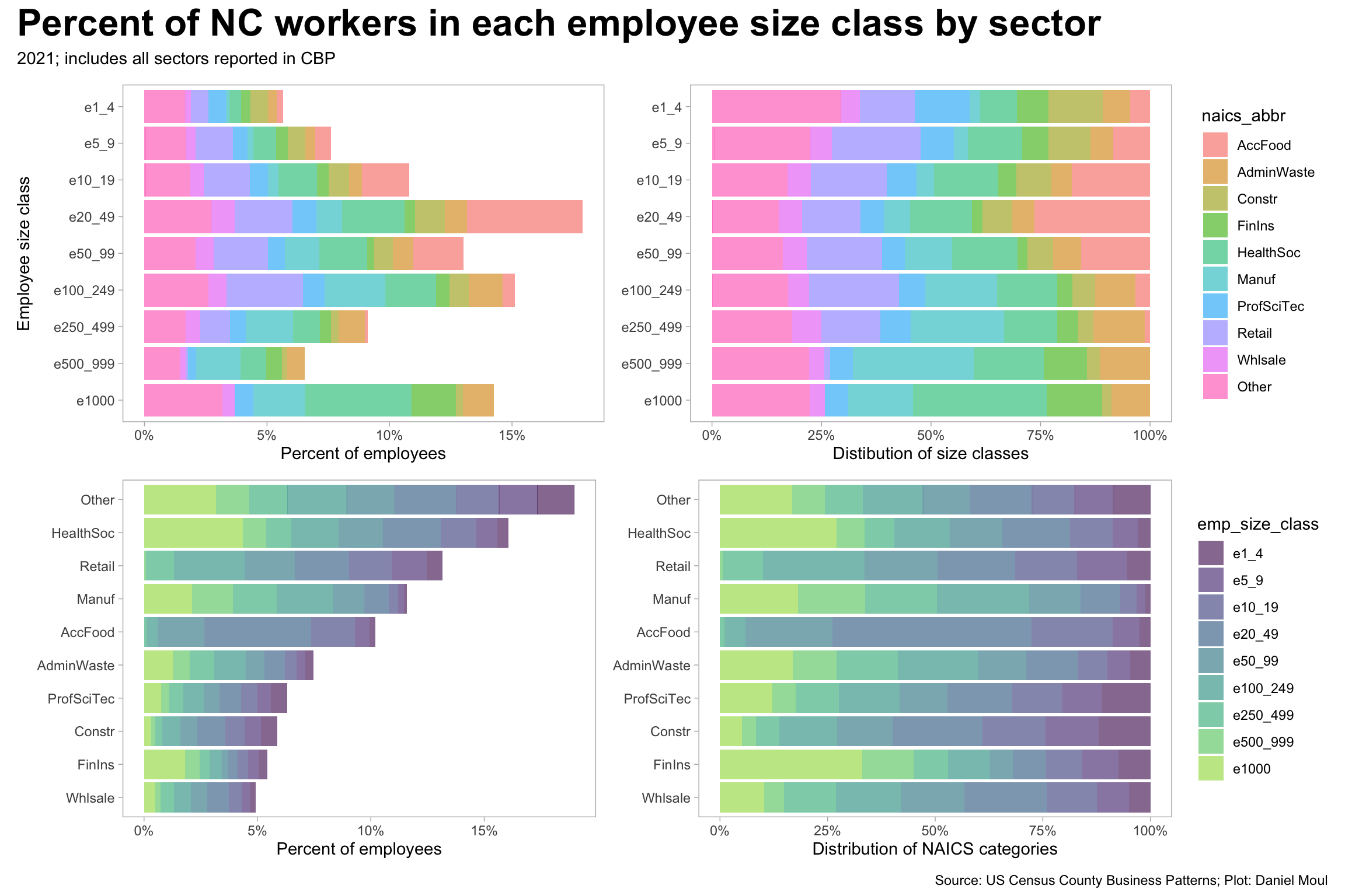
Further categorizing this data by industry sector reveals which industries have concentrations of workers in establishments of particular size classes. Employees in AccFood mostly work in establishments in the 10 to 100 employee range. In Retail there is a wider range: from very small to 499 employees and almost none larger. The industry sectors with the largest portion of employees working for the largest establishments are HeathSoc (hospital systems, I assume) and FinIns. Construction and ProfSciTech have the largest portion of employees in the sector working in 1-4 employee establishments.
Show the code
data_for_plot <- d_emp_state_nc_size_classes |>filter(year ==2021) |>inner_join(n_employees_ref |>select(-est_size_class),by ="emp_size_class") |>mutate(emp_size_class =factor(emp_size_class, levels = emp_size_class_levels),naics_abbr =fct_lump(naics_abbr, n =9, w = emp)) p1 <- data_for_plot |>ggplot() +geom_col(aes(x = pct_emp, y = emp_size_class, fill = naics_abbr),alpha =0.6, show.legend =FALSE) +scale_x_continuous(labels =label_percent(accuracy =1)) +scale_y_discrete(limits=rev) +labs(x ="Percent of employees",y ="Employee size class",color =NULL )p2 <- data_for_plot |>ggplot() +geom_col(aes(x = pct_emp, y = emp_size_class, fill = naics_abbr),alpha =0.6, position =position_fill()) +scale_x_continuous(labels =label_percent(accuracy =1)) +scale_y_discrete(limits=rev) +labs(x ="Distibution of size classes",y =NULL,color =NULL )p3 <- data_for_plot |>mutate(naics_abbr =fct_reorder(naics_abbr, emp, sum)) |>ggplot() +geom_col(aes(x = pct_emp, y = naics_abbr, fill = emp_size_class),alpha =0.6, show.legend =FALSE) +scale_x_continuous(labels =label_percent(accuracy =1)) +scale_fill_viridis_d(end =0.85) +labs(x ="Percent of employees",y =NULL,color =NULL )p4 <- data_for_plot |>mutate(naics_abbr =fct_reorder(naics_abbr, emp, sum)) |>ggplot() +geom_col(aes(x = pct_emp, y = naics_abbr, fill = emp_size_class),alpha =0.6, position =position_fill()) +scale_x_continuous(labels =label_percent(accuracy =1)) +scale_fill_viridis_d(end =0.85) +labs(x ="Distribution of NAICS categories",y =NULL,color =NULL )(p1 + p2) / (p3 + p4) +plot_annotation(title ="Percent of NC workers in each employee size class by sector",subtitle ="2021; includes all sectors reported in CBP",caption = my_caption )
Figure 1.4: Percent of NC workers in each employee size class by sector 2021
1.2 Top sectors in largest NC counties
Are there similarities in the top sectors and their proportions in the counties with the most workers? Yes. HealthSoc, Retail, and AccFood are among the top four sectors in each of the top nine counties and the “Statewide” category. There are some differences: Mecklenburg’s top sector is FinIns, Durham’s is ProfSciTec, and Catawba’s is Manuf.
Show the code
county_name_label <- d_emp_sector_total_county |>#d_sector_totals_county |>filter(year ==2021) |>select(year, fipscty, emp, county_name, naics) |>summarize(emp_sum =sum(emp),.by = county_name) |>slice_max(order_by = emp_sum, n =10) |>mutate(county_name_label =glue("{county_name}\n{comma(emp_sum)}"),county_name_label =fct_reorder(county_name_label, -emp_sum))data_for_plot <- d_nc_2021_top5_sectors_county_nc |>select(county_name, emp, naics, naics_descr, emp_rank) |>left_join(d_naics_abbr_ref,by =c("naics_descr")) |>left_join(county_name_label,by =c("county_name")) |>mutate(pct_emp = emp / emp_sum,county_name_label =fct_reorder(county_name_label, -emp, sum)) |>complete(county_name_label, naics_abbr, fill =list(emp =NA, pct_emp =NA)) data_for_plot |>ggplot() +geom_line(aes(x = county_name_label, y = pct_emp, group = naics_abbr, color = naics_abbr),show.legend =FALSE, na.rm =TRUE) +geom_label(aes(x = county_name_label, y = pct_emp, label = naics_abbr, fill = naics_abbr),show.legend =FALSE, na.rm =TRUE, alpha =0.4, size = data_label_size) +scale_x_discrete(position ="top") +scale_y_continuous(labels =label_percent()) +coord_cartesian(ylim =c(NA, 0.30)) +theme(axis.text.x =element_text(size =10)) +labs(title ="Top 5 sectors in 10 largest NC counties:\npercent of county employment",subtitle =glue("Ordered by total county employment reported in CBP","; 'Statewide' refers to employees not associated with one county","\nNot showing Statewide AdminWaste, since it's over 50% of all 'Statewide' employees"),x ="",y ="Percent of county employment",color =NULL,caption = my_caption )
Figure 1.5: Sector percent of country emplyment rank
The same information is presented below with simple ranking:
Show the code
data_for_plot |>ggplot() +geom_line(aes(x = county_name_label, y = emp_rank, group = naics_abbr, color = naics_abbr),show.legend =FALSE, na.rm =TRUE) +geom_label(aes(x = county_name_label, y = emp_rank, label = naics_abbr, fill = naics_abbr),show.legend =FALSE, na.rm =TRUE, alpha =0.4, size = data_label_size) +scale_x_discrete(position ="top") +scale_y_reverse() +theme(axis.text.x =element_text(size =10)) +labs(title ="Top 5 sectors in 10 largest NC counties: ranking",subtitle =glue("Ordered by total county employment reported in CBP","; 'Statewide' refers to workers not associated with one county"),x ="",y ="Rank in county employment",color =NULL,caption = my_caption )
Figure 1.6: Sector rank by number of employees
1.3 Trends in employment
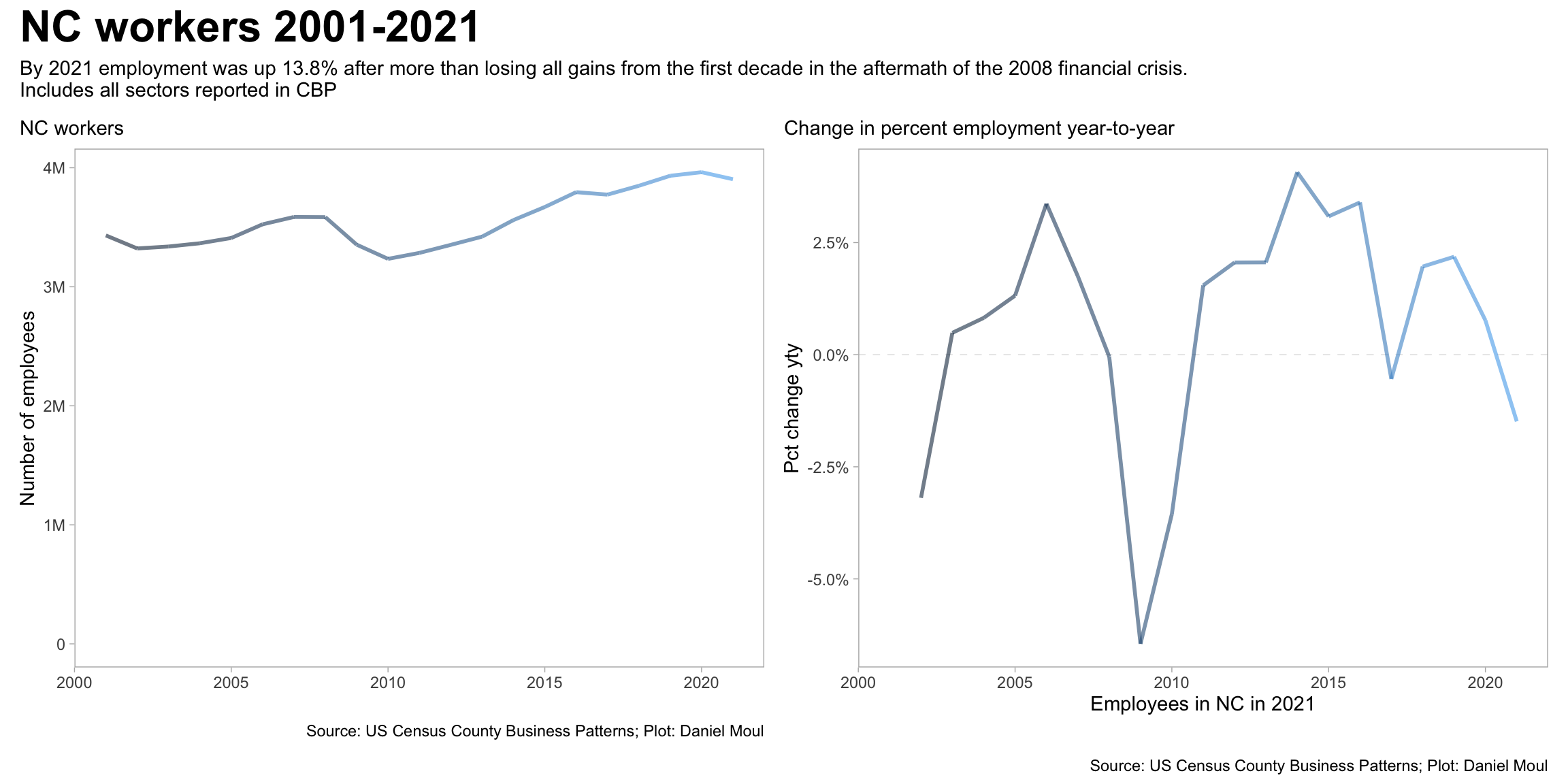
The last two decades have brought significant changes in the number and mix of employees in NC. The financial crisis in 2008 and the following years caused significant job losses (and company closings see Figure 2.3), the trend overall has been upward, reflecting the growing population of the state.
Show the code
state_emp_change <- d_emp_total_state_nc |>mutate(emp_fist_year = emp[year ==min(year)],emp_last_year = emp[year ==max(year)],.by =c("naics")) |>mutate(pct_emp_diff = emp_last_year / emp_fist_year -1) |>distinct(emp_fist_year, emp_last_year, pct_emp_diff)data_for_plot <- d_emp_total_state_nc |>arrange(year) |>mutate(pct_emp_diff_yty = emp /lag(emp) -1)p1 <- data_for_plot |>ggplot() +geom_line(aes(x = year, y = emp, color = year),linewidth =1, alpha =0.6, show.legend =FALSE) +scale_y_continuous(labels =label_number(scale_cut =cut_short_scale())) +guides(color =guide_legend(override.aes =c(linewidth =3))) +expand_limits(y =0) +labs(subtitle ="NC workers",x ="",y ="Number of employees",color =NULL,caption = my_caption )p2 <- data_for_plot |>ggplot(aes(year, pct_emp_diff_yty, color = year)) +#, color = yeargeom_hline(yintercept =0, lty =2, linewidth =0.2, alpha =0.2) +geom_line(linewidth =1, alpha =0.6, na.rm =TRUE, show.legend =FALSE) +scale_y_continuous(labels =label_percent()) +labs(subtitle =glue("Change in percent employment year-to-year"),x ="Employees in NC in 2021",y ="Pct change yty" )(p1 + p2) +plot_annotation(title ="NC workers 2001-2021",subtitle =glue("By 2021 employment was up {percent(state_emp_change$pct_emp_diff, accuracy = 0.1)}"," after more than losing all gains from the first decade in the aftermath of the 2008 financial crisis.","\nIncludes all sectors reported in CBP"),caption = my_caption )
Figure 1.7: NC workers 2001-2021
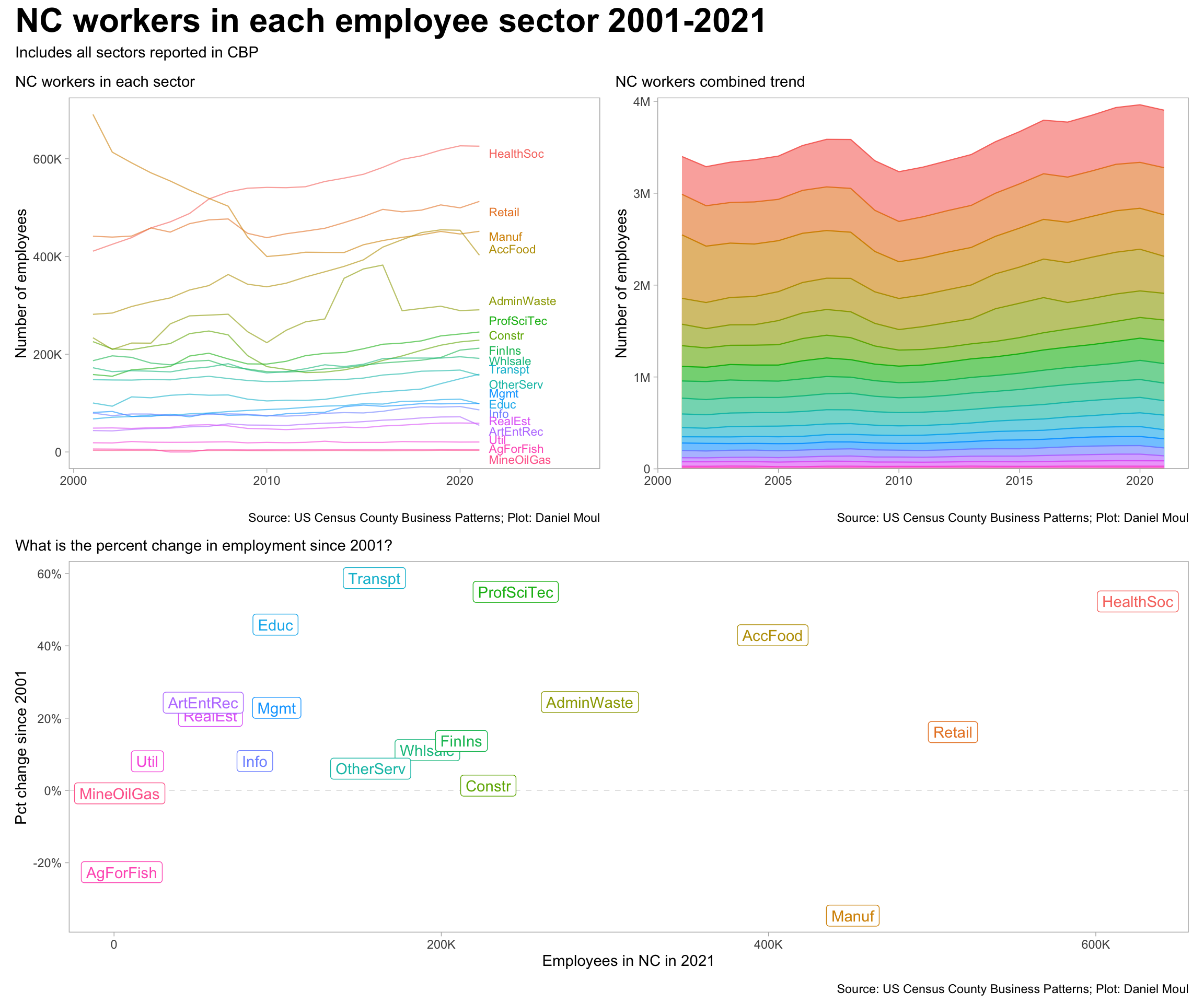
The sector-level dynamics have varied a lot. Compare Manuf with HealthSoc, for example:
Show the code
data_for_plot <- d_emp_sector_total_state_nc |>filter(naics_abbr !="OtherInd") |>mutate(naics_abbr =fct_reorder(naics_abbr, -emp) ) |>mutate(emp_fist_year = emp[year ==min(year)],emp_last_year = emp[year ==max(year)],.by =c("naics")) |>mutate(pct_emp_diff = emp_last_year / emp_fist_year -1)labels_for_plot <- data_for_plot |>filter(year ==max(year))p1 <- data_for_plot |>filter(naics_abbr !="Other") |>ggplot() +geom_line(aes(x = year, y = emp, color = naics_abbr, group = naics_abbr),linewidth =0.4, alpha =0.6, show.legend =FALSE) +geom_text_repel(data = labels_for_plot,aes(x = year +0.5, y = emp, label = naics_abbr, color = naics_abbr),direction ="y", hjust =0, vjust =0.5, size =3,min.segment.length =unit(1, "cm"), force_pull =100,seed =123,show.legend =FALSE) +scale_y_continuous(labels =label_number(scale_cut =cut_short_scale())) +expand_limits(x =2026,y =0) +guides(color =guide_legend(override.aes =c(linewidth =3))) +labs(subtitle ="NC workers in each sector",x ="",y ="Number of employees",color =NULL,caption = my_caption )p2 <- data_for_plot |>filter(naics_abbr !="Other") |>ggplot() +geom_area(aes(x = year, y = emp, color = naics_abbr, fill = naics_abbr, group = naics_abbr),linewidth =0.4, alpha =0.6, show.legend =FALSE) +scale_y_continuous(labels =label_number(scale_cut =cut_short_scale()),expand =expansion(mult =c(0, 0.02))) +expand_limits(y =0) +guides(color =guide_legend(override.aes =c(linewidth =3))) +labs(subtitle ="NC workers combined trend",x ="",y ="Number of employees",color =NULL,caption = my_caption )p3 <- data_for_plot |>filter(year ==2021, emp !=0) |>ggplot(aes(emp, pct_emp_diff, color = naics_abbr)) +geom_hline(yintercept =0, lty =2, size =0.2, alpha =0.2) +geom_label(aes(label = naics_abbr),show.legend =FALSE, hjust =0.5, vjust =0.5) +scale_x_continuous(labels =label_number(scale_cut =cut_short_scale())) +scale_y_continuous(labels =label_percent()) +labs(subtitle =glue("What is the percent change in employment since 2001?"),x ="Employees in NC in 2021",y ="Pct change since 2001" )(p1 + p2) / p3 +plot_annotation(title ="NC workers in each employee sector 2001-2021",subtitle ="Includes all sectors reported in CBP",caption = my_caption )
Figure 1.8: NC workers in each sector 2001-2021
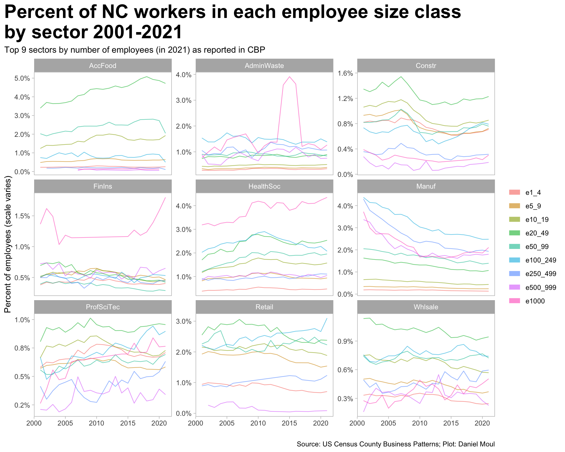
The portion of employees in each employee class size varies over time and across sectors. Decade-long trends are visible:
The share of employees in the Accommodation and Food sector has been increasing in most employee size classes, yet this sector suffered the most during the COVID-19 pandemic 2020-2021.
The share in Manufacturing has been in noticeable decline, especially through 2015 and in the larger employee size classes
Construction slowed significantly after the 2008 financial crisis.
In the HealthSoc, Retail, and ProfSciTec sectors there are cases of big changes from one year to the next in multiple employee size classes. I wonder if this is due to changes in NAICS categories, changes in measurement methodology, or a real change in that sector.
Noise added to some data before release may be the cause of the jumpiness in some of the least common employee size classes.
Show the code
data_for_plot <- d_emp_state_nc_size_classes |>inner_join(n_employees_ref |>select(-est_size_class),by ="emp_size_class") |>mutate(emp_size_class =factor(emp_size_class, levels = emp_size_class_levels),naics_abbr =fct_lump(naics_abbr, n =9, w = emp)) data_for_plot |>filter(naics_abbr !="Other") |>ggplot() +geom_line(aes(x = year, y = pct_emp, color = emp_size_class, group = emp_size_class),linewidth =0.4, alpha =0.6) +scale_y_continuous(labels =label_percent(accuracy =0.1)) +facet_wrap(. ~ naics_abbr, scales ="free_y") +guides(color =guide_legend(override.aes =c(linewidth =3))) +labs(title ="Percent of NC workers in each employee size class\nby sector 2001-2021",subtitle ="Top 9 sectors by number of employees (in 2021) as reported in CBP",x ="",y ="Percent of employees (scale varies)",color =NULL,caption = my_caption )
Figure 1.9: Percent of NC workers in each employee size class by sector
The year over year drop in manufacturing jobs through 2012 is striking. As is the consistent growth through the 21-year period in (1) Healthcare and social services and (2) Accommodation and food.
Figure 1.10: Employment trend: top 5 sectors by number of employees
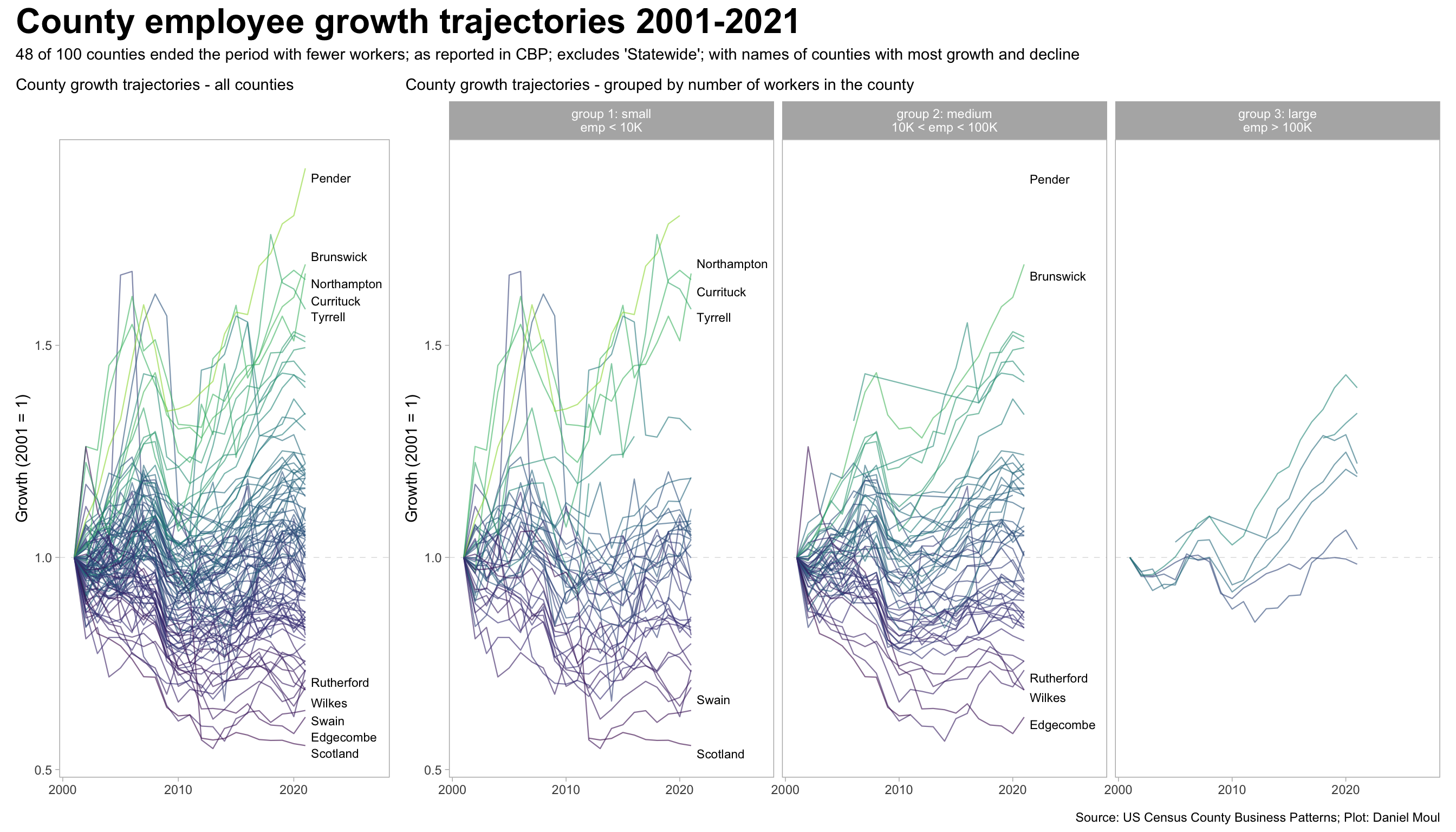
1.4 Trends in employment - counties
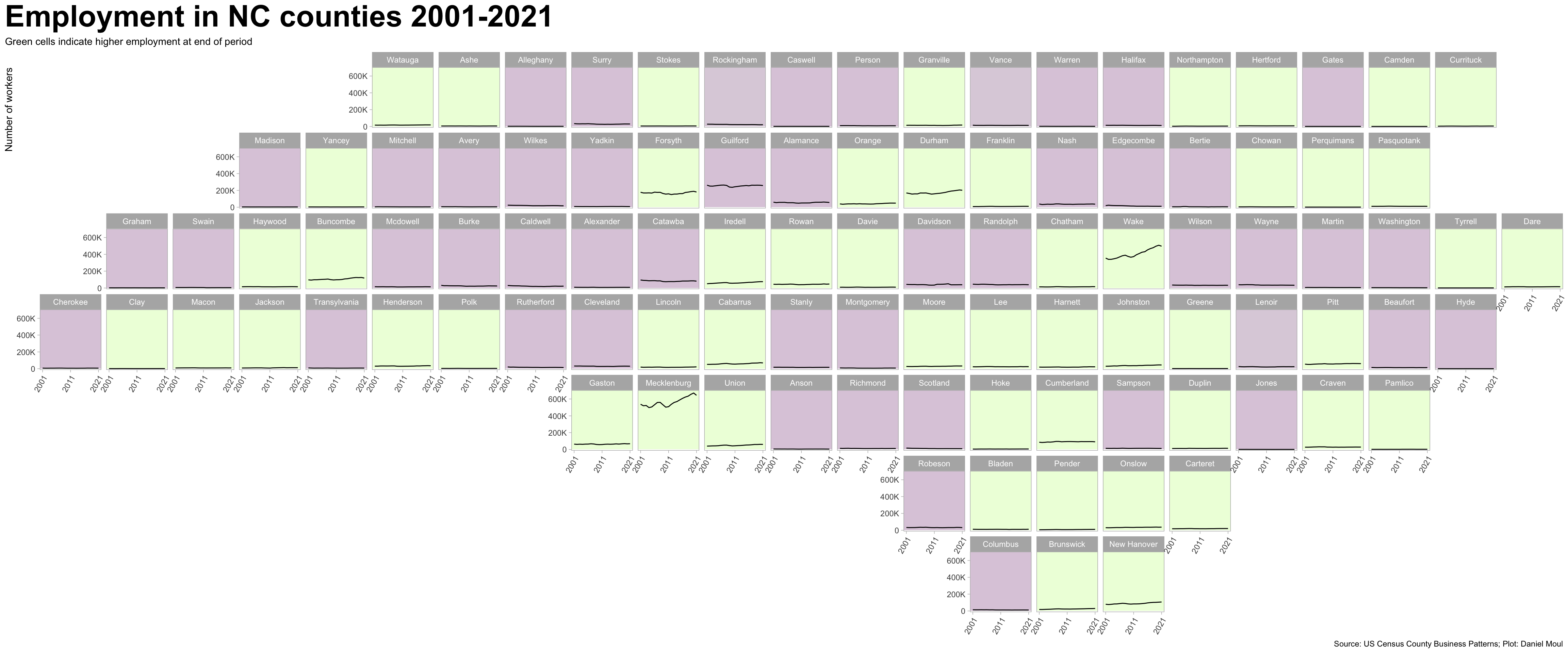
There is naturally more variation when looking at the 100 counties rather than state summaries. The patterns are generally the same across counties of differing number of workers. I see two noticeable differences: (1) the largest counties are not in the group of the most extreme growth or decline; and (2) there is a group of ten or so mid-sized counties that declined modestly from 2001-2007, then quickly 2008-2009, and have grown slowly since then but still with lower employment than in 2001.
Show the code
data_for_plot <- d_emp_total_county |>filter(county_name !="Statewide, NC") |>arrange(year) |>mutate(pct_growth_since_2001 = emp / emp[year ==min(year)],pct_growth_full_period = pct_growth_since_2001[year ==max(year)],pct_emp_diff_yty = emp /lag(emp) -1,.by =c(fipscty)) |>mutate(size_group =case_when( emp <1e4~"group 1: small\nemp < 10K", emp <1e5~"group 2: medium\n10K < emp < 100K", emp >=1e5~"group 3: large\nemp > 100K" ))labels_for_plot_tmp <- data_for_plot |>filter(year ==max(year)) labels_for_plot <-bind_rows( labels_for_plot_tmp |>slice_max(order_by = pct_growth_full_period, n =5), labels_for_plot_tmp |>slice_min(order_by = pct_growth_full_period, n =5))n_smaller <- data_for_plot |>filter(year ==max(year)) |>filter(pct_growth_full_period <1) |>nrow()p1 <- data_for_plot |>ggplot() +geom_hline(yintercept =1, lty =2, size =0.2, alpha =0.2) +geom_line(aes(x = year, y = pct_growth_since_2001, group = county_name, color = pct_growth_full_period),linewidth =0.4, alpha =0.6, show.legend =FALSE) +geom_text_repel(data = labels_for_plot,aes(x = year +0.5, y = pct_growth_full_period, label = county_name),direction ="y", hjust =0, vjust =0.5, size =3,min.segment.length =unit(1, "cm"), force_pull =100,seed =123,show.legend =FALSE) +scale_color_viridis_c(end =0.85) +expand_limits(x =2027) +labs(subtitle ="County growth trajectories - all counties",x =NULL,y ="Growth (2001 = 1)" )p2 <- data_for_plot |>ggplot() +geom_hline(yintercept =1, lty =2, size =0.2, alpha =0.2) +geom_line(aes(x = year, y = pct_growth_since_2001, group = county_name, color = pct_growth_full_period),linewidth =0.4, alpha =0.6, show.legend =FALSE) +geom_text_repel(data = labels_for_plot,aes(x = year +0.5, y = pct_growth_full_period, label = county_name),direction ="y", hjust =0, vjust =0.5, size =3,min.segment.length =unit(1, "cm"), force_pull =100,seed =123,show.legend =FALSE) +scale_color_viridis_c(end =0.85) +facet_wrap( ~ size_group) +expand_limits(x =2027) +labs(subtitle ="County growth trajectories - grouped by number of workers in the county",x =NULL,y ="Growth (2001 = 1)" )p1 + p2 +plot_layout(widths =c(1, 3)) +plot_annotation(title ="County employee growth trajectories 2001-2021",subtitle =glue("{n_smaller} of 100 counties ended the period with fewer workers", "; as reported in CBP; excludes 'Statewide'","; with names of counties with most growth and decline"),caption = my_caption )
Figure 1.11: NC state employees by county (percent) 2021-2021
Placing the county trends in their approximate geographic context, it’s noticeable that (1) growth or decline is not concentrated in one part of the state; (2) most of the workers are in a relatively small number of counties; and (3) most of the counties with more than 50K workers saw employment growth 2001-2021 (and plenty of counties with few workers saw employment growth too).
Figure 1.12: Employment trends in NC counties (approximate geographical position)
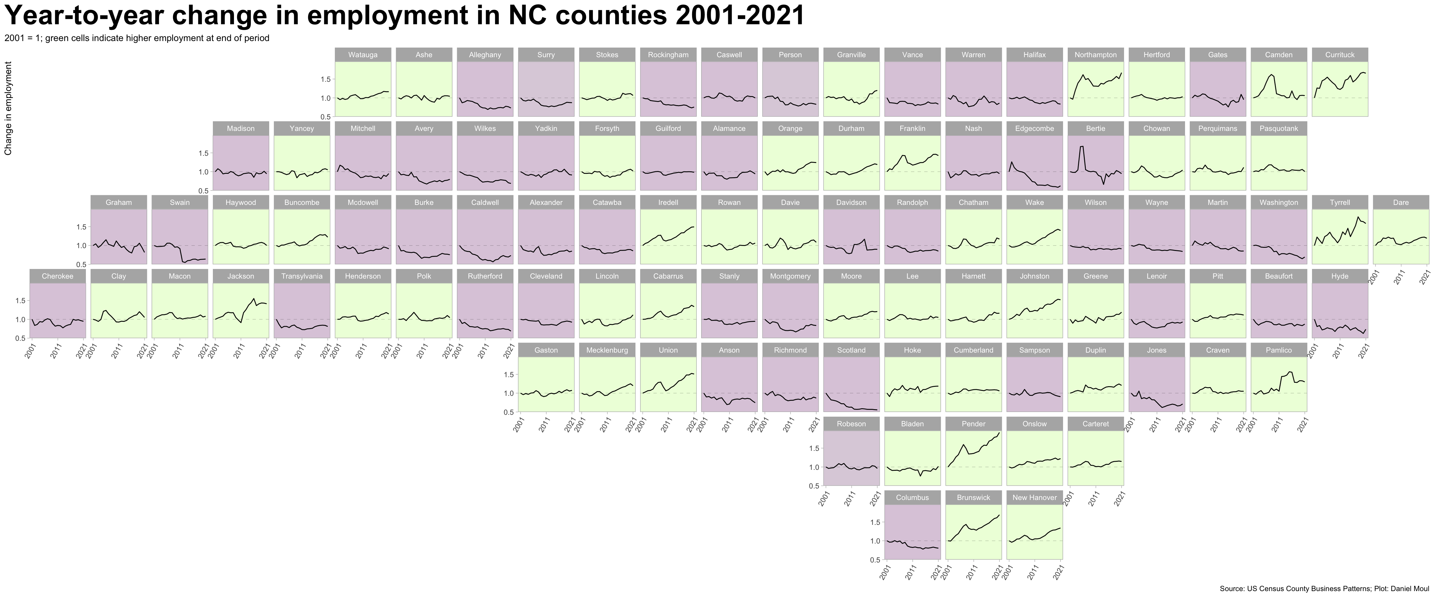
Looking at change year-to-year for each county where 2001 employment equals 1, some patterns emerge: (1) counties with employment growth in this period tended to grow fast, declined during and after the financial crisis, then grew beyond their previous high water mark in the last decade; (2) some counties in decline lost workers nearly every year.
Figure 1.13: Employment trends in NC counties (approximate geographical position)
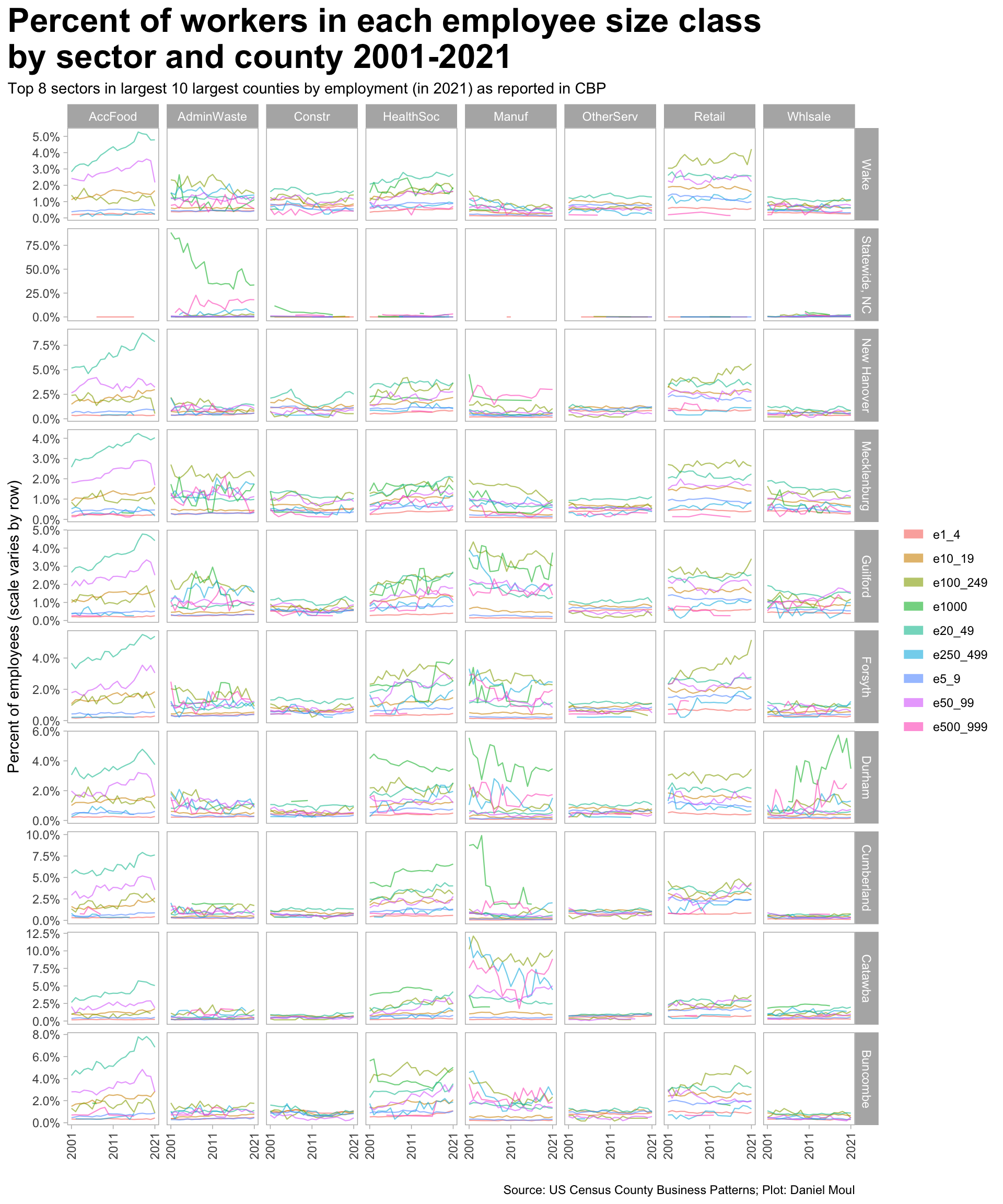
There is variation in the industry sectors, counties, and employee size classes.
Show the code
data_for_plot <- d_emp_county_nc_size_classes |>mutate(naics_abbr =fct_lump(naics_abbr, n =8, w = pct_emp),county_name =fct_lump(county_name, n =10, w = emp),county_name =fct_rev(county_name)) data_for_plot |>filter(naics_abbr !="Other", county_name !="Other") |>ggplot() +geom_line(aes(x = year, y = pct_emp, color = emp_size_class, group = emp_size_class),linewidth =0.4, alpha =0.6) +scale_x_continuous(breaks =c(2001, 2011, 2021)) +scale_y_continuous(labels =label_percent(accuracy =0.1)) +facet_grid(county_name ~ naics_abbr, scales ="free_y") +theme(axis.text.x =element_text(angle =90, hjust =1, vjust =0.5)) +guides(color =guide_legend(override.aes =c(linewidth =3))) +labs(title ="Percent of workers in each employee size class\nby sector and county 2001-2021",subtitle ="Top 8 sectors in largest 10 largest counties by employment (in 2021) as reported in CBP",x ="",y ="Percent of employees (scale varies by row)",color =NULL,caption = my_caption )
Figure 1.14: NC state employees by establishment size class and sector (percent) 2001-2021
1.5 Trends in average wages statewide
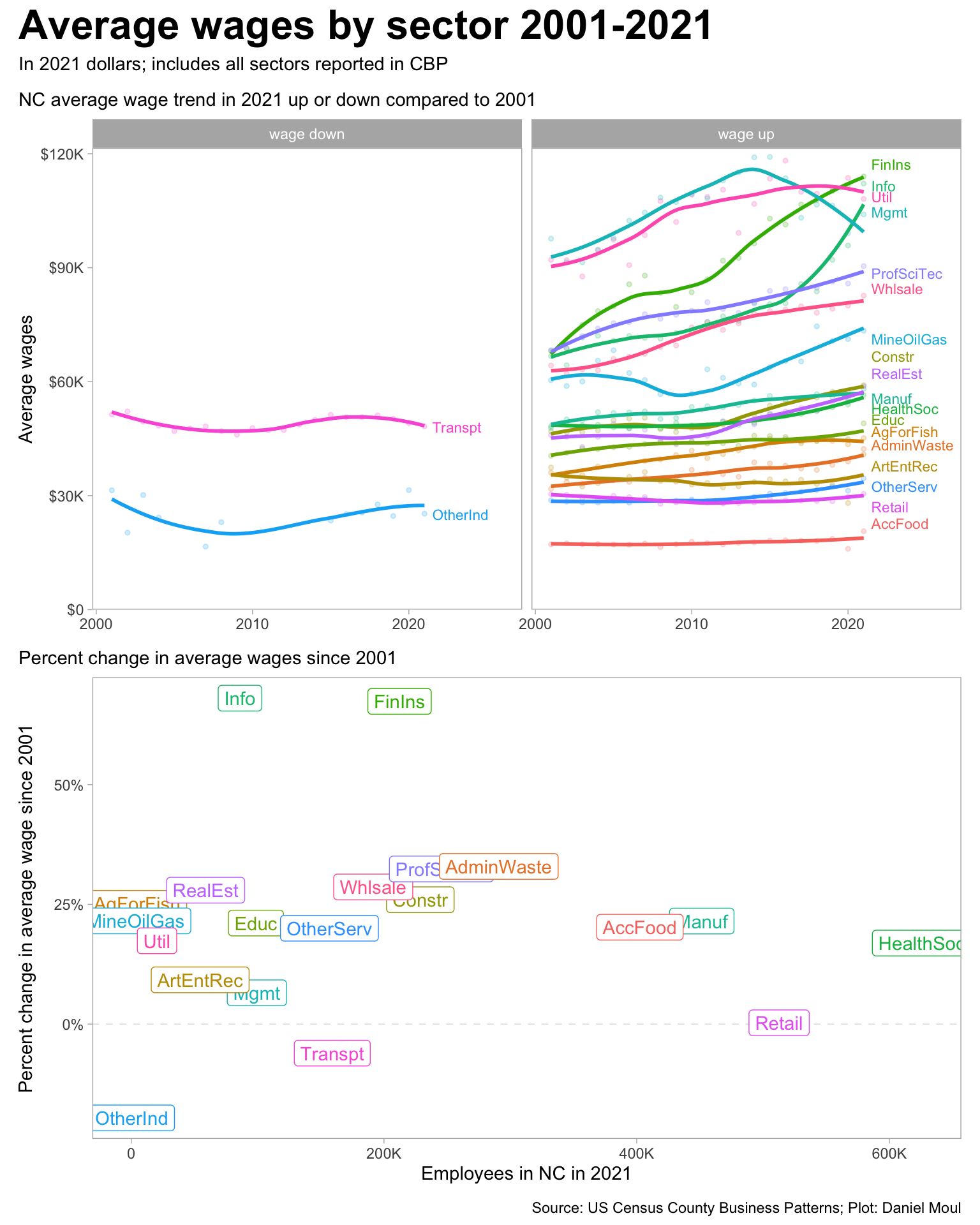
Average wage trends are not uniform across sectors. Wages in four of the five highest paying sectors grew faster than inflation while they dropped in “Management”. I wonder if the drop in the average wage of the management sector is due to manufacturing and financial services disruptions set in motion by the 2008 financial crisis and the COVID-19 pandemic. Or perhaps managers are getting a smaller portion of their income in wages and more in stock or other benefits.
Figure 1.15: Wage trend: top 5 sectors by average wage in 2021
Show the code
data_for_plot <- d_emp_sector_total_state_nc |>inner_join(d_infation_adj,by ="year") |>mutate(avg_wage_adjusted = avg_wage * adj) |>mutate(wage_fist_year = avg_wage_adjusted[year ==min(year)],wage_last_year = avg_wage_adjusted[year ==max(year)],.by =c("naics")) |>mutate(wage_diff = wage_last_year - wage_fist_year,wage_direction =if_else(wage_diff >0, "wage up", "wage down"),pct_wage_diff = wage_last_year / wage_fist_year -1)labels_for_plot <- data_for_plot |>filter(year ==max(year))p1 <- data_for_plot |>filter(emp !=0) |>ggplot(aes(year, avg_wage_adjusted, color = naics_abbr)) +geom_point(size =1, alpha =0.2, na.rm =TRUE,show.legend =FALSE) +geom_smooth(method ='loess', formula ='y ~ x',#span = 3,se =FALSE, show.legend =FALSE) +geom_text_repel(data = labels_for_plot,aes(x = year +0.5, y = avg_wage_adjusted, label = naics_abbr),direction ="y", hjust =0, vjust =0.5, size =3,min.segment.length =unit(1, "cm"), force_pull =100,seed =123,show.legend =FALSE) +scale_y_continuous(labels =label_number(scale_cut =cut_short_scale(),prefix ="$"),expand =expansion(mult =c(0, 0.02))) +expand_limits(x =2026,y =0) +facet_wrap(~ wage_direction) +labs(subtitle ="NC average wage trend in 2021 up or down compared to 2001",x =NULL,y ="Average wages" )p2 <- data_for_plot |>filter(year ==2021, emp !=0) |>ggplot(aes(emp, pct_wage_diff, color = naics_abbr)) +geom_hline(yintercept =0, lty =2, size =0.2, alpha =0.2) +geom_label(aes(label = naics_abbr),show.legend =FALSE, hjust =0.5, vjust =0.5) +scale_x_continuous(labels =label_number(scale_cut =cut_short_scale())) +scale_y_continuous(labels =label_percent()) +labs(subtitle =glue("Percent change in average wages since 2001"),x ="Employees in NC in 2021",y ="Percent change in average wage since 2001" )p1 / p2 +plot_annotation(title ="Average wages by sector 2001-2021",subtitle ="In 2021 dollars; includes all sectors reported in CBP",caption = my_caption )
Figure 1.16: NC average wage trend by sector 2001-2021
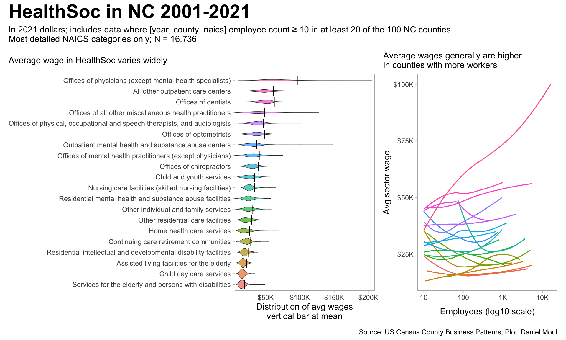
There is a lot of wage variation in subcategories based on job role and location. Consider “Health and social services” (HealthSoc):
Show the code
data_for_plot <- d_emp_county_healthsoc |>filter(emp >=10,!str_detect(naics, "/$|-$")) |># only the most detailed categoriesmutate(naics_descr =fct_lump(naics_descr, 20)) |>filter(naics_descr !="Other") |>inner_join(d_infation_adj,by ="year") |>mutate(avg_wage_adjusted = avg_wage * adj) |>filter(!is.na(avg_wage_adjusted))ave_wage_detailed_naics <- data_for_plot |>summarize(avg_wage =weighted.mean(avg_wage_adjusted, w = emp),.by =c(naics, naics_descr))n_datapoints <-nrow(data_for_plot)p1 <- data_for_plot |>mutate(naics_descr =fct_reorder(naics_descr, avg_wage, mean)) |>ggplot(aes(avg_wage, naics_descr, fill = naics_descr)) +geom_violin(linewidth =0.2, alpha =0.7, show.legend =FALSE) +#fill = carolina_blue, geom_point(data = ave_wage_detailed_naics,aes(avg_wage, naics_descr),shape ="|", size =4, show.legend =FALSE) +scale_x_continuous(labels =label_number(scale_cut =cut_short_scale(),prefix ="$"),expand =expansion(mult =c(0, 0.02))) +labs(subtitle =glue("Average wage in HealthSoc varies widely"),x ="Distribution of avg wages\nvertical bar at mean",y =NULL, )p2 <- data_for_plot |>mutate(naics_descr =fct_reorder(naics_descr, avg_wage, mean)) |>ggplot(aes(emp, avg_wage, group = naics_descr, color = naics_descr)) +geom_smooth(span =0.97, method ='loess', formula ='y ~ x',se =FALSE, show.legend =FALSE,linewidth =0.6, alpha =0.4) +scale_x_log10(labels =label_number(scale_cut =cut_short_scale())) +scale_y_continuous(labels =label_number(scale_cut =cut_short_scale(),prefix ="$")) +labs(subtitle =glue("Average wages generally are higher\nin counties with more workers"),x ="Employees (log10 scale)",y ="Avg sector wage",y =NULL )p1 + p2 +plot_annotation(title ="HealthSoc in NC 2001-2021",subtitle =glue("In 2021 dollars; includes data where [year, county, naics] employee count ≥ 10 in at least 20 of the 100 NC counties", "\nMost detailed NAICS categories only; N = {comma(n_datapoints)}"),caption = my_caption )
Figure 1.17: NC average wages in HealthSoc sector
1.6 Tables
Below are the sector summary categories used in the CBP. To simplify plotting, I created some abbreviations:
Show the code
d_naics_abbr_ref |>arrange(naics_abbr_num) |>select(naics_abbr, naics_descr) |>mutate(rowid =row_number()) |>gt() |>tab_header(md(glue("**NAICS categories and abbreviations used in this analysis**"))) |>tab_source_note(md("*US Census County Business Patterns; analysis by Daniel Moul*")) |>tab_options(table.font.size =10)
Table 1.1: NAICS sector categories and abbreviations
NAICS categories and abbreviations used in this analysis
naics_abbr
naics_descr
rowid
TotalAllSec
Total for all sectors
1
AccFood
Accommodation and food services
2
AdminWaste
Administrative and support and waste management and remediation services
3
AgForFish
Agriculture, forestry, fishing and hunting
4
ArtEntRec
Arts, entertainment, and recreation
5
Constr
Construction
6
Educ
Educational services
7
FinIns
Finance and insurance
8
HealthSoc
Health care and social assistance
9
Info
Information
10
Manuf
Manufacturing
11
MineOilGas
Mining, quarrying, and oil and gas extraction
12
Mgmt
Management of companies and enterprises
13
ProfSciTec
Professional, scientific, and technical services
14
RealEst
Real estate and rental and leasing
15
Retail
Retail trade
16
Transpt
Transportation and warehousing
17
Util
Utilities
18
Whlsale
Wholesale trade
19
OtherServ
Other services (except public administration)
20
OtherInd
Industries not classified
21
US Census County Business Patterns; analysis by Daniel Moul
Sectors sorted by number of employees:
Show the code
d_emp_sector_total_state_nc |>filter(year ==2021) |>filter(naics_abbr !="OtherInd") |>select(naics, naics_abbr, naics_descr, emp_2021 = emp, pct_emp_2021 = pct_emp) |>arrange(-emp_2021) |>mutate(rowid =row_number()) |>relocate(naics_descr, .after = naics) |>gt() |>tab_header(md(glue("**NC sector employment 2021**","<br>*Sorted by sector employment*"))) |>tab_source_note(md("*US Census County Business Patterns; analysis by Daniel Moul*")) |>tab_options(table.font.size =10) |>fmt_number(columns =c(emp_2021), #, avg_wagedecimals =0) |>fmt_percent(columns = pct_emp_2021, decimals =0)
Table 1.2: NC state employment by sector 2021
NC sector employment 2021 Sorted by sector employment
naics
naics_descr
naics_abbr
emp_2021
pct_emp_2021
rowid
62----
Health care and social assistance
HealthSoc
625,672
16%
1
44----
Retail trade
Retail
512,706
13%
2
31----
Manufacturing
Manuf
451,487
12%
3
72----
Accommodation and food services
AccFood
402,561
10%
4
56----
Administrative and support and waste management and remediation services
AdminWaste
290,845
7%
5
54----
Professional, scientific, and technical services
ProfSciTec
245,485
6%
6
23----
Construction
Constr
228,752
6%
7
52----
Finance and insurance
FinIns
212,324
5%
8
42----
Wholesale trade
Whlsale
191,495
5%
9
48----
Transportation and warehousing
Transpt
159,091
4%
10
81----
Other services (except public administration)
OtherServ
156,834
4%
11
55----
Management of companies and enterprises
Mgmt
99,410
3%
12
61----
Educational services
Educ
98,677
3%
13
51----
Information
Info
86,053
2%
14
53----
Real estate and rental and leasing
RealEst
58,890
2%
15
71----
Arts, entertainment, and recreation
ArtEntRec
54,515
1%
16
22----
Utilities
Util
20,391
1%
17
11----
Agriculture, forestry, fishing and hunting
AgForFish
4,714
0%
18
21----
Mining, quarrying, and oil and gas extraction
MineOilGas
3,464
0%
19
US Census County Business Patterns; analysis by Daniel Moul
Sorted by percent difference from 2001 to 2021
Show the code
d_emp_sector_total_state_nc |>filter(naics_abbr !="OtherInd") |>mutate(naics_abbr =fct_reorder(naics_abbr, -emp) ) |>mutate(emp_fist_year = emp[year ==min(year)],emp_last_year = emp[year ==max(year)],.by =c("naics")) |>mutate(pct_emp_diff = emp_last_year / emp_fist_year -1) |>filter(year ==2021) |>select(naics, naics_abbr, emp_2021 = emp, pct_emp_2021 = pct_emp, pct_emp_diff_since_2001 = pct_emp_diff) |>arrange(-pct_emp_diff_since_2001) |>mutate(rowid =row_number()) |>gt() |>tab_header(md(glue("**NC sector employment in 2021 and growth since 2001**","<br>*Sorted by growth since 2001*"))) |>tab_source_note(md("*US Census County Business Patterns; analysis by Daniel Moul*")) |>tab_options(table.font.size =10) |>fmt_number(columns =c(emp_2021),decimals =0) |>fmt_percent(columns =c(pct_emp_2021, pct_emp_diff_since_2001),decimals =0)
Table 1.3: NC state employment growth by sector 2001-2021
NC sector employment in 2021 and growth since 2001 Sorted by growth since 2001
naics
naics_abbr
emp_2021
pct_emp_2021
pct_emp_diff_since_2001
rowid
48----
Transpt
159,091
4%
59%
1
54----
ProfSciTec
245,485
6%
55%
2
62----
HealthSoc
625,672
16%
52%
3
61----
Educ
98,677
3%
46%
4
72----
AccFood
402,561
10%
43%
5
56----
AdminWaste
290,845
7%
24%
6
71----
ArtEntRec
54,515
1%
24%
7
55----
Mgmt
99,410
3%
23%
8
53----
RealEst
58,890
2%
21%
9
44----
Retail
512,706
13%
16%
10
52----
FinIns
212,324
5%
14%
11
42----
Whlsale
191,495
5%
11%
12
51----
Info
86,053
2%
8%
13
22----
Util
20,391
1%
8%
14
81----
OtherServ
156,834
4%
6%
15
23----
Constr
228,752
6%
1%
16
21----
MineOilGas
3,464
0%
−1%
17
11----
AgForFish
4,714
0%
−23%
18
31----
Manuf
451,487
12%
−35%
19
US Census County Business Patterns; analysis by Daniel Moul
Sorted by average wage:
Show the code
d_emp_sector_total_state_nc |>filter(year ==2021) |>select(naics, naics_abbr, avg_wage_2021 = avg_wage, emp_2021 = emp, pct_emp_2021 = pct_emp) |>arrange(-avg_wage_2021) |>mutate(rowid =row_number()) |>gt() |>tab_header(md(glue("**NC sector employment 2021**","<br>*Sorted by sector average wage*"))) |>tab_source_note(md("*US Census County Business Patterns; analysis by Daniel Moul*")) |>tab_options(table.font.size =10) |>fmt_number(columns =c(emp_2021, avg_wage_2021),decimals =0) |>fmt_percent(columns = pct_emp_2021, decimals =0)
Table 1.4: NC state average wage by sector 2021
NC sector employment 2021 Sorted by sector average wage
naics
naics_abbr
avg_wage_2021
emp_2021
pct_emp_2021
rowid
52----
FinIns
114,024
212,324
5%
1
51----
Info
112,154
86,053
2%
2
22----
Util
108,108
20,391
1%
3
55----
Mgmt
104,025
99,410
3%
4
54----
ProfSciTec
90,430
245,485
6%
5
42----
Whlsale
82,657
191,495
5%
6
21----
MineOilGas
73,410
3,464
0%
7
23----
Constr
59,089
228,752
6%
8
53----
RealEst
58,796
58,890
2%
9
31----
Manuf
58,104
451,487
12%
10
62----
HealthSoc
56,471
625,672
16%
11
61----
Educ
49,027
98,677
3%
12
48----
Transpt
48,231
159,091
4%
13
11----
AgForFish
45,136
4,714
0%
14
56----
AdminWaste
42,286
290,845
7%
15
71----
ArtEntRec
40,880
54,515
1%
16
81----
OtherServ
34,543
156,834
4%
17
44----
Retail
30,474
512,706
13%
18
99----
OtherInd
25,248
448
0%
19
72----
AccFood
20,614
402,561
10%
20
US Census County Business Patterns; analysis by Daniel Moul
Show the code
d_emp_sector_total_state_nc |>inner_join(d_infation_adj,by ="year") |>mutate(avg_wage_adjusted = avg_wage * adj) |>mutate(wage_fist_year = avg_wage_adjusted[year ==min(year)],wage_last_year = avg_wage_adjusted[year ==max(year)],.by =c("naics")) |>mutate(wage_diff = wage_last_year - wage_fist_year,pct_wage_diff = wage_last_year / wage_fist_year -1) |>filter(year ==2021) |>select(naics, naics_abbr, avg_wage_2021 = wage_last_year, pct_avg_wage_diff_since_2001 = pct_wage_diff, emp_2021 = emp, pct_emp_2021 = pct_emp) |>arrange(-pct_avg_wage_diff_since_2001) |>mutate(rowid =row_number()) |>gt() |>tab_header(md(glue("**NC sector average wage 2021 and difference since 2001**","<br>*Sorted by average wage difference*"))) |>tab_source_note(md("*US Census County Business Patterns; analysis by Daniel Moul*")) |>tab_options(table.font.size =10) |>fmt_number(columns =c(avg_wage_2021, emp_2021),decimals =0) |>fmt_percent(columns =c(pct_avg_wage_diff_since_2001, pct_emp_2021), decimals =0)
Table 1.5: NC state average wage growth by sector 2001-2021
NC sector average wage 2021 and difference since 2001 Sorted by average wage difference
naics
naics_abbr
avg_wage_2021
pct_avg_wage_diff_since_2001
emp_2021
pct_emp_2021
rowid
51----
Info
112,154
68%
86,053
2%
1
52----
FinIns
114,024
67%
212,324
5%
2
56----
AdminWaste
42,286
33%
290,845
7%
3
54----
ProfSciTec
90,430
32%
245,485
6%
4
42----
Whlsale
82,657
29%
191,495
5%
5
53----
RealEst
58,796
28%
58,890
2%
6
23----
Constr
59,089
26%
228,752
6%
7
11----
AgForFish
45,136
25%
4,714
0%
8
21----
MineOilGas
73,410
22%
3,464
0%
9
31----
Manuf
58,104
22%
451,487
12%
10
61----
Educ
49,027
21%
98,677
3%
11
72----
AccFood
20,614
20%
402,561
10%
12
81----
OtherServ
34,543
20%
156,834
4%
13
22----
Util
108,108
17%
20,391
1%
14
62----
HealthSoc
56,471
17%
625,672
16%
15
71----
ArtEntRec
40,880
9%
54,515
1%
16
55----
Mgmt
104,025
7%
99,410
3%
17
44----
Retail
30,474
0%
512,706
13%
18
48----
Transpt
48,231
−6%
159,091
4%
19
99----
OtherInd
25,248
−20%
448
0%
20
US Census County Business Patterns; analysis by Daniel Moul