Show the code
source(here::here("scripts/setup.R"))

source(here("scripts/load-voyages.R"))source(here::here("scripts/setup.R"))
source(here("scripts/load-voyages.R"))After cleaning, the data set includes the following:
left_join(
  df_voyages %>%
    distinct(ShipName, Nationality) %>%
    count(Nationality, name = "n_ships", sort=TRUE),
  df_voyages %>%
    distinct(ShipName, VoyageIni, Nationality) %>%
    count(Nationality, name = "n_voyages", sort=TRUE),
  by = "Nationality"
  ) %>%
  left_join(
    .,
    df_voyages %>%
      group_by(Nationality) %>%
      summarize(n_observations = n()) %>%
      ungroup(),
    by = "Nationality"
  ) %>%
  left_join(
    .,
    df_voyages %>%
      group_by(Nationality, ShipName, VoyageIni) %>%
      summarize(n_days_enroute = max(n_days)) %>%
      ungroup() %>%
      group_by(Nationality) %>%
      summarize(n_days_enroute = sum(n_days_enroute)) %>%
      ungroup(),
    by = "Nationality"
  ) |>
janitor::adorn_totals(where = "row") |>
  gt() |>
  # tab_header(md("**abc**")) |>
  fmt_number(
    columns = 2:5,
    decimals = 0,
    suffixing = FALSE
  ) %>%
  cols_align(
    align = "right",
    columns = 2:5
)| Nationality | n_ships | n_voyages | n_observations | n_days_enroute |
|---|---|---|---|---|
| BRITISH | 384 | 1,971 | 83,707 | 92,772 |
| DUTCH | 155 | 584 | 33,414 | 38,464 |
| SPANISH | 151 | 716 | 39,435 | 43,449 |
| FRENCH | 74 | 220 | 7,488 | 7,937 |
| AMERICAN | 2 | 2 | 195 | 196 |
| SWEDISH | 1 | 2 | 335 | 614 |
| HAMBURG | 1 | 1 | 65 | 66 |
| DANISH | 1 | 1 | 58 | 59 |
| Total | 769 | 3,497 | 164,697 | 183,557 |
data_for_plot <- df_voyages %>%
  distinct(ShipName, Year, Nationality, color_route) %>%
  mutate(Nationality = str_to_title(Nationality)) %>%
  # not enough data for the histogram
  filter(!Nationality %in% c("American", "Danish", "Hamburg", "Swedish"))

data_for_plot_all <- data_for_plot %>%
  select(-Nationality)

ggplot() +
  geom_histogram(data = data_for_plot_all,
                 aes(Year),
                 binwidth = 5,
                 fill = "lightslategrey", alpha = 0.3) +
  geom_histogram(data = data_for_plot,
                 aes(Year, fill = color_route),
                 binwidth = 5) +
  scale_x_continuous(breaks = c(1760, 1780, 1800),
                     expand = expansion(mult = c(0, 0.02))) +
  scale_y_continuous(expand = expansion(mult = c(0, 0.02))) +
  facet_wrap(~Nationality) +
  scale_fill_identity(labels = str_to_title(color_routes$Nationality),
                         breaks = color_routes$color_route,
                         guide = "legend") +
  theme(legend.position = "none") +
  labs(title = "Years in which there are observations",
       subtitle = glue("{min(data_for_plot_all$Year)} - {max(data_for_plot_all$Year)} in 5-year bins",
                       "\nCounting each ship and year in which observations were made"),
       x = "Year",
       y = "Count",
       caption = my_caption)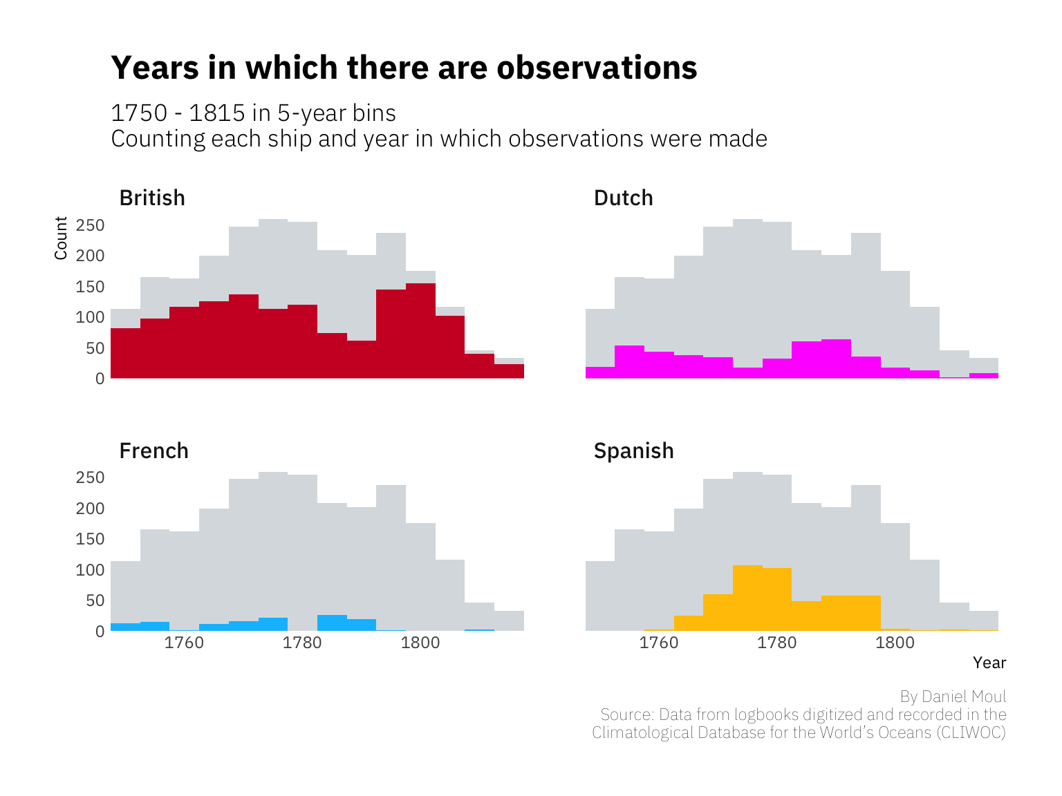
Unlike the land-bound, for sailors, the sea shore is the dangerous edge. Daily life happens on the seas, their medium of travel. Considered as a whole, most voyages in this data set lasted about seven weeks. Spanish and Dutch voyages were longest on average, since their colonial and commercial ties were further away; French ships’ destinations were mostly closer to home in the North Atlantic and Caribbean.
HIST_BINWIDTH <- 7 # days

data_for_plot <- df_voyages %>%
  mutate(Nationality = str_to_title(Nationality)) %>%
  # not enough data for these countries to include them in the histogram
  filter(!Nationality %in% c("American", "Danish", "Hamburg", "Swedish"))

my_median <- median(data_for_plot$n_days, na.rm = TRUE)

national_median <- data_for_plot %>%
  group_by(Nationality) %>%
  summarize(med = median(n_days, na.rm = TRUE)) %>%
  ungroup() %>%
  mutate(med_label = glue("Median days: {med}"))

data_for_plot %>%
  filter(n_days <= 365) %>%
  ggplot() +
  geom_histogram(aes(n_days, fill = color_route),
                 binwidth = HIST_BINWIDTH
                 ) +
  geom_vline(data = national_median,
             aes(xintercept = med)
             ) +
  scale_x_continuous(breaks = 90 * (1:8),
                     expand = expansion(mult = c(0, 0.02))) +
  scale_y_continuous(labels = label_number(scale_cut = cut_short_scale()),
                     expand = expansion(mult = c(0, 0.02))) +
  geom_text(data = national_median,
            aes(x = med + 10, y = 5000, label = med_label),
            hjust = 0
            ) +
  scale_fill_identity(labels = str_to_title(color_routes$Nationality),
                         breaks = color_routes$color_route,
                         guide = "legend"
                      ) +
  facet_wrap(~Nationality) +
  theme(legend.position = "none") +
  labs(title = "Duration of voyages",
       subtitle = glue("In {HIST_BINWIDTH}-day bins. Overall median: {my_median} days.",
                       "\nShowing voyages less than 1 year in duration."),
       caption = my_caption)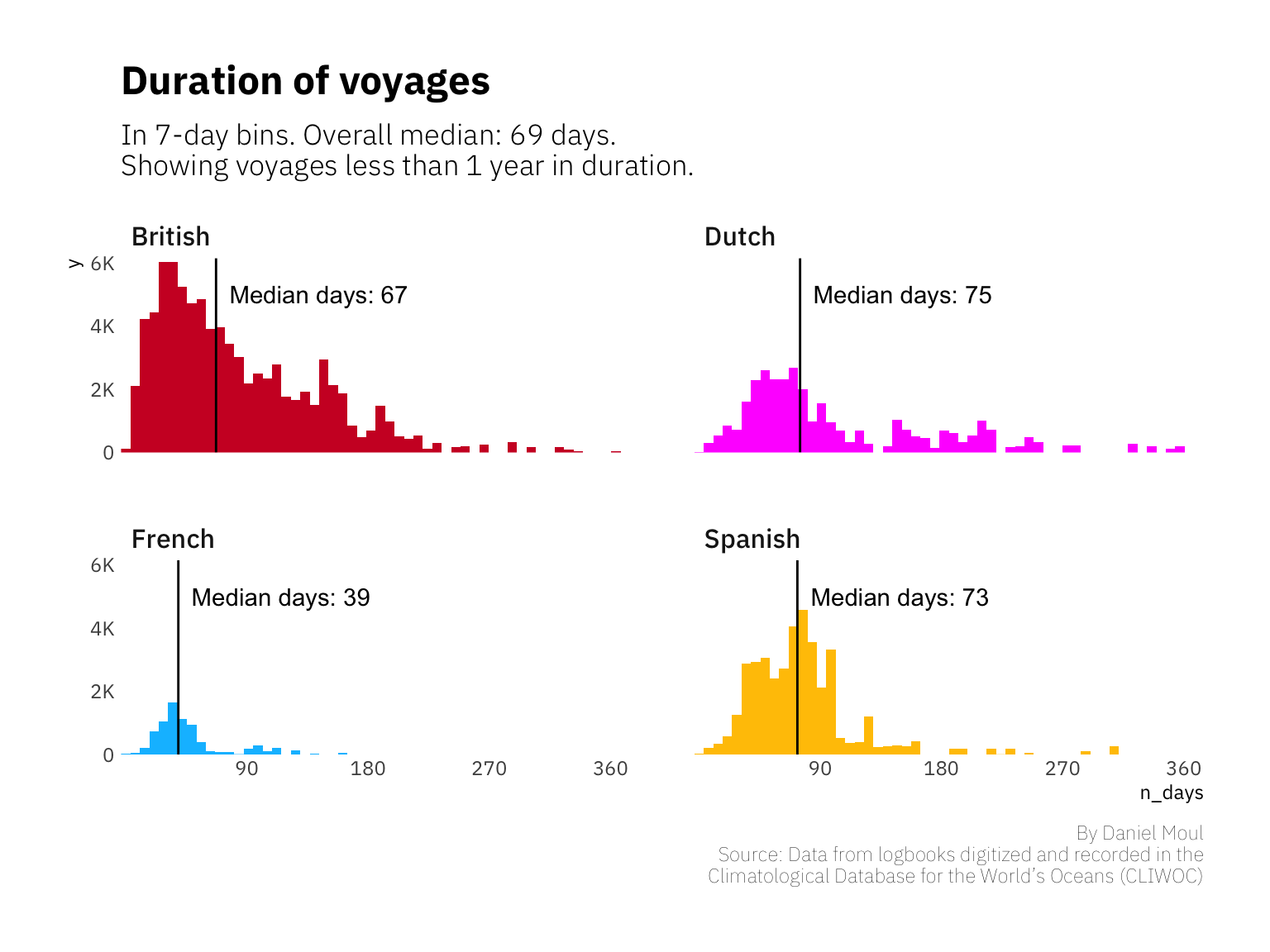
Wind to a sailor is what money is to life on shore.
–Sterlin Hayden
There was great variability in the distance ships traveled in a day. In addition to differences in ships’ designs and the degree to which their bottoms were fouled with marine growth, sometimes the wind didn’t blow or blew in the wrong direction. Often there wasn’t a need to put sails, spars, and masts at risk to eke out all possible speed. Sometimes there just wasn’t far to go.
While the wind can be capricious anywhere, the doldrums are justly named: ships could drift for weeks in the heat, rolling uncomfortably and running low on fresh water.
Down dropt the breeze, the sails dropt down,
’Twas sad as sad could be;
And we did speak only to break
The silence of the sea!All in a hot and copper sky,
The bloody Sun, at noon,
Right up above the mast did stand,
No bigger than the Moon.Day after day, day after day,
We stuck, nor breath nor motion; As idle as a painted ship
Upon a painted ocean.Water, water, every where,
And all the boards did shrink;
Water, water, every where,
Nor any drop to drink.
From The Rime of the Ancient Mariner, by Samuel Taylor Coleridge
At other times the wind was just right, and life was easy–or at least easier.
The fair breeze blew, the white foam flew,
The furrow followed free:
We were the first that ever burst
Into that silent sea.
From The Rime of the Ancient Mariner, by Samuel Taylor Coleridge
The distribution of distances traveled per day is remarkably similar, suggesting similar technology and sailing practices.
HIST_BINWIDTH <- 20 # km

data_for_plot <- df_voyages %>%
  mutate(Nationality = str_to_title(Nationality)) %>%
  # not enough data for these countries to include them in the histogram
  filter(!Nationality %in% c("American", "Danish", "Hamburg", "Swedish")) %>%
  # account for missing log entries in distance
  filter(!days_since_last_obs > 1)

my_median <- median(data_for_plot$distance_km, na.rm = TRUE)

national_median <- data_for_plot %>%
  group_by(Nationality) %>%
  summarize(med = median(distance_km, na.rm = TRUE)) %>%
  ungroup() %>%
  mutate(med_label = glue("Median km: {med}"))

data_for_plot %>%
  filter(
    distance_km <= 600,
    n_days <= 365) %>% # should we also filter more finely than 1000 km?
  ggplot() +
  geom_histogram(aes(distance_km, fill = color_route),
                 binwidth = HIST_BINWIDTH
                 ) +
  geom_vline(data = national_median,
             aes(xintercept = med)
             ) +
  scale_x_continuous(expand = expansion(mult = c(0, 0.02))) +
  scale_y_continuous(labels = label_number(scale_cut = cut_short_scale()),
                     expand = expansion(mult = c(0, 0.02))) +
  scale_fill_identity(labels = str_to_title(color_routes$Nationality),
                         breaks = color_routes$color_route,
                         guide = "legend"
                      ) +
  facet_wrap(~Nationality, scales = "free_y") +
  theme(legend.position = "none") +
  labs(title = "Distance traveled in 24-hour periods",
       subtitle = glue("In {HIST_BINWIDTH} km bins. Median: {round(my_median, 0)} km"),
       caption = my_caption)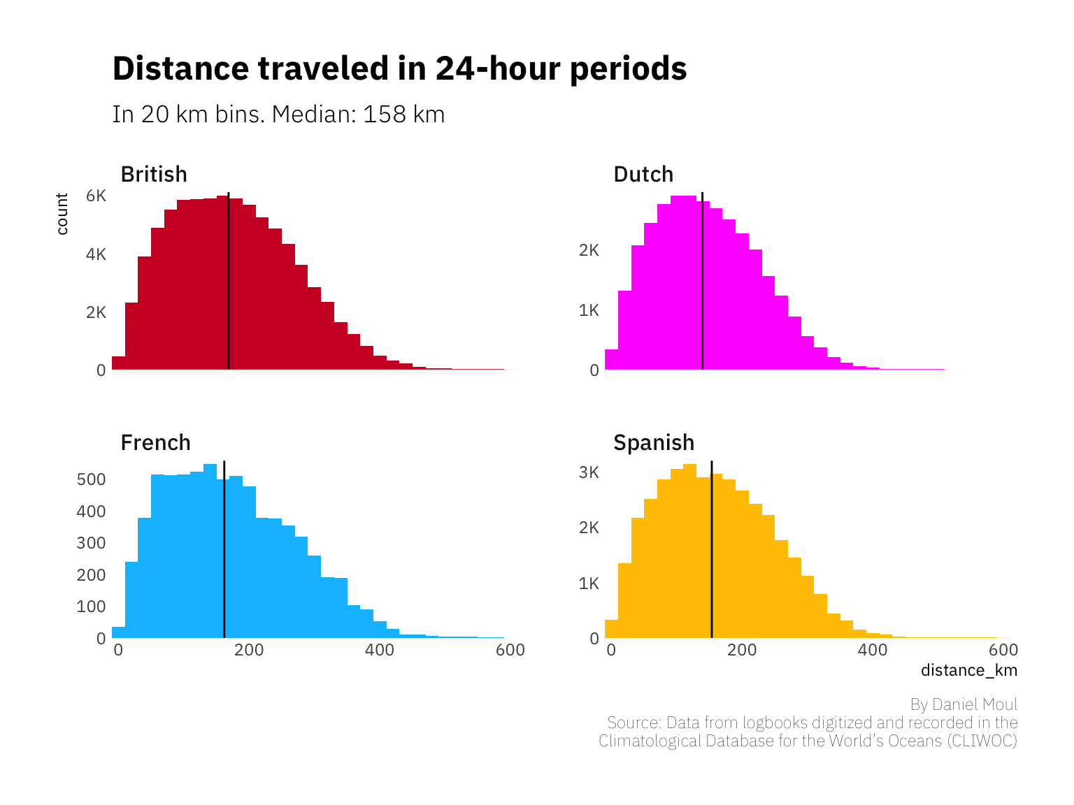
Journeys of longer duration in this data set typically include gaps in the observation dates without increases in distance as seen in the plot of British ships below. These horizontal lines indicate time in port, I assume.
DURATION_CUTOFF_DAYS <- 365

data_for_plot <- df_voyages %>%
  mutate(voyage_id = paste0(ShipName, "-", VoyageIni),
         Nationality = str_to_title(Nationality)
         ) %>%
  # not enough data for these countries to include them in the histogram
  # filter(!Nationality %in% c("American", "Danish", "Hamburg", "Swedish")) %>%
  filter(Nationality == "British")

data_for_plot %>%
  filter(days_enroute < 365) %>% # should we also filter more finely than 1000 km?
  ggplot() +
  geom_line(aes(x = days_enroute, y = cum_distance, group = voyage_id),
            size = 0.1, alpha = 0.9, show.legend = FALSE, color = "black"
  ) +
  geom_point(aes(x = days_enroute, y = cum_distance, color = color_route, group = voyage_id),
             size = 0.1, alpha = 0.2
  ) +
  scale_x_continuous(expand = expansion(mult = c(0, 0.02))) +
  scale_y_continuous(labels = label_number(scale_cut = cut_short_scale()),
                     expand = expansion(mult = c(0, 0.02))
                     ) +
  scale_color_identity(labels = str_to_title(color_routes$Nationality),
                       breaks = color_routes$color_route,
                       guide = "legend"
  ) +
  facet_wrap(~Nationality) +
  guides(color = guide_legend(override.aes = list(size=4))) +
  theme(legend.position = "none") +
  labs(title = glue("Distance {str_to_title(data_for_plot$Nationality)} ships traveled day-by-day"),
       subtitle = glue("Showing less than {DURATION_CUTOFF_DAYS} days en route",
                       "\nHorizontal lines indicate time in port"),
       caption = my_caption)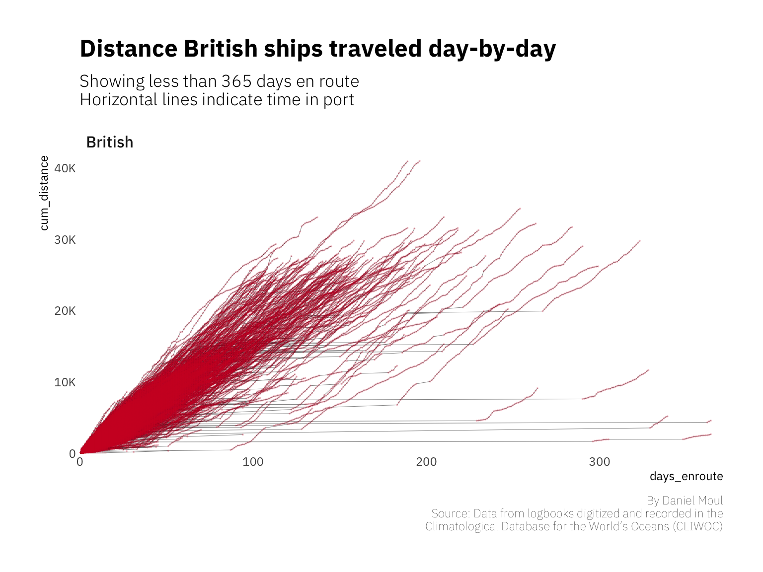
British and Dutch ships spent proportionally longer in port. This dynamic could have been due to the need for repairs after a trip around the South African cape, or possibly it could be a willingness to station a ship at a port for longer periods of time.
CUTOFF_DAYS <- 90

data_for_plot <- df_voyages %>%
  mutate(Nationality = str_to_title(Nationality)) %>%
  # not enough data for these countries to include them in the histogram
  filter(!Nationality %in% c("American", "Danish", "Hamburg", "Swedish")) %>%
  filter(days_since_last_obs > 1)

my_median <- median(data_for_plot$days_since_last_obs, na.rm = TRUE)

national_median <- data_for_plot %>%
  group_by(Nationality) %>%
  summarize(med = median(days_since_last_obs, na.rm = TRUE)) %>%
  ungroup() %>%
  mutate(med_label = glue("Median days: {med}"))

n_excluded <- data_for_plot %>% filter(days_since_last_obs > CUTOFF_DAYS) %>% nrow()

data_for_plot %>%
  ggplot(aes(days_since_last_obs, color = color_route)) +
  stat_ecdf(geom = "line", pad = FALSE,
         size = 1, alpha = 0.8) +
  scale_x_continuous(breaks = 30*(0:6),
                     limits = c(0, CUTOFF_DAYS),
                     expand = expansion(mult = c(0, 0.02))) +
  scale_y_continuous(labels = percent_format(),
                     expand = expansion(mult = c(0, 0.02))) +
  scale_color_identity(labels = str_to_title(color_routes$Nationality),
                         breaks = color_routes$color_route,
                         guide = "legend"
                      ) +
  theme(legend.position = "right") +
  labs(title = "Days in port during voyages",
       y = "Cumulative pct of gaps in logs",
       subtitle = glue("{nrow(data_for_plot)} gaps in logs of a day or more",
       " ({round(100 * nrow(data_for_plot) / nrow(df_voyages), 2)}% of log entries)",
       "\nMedian days: {round(my_median, 0)} days; not showing {n_excluded} gaps > {CUTOFF_DAYS} days"),
       color = NULL,
       caption = my_caption)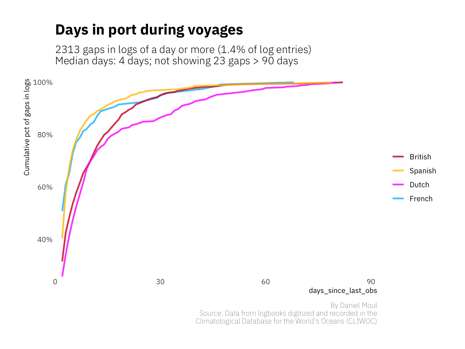
At the end of a voyage ships need to be unloaded, refitted, and reprovisioned before sailing anew. Crew need to be paid off. Some need to leave (or are asked to leave), and replacements need to be found. When arriving at home port, crew want a little time with family and sweethearts. Still it doesn’t seem accurate to me that the median days between voyages in this data set is 166 days (5.5 months). Could it be that too many voyages are not included in this data set, inflating the days between voyages? Or some of the largest time gaps are actually a later ship of the same name (10000 days is 27.4 years).
data_for_plot <- df_voyages %>%
  filter(is.na(days_since_last_obs)) |> # first day of voyage
  group_by(ShipName) |>
  arrange(ShipName, ObsDate) |>
  mutate(days_between_voyages = as.numeric(difftime(ObsDate, lag(ObsDate, default = NA ),
                                         units = "days"))) |>
  ungroup() |>
  # not enough data for these countries to include them in the histogram
  filter(!Nationality %in% str_to_upper(c("American", "Danish", "Hamburg", "Swedish"))) |>
  droplevels()

my_median_days <- median(data_for_plot$days_between_voyages, na.rm = TRUE)

national_median <- data_for_plot %>%
  group_by(Nationality) %>%
  summarize(med = median(days_between_voyages, na.rm = TRUE)) %>%
  ungroup() %>%
  mutate(med_label = glue("Median days: {med}"))

data_for_plot_all <- data_for_plot |>
  select(-Nationality)

ggplot() +
  geom_histogram(data = data_for_plot_all,
                 aes(days_between_voyages),
                 bins = 30,
                 fill = "lightslategrey", alpha = 0.3) +
  geom_histogram(data = data_for_plot,
                 aes(days_between_voyages, fill = color_route),
                 bins = 30,
                 ) +
  geom_vline(data = national_median,
             aes(xintercept = med)
             ) +
  geom_vline(xintercept = my_median_days, lty = 2, linewith = 0.5, alpha = 0.5) +
  scale_x_log10(expand = expansion(mult = c(0.01, 0.02))) +
  scale_y_continuous(expand = expansion(mult = c(0, 0.02))) +
  scale_fill_identity(labels = str_to_title(color_routes$Nationality),
                         breaks = color_routes$color_route,
                         guide = "legend"
                      ) +
  facet_wrap(~Nationality, scales = "free_y") +
  theme(legend.position = "none") +
  labs(title = "Days between voyages",
       subtitle = glue("Median: {round(my_median_days, 0)} days (dashed line)",
                       "\nNote some voyages may not be in this data set"),
       x = "days_between_voyages (log10 scale)",
       caption = my_caption)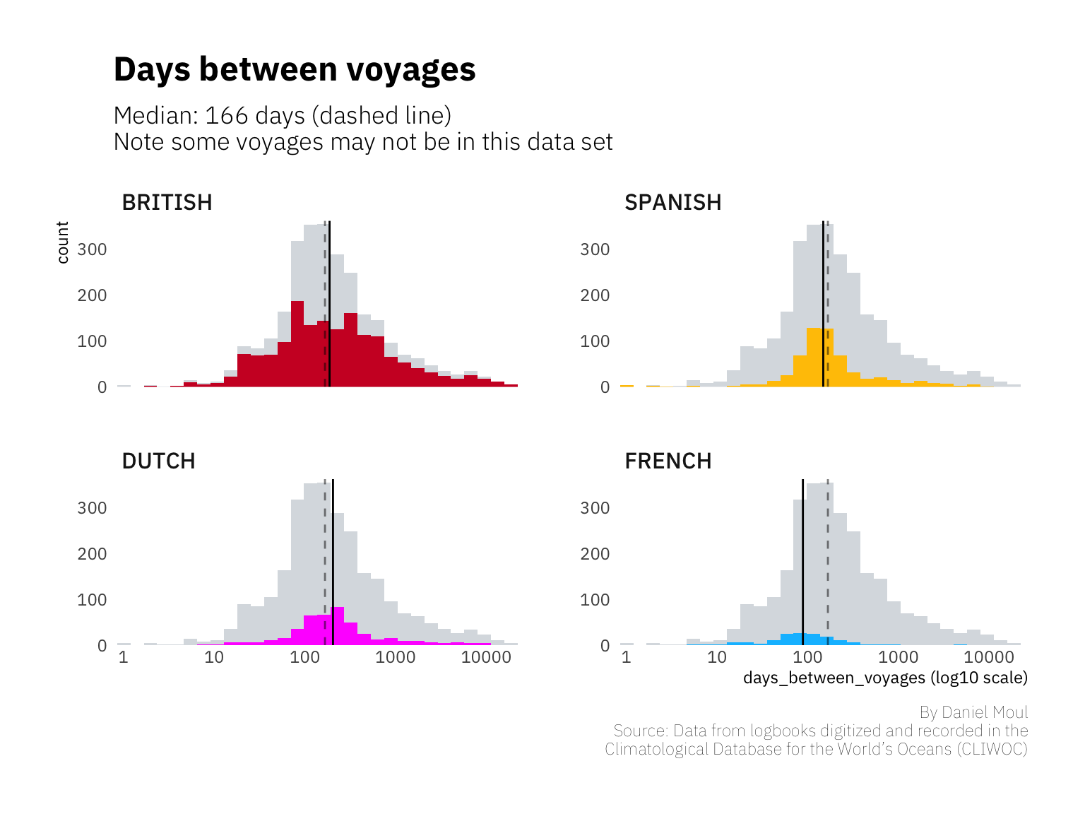
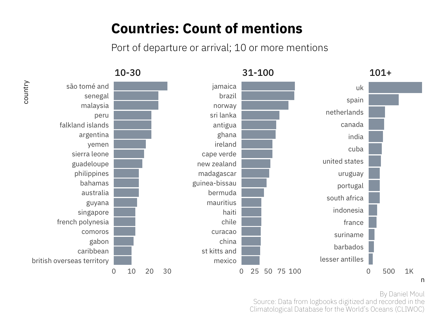
After counting the countries of the origin and destination (Figure 1.7), I offer these observations:
Note that except when commissioning or decommissioning a vessel, for each ship at each port one could expect an arrival voyage followed by departure voyage. The data set is not that complete. The plot below does not distinguish between arrivals and departures.
data_for_plot <- df_voyages %>%
  distinct(ShipName, VoyageIni, .keep_all = TRUE) %>%
  mutate(country = glue("{country_from} : {country_to}")) %>%
  separate_rows(country, sep = " : ") %>%
  count(country) %>%
  mutate(country_trunc = str_extract(country, "^\\s*(?:\\S+\\s+){0,2}\\S+"),
         grouping = cut(n, breaks = c(0, 40, 1500),
                        right = TRUE,
                        labels = c("10-40", "40+"))
  )

data_for_plot <- df_voyages %>%
  distinct(ShipName, VoyageIni, .keep_all = TRUE) %>%
  mutate(country = glue("{country_from} : {country_to}")) %>%
  separate_rows(country, sep = " : ") %>%
  count(country) %>%
  mutate(country_trunc = str_extract(country, "^\\s*(?:\\S+\\s+){0,2}\\S+"),
         grouping = cut(n, breaks = c(0, 30, 100, 1500),
                        right = TRUE,
                        labels = c("10-30", "31-100", "101+"))
  )

data_for_plot %>%
  filter(n >= 10,
         country_trunc != "NA") %>%
  mutate(country_trunc = fct_reorder(country_trunc, n)) %>%
  ggplot() +
  geom_col(aes(x = n, y = country_trunc),
           fill = "light slate gray", alpha = 0.8) +
  # scale_x_continuous(labels = label_number_si()) +
  scale_x_continuous(labels = label_number(scale_cut = cut_short_scale())) +
  facet_wrap(~ grouping, nrow = 1, scales = "free") +
  theme(legend.position = "none") +
  labs(title = "Countries: Count of mentions",
       subtitle = "Port of departure or arrival; 10 or more mentions",
       y = "country",
       caption = my_caption)