2 Exploratory data analysis
c_focus <- tar_read(census_focus_df)
county_boundaries_terra <- as(tar_read(census_focus_df),"Spatial")
state_boundaries_terra <- as(tar_read(state_boundaries_geom),"Spatial")
state_list <- glue_collapse(sort(unique(c_focus$state)), sep = ', ', last = " and ")
2.1 Map
Specifically, I look at the 859 counties in 9 states: AL, GA, KY, MS, NC, SC, TN, VA and WV. It’s interesting to note that in nearly every county there is one main spot of light. Typically this city or town is the county seat of government and locus of economic activity. Radiance values span a wider range than this visible image suggests.
# following the pattern at https://rspatial.org/terra/rs/2-exploration.html
f1 <- rast(source_light_file_2000)
my_bbox <- tar_read(bbox_vec)
e <- ext(as.numeric(c(my_bbox$xmin, my_bbox$xmax, my_bbox$ymin, my_bbox$ymax)))
f2 <- crop(f1, e)

plotRGB(f2, r = 1, g = 1, b = 1, scale = 255, stretch = "lin")
plot(county_boundaries_terra, border = "#fffdd0", lwd = 0.25, add = TRUE) # cream color
plot(state_boundaries_terra, border = "#fffdd0", add = TRUE) # cream color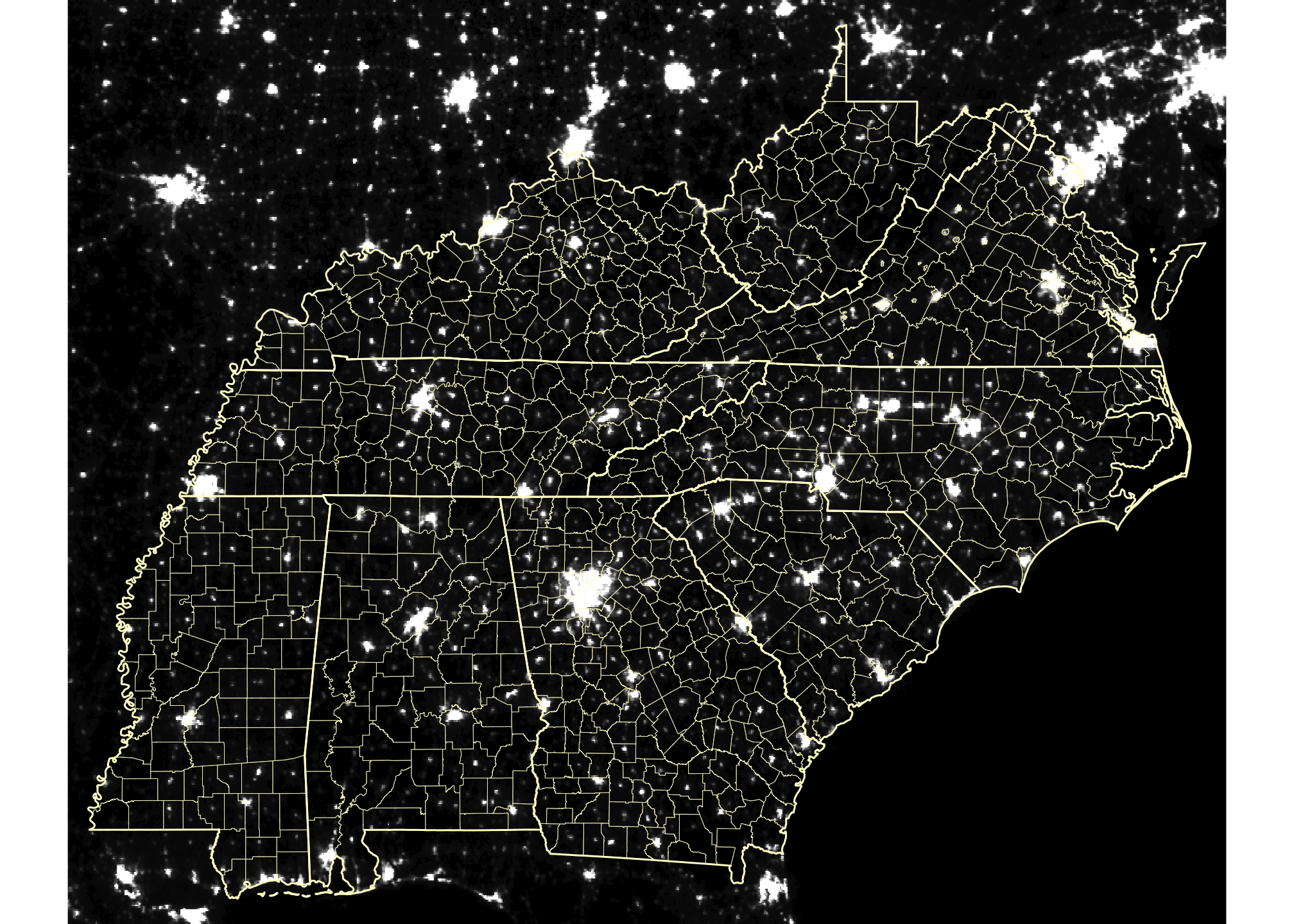
Figure 2.1: Average nightlight in the S.E. United States in 2000
2.2 Data for modeling
# models_df <- tar_read(models)
data_df <- tar_read(all_df) %>%
  #fix NAs
  mutate(atotal = if_else(!is.na(atotal), atotal, calc_area),
         pop_density_official = if_else(!is.na(pop_density_official), pop_density_official, pop_density)) %>%
  # drop a small number of apparent data errors
  filter(light_avg > 1e-5)

county_light_sf <- tar_read(county_sf)
d_df <- data_df %>%
dplyr::select(state:pop_density_official) %>%
mutate(area_diff_pct = calc_area / atotal - 1,
pop_densisty_diff_pct = pop_density / pop_density_official - 1)2.2.1 Predictors and data transformations
I have a plausible causal conjecture for two easily accessible variables associated with “human presence” such that we can use radiance to predict them:
pop_density: the more people that live in a unit area, the more built out the area will be; the more built out an area is, the more light generated in that areamedincome: the wealthier people are, the more light they will generate
pop_density and medincome likely are correlated, so I may use only one of them.
Since associations are reflexive, we can work from the data we have (predictor(s)) to the outcome we seek (response). In this case: using light to predict population density.
In the plots below, the blue line is a LOESS curve (locally estimated scatterplot smoothing), the red line a straight regression line.
Figures 2.2 to 2.5 show that light_avg and pop_density work best on a log scale.
# light as predictor

d_df %>%
  ggplot() +
  geom_point(aes(light_avg, pop_density, color = state), alpha = 0.5) +
  geom_smooth(aes(light_avg, pop_density, ), se = FALSE, size = 0.5) +
  geom_smooth(aes(light_avg, pop_density, ), method = "lm", color = "firebrick",
              se = FALSE, size = 0.5) +
  scale_x_continuous(labels = scales::label_number_si()) +
  labs(title = "pop_density by light_avg")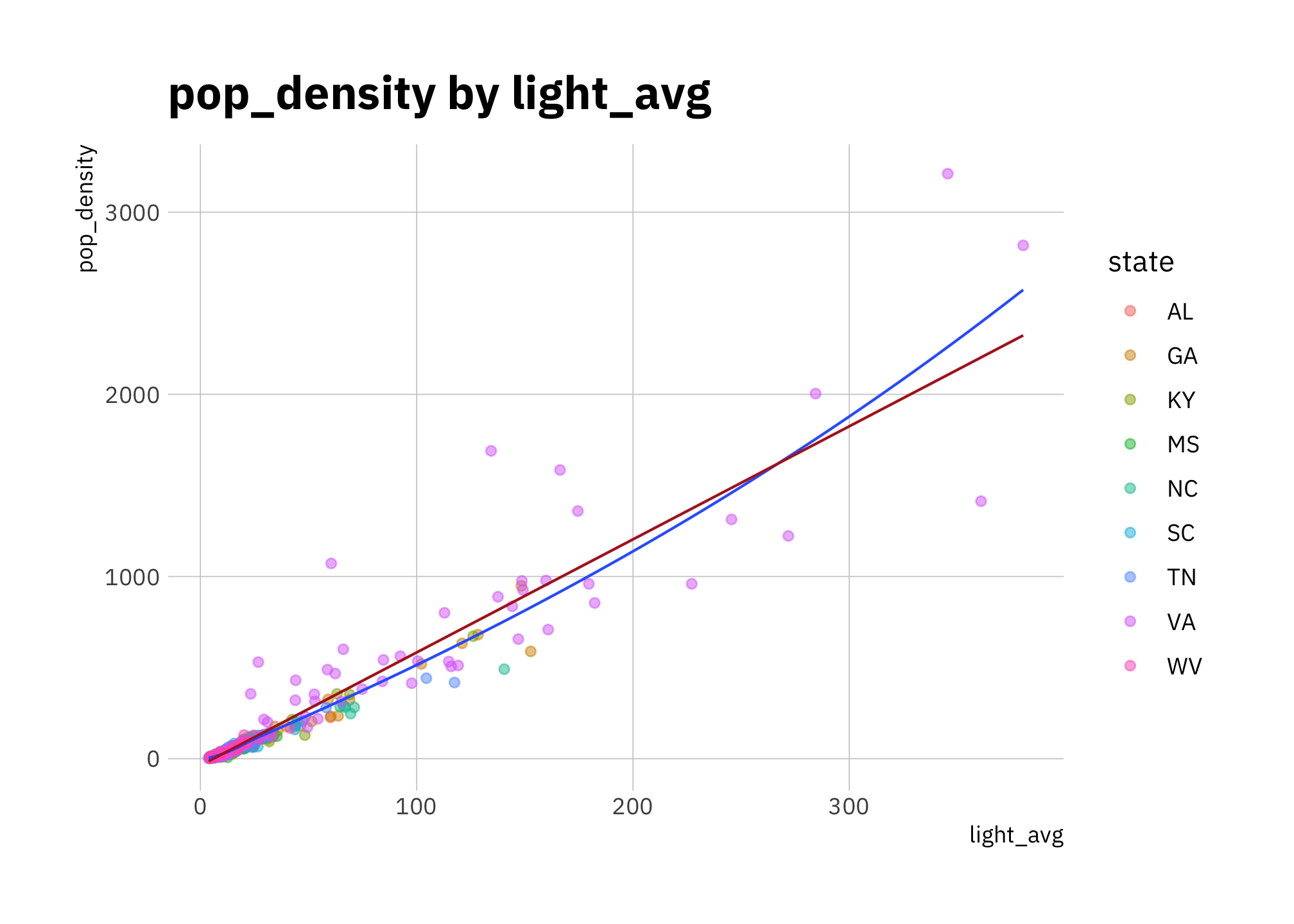
Figure 2.2: pop_density by light_avg (all states)
d_df %>%
  ggplot(aes(light_avg, pop_density)) +
  geom_point(alpha = 0.5) +
  geom_smooth(se = FALSE, size = 0.5) +
  geom_smooth(method = "lm", color = "firebrick",
              se = FALSE, size = 0.5) +
  scale_y_continuous(labels = scales::label_number_si()) +
  facet_wrap(~state)+
  labs(title = "pop_density by light_avg")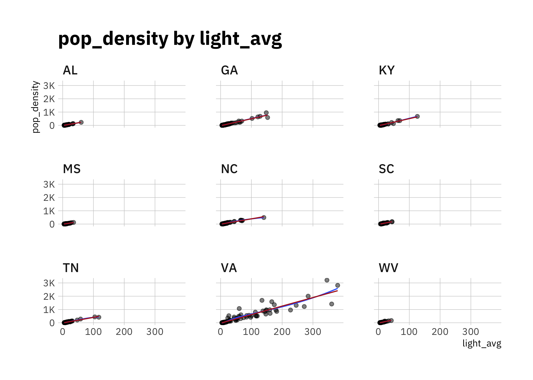
Figure 2.3: pop_density by light_avg (faceted by state)
d_df %>%
  ggplot() +
  geom_point(aes(light_avg, pop_density, color = state), alpha = 0.5) +
  geom_smooth(aes(light_avg, pop_density), se = FALSE, size = 0.5) +
  geom_smooth(aes(light_avg, pop_density),
              method = "lm", color = "firebrick",
              se = FALSE, size = 0.5) +
  scale_x_log10() +
  scale_y_log10(labels = scales::label_number_si()) +
  labs(title = "log_pop_density by log_light_avg",
       y = "pop_density (log10 scale)",
       x = "light_avg (log10 scale)")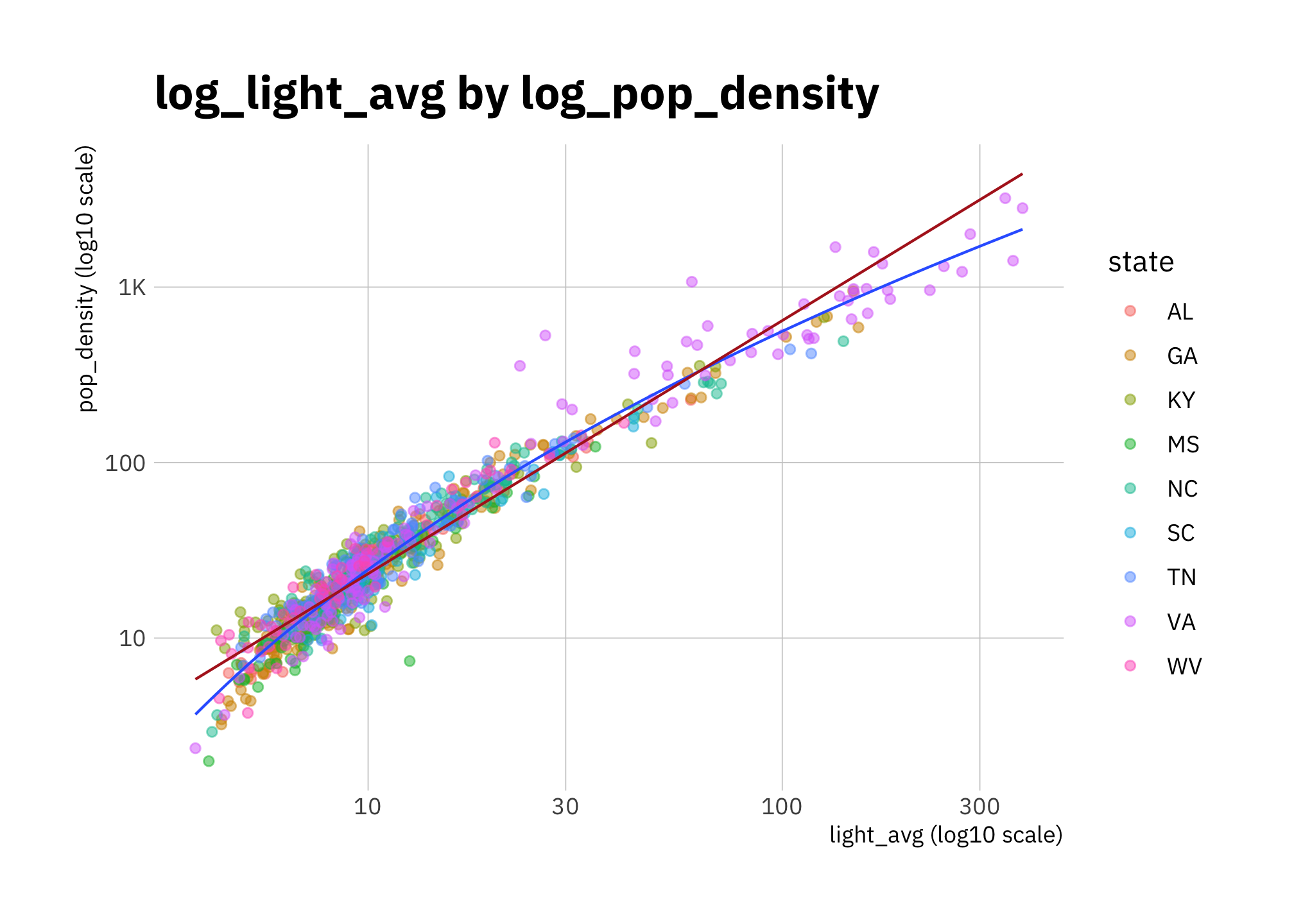
Figure 2.4: log_pop_density by log_light_avg (all states)
d_df %>%
  ggplot(aes(light_avg, pop_density)) +
  geom_point(alpha = 0.5) +
  geom_smooth(se = FALSE, size = 0.5) +
  geom_smooth(method = "lm", color = "firebrick",
              se = FALSE, size = 0.5) +
  scale_x_log10() +
  scale_y_log10(labels = scales::label_number_si()) +
  facet_wrap(~state)+
  labs(title = "log_light_avg by log_pop_density",
       y = "pop_density (log10 scale)",
       x = "light_avg (log10 scale)")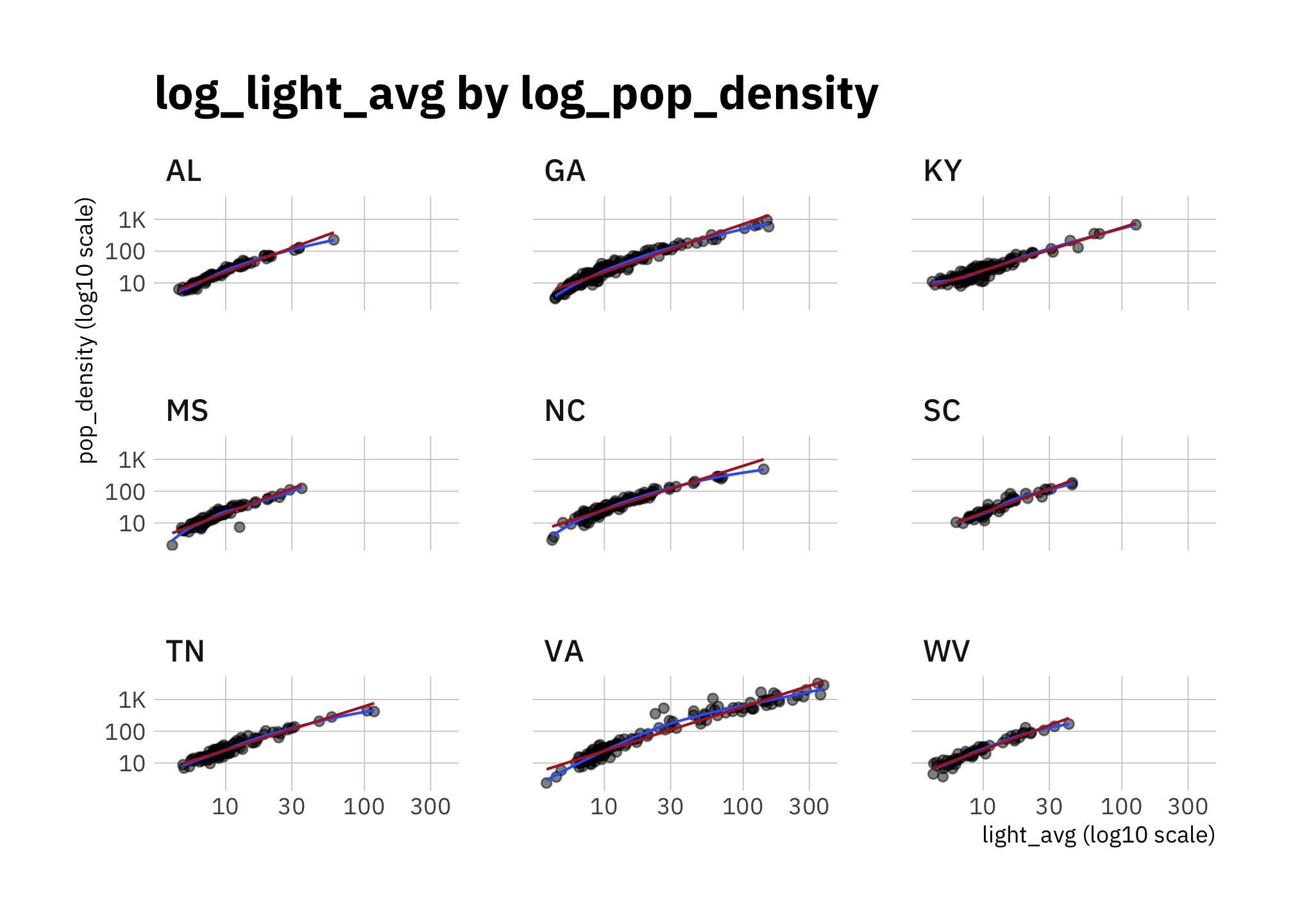
Figure 2.5: log_pop_density by log_light_avg (faceted by state)
Figures 2.6 to 2.8 show that medincome also works best on a log scale.
# median income as predictor

d_df %>%
  ggplot() +
  geom_point(aes(light_avg, medincome, color = state), alpha = 0.5) +
  geom_smooth(aes(light_avg, medincome), se = FALSE, size = 0.5) +
  geom_smooth(aes(light_avg, medincome), method = "lm", color = "firebrick",
              se = FALSE, size = 0.5) +
  scale_y_continuous(labels = scales::label_number_si()) +
  # scale_y_log10() +
  #facet_wrap(~state)+
  labs(title = "medincome by light_avg",
       subtitle = glue("correlation: {round(cor(d_df$pop_density, d_df$medincome), 2)}"))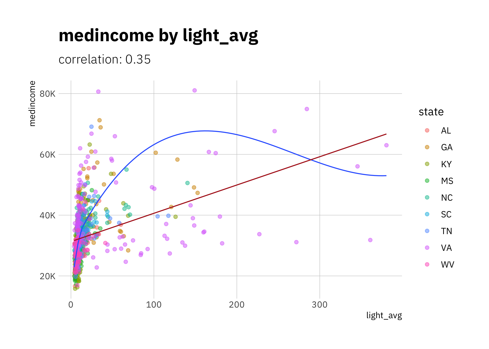
Figure 2.6: medincome by light_avg (all states)
d_df %>%
  ggplot() +
  geom_point(aes(light_avg, medincome, color = state), alpha = 0.5) +
  geom_smooth(aes(light_avg, medincome), se = FALSE, size = 0.5) +
  geom_smooth(aes(light_avg, medincome), method = "lm", color = "firebrick",
              se = FALSE, size = 0.5) +
  scale_x_log10() +
  scale_y_log10(labels = scales::label_number_si()) +
  labs(title = "log_medincome by log_light_avg",
       y = "medincome (log10 scale)",
       x = "light_avg (log10 scale)")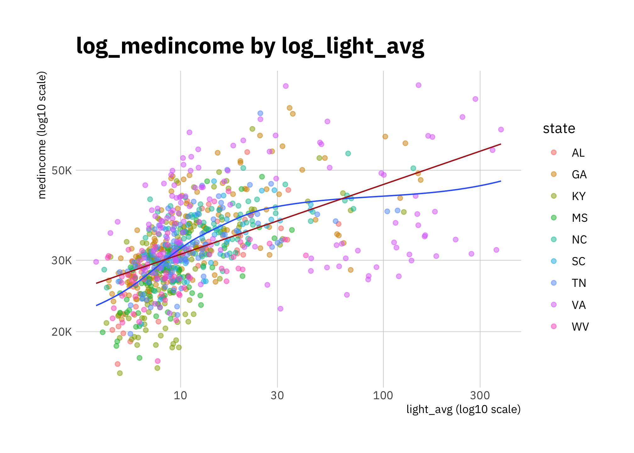
Figure 2.7: log_medincome by log_light_avg (all states)
d_df %>%
  ggplot(aes(light_avg, medincome)) +
  geom_point(alpha = 0.5) +
  geom_smooth(se = FALSE, size = 0.5) +
  geom_smooth(method = "lm", color = "firebrick",
              se = FALSE, size = 0.5) +
  scale_y_continuous(labels = scales::label_number_si()) +
  # scale_y_log10() +
  facet_wrap(~state)+
  labs(title = "medincome by light_avg")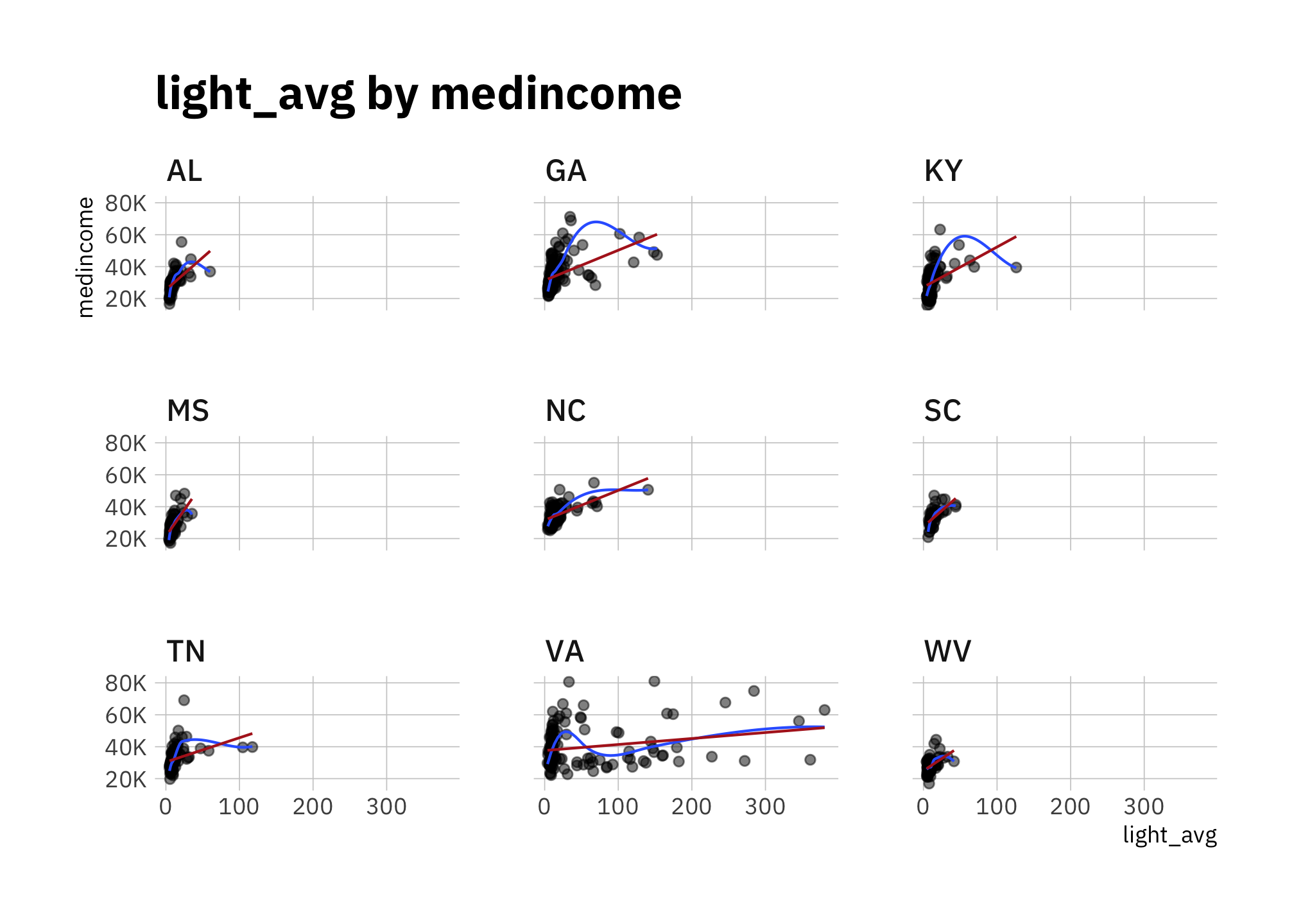
Figure 2.8: medincome by light_avg (faceted by state)
d_df %>%
  ggplot(aes(light_avg, medincome)) +
  geom_point(alpha = 0.5) +
  geom_smooth(se = FALSE, size = 0.5) +
  geom_smooth(method = "lm", color = "firebrick",
              se = FALSE, size = 0.5) +
  scale_x_log10() +
  scale_y_log10(labels = scales::label_number_si()) +
  facet_wrap(~state)+
  labs(title = "log_medincome by log_light_avg",
       y = "medincome (log10 scale)",
       x = "light_avg (log10 scale)")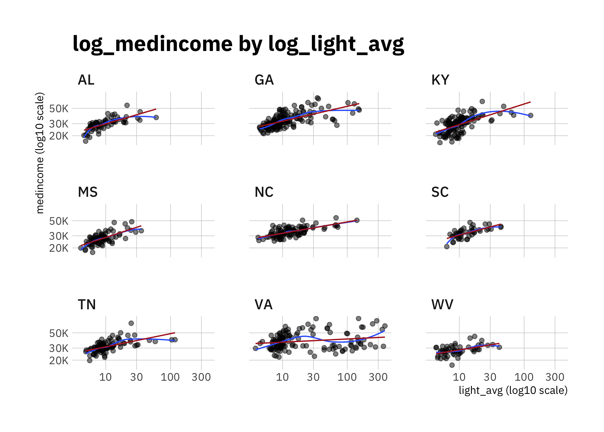
Figure 2.9: log_medincome by log_light_avg (faceted by state)
pop_density and medincome are correlated (corr = 0.35) but less so for states with big urban areas (especially VA). Since they are correlated, and my goal is to check whether we can associate radiance levels with a demographic change, it’s best if I include only one models. Since pop_density ~ light_avg (corr = 0.94) has less variance than pop_density ~ light_avg (corr = 0.37).
2.2.2 Radiance distribution by state
Each pixel has a light radiance value. A plot of the empirical cumulative distribution function (Figure 2.10 shows that the distributions are similar in shape. The most noticeable difference is that the portion of zero values (completely black pixels) differs by state.
county_light_sf %>%
  mutate(state = fct_reorder(state, value, median)) %>%
  ggplot(aes(value, color = state)) +
  stat_ecdf(geom = "line", pad = FALSE,
            size = 0.5, alpha = 0.6) +
  scale_x_log10() +
  scale_y_continuous(label = percent_format()) +
  labs(title = "Radiance ECDF",
       x = "light value (log10 scale)",
       y = "")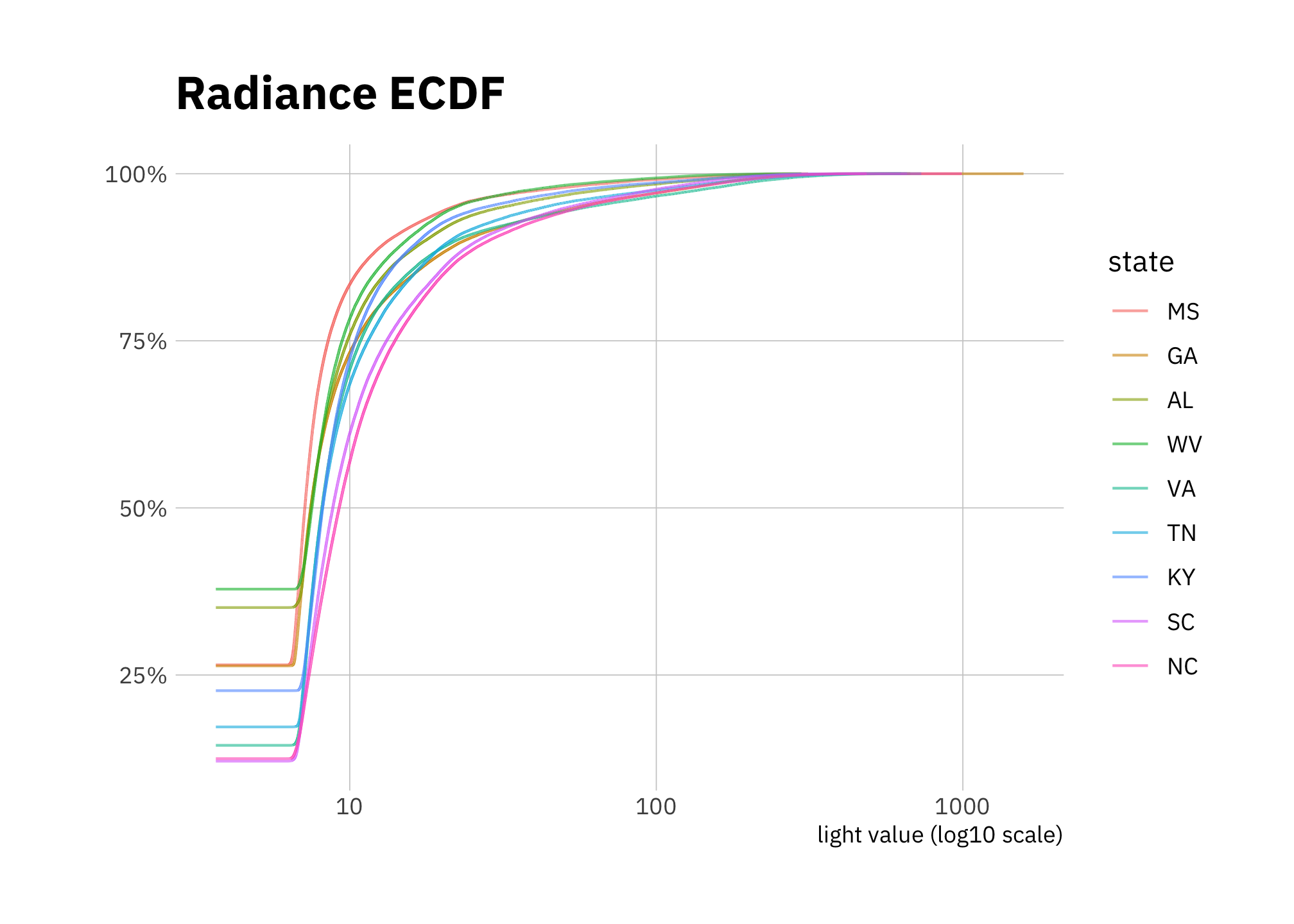
Figure 2.10: Radiance empirical cumulative density 2000
The unusual shape of the density plot (Figure 2.11) shows each state has a lot of pixels with zero values, then almost no pixels with values less than about 5 (this is a log scale), then a large portion with values in approximately the 6-30 range.
county_light_sf %>%
  mutate(value = value + 1e-6,
         state = fct_reorder(state, value, median)) %>%
  ggplot(aes(value, color = state)) +
  geom_density(size = 0.5) +
  scale_x_log10() +
  labs(title = "Radiance density",
       x = "light value (log10 scale)",
       y = "")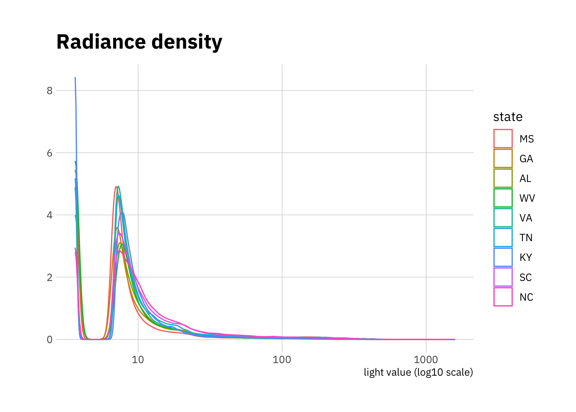
Figure 2.11: Radiance density 2000
2.2.3 \(R^2\) and linear relationships: slope estimates by state
models_nested <- d_df %>%
  mutate(log_light_avg = log10(light_avg),
         log_pop_density = log10(pop_density)) %>%
  select(state, log_pop_density, log_light_avg) %>%
  group_by(state) %>%
  nest() %>%
  mutate(model = map(data, function(df) lm(log_pop_density ~ log_light_avg, data = df)),
         tidied = map(model, tidy),
         augmented = map(model, broom::augment),
         glanced = map(model, broom::glance)
  )

models <- left_join(tidied <- models_nested %>%
                  unnest(c(state, tidied)),
                adj_r_sqr <- models_nested %>%
                  unnest(c(state, glanced)) %>%
                  select(state, adj.r.squared, sigma),
                by = "state"
) %>%
  filter(!term == "(Intercept)") %>%
  select(state, term, estimate, estimate_std.error = std.error, adj.r.squared, adj.r.squared_sigma = sigma) %>%
  arrange(desc(adj.r.squared))

state_levels <- rev(models$state)
models %>%
pivot_longer(cols = c(estimate, adj.r.squared), names_to = "metric", values_to = "value") %>%
mutate(state = factor(state, levels = state_levels)) %>%
ggplot(aes(value, state)) +
geom_point() +
expand_limits(x = 0) +
facet_wrap(~ metric, scales = "free_x", nrow = 1) +
labs(title = "R^2 and estimated slope of\nlm(log_pop_density ~ log_light_avg)")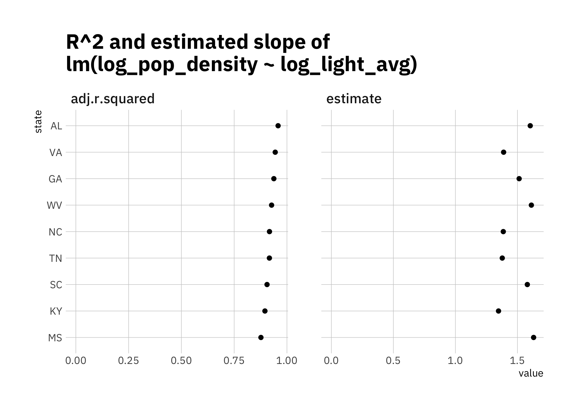
Figure 2.12: R-squared and estimated slope of lm(log_light_avg ~ log_pop_density)
2.2.4 EDA summary comments
The relationship between \(log_{10}(pop\_density)\) and \(log_{10}(light\_avg)\) in figures 2.4 and 2.5 isn’t quite linear, and there are differences by state. So I expect simple linear models to perform worse than more sophisticated ones. Nonetheless, I want to see how good linear models are, since they are simple and inexpensive.
By Daniel Moul (heydanielmoul via gmail)
 This work is licensed under a Creative Commons Attribution 4.0 International License