4 Interpreting the results
As noted in the last section:
The simpler models do better: lin3, pol1, and bs1 are essentially equal in performance while xg1 does worse and underestimates most radiance values.
Let’s look closer at how population density and radiance levels changed between 2000 and 2010.
d_df <- tar_read(all_df) %>%
  # drop a small number of data errors/artifacts
  filter(light_avg > 1e-5) %>%
  select(state, county, light_avg, log_light_avg, pop, calc_area, pop_density, log_pop_density)

pop_density_2000_mean <- sum(d_df$pop) / sum(d_df$calc_area) # summary of all states of interest (avoiding averages of averages)
pop_density_2000_median <- median(d_df$pop / d_df$calc_area)

light_2000 <- tar_read(light_sf)
d_df_c <- tar_read(all_df_c) %>%
# drop a small number of data errors/artifacts
filter(light_avg > 1e-5) %>%
select(state, county, light_avg, log_light_avg, pop, calc_area, pop_density, log_pop_density)
pop_density_2010_mean <- sum(d_df_c$pop) / sum(d_df_c$calc_area) # summary of all states of interest (avoiding averages of averages)
pop_density_2010_median <- median(d_df_c$pop / d_df_c$calc_area)
light_2010 <- tar_read(light_sf_c)4.1 How much did the population density and radiance change between 2000 and 2010?
census_compare <- d_df %>%
  select(state, county,
         light_avg_2000 = light_avg,
         pop_density_2000 = pop_density,
         log_light_avg_2000 = log_light_avg,
         log_pop_density_2000 = log_pop_density) %>%
  left_join(.,
            d_df_c %>%
              select(state, county,
                     light_avg_2010 = light_avg,
                     pop_density_2010 = pop_density,
                     log_light_avg_2010 = log_light_avg,
                     log_pop_density_2010 = log_pop_density
              ),
            by = c("state", "county")) %>%
  mutate(light_diff = light_avg_2010 - light_avg_2000,
         pop_density_diff = pop_density_2010 - pop_density_2000,
         pct_light_diff = light_avg_2010 / light_avg_2000 - 1,
         pct_pop_density_diff = pop_density_2010 / pop_density_2000 - 1) %>%
  na.omit()

census_compare_long <- census_compare %>%
  pivot_longer(cols = contains(c("2000", "2010", "diff")), names_to = "metric", values_to = "values")
4.1.1 From 2000 to 2010 radiance increased almost twice as much as population density
County population density is up by ~13% overall in the states of interest, and median population density is up by 8.5%. Over the same time interval county average light radiance is up by a whopping 23%. What could account for such significant change in radiance? I see three main possibilities:
- Perhaps the result is real, and I’m missing confounding influences (U_pe and U_er in Figure 1.1). For example, in 2010 the country was early in recovery from the Great Recession, and interest rates (and bond financing for construction projects) were very low. Did this spark a building boom that increased radiance values? Perhaps I should consider the business cycle or other representation of relative economic activity.
- Perhaps the radiance levels have a lot of error in them, the intercalibration coefficients don’t do enough to allow valid multi-year comparisons, or there are other anomalies or influences (U_rad).
- Perhaps I made errors along the way.
mean_summary <- tribble(
  ~variable, ~mean_2000, ~mean_2010, ~median_2000, ~median_2010,
  "light_avg", mean(light_2000$value), mean(light_2010$value), median(light_2000$value), median(light_2010$value),
  "pop_density", pop_density_2000_mean, pop_density_2010_mean, pop_density_2000_median, pop_density_2010_median
) %>%
  mutate(pct_diff_mean = mean_2010 / mean_2000 - 1,
         pct_diff_median = median_2010 / median_2000 - 1)

mean_summary %>%
  gt() %>%
  tab_header(
    title = md("**County population density km^2 in 2000 and 2010**")
    ) %>%
  fmt_number(columns = starts_with(c("mean", "median")),
             decimals = 1) %>%
  fmt_percent(columns = contains("diff"),
decimals = 1)| County population density km^2 in 2000 and 2010 | ||||||
|---|---|---|---|---|---|---|
| variable | mean_2000 | mean_2010 | median_2000 | median_2010 | pct_diff_mean | pct_diff_median |
| light_avg | 14.2 | 17.5 | 7.9 | 8.6 | 23.0% | 8.3% |
| pop_density | 46.0 | 52.0 | 24.0 | 26.1 | 13.1% | 8.5% |
data_for_plot <- bind_rows(
   census_compare %>%
     select(log_light_avg = log_light_avg_2000, log_pop_density = log_pop_density_2000) %>%
     mutate(year = "2000"),
  census_compare %>%
     select(log_light_avg = log_light_avg_2010, log_pop_density = log_pop_density_2010) %>%
     mutate(year = "2010"),
)

p1 <- data_for_plot %>%
  ggplot() +
  geom_smooth(aes(log_light_avg, log_pop_density, color = year),
              se = FALSE) +
  scale_color_viridis_d(end = 0.9) +
  annotate("rect", xmin = 0.25, xmax = 1.2, ymin = 0.25, ymax = 1.5, alpha = .2) +
  labs(title = "Comparing log_pop_density ~ log_light_avg",
       subtitle = "Loess")

p2 <- data_for_plot %>%
  ggplot() +
  geom_smooth(aes(log_light_avg, log_pop_density, color = year),
              method = "lm", se = FALSE) +
  scale_color_viridis_d(end = 0.9) +
  annotate("rect", xmin = 0.25, xmax = 1.2, ymin = 0.25, ymax = 1.5, alpha = .2) +
  labs(subtitle = "Linear")
A shift in the underlying distributions is changing the regression lines.
(p1 + p2) +
  plot_layout(guides = 'collect') +
  theme(plot.margin = unit(c(10, 0, 5, 0), "mm"))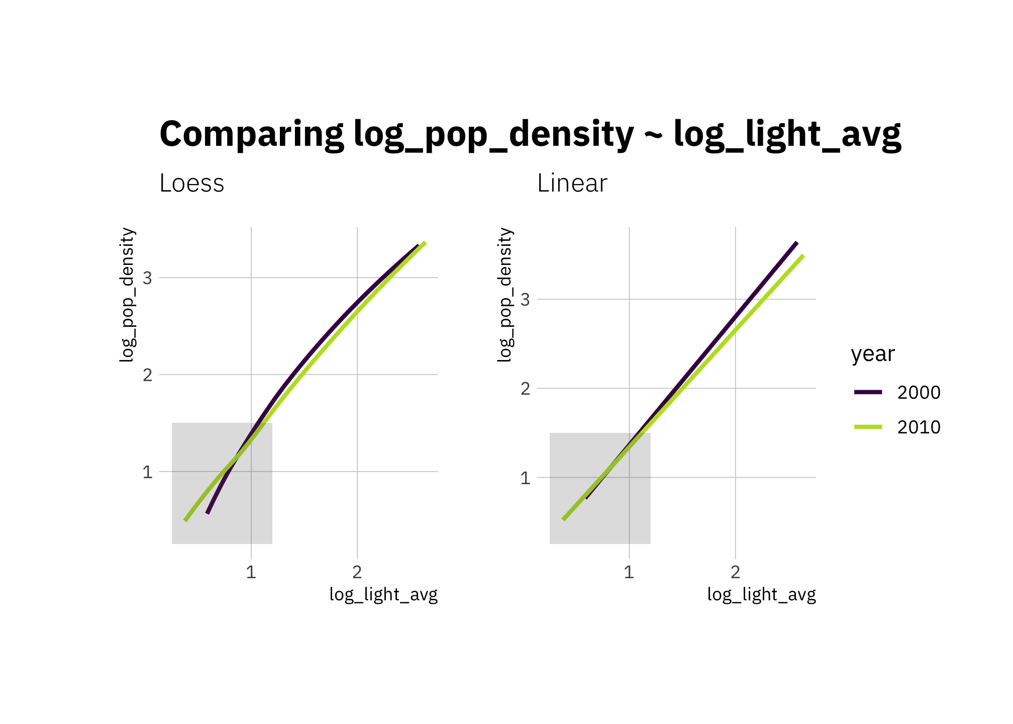
Figure 4.1: Comparing regression lines in 2000 and 2010 (loess and linear)
4.1.2 Exploring changes in radiance and population density 2000 and 2010
The following density plots indicate a large portion of low-density counties lost population (a continuation of rural counties hollowing out) with growth happening in relatively few counties. An even smaller portion of the counties had increased radiance in 2010.
census_compare_long %>%
  filter(str_detect(metric, "pct")) %>%
  ggplot(aes(x = values, y = metric, color = metric, fill = metric)) +
  geom_density_ridges(rel_min_height = 0.005, alpha = 0.4) +
  scale_x_continuous(labels = percent_format(accuracy = 1)) +
  scale_color_viridis_d(end = 0.8) +
  scale_fill_viridis_d(end = 0.8) +
  labs(title = "Percentage difference - density plot",
       subtitle = "Values: 2010 / 2000 - 1")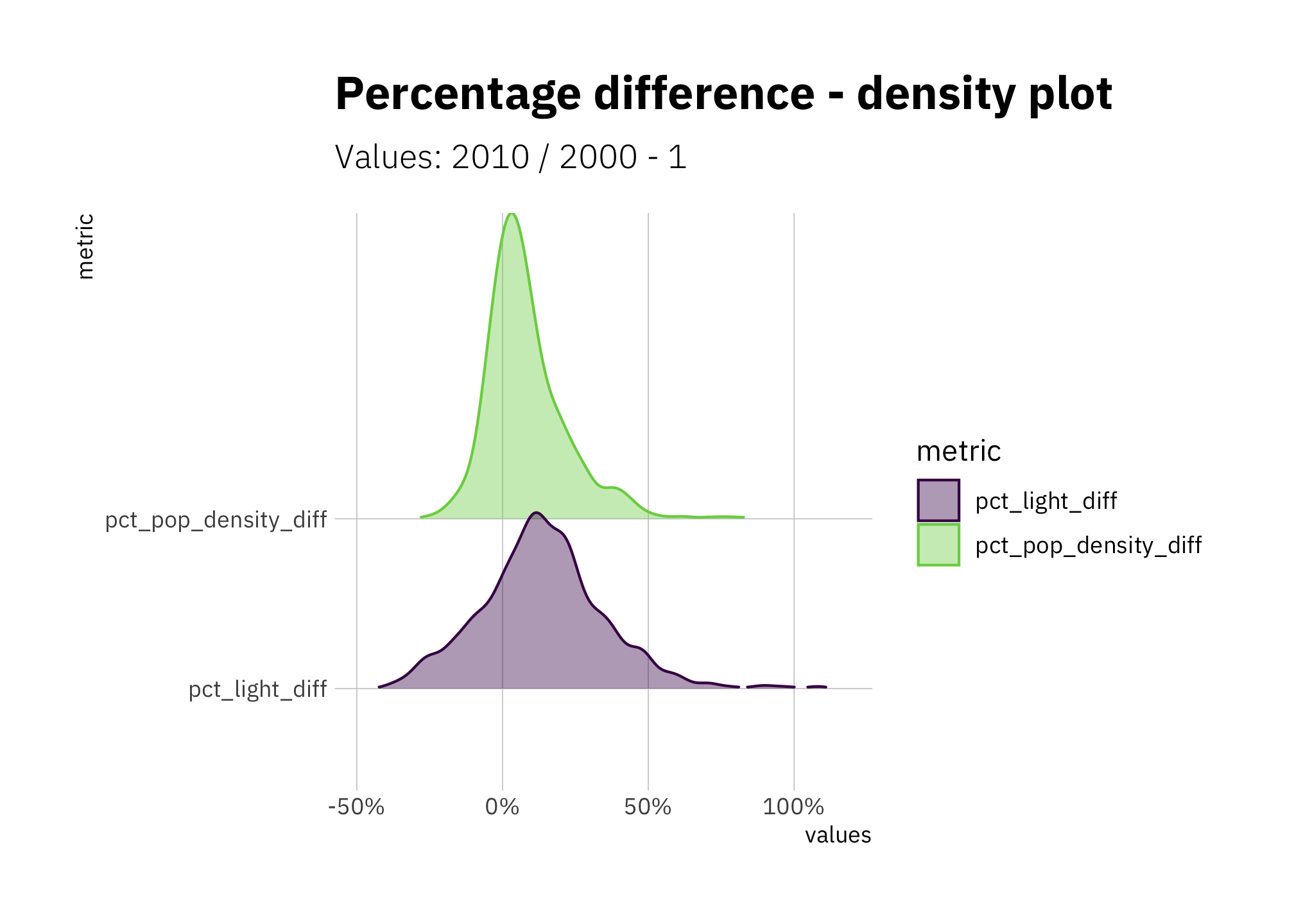
Figure 4.2: Percentage difference in population density and radiance 2000 and 2010
Compared to 2000, the radiance values from 2010 are not as concentrated. There are more counties at the lowest radiance levels, and at radiance values larger than the mode, the density curve shifts right.
census_compare_long %>%
  filter(metric %in% c("light_avg_2000", "light_avg_2010")) %>%
  ggplot(aes(x = values, color = metric, fill = metric)) +
  geom_density(alpha = 0.4) +
  scale_x_log10(labels = label_number_si()) +
  scale_color_viridis_d(end = 0.8) +
  scale_fill_viridis_d(end = 0.8) +
  labs(title = "County light radiance ",
       subtitle =  "2010 and 2000 census values",
       x = "values (log10 scale)")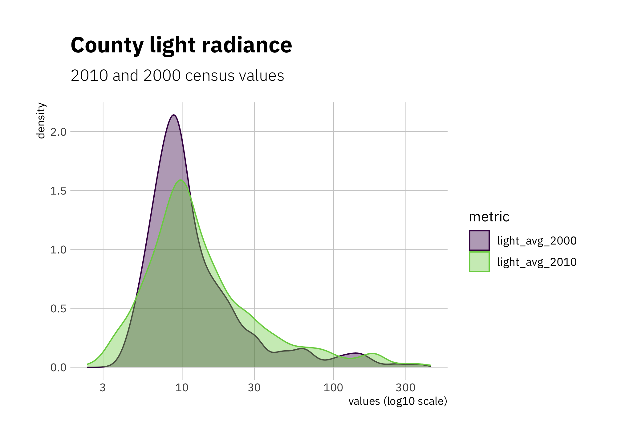
Figure 4.3: County average radiance 2000 and 2010
Looking at population density values rather than percentage differences (figure 4.2), in 2010 I see a small shift to more counties being in the range 30-400 per sq km (37 - 154 per sq mi) range.
census_compare_long %>%
  filter(metric %in% c("pop_density_2000", "pop_density_2010")) %>%
  ggplot(aes(x = values, color = metric, fill = metric)) +
  geom_density(alpha = 0.3) +
  scale_x_log10(labels = label_number_si()) +
  scale_color_viridis_d(end = 0.8) +
  scale_fill_viridis_d(end = 0.8) +
  labs(title = "Country population density",
       subtitle =  "2010 and 2000 census values",
       x = "values (log10 scale)")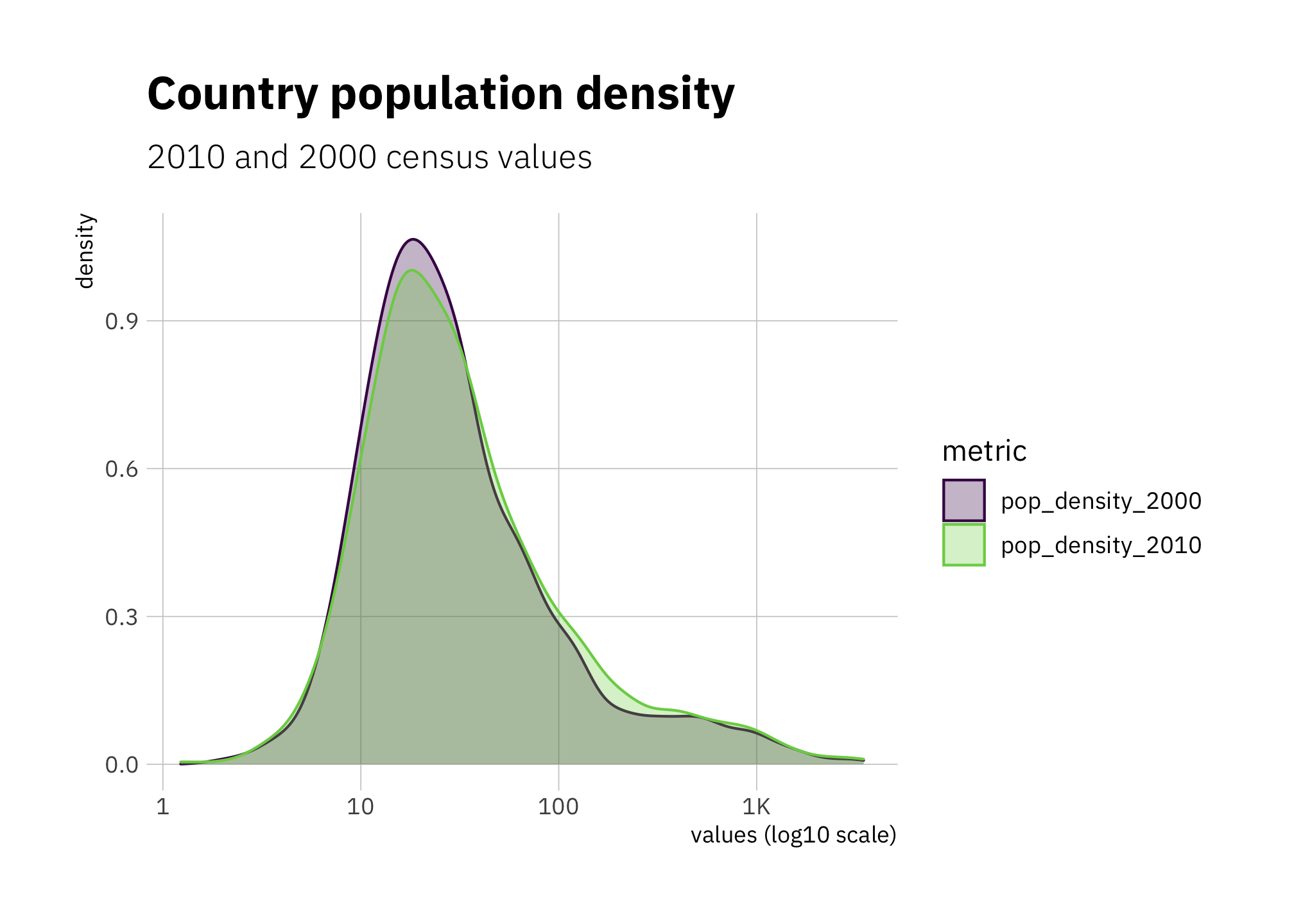
Figure 4.4: County population density 2000 and 2010
Looking at percent changes in population density 2000 to 2010 with pop_density_2000 on the x-axis, I see similar trends in each state:
census_compare %>%
  ggplot(aes(x = pop_density_2000, y = pct_pop_density_diff, color = state)) +
  geom_point(alpha = 0.15) +
  geom_smooth(se = FALSE, size = 0.5) +
  scale_x_log10() +
  scale_y_continuous(labels = percent_format()) +
  expand_limits(y = c(-0.5, 1.0)) +
  labs(title = glue("Which counties had the biggest changes\nin population density?"),
       subtitle = "2000 to 2010",
       x = "pop_density_2000 (log scale)"
  )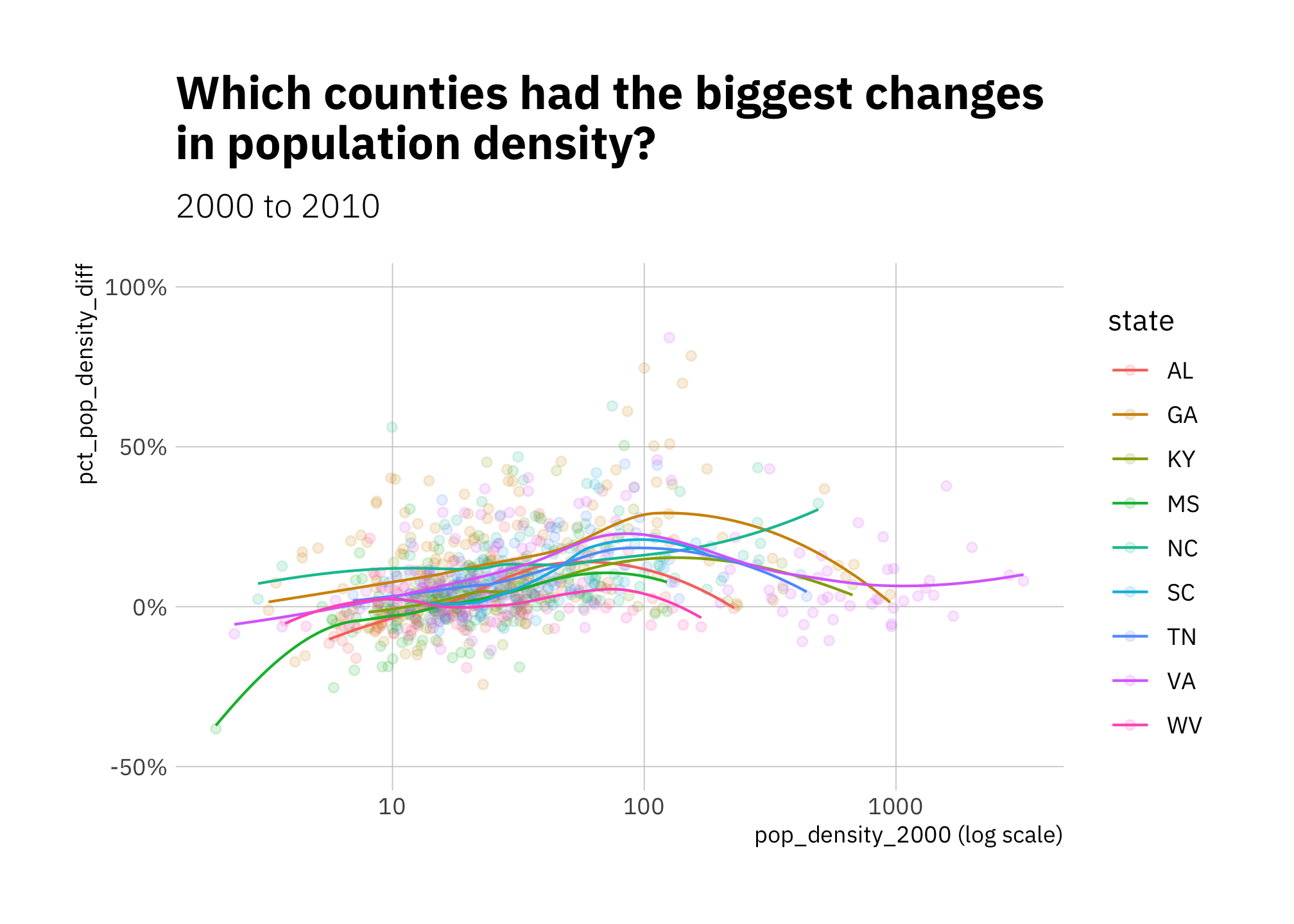
Figure 4.5: Changes in population density 2000-2010
Below a radiance value of about 30, the percent difference in radiance between 2000 and 2010 seems nearly linear; above 30 there is little or no relationship.
census_compare %>%
  ggplot(aes(x = light_avg_2000, y = pct_light_diff, color = state)) +
  geom_point(alpha = 0.15) +
  geom_smooth(se = FALSE, size = 0.5) +
  scale_x_log10() +
  scale_y_continuous(labels = percent_format()) +
  labs(title = glue("Which counties had the biggest changes\nin avg radiance?"),
       subtitle = "2000 to 2010",
       x = "light_avg_2000 (log scale)"
  )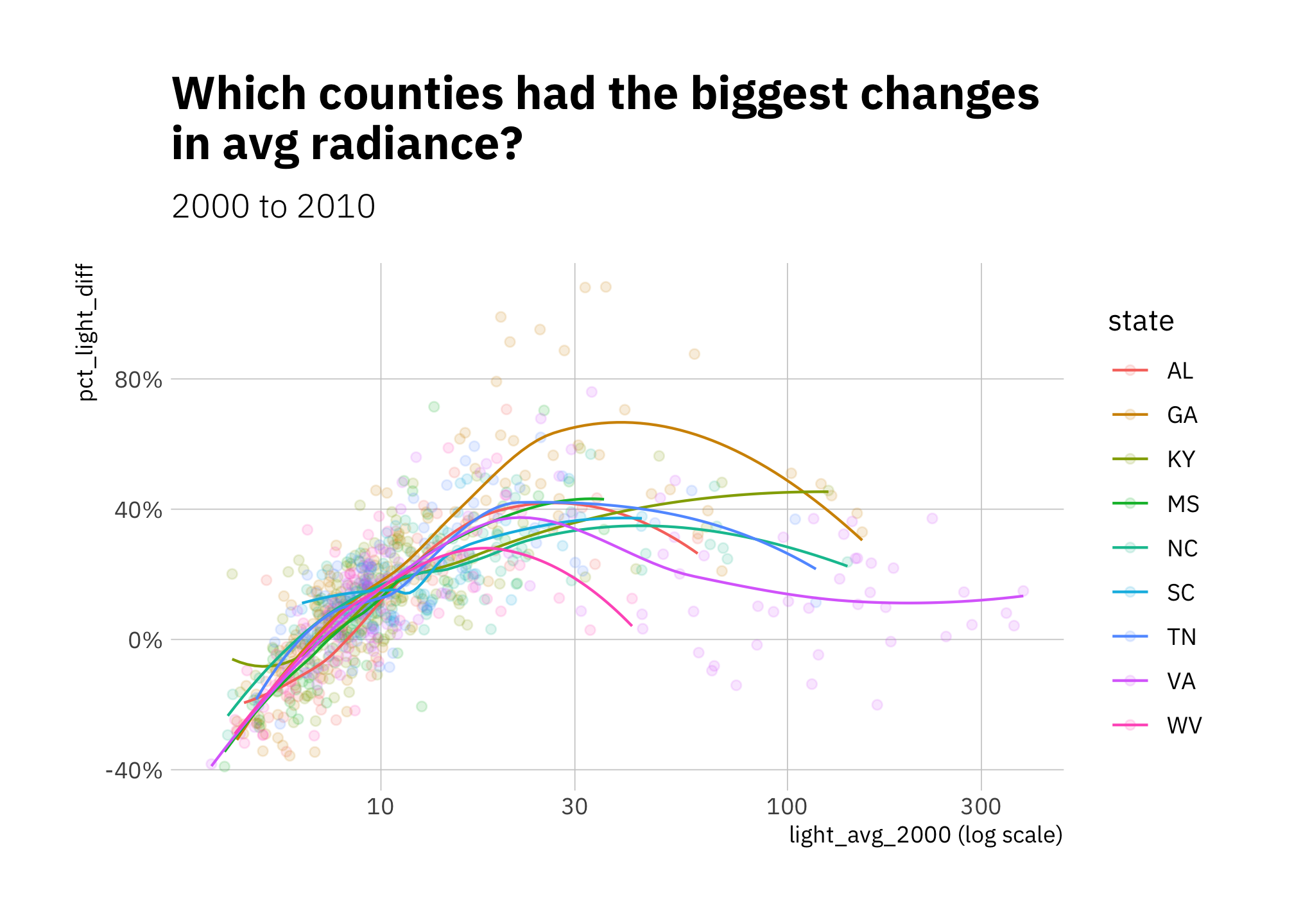
Figure 4.6: Changes in radiance 2000-2010
Looking at the relationship between pct_pop_density_diff and pct_light_diff, once again I see the highest and lowest radiance values are remarkably less linear in relationship than the great majority of the values, which lay between them.
census_compare %>%
  ggplot(aes(pct_light_diff, pct_pop_density_diff, color = pop_density_2000, size = pop_density_2000)) +
  geom_point(alpha = 0.25) +
  geom_smooth(se = FALSE, size = 0.5) +
  geom_smooth(method = "lm", color = "firebrick",
              se = FALSE, size = 0.5) +
  scale_x_continuous(labels = percent_format()) +
  scale_y_continuous(labels = percent_format()) +
  scale_color_gradient2(low = "black", mid = "green", high = "orange",
                        midpoint = log10(pop_density_2000_median),
                        trans=log10_trans()) +
  guides(size = "none") +
  labs(title = glue("pct_pop_density_diff by pct_light_diff"),
       subtitle = "2000 to 2010"
  )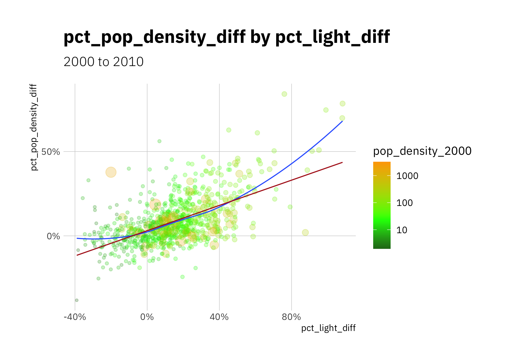
Figure 4.7: Comparing the percent difference in county radiance with percent difference in county population density (2000 to 2010
4.2 Conclusion
Since the underlying distributions shifted between 2000 and 2010, I am not surprised that xg1, the model most sensitive to the training data, performs worse on the 2010 data. I trained bs1 on 2000 data as well, however its spline knot parameter holds much less information and thus is less sensitive.
If I were attempting original research or directing civil or governmental investments using the techniques employed here, how would I know the underlying distributions changed (or more specifically: changed enough to affect the accuracy of some of my models)? I would look for changes in the distribution of the data I could gather, then likely use an ensemble of models to make predictions.
By Daniel Moul (heydanielmoul via gmail)
 This work is licensed under a Creative Commons Attribution 4.0 International License