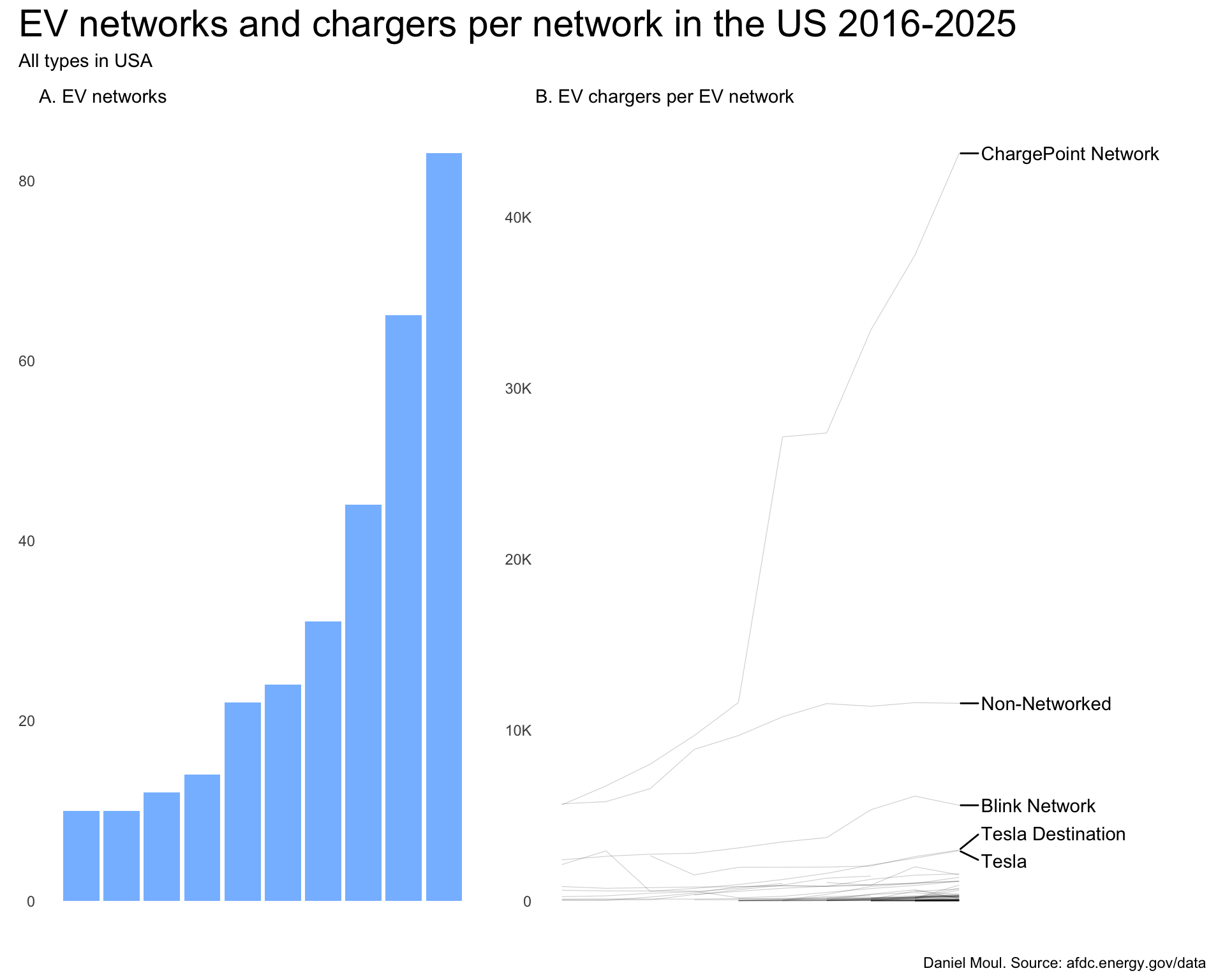
There are a growing number of EV charging network companies. At the end of 2025 there were 92 in the data set. Many offer a small number of stations. I focus here on the top ten.
Most dramatic is the rise of ChargePoint as the dominant provider. This network was the largest in 2015 in terms of chargers. Their lead increased over the next nine years. In the four years prior to 2021, ChargePoint had the most chargers and was growing fast. But starting in 2022 growth accelerated even faster to put ChargePoint in a different class. Perhaps it’s partly their business model, which seems to have evolved to targeting two chargers in each location (Figure 2.5).
Show the code
p1 <- dta |>reframe(n =n(),n_networks =n_distinct(ev_network),.by = yr) |>ggplot() +geom_col(aes(yr, n_networks)) +scale_x_discrete(labels = year_labels) +labs(subtitle ="A. EV networks",x =NULL,y =NULL )dta_for_plot <- dta |>filter(n_chargers >0) |>reframe(n_stations =n(),n_chargers =sum(n_chargers),chargers_per_station = n_chargers / n_stations,.by =c(yr, ev_network) ) dta_labels_for_plot <- dta_for_plot |>filter(yr ==2025) |>slice_max(order_by = n_stations, n =1,by = ev_network) |>slice_max(order_by = n_stations, n =5)p2 <- dta_for_plot |>ggplot() +geom_line(aes(yr, n_stations, group = ev_network),linewidth =0.2,alpha =0.2) +geom_text_repel(data = dta_labels_for_plot,aes(yr, n_stations, group = ev_network, label = ev_network),nudge_x =0.5,direction ="y",hjust =0) +scale_x_discrete(labels = year_labels) +scale_y_continuous(labels =label_number(scale_cut =cut_short_scale())) +coord_cartesian(xlim =c(NA, 2030)) +labs(subtitle ="B. EV chargers per EV network",x =NULL,y =NULL )my_layout <-c("AABBB")p1 + p2 +plot_annotation(title ="EV networks and chargers per network in the US 2016-2025",subtitle ="All types in USA",caption = my_caption ) +plot_layout(design = my_layout <-c("AABBB"))
Figure 2.1: Count of EV networks and chargers per network in the US 2016-2025
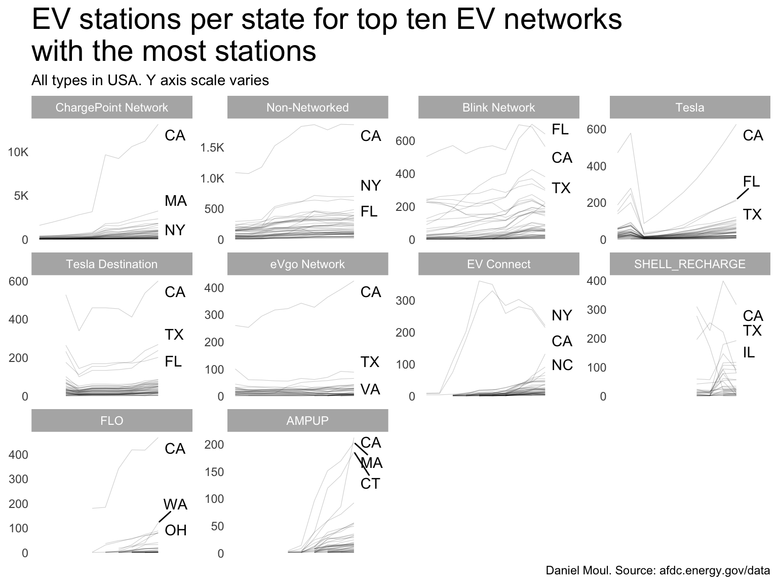
2.1 Faceted by top 10 EV Networks
As expected California tops the charts for nearly all EV networks. Some observations:
After California, there is variety in the top states for EV Networks.
Tesla’s Destination and supercharger stations were not differentiated in the data prior to 2018, hence the unexpected drop in the “Tesla” sub-plot below (“Tesla” is the supercharger network).
Some EV networks are pulling back in some states
Blink Network in most states
EV Connect in California and New York as they ramp up in other less-saturated markets
Shell Recharge as their business strategy has fluctuated
Show the code
ev_network_top_10 <- dta |>filter(yr ==2025) |>count(ev_network, sort =TRUE) |>head(10)dta_for_plot <- dta |>filter(n_chargers >0) |>filter(ev_network %in% ev_network_top_10$ev_network) |>reframe(n_stations =n(),n_chargers =sum(n_chargers),chargers_per_station = n_chargers / n_stations,.by =c(yr, state, ev_network) ) |>mutate(ev_network =fct_reorder(ev_network, -n_stations, sum))dta_labels_for_plot <- dta_for_plot |>filter(yr ==2025) |>slice_max(order_by = n_stations, n =3,by = ev_network)dta_for_plot |>ggplot() +geom_line(aes(yr, n_stations, group = state),linewidth =0.2,alpha =0.2) +geom_text_repel(data = dta_labels_for_plot,aes(x = yr,y = n_stations,label = state, ),nudge_x =0.5,direction ="y",force =10,hjust =0) +scale_x_discrete(labels = year_labels) +scale_y_continuous(labels =label_number(scale_cut =cut_short_scale())) +facet_wrap( ~ev_network, scales ="free_y") +theme(strip.text =element_text(size =rel(strip_text_param))) +coord_cartesian(xlim =c(NA, 2027)) +labs(title ="EV stations per state for top ten EV networks\nwith the most stations",subtitle ="All types in USA. Y axis scale varies",x =NULL,y =NULL,caption = my_caption )
Figure 2.2: EV stations per state for top ten EV networks with the most stations
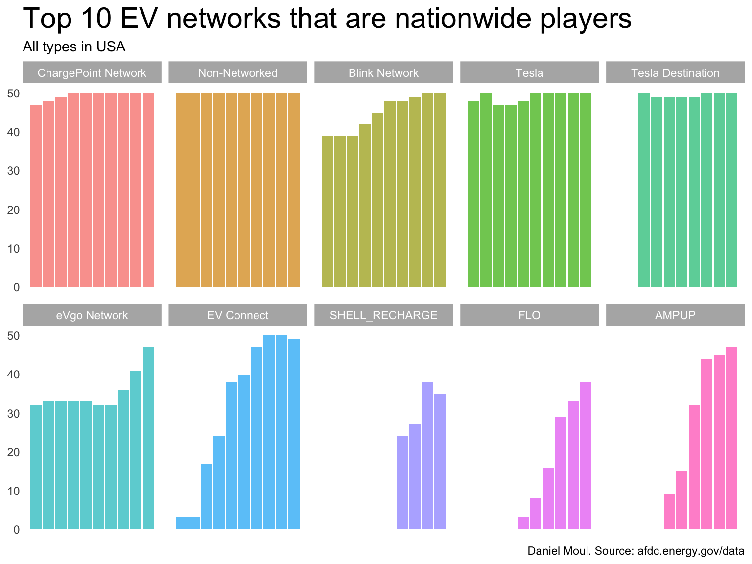
How many states are charging networks operating in? The larger networks have been around longer; most were operating in nearly all states a decade ago. We see the geographical growth of the newer companies in Figure 2.3.
Figure 2.3: Top 10 EV networks that are nationwide players
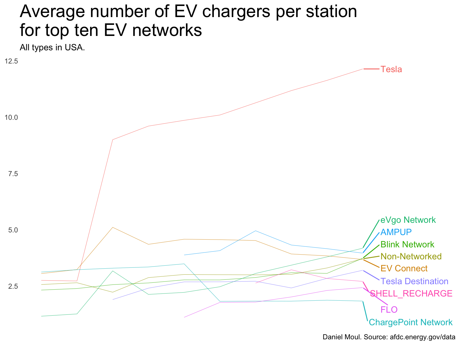
2.1.1 Chargers by EV network
Tesla’s supercharger stations have more than double the average number of chargers as other EV networks, and the chargers per station continues to grow (Figure 2.4).
Show the code
dta_for_plot <- dta |>filter(n_chargers >0) |>filter(ev_network %in% ev_network_top_10$ev_network) |>reframe(n_stations =n(),n_chargers =sum(n_chargers),chargers_per_station = n_chargers / n_stations,.by =c(yr, ev_network) ) |>mutate(ev_network =fct_reorder(ev_network, -chargers_per_station, sum))dta_labels_for_plot <- dta_for_plot |>filter(yr ==2025) #|># slice_max(order_by = chargers_per_station, n = 5)dta_for_plot |>ggplot() +geom_line(aes(yr, chargers_per_station, color = ev_network, group = ev_network),linewidth =0.2,alpha =0.8) +geom_text_repel(data = dta_labels_for_plot,aes(x = yr,y = chargers_per_station,label = ev_network,color = ev_network),nudge_x =0.5,direction ="y",hjust =0) +scale_x_discrete(labels = year_labels) +scale_y_continuous(labels =label_number(scale_cut =cut_short_scale())) +guides(color ="none") +theme(strip.text =element_text(size =rel(strip_text_param))) +coord_cartesian(xlim =c(NA, 2027)) +labs(title ="Average number of EV chargers per station\nfor top ten EV networks",subtitle ="All types in USA.",x =NULL,y =NULL,caption = my_caption )
Figure 2.4
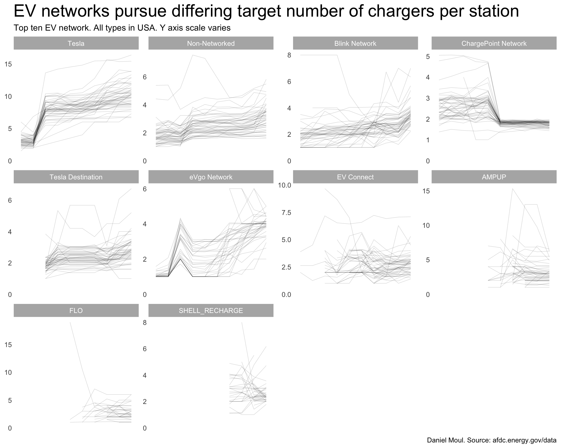
EV Networks seem to have differing strategies regarding the number of chargers per station (Figure 2.5).
Telsa supercharger network has the most chargers per station
Some networks seem to be converging to a preferred number of chargers:
ChargePoint → 2
EV Connect → 2-4
eVgo → 3-5
Shell Recharge → 2
Tesla is trending upward in chargers per station in some states
Show the code
dta_for_plot <- dta |>filter(n_chargers >0) |>filter(ev_network %in% ev_network_top_10$ev_network) |>reframe(n_stations =n(),n_chargers =sum(n_chargers),chargers_per_station = n_chargers / n_stations,.by =c(yr, ev_network, state) ) |>mutate(ev_network =fct_reorder(ev_network, -chargers_per_station, sum))dta_for_plot |>ggplot() +geom_line(aes(yr, chargers_per_station, group = state),linewidth =0.2,alpha =0.2) +scale_x_discrete(labels = year_labels) +scale_y_continuous(labels =label_number(scale_cut =cut_short_scale())) +facet_wrap( ~ev_network, scales ="free_y") +theme(strip.text =element_text(size =rel(strip_text_param))) +expand_limits(y =0) +labs(title ="EV networks pursue differing target number of chargers per station",subtitle ="Top ten EV network. All types in USA. Y axis scale varies",x =NULL,y =NULL,caption = my_caption )
Figure 2.5: EV networks pursue differing target number of chargers per station
2.2 Looking into California
Since California was an early mover in EVs and has achieved one of the best people_to_charger ratios, it’s interesting to look at this state separately.
California is the clear outlier, hosting 25% of all stations at the end of 2025. And ChargePoint Network is the majority supplier in California, offering 12% of California’s charging stations
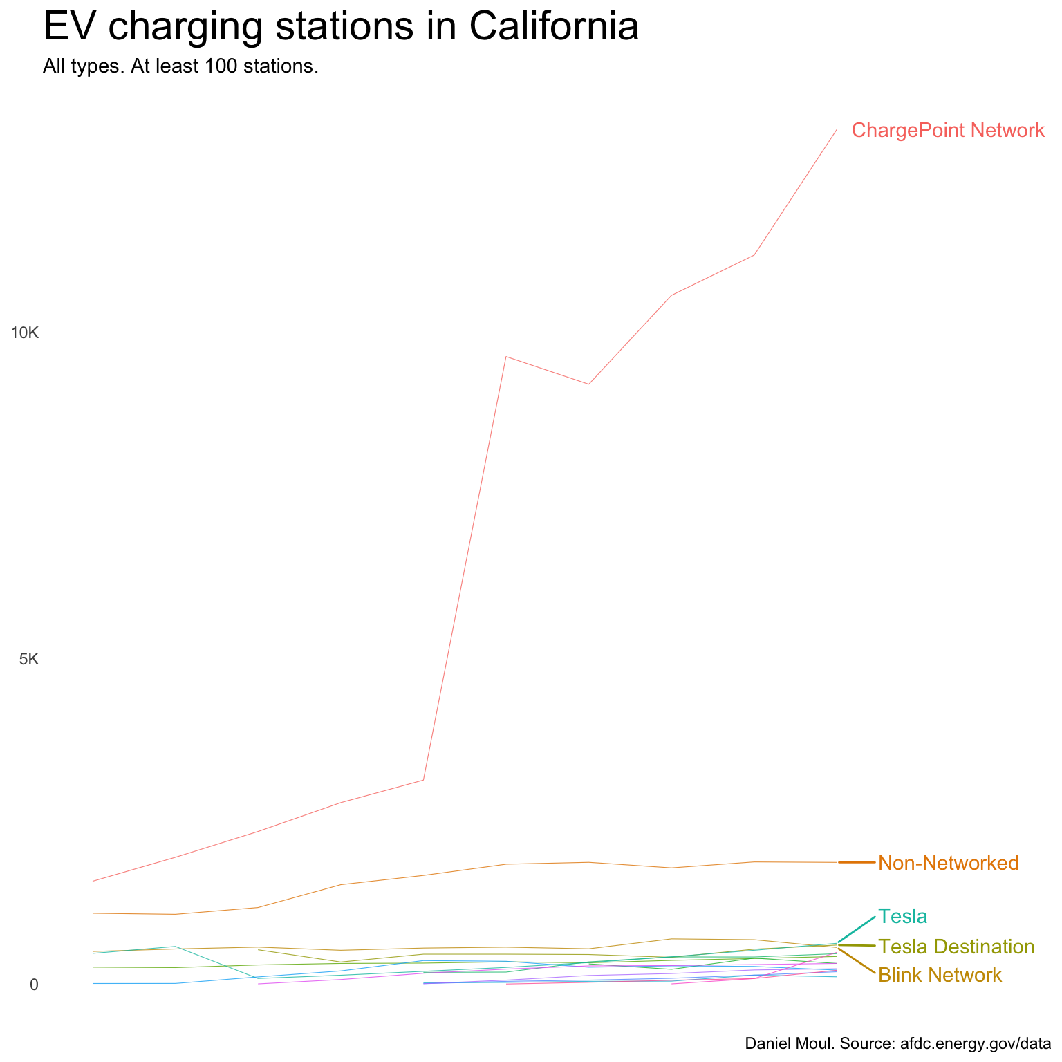
Figure 2.7 shows only the California data that’s also shown in Figure 2.2. It’s interesting that some networks are growing in California in recent years while others are declining.
Show the code
dta_for_plot |>filter(ev_network %in% dta_ca_gt_100_stations$ev_network) |>ggplot() +geom_line(aes(yr, n_stations, group = ev_network),linewidth =0.2,alpha =0.8) +scale_x_discrete(labels = year_labels) +scale_y_continuous(labels =label_number(scale_cut =cut_short_scale())) +facet_wrap( ~ev_network, scales ="free_y") +theme(strip.text =element_text(size =rel(strip_text_param)))+labs(title ="EV charging stations in California",subtitle ="All types. At least 100 stations. Y axis scale varies",x =NULL,y =NULL,caption = my_caption )
Figure 2.7
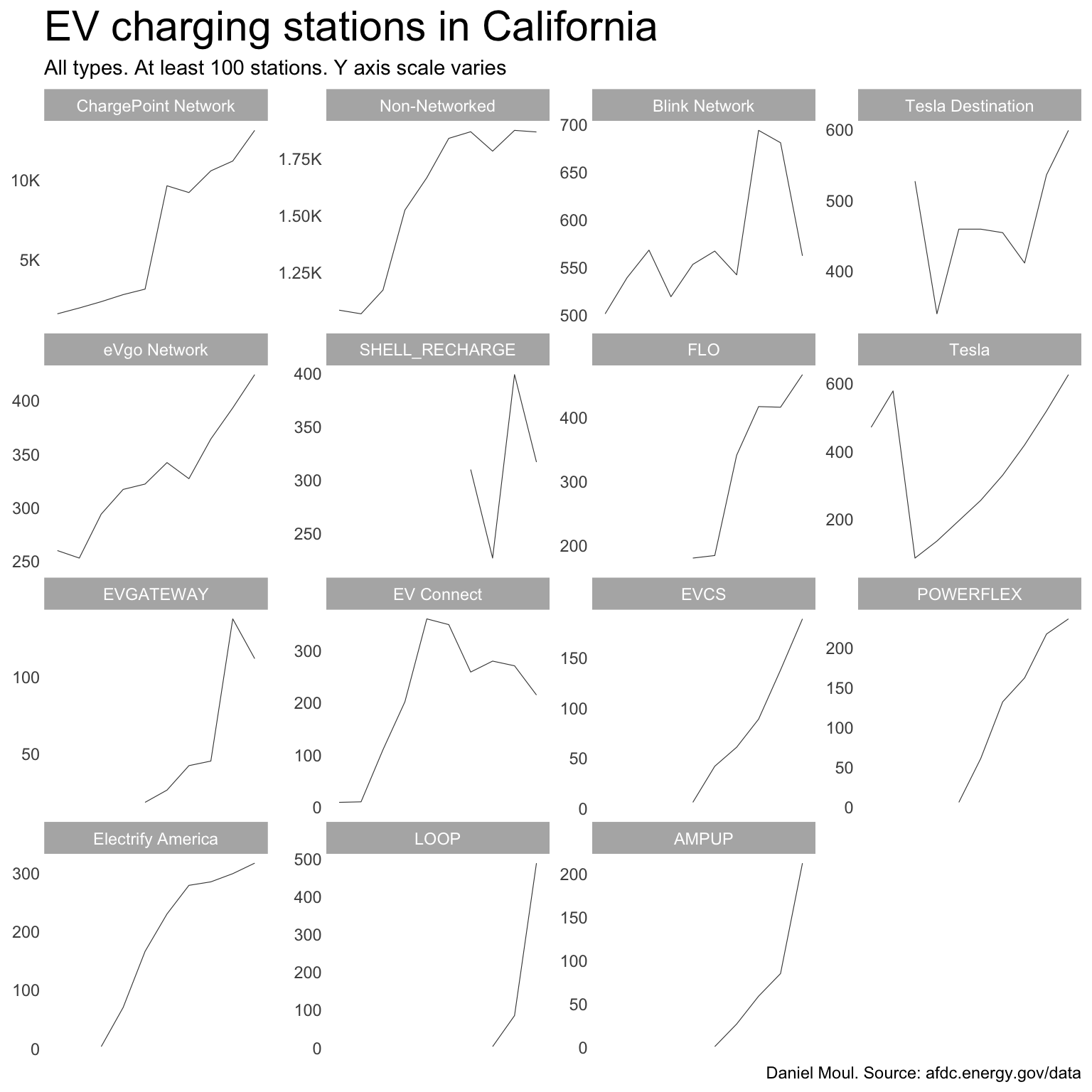
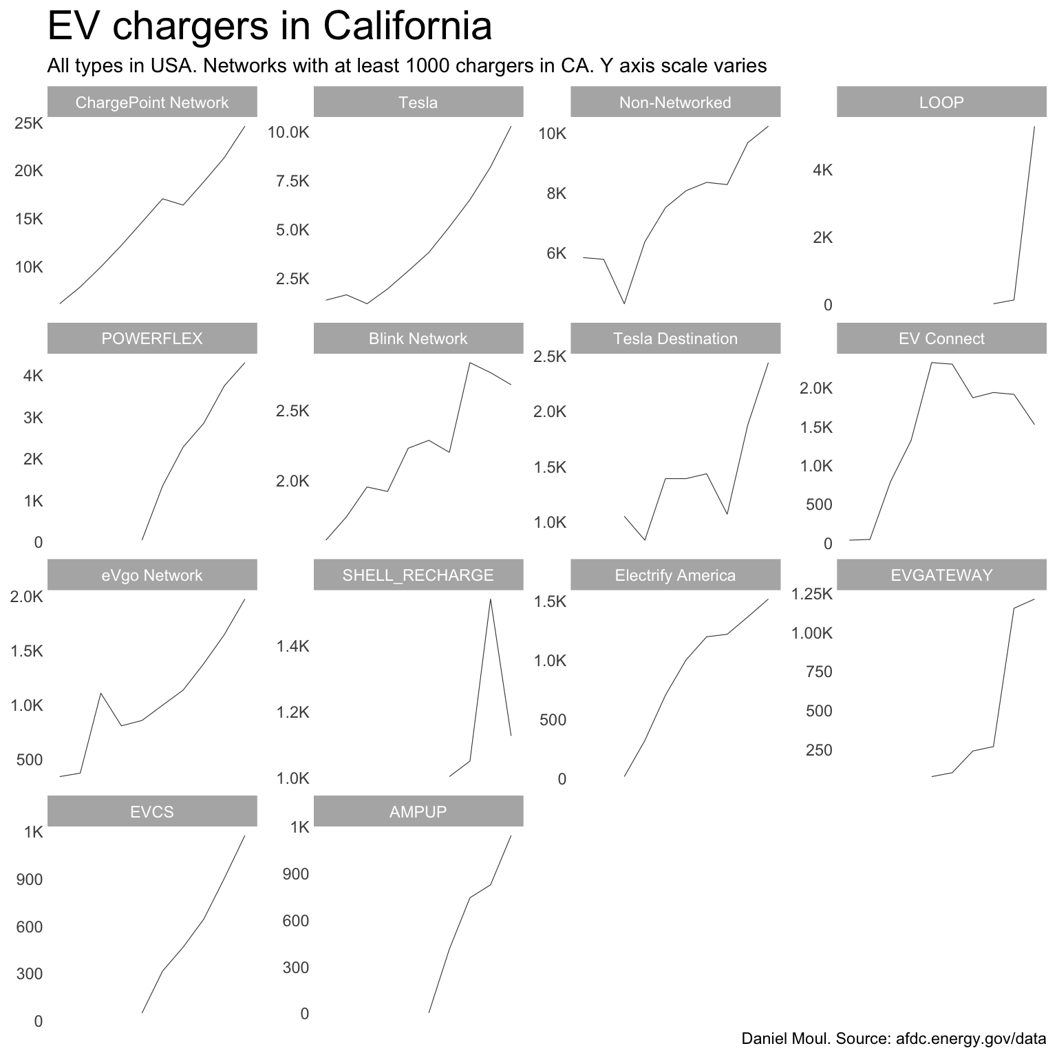
2.2.2 California chargers
The picture is similar for chargers.
Show the code
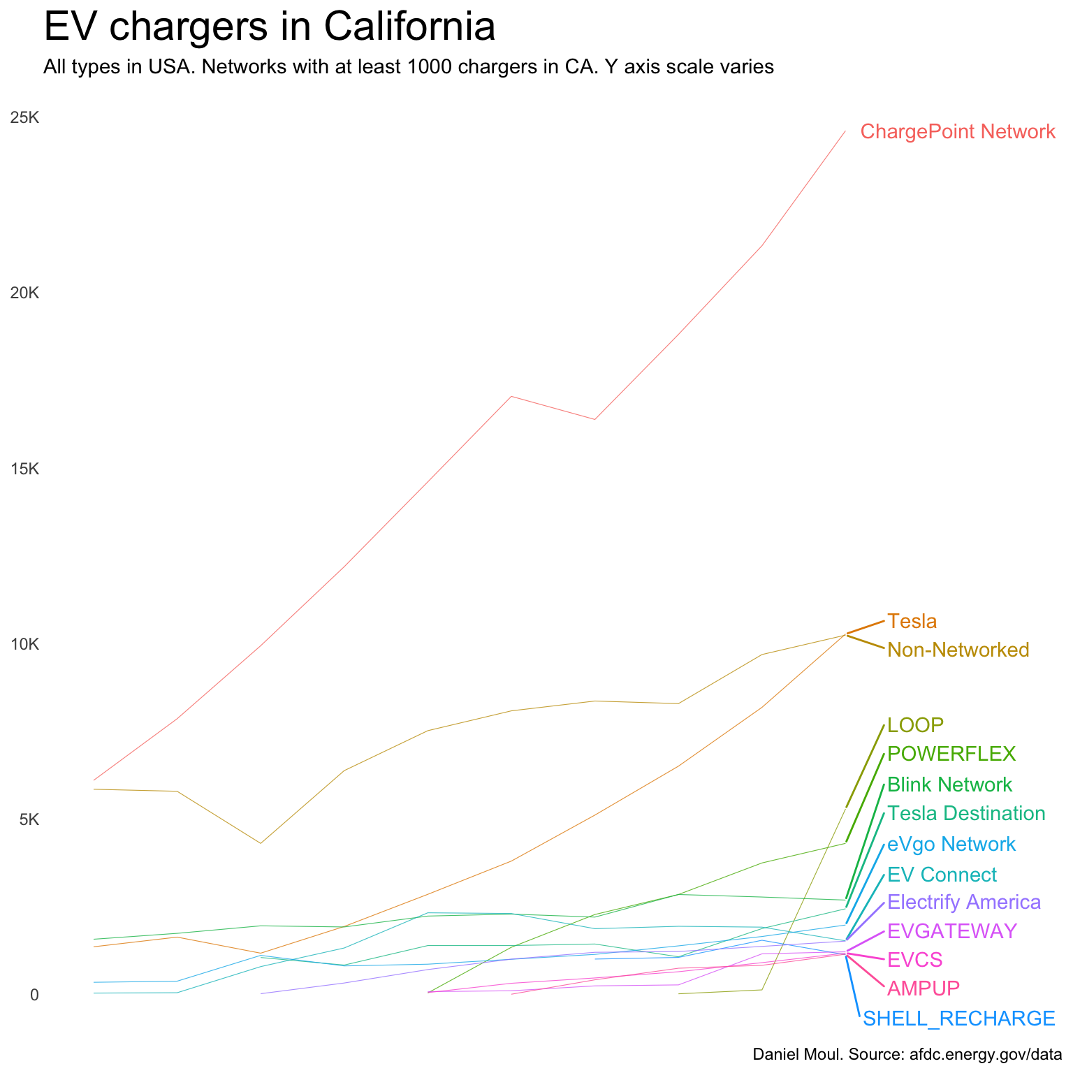
ev_network_top_10_ca <- dta_ca |>filter(yr ==2025) |>count(ev_network, wt = n_chargers,sort =TRUE) |>head(10)dta_for_plot <- dta_ca |>filter(n_chargers >0) |>reframe(n_stations =n(),n_chargers =sum(n_chargers),chargers_per_station = n_chargers / n_stations,.by =c(yr, state, ev_network) ) |>mutate(ev_network =fct_reorder(ev_network, -n_chargers, min))cutoff_chargers <-1000dta_ca_gt_cutoff_chargers <- dta_for_plot |>filter(yr ==2025, n_chargers > cutoff_chargers)dta_labels_for_plot <- dta_for_plot |>filter(yr ==2025, ev_network %in% dta_ca_gt_cutoff_chargers$ev_network)dta_for_plot |>filter(ev_network %in% dta_ca_gt_cutoff_chargers$ev_network) |>ggplot() +geom_line(aes(yr, n_chargers, color = ev_network, group = ev_network),linewidth =0.2,alpha =0.8) +geom_text_repel(data = dta_labels_for_plot,aes(x = yr,y = n_chargers,label = ev_network,color = ev_network),nudge_x =0.5,direction ="y",hjust =0) +scale_x_discrete(labels = year_labels) +scale_y_continuous(labels =label_number(scale_cut =cut_short_scale())) +coord_cartesian(xlim =c(NA, 2027)) +guides(color ="none") +labs(title ="EV chargers in California",subtitle =glue("All types in USA. Networks with at least {cutoff_chargers} chargers in CA. Y axis scale varies"),x =NULL,y =NULL,caption = my_caption )
Figure 2.8
Show the code
dta_for_plot |>filter(ev_network %in% dta_ca_gt_cutoff_chargers$ev_network) |>ggplot() +geom_line(aes(yr, n_chargers, group = ev_network),linewidth =0.2,alpha =0.8) +scale_x_discrete(labels = year_labels) +scale_y_continuous(labels =label_number(scale_cut =cut_short_scale())) +facet_wrap( ~ev_network, scales ="free_y") +theme(strip.text =element_text(size =rel(strip_text_param)))+labs(title ="EV chargers in California",subtitle =glue("All types in USA. Networks with at least {cutoff_chargers} chargers in CA. Y axis scale varies"),x =NULL,y =NULL,caption = my_caption )