1  Stations and chargers

It’s useful to count and compare charging stations and chargers, since some stations have one or two chargers, and others have ten or more. State governments have differing priorities and offer differing incentives related to the electrification of their state’s vehicle fleets, and EV network charging companies have differing strategies in terms of where they put stations and how many and of what type of chargers they install in each station.

1.1 Number of stations

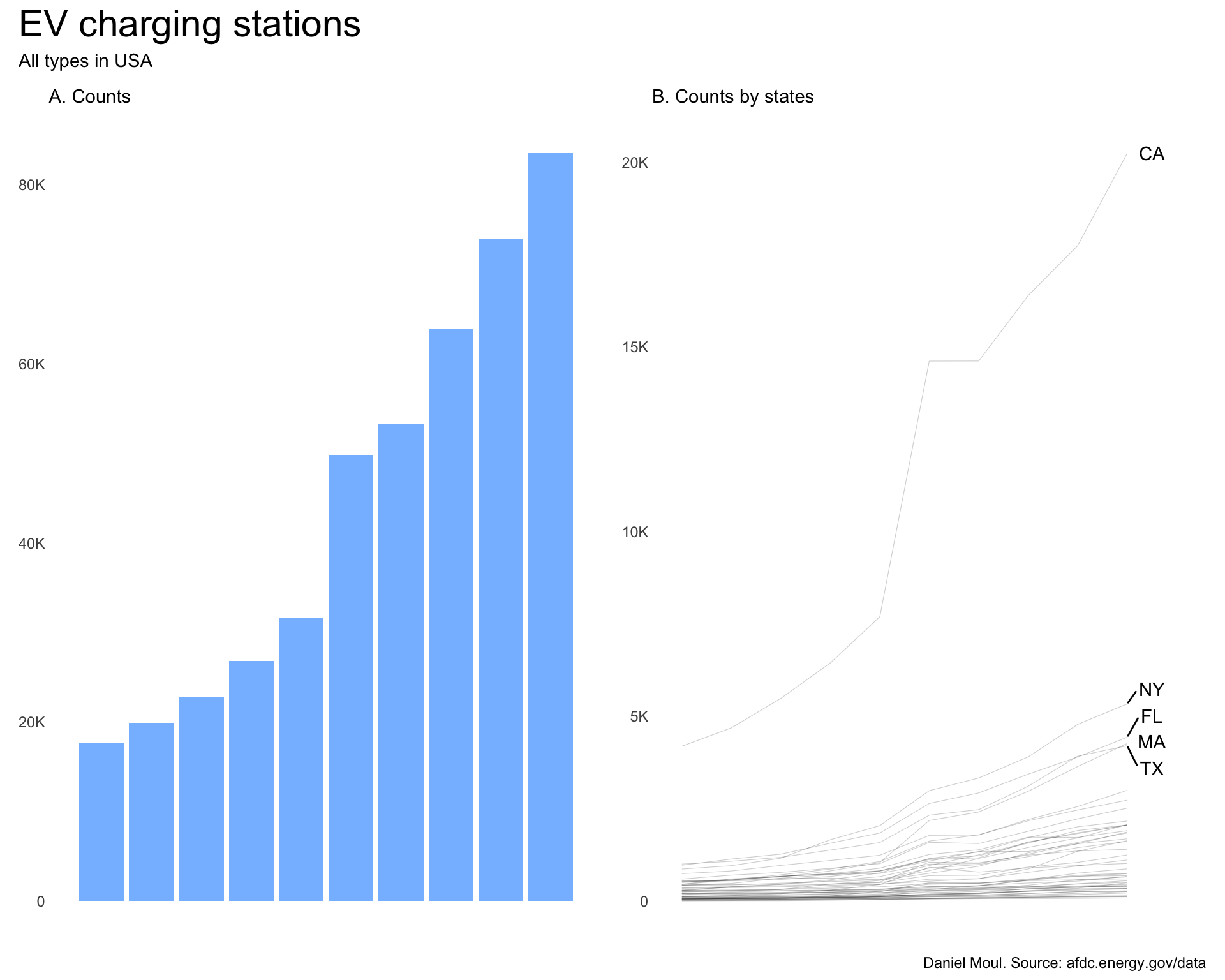
Station availability has increased dramatically over the 10 years ending in 2025, more than quadrupling (Figure 1.1 panel A). California has about four times the number of stations as New York, the second-ranked state.

Show the code
p1 <- dta |>
  count(yr) |>
  ggplot() +
    geom_col(aes(yr, n)) +
  scale_x_discrete(labels = year_labels) +
  scale_y_continuous(labels = label_number(scale_cut = cut_short_scale())) +
  labs(
    subtitle = "A. Counts",
    x = NULL,
    y = NULL
  )
  
dta_for_plot <- dta |>
  count(yr, state, name = "n_stations")

dta_labels_for_plot <- dta_for_plot |>
  slice_max(order_by = n_stations, n = 1,
            by = state) |>
  slice_max(order_by = n_stations, n = 5)


p2 <- dta_for_plot |>
  ggplot() +
  geom_line(aes(yr, n_stations, group = state),
            linewidth = 0.2,
            alpha = 0.2) +
  geom_text_repel(data = dta_labels_for_plot,
                  aes(yr, n_stations, group = state, label = state),
                  nudge_x = 0.5,
                  direction = "y") +
  scale_x_discrete(labels = year_labels) +
  scale_y_continuous(labels = label_number(scale_cut = cut_short_scale())) +
  coord_cartesian(xlim = c(NA, 2026)) +
  labs(
    subtitle = "B. Counts by states",
    x = NULL,
    y = NULL
  )

p1 + p2 +
  plot_annotation(
    title = "EV charging stations",
    subtitle = "All types in USA",
    caption = my_caption
  )
Figure 1.1: EV non-residential charging stations in the US by year and state 2016-2025


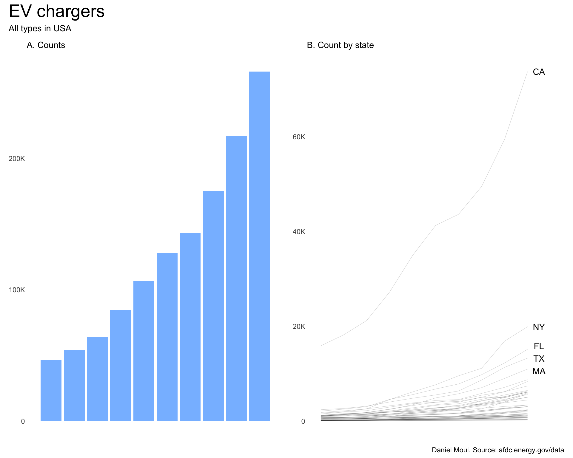
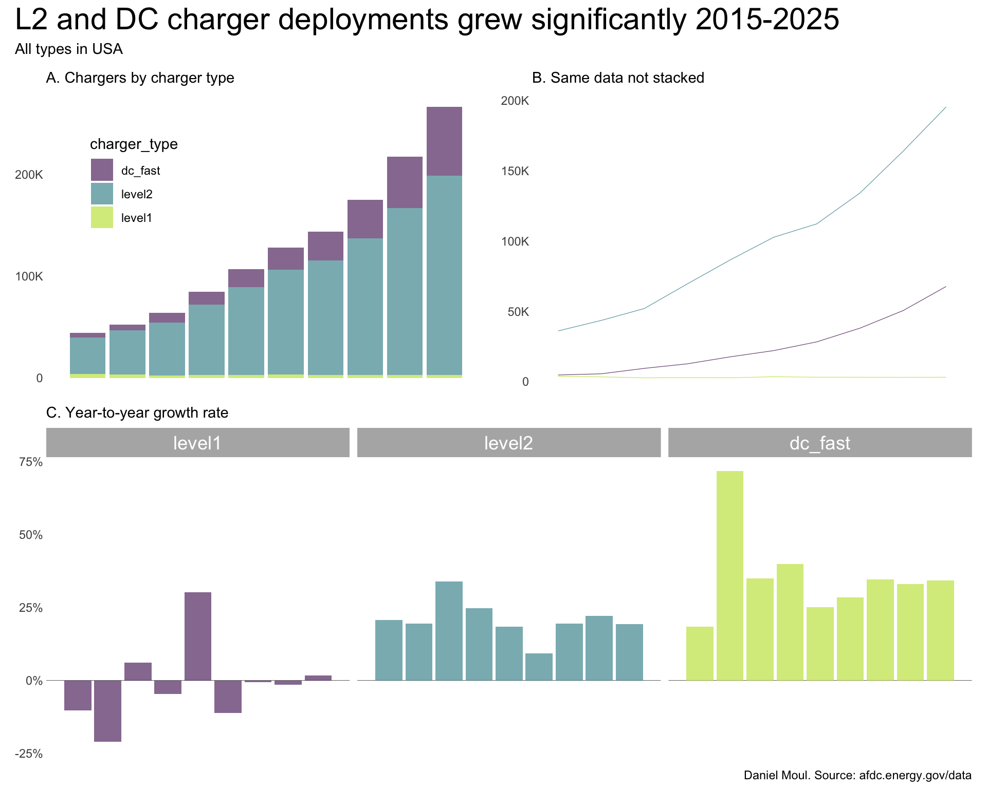
1.2 Number of chargers

In terms of chargers, there were five times as many available at the end of 2025 compared to 10 years earlier. California has more than three times as many as New York.

Show the code
p1 <- dta |>
  count(yr, wt = n_chargers) |>
  ggplot() +
    geom_col(aes(yr, n)) +
  scale_x_discrete(labels = year_labels) +
  scale_y_continuous(labels = label_number(scale_cut = cut_short_scale())) +
  labs(
    subtitle = "A. Counts",
    x = NULL,
    y = NULL
  )

dta_for_plot <- dta |>
  count(yr, state, name = "n_chargers", wt = n_chargers)

dta_labels_for_plot <- dta_for_plot |>
  slice_max(order_by = n_chargers, n = 1,
            by = state) |>
  slice_max(order_by = n_chargers, n = 5)

p2 <- dta_for_plot |>
  ggplot() +
  geom_line(aes(yr, n_chargers, group = state),
            linewidth = 0.2,
            alpha = 0.2) +
  geom_text_repel(data = dta_labels_for_plot,
                  aes(yr, n_chargers, group = state, label = state),
                  nudge_x = 0.5,
                  direction = "y") +
  scale_x_discrete(labels = year_labels) +
  scale_y_continuous(labels = label_number(scale_cut = cut_short_scale())) +
  coord_cartesian(xlim = c(NA, 2026)) +
  labs(
    subtitle = "B. Count by state",
    x = NULL,
    y = NULL
  )
  
p1 + p2 +
  plot_annotation(
    title = "EV chargers",
    subtitle = "All types in USA",
    caption = my_caption
  )
Figure 1.2: EV non-residential chargers in the US by year and state 2016-2025


1.3 People per charger

Show the code
dta_people_per_charger_state <- dta |>
  reframe(
    n_stations = n(),
    n_chargers = sum(n_chargers),
    n_ev_network = n_distinct(ev_network),
    .by = c(yr, state)
    ) |>
  left_join(
    state_pop_2020,
    by = join_by(state)
    
  ) |>
  mutate(
    people_per_charger = pop / n_chargers,
  )

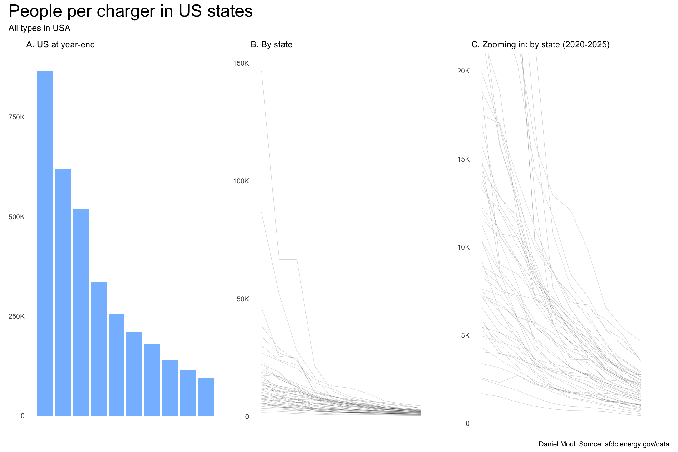
Since states vary widely in population, the normalized view people_per_charger is helpful. This plot shows a significant increase in and convergence of charger density happening in the states (Figure 1.3). The availability of chargers improved dramatically between 2016 and 2020 (panel B) then continued to improve as the charger density converges for all states below 5000 people per charger by 2025 (panel C).

Show the code
p1 <- dta_people_per_charger_state |>
  mutate(
    avg_people_per_charger = mean(people_per_charger),
    .by = yr) |>
  ggplot() +
    geom_col(aes(yr, avg_people_per_charger)) +
  scale_x_discrete(labels = year_labels) +
  scale_y_continuous(labels = label_number(scale_cut = cut_short_scale())) +
  labs(
    subtitle = "A. US at year-end",
    x = NULL,
    y = NULL
  )

p2 <- dta_people_per_charger_state |>
  ggplot() +
  geom_line(aes(yr, people_per_charger, group = state),
            linewidth = 0.2,
            alpha = 0.2) +
  # geom_text_repel(data = dta_labels_for_plot,
  #                 aes(yr, n_chargers, group = state, label = state),
  #                 nudge_x = 0.5,
  #                 direction = "y") +
  scale_x_discrete(labels = year_labels) +
  scale_y_continuous(labels = label_number(scale_cut = cut_short_scale())) +
  coord_cartesian(xlim = c(NA, 2026)) +
  labs(
    subtitle = "B. By state",
    x = NULL,
    y = NULL
  )

p3 <- dta_people_per_charger_state |>
  ggplot() +
  geom_line(aes(yr, people_per_charger, group = state),
            linewidth = 0.2,
            alpha = 0.2) +
  scale_x_discrete(labels = year_labels) +
  scale_y_continuous(labels = label_number(scale_cut = cut_short_scale())) +
  coord_cartesian(xlim = c(NA, 2026),
                  ylim = c(NA, 20000)) +
  labs(
    subtitle = "C. Zooming in: by state (2020-2025)",
    x = NULL,
    y = NULL
  )
  
p1 + p2 + p3 +
  plot_annotation(
    title = "People per charger in US states",
    subtitle = "All types in USA",
    caption = my_caption
  )
Figure 1.3: People per charger in the US by year and state 2016-2025


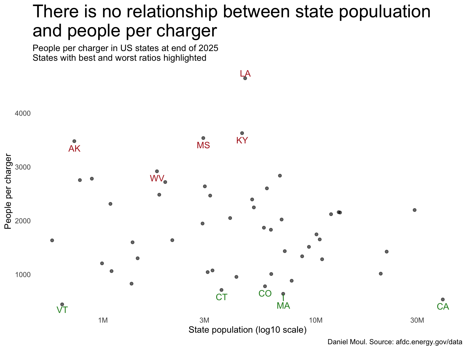
There is no relationship between state population and people per charger. California, the most populous state, has one of the lowest ratios of people per charger, and Vermont, one of the least populous states, has a similar ratio.

Show the code
best_worst <-
  bind_rows(
    dta_people_per_charger_state |>
      filter(yr == 2025) |>
      slice_min(order_by = people_per_charger,
                n = 5) |>
      mutate(category = "best"),
    dta_people_per_charger_state |>
      filter(yr == 2025) |>
      slice_max(order_by = people_per_charger,
                n = 5) |>
      mutate(category = "worst")
)

dta_people_per_charger_state |>
  filter(yr == 2025) |>
  ggplot(aes(pop, people_per_charger)) +
  geom_point(alpha = 0.6) +
  geom_text_repel(
    data = best_worst,
    aes(label = state, color = category),
    nudge_x = 0.001,
    direction = "y") +
  scale_color_manual(values = c("forestgreen", "firebrick")) +
  scale_x_log10(labels = label_number(scale_cut = cut_short_scale())) +
  guides(color = "none") +
  labs(
    title = "There is no relationship between state populuation\nand people per charger",
    subtitle = glue("People per charger in US states at end of 2025",
                    "\nStates with best and worst ratios highlighted"),
    x = "State population (log10 scale)",
    y = "People per charger",
    caption = my_caption
  )
Figure 1.4: There is no relationship between state population and people per charger


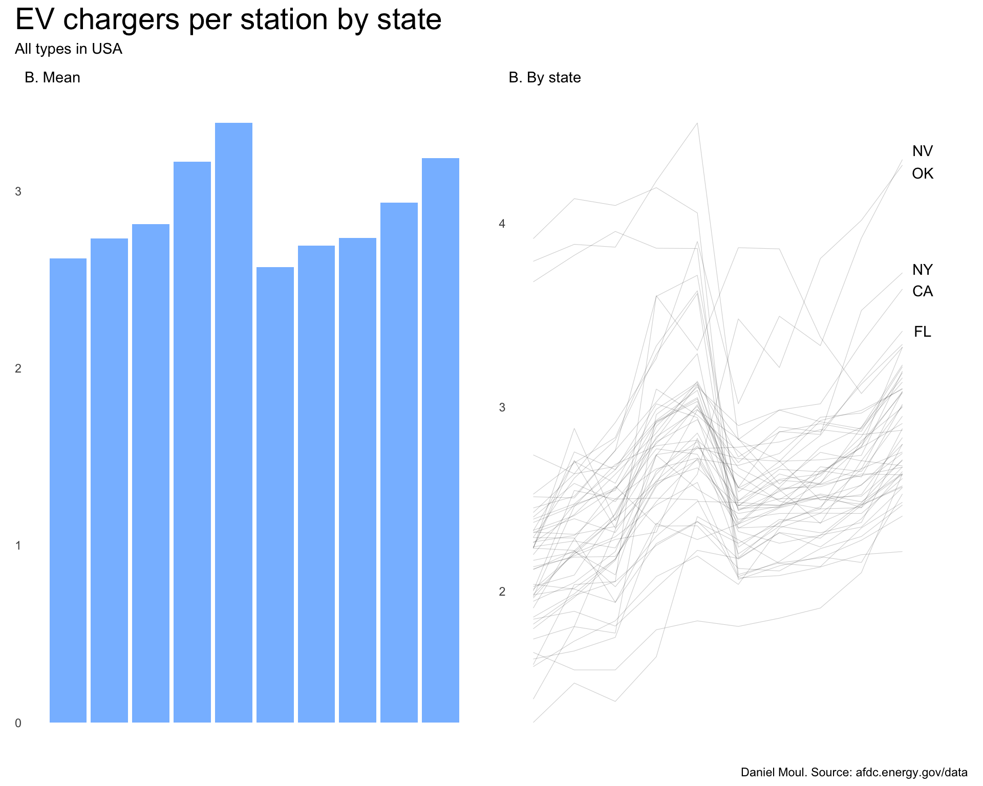
1.4 Chargers per station

Each station offers one or more chargers. Why is there a systematic drop in chargers per station between 2020 and 2021 (Figure 1.5)? Was there a change in data standards? Reporting policy? I have not found evidence in the data supporting any of these explanations.

Show the code
ev_network_top_10 <- dta |>
  filter(yr == 2025) |>
  count(ev_network, wt = n_chargers, sort = TRUE) |>
  head(10)

p1 <- dta |>
  filter(
    n_chargers > 0) |>
  reframe(
    n_stations = n(),
    n_chargers = sum(n_chargers, na.rm = TRUE),
    chargers_per_station = n_chargers / n_stations,
    .by = yr
  ) |>
  ggplot() +
    geom_col(aes(yr, chargers_per_station)) +
  scale_x_discrete(labels = year_labels) +
  scale_y_continuous(labels = label_number(scale_cut = cut_short_scale())) +
  labs(
    subtitle = "B. Mean",
    x = NULL,
    y = NULL
  )
  
dta_for_plot <- dta |>
  filter(n_chargers > 0) |>
  reframe(
    n_stations = n(),
    n_chargers = sum(n_chargers, na.rm = TRUE),
    chargers_per_station = n_chargers / n_stations,
    .by = c(yr, state)
  )

dta_labels_for_plot <- dta_for_plot |>
  filter(yr == 2025) |>
  slice_max(order_by = chargers_per_station, n = 1,
            by = state) |>
  slice_max(order_by = chargers_per_station, n = 5)

p2 <- dta_for_plot |>
  ggplot() +
  geom_line(aes(yr, chargers_per_station, group = state),
            linewidth = 0.2,
            alpha = 0.2) +
  geom_text_repel(data = dta_labels_for_plot,
                  aes(yr, chargers_per_station, group = state, label = state),
                  nudge_x = 0.5,
                  direction = "y") +
  scale_x_discrete(labels = year_labels) +
  scale_y_continuous(labels = label_number(scale_cut = cut_short_scale())) +
  coord_cartesian(xlim = c(NA, 2026)) +
  labs(
    subtitle = "B. By state",
    x = NULL,
    y = NULL
  )

p1 + p2 +
  plot_annotation(
    title = "EV chargers per station by state",
    subtitle = "All types in USA",
    caption = my_caption
  )
Figure 1.5: EV chargers per station by state in the US by year and state 2016-2025


1.5 Charger types

There are three main charger types. These definitions are from the US Department of Transportation1

  • L1 charging: charging through a common residential 120-volt (120V) AC outlet. Level 1 chargers can take 40-50+ hours to charge a BEV to 80 percent from empty and 5-6 hours for a PHEV.
  • L2 charging: higher-rate AC charging through 240V (in residential applications) or 208V (in commercial applications) electrical service, and is common for home, workplace, and public charging. Level 2 chargers can charge a BEV to 80 percent from empty in 4-10 hours and a PHEV in 1-2 hours.
  • DC charging (also called direct current fast charging (DCFC): rapid charging along heavy-traffic corridors at installed stations. DCFC equipment can charge a BEV to 80 percent in just 20 minutes to 1 hour. Most PHEVs currently on the market do not work with fast chargers.
Show the code
dta_for_plot <- dta |>
  select(yr, state, ev_network, level1 = ev_level1_evse_num, level2 = ev_level2_evse_num,
         dc_fast = ev_dc_fast_count) |>
  pivot_longer(
    cols = c(level1, level2, dc_fast),
    names_to = "charger_type",
    values_to = "n"
  ) |>
  replace_na(list(n = 0)) |>
  count(yr, charger_type, wt = n) |>
  mutate(charger_type = factor(charger_type, levels = c("dc_fast", "level2", "level1")))

p1 <- dta_for_plot |>
  ggplot() +
    geom_col(aes(yr, n, fill = charger_type),
             alpha = 0.6) +
  scale_x_discrete(labels = year_labels) +
  scale_y_continuous(labels = label_number(scale_cut = cut_short_scale())) +
  scale_fill_viridis_d(end = 0.9,
                       alpha = 0.6) +
  guides(fill = guide_legend(position = "inside")) +
  theme(legend.position.inside = c(0.2, 0.7)) +
  labs(
    subtitle = "A. Chargers by charger type",
    x = NULL,
    y = NULL
  )
  
p2 <- dta_for_plot |>
  ggplot() +
  geom_line(
    aes(yr, n, color = charger_type, group = charger_type),
            linewidth = 0.2,
            alpha = 0.8) +
  scale_x_discrete(labels = year_labels) +
  scale_y_continuous(labels = label_number(scale_cut = cut_short_scale())) +
  scale_color_viridis_d(end = 0.9) +
  guides(color = "none") +
  labs(
    subtitle = "B. Same data not stacked",
    x = NULL,
    y = NULL
  )

p3 <- dta_for_plot |> 
  rename(n_chargers = n) |>
  mutate(
    yty_pct = n_chargers / lag(n_chargers, default = NA) - 1,
    .by = charger_type) |>
  mutate(
    charger_type = fct_rev(charger_type)
  ) |>
  ggplot() +
  geom_hline(
    yintercept = 0,
    linewidth = 0.2,
    alpha = 0.6) +
  geom_col(
    aes(yr, yty_pct, fill = charger_type),
    alpha = 0.6,
    na.rm = TRUE
  ) +
  scale_x_discrete(labels = year_labels) +
  scale_y_continuous(labels = label_percent()) +
  scale_fill_viridis_d(end = 0.9,
                       alpha = 0.6) +
  guides(fill = "none") +
  facet_wrap( ~ charger_type) +
  labs(
    subtitle = "C. Year-to-year growth rate",
    x = NULL,
    y = NULL
  )

(p1 + p2) / p3 +
  plot_annotation(
    title = "L2 and DC charger deployments grew significantly 2015-2025",
    subtitle = "All types in USA",
    caption = my_caption
  )
Figure 1.6: L2 and DC charger deployments grew significantly in US states 2016-2025


Level 1 chargers are in decline. The number of L2 chargers grew more than 5x and DC chargers grew more than 14x during this period (Table 1.1).

Show the code
dta_for_tbl <- dta_for_plot |>
  filter(n > 0) |>
  reframe(
    n = sum(n, na.rm = TRUE),
    .by = c(yr, charger_type)
  )

dta_for_tbl |>
  pivot_wider(id_cols = charger_type,
              names_from = yr,
              values_from = n) |>
  mutate(multiple = (`2025`/ `2016`),
         growth = `2025`/ `2016` - 1) |>
  gt() |>
  tab_options(table.font.size = 11) |>
  tab_header(md(glue("**Counts of EV charger types 2016-2025 in the USA**",
                     "<br>Including growth over those 10 years"))) |>
  tab_source_note(md("*Daniel Moul. Source: AFDC*")) |>
  fmt_number(columns = everything(),
             decimals = 0) |>
  fmt_number(columns = multiple,
             decimals = 1) |>
  fmt_percent(columns = growth,
              decimals = 0) |>
  cols_align(columns = charger_type,
             align = "left")
Counts of EV charger types 2016-2025 in the USA
Including growth over those 10 years
charger_type 2016 2017 2018 2019 2020 2021 2022 2023 2024 2025 multiple growth
dc_fast 4,556 5,398 9,275 12,510 17,506 21,904 28,128 37,872 50,348 67,560 14.8 1,383%
level1 3,578 3,209 2,534 2,687 2,561 3,336 2,964 2,946 2,902 2,953 0.8 −17%
level2 35,926 43,382 51,858 69,419 86,578 102,583 112,122 134,048 163,712 195,373 5.4 444%
Daniel Moul. Source: AFDC
Table 1.1: Counts of EV charger types 2016-2025 in the USA


ChargePoint and Tesla have invested the most in growing the number of chargers they offer (Figure 1.7).

Show the code
ev_network_top_10 <- dta |>
  filter(yr == 2025) |>
  count(ev_network, wt = n_chargers, sort = TRUE) |>
  head(10)

dta_for_plot <- dta |>
  select(yr, state, ev_network, level1 = ev_level1_evse_num, level2 = ev_level2_evse_num,
         dc_fast = ev_dc_fast_count, induct_conduct = ev_other_num) |>
  pivot_longer(
    cols = c(level1, level2, dc_fast),
    names_to = "charger_type",
    values_to = "n"
  ) |>
  replace_na(list(n = 0)) |>
  count(ev_network, yr, charger_type, wt = n) |>
  mutate(charger_type = factor(charger_type, levels = c("dc_fast", "level2", "level1")),
         ev_network = fct_reorder(ev_network, -n, sum))

dta_for_plot |>
  filter(n > 0,
         ev_network %in% ev_network_top_10$ev_network) |>
  ggplot() +
  geom_line(
    aes(yr, n, color = charger_type, group = charger_type),
    alpha = 0.6) +
  scale_x_discrete(labels = year_labels) +
  scale_y_continuous(labels = label_number(scale_cut = cut_short_scale())) +
  scale_color_viridis_d(end = 0.9) +
  guides(color = guide_legend(position = "inside")) +
  facet_wrap( ~ ev_network) +
  theme(legend.position.inside = c(0.8, 0.2)) +
  labs(
    title = "ChargePoint and Tesla grew their number of chargers\nthe most 2016-2025",
    subtitle = "All types in USA",
    x = NULL,
    y = NULL,
    caption = my_caption
  )
Figure 1.7: ChargePoint and Tesla grew their networks the most 2016-2025


Aspects of the top ten EV network company strategies are visible in Figure 1.8:

  • Tesla, Electrify America, and eVgo Network have gone all in on DC fast chargers.
  • EV Connect is pursuing a dual strategy: Level 2 and DC fast chargers.
  • The others are focused on Level 2 chargers.
Show the code
dta_for_plot |>
  filter(n > 0,
         ev_network %in% ev_network_top_10$ev_network) |>
  ggplot() +
  geom_line(
    aes(yr, n, color = charger_type, group = charger_type),
    alpha = 0.6) +
  scale_x_discrete(labels = year_labels) +
  scale_y_continuous(labels = label_number(scale_cut = cut_short_scale())) +
  scale_color_viridis_d(end = 0.9) +
  guides(color = guide_legend(position = "inside")) +
  facet_wrap( ~ ev_network, scales = "free_y") +
  theme(legend.position.inside = c(0.8, 0.2)) +
  labs(
    title = "EV network companies are pursuing differing strategies\nregarding the types of chargers they install",
    subtitle = "All types in USA. Y axis varies.",
    x = NULL,
    y = NULL,
    caption = my_caption
  )
Figure 1.8: EV network companies are pursuing differing strategies regarding the types of chargers they install


What about those not in the top 10? Again, some are focusing on DC fast chargers, others on L2 chargers, others a mix of both (Figure 1.7):

Show the code
ev_network_top_10 <- dta |>
  filter(yr == 2025) |>
  count(ev_network, wt = n_chargers, sort = TRUE) |>
  head(10)

dta_for_plot <- dta |>
  select(yr, state, ev_network, level1 = ev_level1_evse_num, level2 = ev_level2_evse_num,
         dc_fast = ev_dc_fast_count, induct_conduct = ev_other_num) |>
  pivot_longer(
    cols = c(level1, level2, dc_fast),
    names_to = "charger_type",
    values_to = "n"
  ) |>
  replace_na(list(n = 0)) |>
  count(ev_network, yr, charger_type, wt = n) |>
  mutate(charger_type = factor(charger_type, levels = c("dc_fast", "level2", "level1")),
         ev_network = fct_reorder(ev_network, -n, sum)) |>
  mutate(n_years_data = n(),
         .by = c(ev_network, charger_type))

dta_for_plot_sparse <- dta_for_plot |>
  filter(any(n_years_data <= 1),
         .by = ev_network)

dta_for_plot |>
  filter(n > 0,
         any(yr == 2025),
         .by = ev_network,
         !ev_network %in% ev_network_top_10$ev_network,
         !ev_network %in% dta_for_plot_sparse$ev_network) |>
  ggplot() +
  geom_line(
    aes(yr, n, color = charger_type, group = charger_type),
    alpha = 0.6) +
  scale_x_discrete(labels = year_labels) +
  scale_color_viridis_d(end = 0.9) +
  guides(color = guide_legend(position = "top")) +
  facet_wrap( ~ ev_network, scales = "free_y", ncol = 6) +
  # theme(legend.position.inside = c(0.8, 0.2)) +
  theme(strip.text = element_text(size = rel(strip_text_param))) +
  labs(
    title = "Smaller EV network companies are pursuing differing strategies\nregarding the types of chargers they install",
    subtitle = "All types in USA. Y axis varies.",
    x = NULL,
    y = NULL,
    caption = my_caption
  )
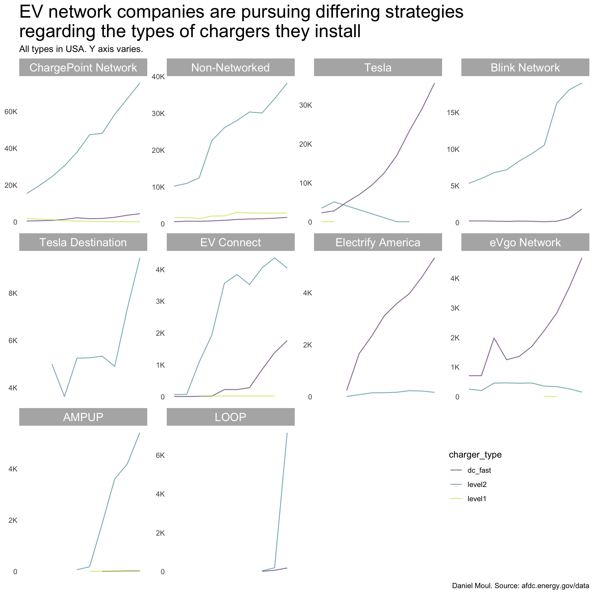
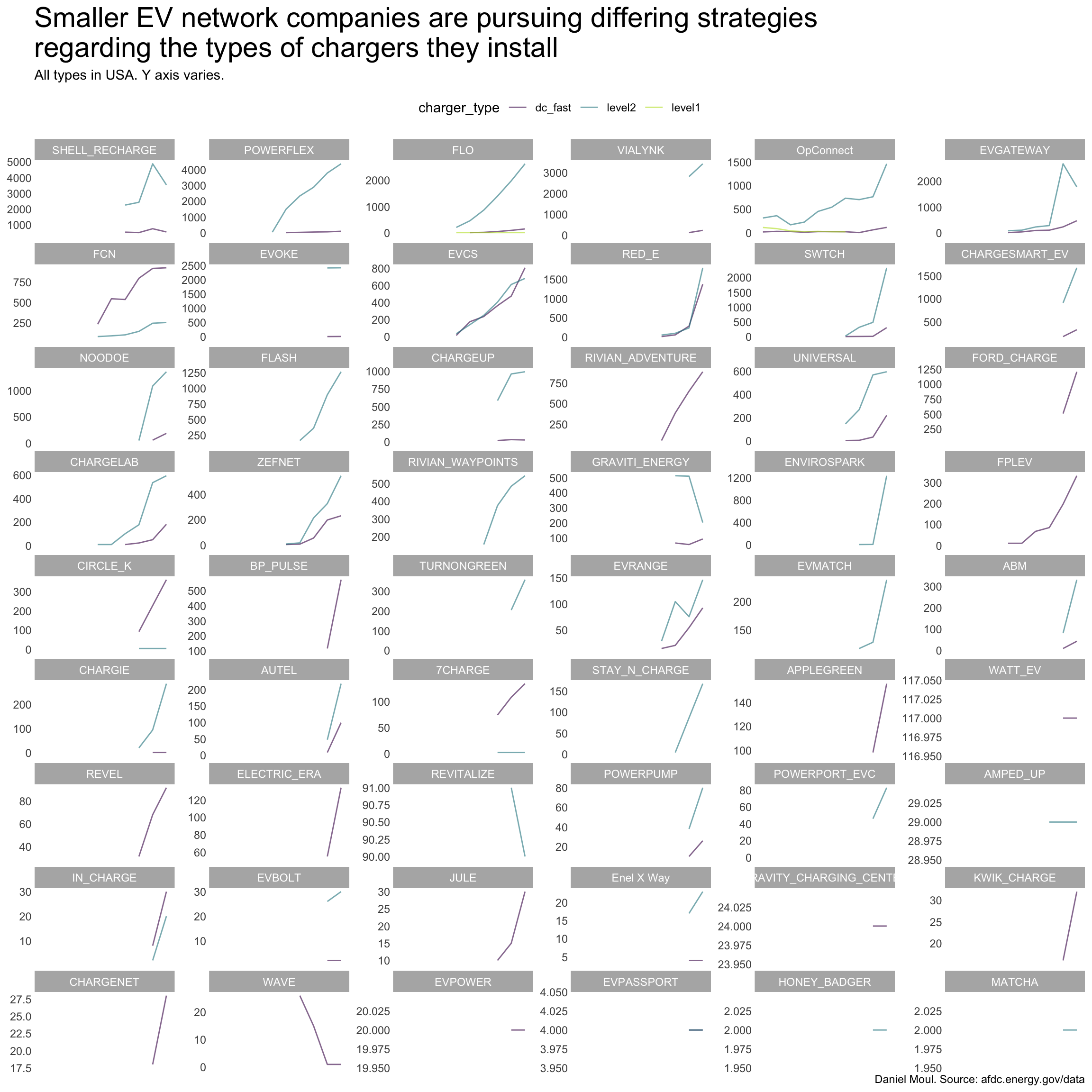
Figure 1.9: Smaller EV network companies are pursuing differing strategies regarding the types of chargers they install


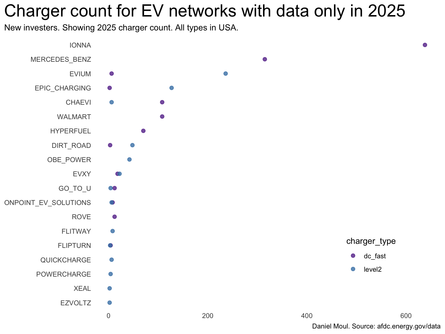
There are some EV networks that show up in the data only in 2025, so trend charts are not meaningful (Figure 1.10). Among these companies iONNA made the biggest splash. From wikipedia:2

iONNA was formed in July 2023 as a joint venture between automakers BMW, Mercedes-Benz, General Motors, Stellantis, Hyundai, Honda, and Kia. In July 2024, Toyota would join the venture. The automakers set a goal of electrifying 30,000 new charge points in North America by 2030, which would put iONNA on the same scale as the Electrify America network by Volkswagen and the Supercharger network by Tesla.

It’s headquartered in Durham, NC, one of the counties in the NC triangle. See Section 4.2.

Show the code
dta_for_plot_sparse <- dta_for_plot |>
  filter(yr == 2025) |>
  filter(any(n_years_data <= 1),
         .by = ev_network) |>
  filter(n > 0) |>
  mutate(ev_network = fct_reorder(ev_network, n, sum))

dta_for_plot_sparse |>
  ggplot() +
  geom_point(
    aes(n, ev_network, color = charger_type),
    size = 2,
    alpha = 0.8) +
  # scale_color_viridis_d(end = 0.9) +
  scale_color_manual(values = c("#663399", "steelblue")) + #
  guides(color = guide_legend(position = "inside")) +
  theme(legend.position.inside = c(0.8, 0.2),
        plot.title.position = "plot") +
  expand_limits(x = 0) +
  labs(
    title = "Charger count for EV networks with data only in 2025",
    subtitle = "New investers. Showing 2025 charger count. All types in USA.",
    x = NULL,
    y = NULL,
    caption = my_caption
  )
Figure 1.10: Charger count for EV networks with data only in 2025 reveals new investers


  1. https://www.transportation.gov/rural/ev/toolkit/ev-basics/charging-speeds ↩︎

  2. https://en.wikipedia.org/wiki/Ionna ↩︎