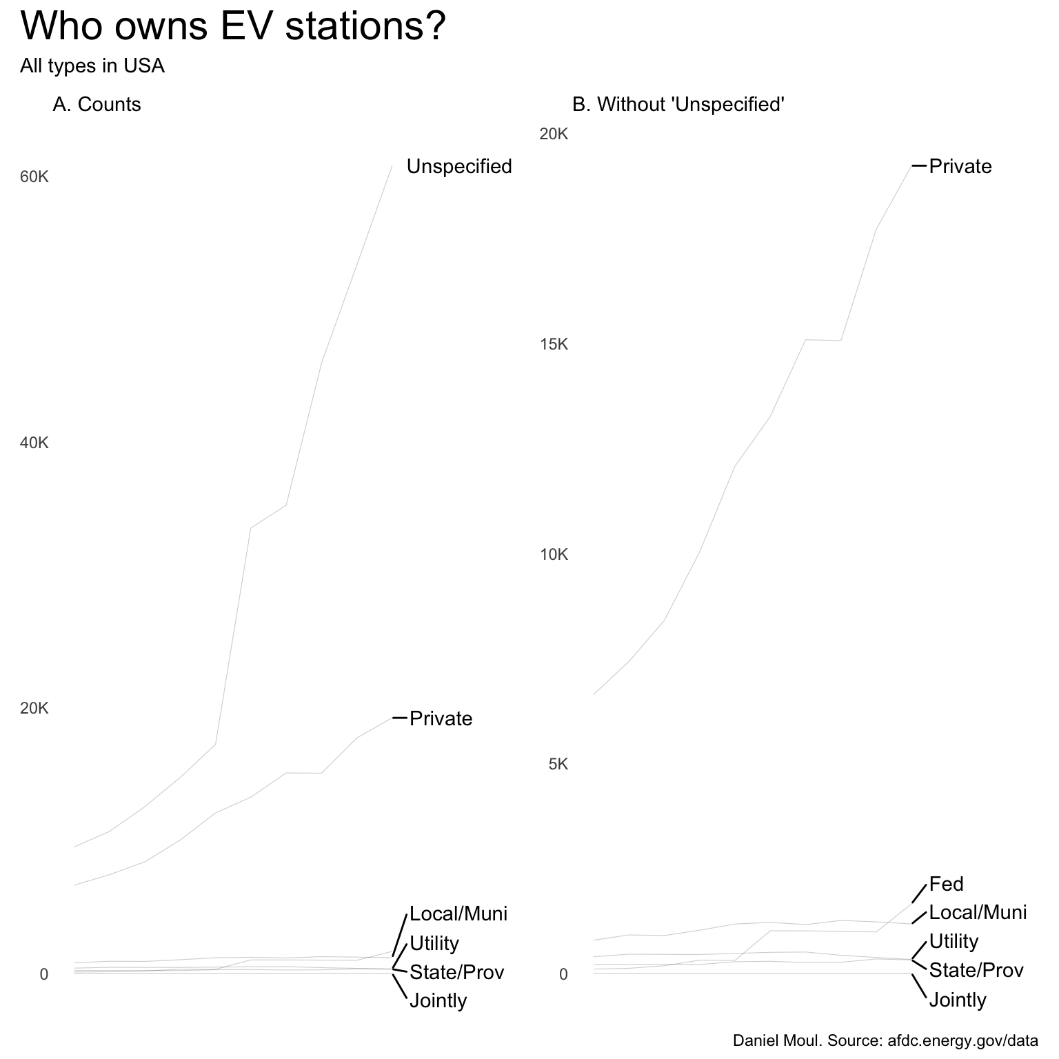
There are so many ownertype values unspecified that we can’t make any meaningful inferences. I have a hunch that most of the unspecified are either privately owned or “Non-Network”.
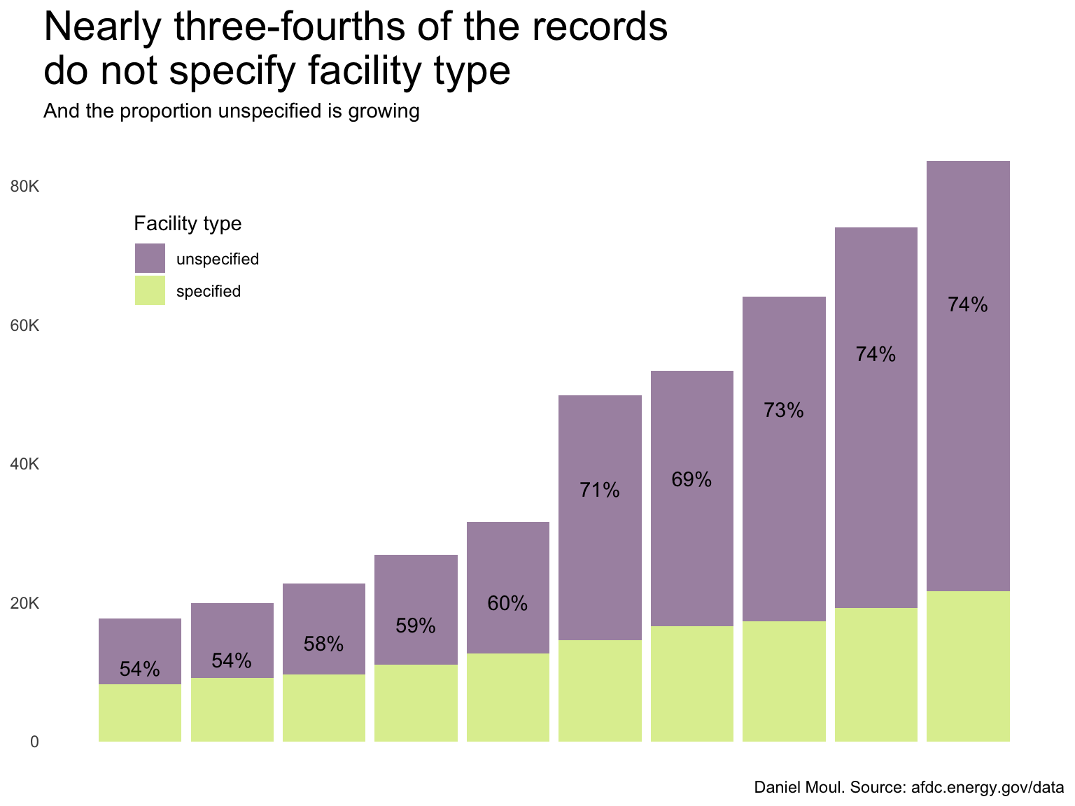
Figure 3.2: Nearly three-fourths of the records do not specify facility type
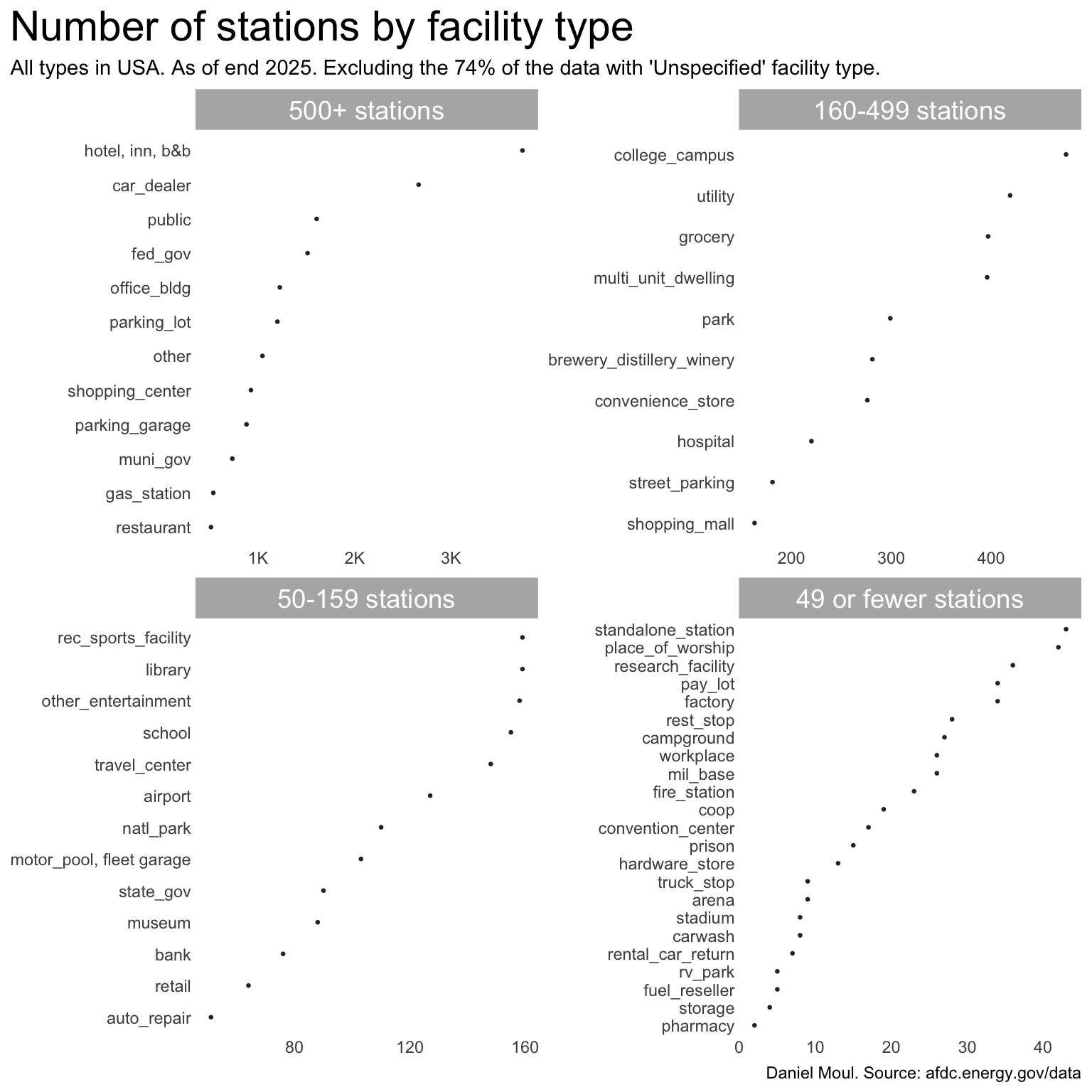
Nonetheless, it’s interesting to see the facility types that are included in the data set. Figure 3.3 shows this by station, and Figure 3.4 shows it by number of chargers.
Show the code
dta_for_plot <- dta |>filter(yr ==2025) |>filter(!is.na(facility_type)) |>count(yr, facility_type, name ="n_stations", sort =TRUE) |>mutate(facility_type =str_to_lower(facility_type),pct_of_facilities = n_stations /sum(n_stations),pct_label =percent(pct_of_facilities, accuracy = .01),facility_type =fct_reorder(facility_type, n_stations),cum_sum_stations =cumsum(n_stations),my_facet =case_when( n_stations >500~"500+ stations",between(n_stations, 160, 499) ~"160-499 stations",between(n_stations, 50, 159) ~"50-159 stations", n_stations <50~"49 or fewer stations" ),my_facet =factor( my_facet, levels =c("500+ stations","160-499 stations","50-159 stations","49 or fewer stations") ) )dta_for_plot |>ggplot(aes(n_stations, facility_type)) +geom_point(size =0.5,alpha =0.8) +scale_x_continuous(labels =label_number(scale_cut =cut_short_scale())) +facet_wrap( ~ my_facet, nrow =2, scales ="free") +theme(plot.title.position ="plot") +labs(title ="Number of stations by facility type",subtitle ="All types in USA. As of end 2025. Excluding the 74% of the data with 'Unspecified' facility type.",x =NULL,y =NULL,caption = my_caption )
Figure 3.3: Number of stations by facility type (where this information is available)
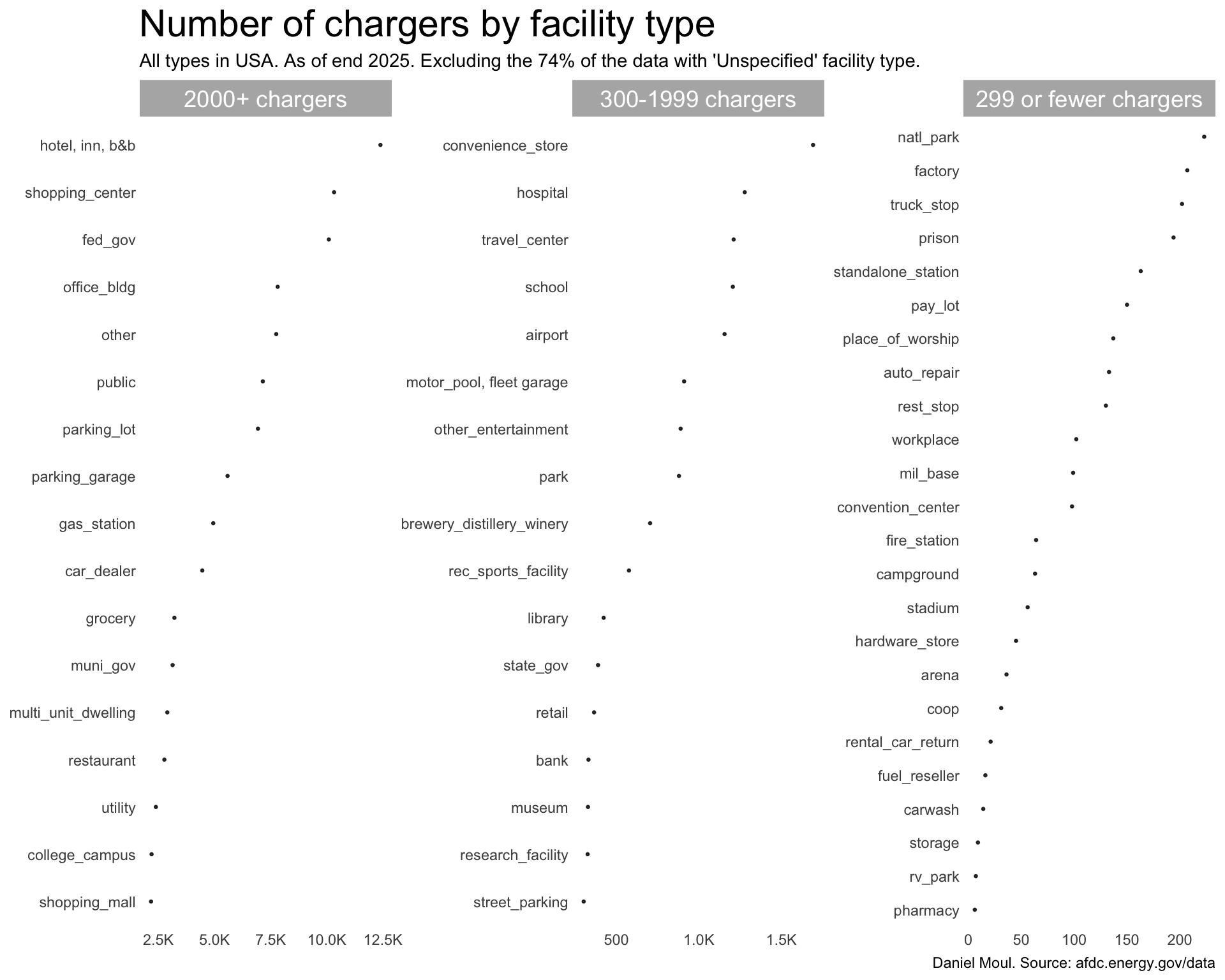
Similarly for chargers:
Show the code
dta_for_plot <- dta |>filter(yr ==2025) |>filter(!is.na(facility_type)) |>count(yr, facility_type, wt = n_chargers,name ="n_chargers", sort =TRUE) |>mutate(facility_type =str_to_lower(facility_type),pct_of_chargers = n_chargers /sum(n_chargers),pct_label =percent(pct_of_chargers, accuracy = .01),facility_type =fct_reorder(facility_type, n_chargers),cum_sum_chargers =cumsum(n_chargers),my_facet =case_when( n_chargers >2000~"2000+ chargers",between(n_chargers, 300, 1999) ~"300-1999 chargers", n_chargers <300~"299 or fewer chargers" ),my_facet =factor( my_facet,levels =c("2000+ chargers","300-1999 chargers","299 or fewer chargers") ) )dta_for_plot |>ggplot(aes(n_chargers, facility_type)) +geom_point(size =0.5,alpha =0.8) +scale_x_continuous(labels =label_number(scale_cut =cut_short_scale())) +facet_wrap( ~ my_facet, nrow =1, scales ="free") +labs(title ="Number of chargers by facility type",subtitle ="All types in USA. As of end 2025. Excluding the 74% of the data with 'Unspecified' facility type.",x =NULL,y =NULL,caption = my_caption )
Figure 3.4: Number of chargers by facility type (where this information is available)
3.2 Private and public acccess to charging stations
Show the code
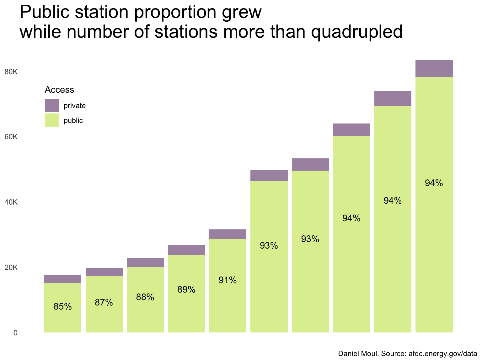
dta_for_plot <- dta |>filter(!is.na(access_code)) |>count(yr, access_code, sort =TRUE) |>mutate(pct = n /sum(n),.by = yr)dta_for_plot |>ggplot(aes(yr, n, fill = access_code)) +geom_col(alpha =0.5) +geom_text(aes(x = yr,y =if_else(access_code =="public", n *0.6,NA),label =percent(pct, accuracy =1)),vjust =1,na.rm =TRUE) +scale_x_discrete(labels = year_labels) +scale_y_continuous(labels =label_number(scale_cut =cut_short_scale())) +scale_fill_viridis_d(end =0.9) +guides(fill =guide_legend(position ="inside")) +theme(legend.position.inside =c(0.1, 0.8)) +labs(title =glue("Public station proportion grew", "\nwhile number of stations more than quadrupled"),x =NULL,y =NULL,caption = my_caption,fill ="Access" )
Figure 3.5: Public station proportion has been consistent since 2021 while number of stations more than doubled
Show the code
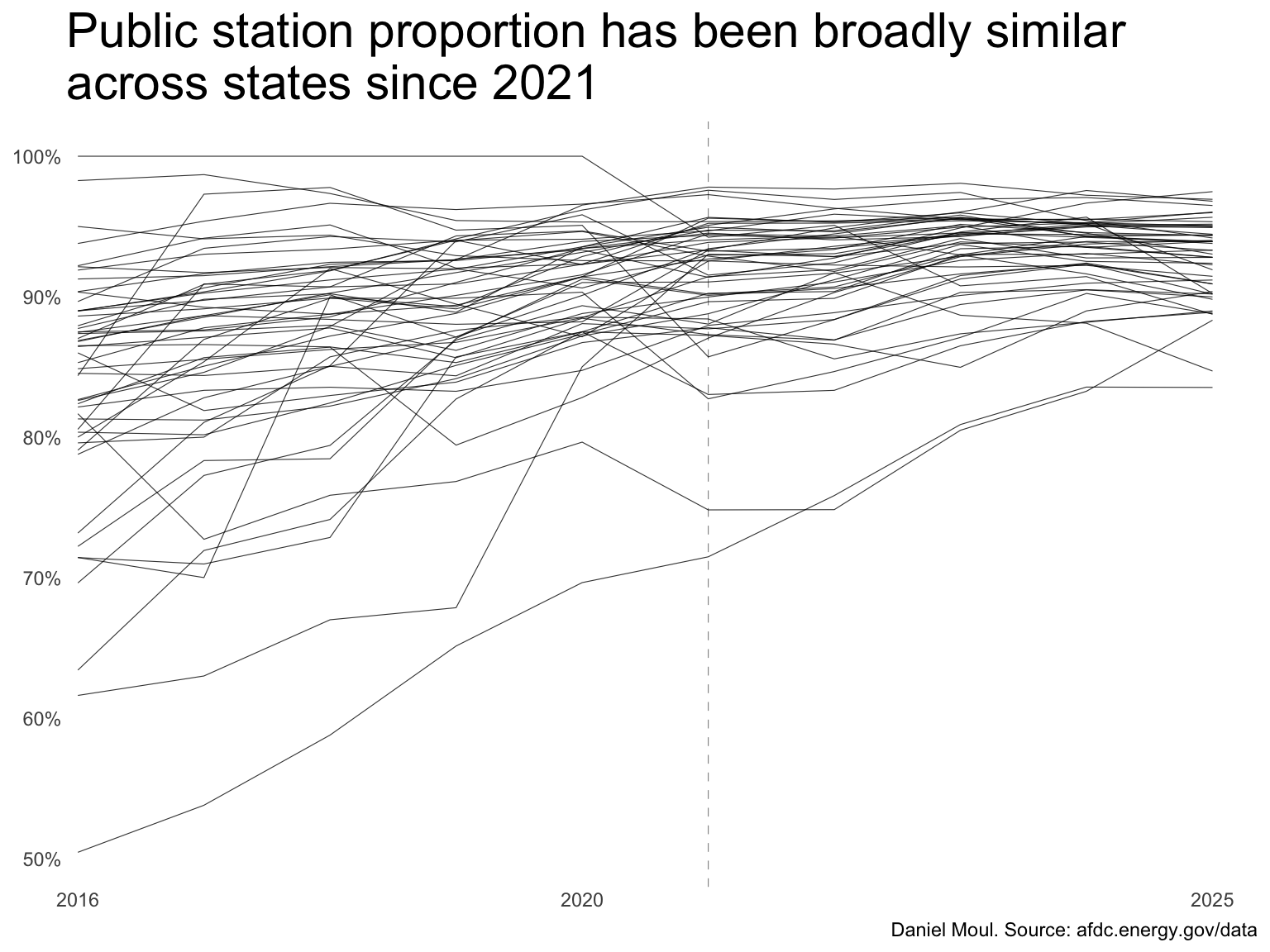
dta_for_plot <- dta |>count(yr, state, access_code, sort =TRUE) |>mutate(pct = n /sum(n),.by =c(yr, state) )dta_for_plot |>filter(access_code =="public") |>ggplot(aes(yr, pct, group = state)) +geom_vline(xintercept =2021,lty =2,linewidth =0.2,alpha =0.5) +geom_line(linewidth =0.2,alpha =0.8, ) +scale_x_continuous(labels = year_labels,breaks = year_labels,expand =expansion(mult =c(0.01, 0.04)) ) +scale_y_continuous(labels =label_percent()) +theme(legend.position.inside =c(0.1, 0.8)) +labs(title =glue("Public station proportion has been broadly similar","\nacross states since 2021"),x =NULL,y =NULL,caption = my_caption,fill ="Access" )
Figure 3.6: Public station proportion has been broadly similar across states since 2021
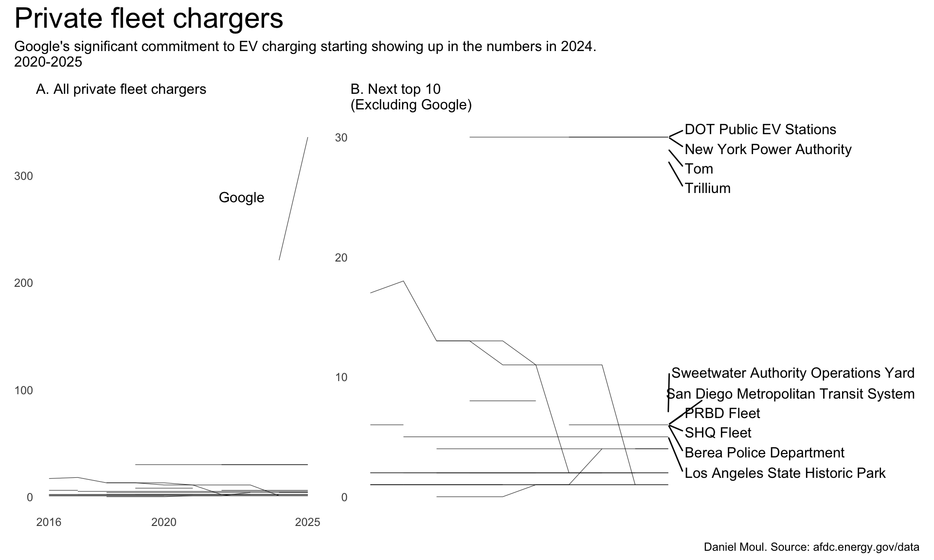
3.3 Fleet EV charging stations
Some governmental and private organizations transitioned some or all of their vehicle fleet to electric vehicles, in which case it’s economic to install chargers for their fleet. Typically they are not available to the public.
Let’s start with the privately owned stations with “fleet” mentioned in access_days_time.