Show the code
knitr::include_graphics(here("images/tree-national-charging-network.jpg"))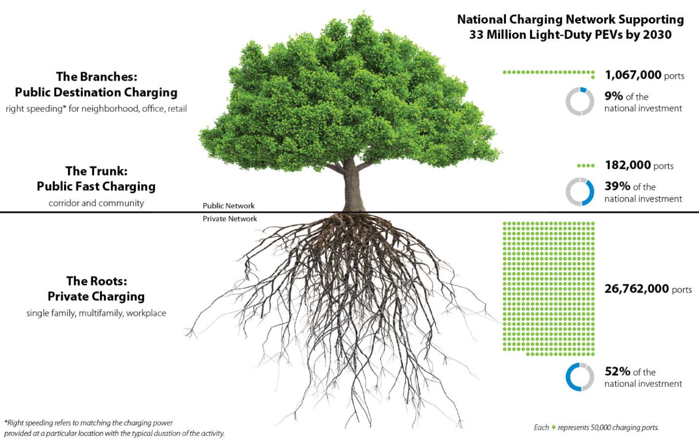
The Electrical Safety Foundation International reported in 2023 that 86% of EV owners in the USA have at-home chargers.1 Considering there were more than 7M EVs purchased in the USA 2015-2025Q3 with more than half occurring in 2022-20252, there could be at least 6M at-home chargers in 2025.3
Eric Wood et al. projected in a 2023 study:
… a national network in 2030 could be composed of 26–35 million ports to support 30–42 million PEVs. For a mid-adoption scenario of 33 million PEVs, a national network of 28 million ports could consist of:
26.8 million privately accessible Level 1 and Level 2 charging ports located at single-family homes, multifamily properties, and workplaces
182,000 publicly accessible fast charging ports along highway corridors and in local communities
1 million publicly accessible Level 2 charging ports primarily located near homes and workplaces (including in high-density neighborhoods, at office buildings, and at retail outlets).4
which would result in 96% private chargers (Figure 5.1) with most being at home.
It’s likely that these 2030 estimates are now too optimistic given the US government’s active hostility in 2025 to electrification of vehicles and non-petroleum energy in general.
knitr::include_graphics(here("images/tree-national-charging-network.jpg"))In February 2026 the most recent EV state registration data at the Alternative Fuels Data Center is from the end of 2023. I combined with 2020 Census data to calculate people per registered EV (Figure 5.2) and seen no obvious patterns in this relationship other than to note that states with populations over 10 million all have ratios in the lowest quarter. But then many smaller states have similar ratios too.
state_ev_registrations_2023 |>
  ggplot(aes(pop, people_per_ev_reg)) +
  geom_point() +
  scale_x_log10(label = label_number(scale_cut = cut_short_scale())) +
  labs(
    title = "People per registered EV by state population",
    subtitle = "PEV registration data at YE2023, Population data US Census 2020.",
    x = "State Population",
    y = "People per registered EV",
    caption = my_caption_2030_wood
  )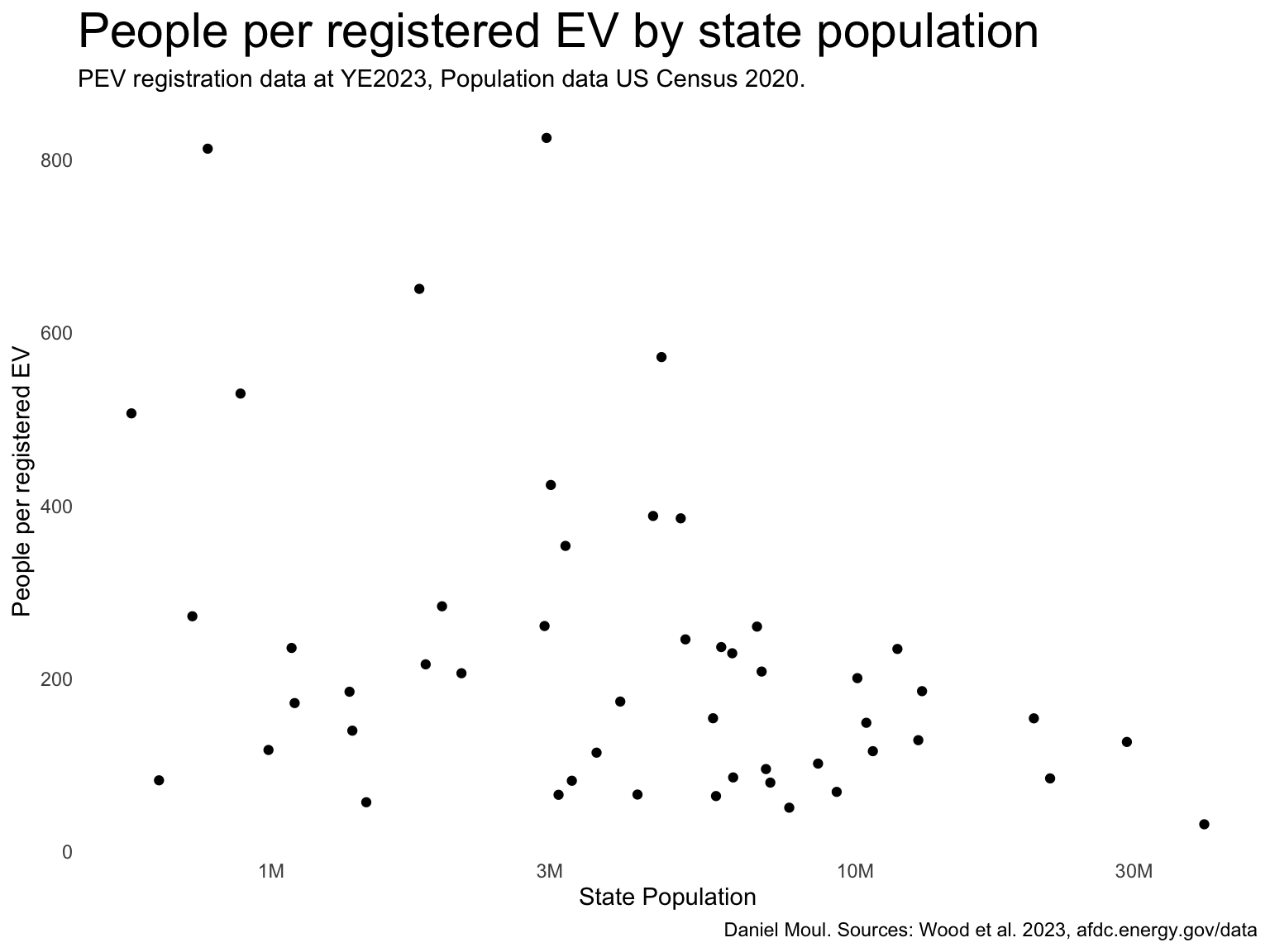
The best and worst ratios are surprising (Table 5.1):
state_ev_registrations_2023 |>
  mutate(rank = rank(people_per_ev_reg)) |>
  filter(between(rank, 1, 10) | between(rank, 41, 50)) |>
  arrange(rank) |>
  select(rank, state_abb, people_per_ev_reg, registration_count, pop) |>
  gt() |>
  tab_options(table.font.size = 11) |>
  tab_header(md(glue("**States with best and worst people per registered ev ratio**",
                     "<br>*Lower is better*"))) |>
  tab_source_note(md(glue("*Daniel Moul. Sources: Wood et al. 2023, US Decennial 2020 Census.*"))) |>
  fmt_number(columns = people_per_ev_reg,
             decimals = 1) |>
  fmt_number(columns = c(registration_count, pop),
decimals = 0)| States with best and worst people per registered ev ratio Lower is better |
||||
|---|---|---|---|---|
| rank | state_abb | people_per_ev_reg | registration_count | pop |
| 1 | CA | 31.5 | 1,256,646 | 39,538,223 |
| 2 | WA | 50.7 | 152,101 | 7,705,281 |
| 3 | HI | 56.9 | 25,565 | 1,455,271 |
| 4 | CO | 64.1 | 90,083 | 5,773,714 |
| 5 | NV | 65.6 | 47,361 | 3,104,614 |
| 6 | OR | 65.8 | 64,361 | 4,237,256 |
| 7 | NJ | 68.9 | 134,753 | 9,288,994 |
| 8 | AZ | 79.6 | 89,798 | 7,151,502 |
| 9 | UT | 81.8 | 39,998 | 3,271,616 |
| 10 | VT | 82.3 | 7,816 | 643,077 |
| 41 | IA | 353.3 | 9,031 | 3,190,369 |
| 42 | AL | 385.1 | 13,047 | 5,024,279 |
| 43 | KY | 387.9 | 11,617 | 4,505,836 |
| 44 | AR | 423.7 | 7,108 | 3,011,524 |
| 45 | WY | 506.5 | 1,139 | 576,851 |
| 46 | SD | 529.4 | 1,675 | 886,667 |
| 47 | LA | 571.5 | 8,150 | 4,657,757 |
| 48 | WV | 650.4 | 2,758 | 1,793,716 |
| 49 | ND | 812.4 | 959 | 779,094 |
| 50 | MS | 824.9 | 3,590 | 2,961,279 |
| Daniel Moul. Sources: Wood et al. 2023, US Decennial 2020 Census. | ||||
home_ev_charging_baseline <- home_ev_charging_all |>
  filter(home_access_scenario == "baseline") # average of low and high scenarios

home_ev_nc <- home_ev_charging_baseline |>
  filter(state == "NC")

###### Wood et al.
sim_2030_private <-
  read_delim(
    here("data/raw/2030-private-network-sim.csv"),
    skip = 2,
    delim = " ",
    col_names = c("State", "PEVs", "Single Family", "Multifamily", "Workplace", "Total"),
    show_col_types = FALSE
    ) |>
  clean_names() %>%
  set_names(str_replace_all(names(.), "_", "")) |>
  filter(!state %in% c("DC", "PR"))

sim_2030_public_l2 <-
  read_delim(
    here("data/raw/2030-public-l2-network-sim.csv"),
    skip = 1,
    delim = " ",
    show_col_types = FALSE
    ) |>
  clean_names() %>%
  set_names(str_replace_all(names(.), "_", "")) |>
  filter(!state %in% c("DC", "PR"))

sim_2030_public_dc <-
  read_delim(
    here("data/raw/2030-public-dc-network-sim.csv"),
    skip = 1,
    delim = " ",
    show_col_types = FALSE
    ) |>
  clean_names() %>%
  set_names(str_replace_all(names(.), "_", "")) |>
  rename(dc350plus = dc350) |>
filter(!state %in% c("DC", "PR")) Single family, multi-family, and non-public workplace charging counts are included in “private charging”.
I note the following regarding Figure 5.3 panel A:
pct_workplace), Florida is a notable outlier. While having a larger number of PEVs, there are relatively few workplace chargers. Perhaps this is due to the high proportion of retirees in the state.The study projects that the great majority of private chargers will be single family charging (panel B).
dta_for_plot <- sim_2030_private |>
  # select(-total) |>
  left_join(
    state_pop_2020 |>
      select(state, pop2020 = pop),
    by = join_by(state)
  ) |>
  mutate(
    pct_singlefamily = singlefamily / total,
    pct_multifamily = multifamily / total,
    pct_workplace = workplace / total
  ) |>
  mutate(state = fct_reorder(state, pct_singlefamily))

dta_for_plot_long <- dta_for_plot |>
  pivot_longer(
    cols = starts_with("pct_"),
    names_to = "metric",
    values_to = "proportion"
  ) |>
  mutate(metric = factor(metric, levels = c("pct_singlefamily", "pct_multifamily", "pct_workplace")))

p1 <- dta_for_plot_long |>
  ggplot(aes(proportion, state, color = metric, group = metric)) +
  geom_point(
    size = 0.75,
    alpha = 0.4) +
  geom_smooth(
    method = 'loess',
    formula = 'y ~ x',
    span = 0.95) +
  scale_x_continuous(labels = label_percent()) +
  scale_color_viridis_d(end = 0.8) +
  guides(color = "none") +
  coord_cartesian(ylim = c(1, 50)) +
  facet_wrap( ~ metric, scales = "free_x") +
  labs(
    subtitle = glue("A. Percent of each component of private charging"),
    y = NULL
  )

p2 <- dta_for_plot_long |>
  mutate(metric = fct_rev(metric)) |>
  ggplot(aes(proportion, state, fill = metric)) +
  geom_col(
    alpha = 0.4,
    color = NA) +
  scale_x_continuous(labels = label_percent()) +
  # scale_color_viridis_d(end = 0.8) +
  scale_fill_viridis_d(end = 0.8,
                       direction = -1) +
  guides(fill = guide_legend(position = "inside",
                             reverse = TRUE)) +
  theme(legend.position.inside = c(0.4, 0.85)) +
  labs(
    subtitle = glue("B. Mostly single family chargers"),
    y = NULL,
    fill = NULL
  )

my_layout <-
c("
AAAB")

p1 + p2 +
  plot_annotation(
    title = "Predicted private chargers in US states in 2030",
    subtitle = "States ordered by pct_singlefamily. Population from 2020 decennial census",
    caption = my_caption_2030_wood
  ) +
  plot_layout(design = my_layout)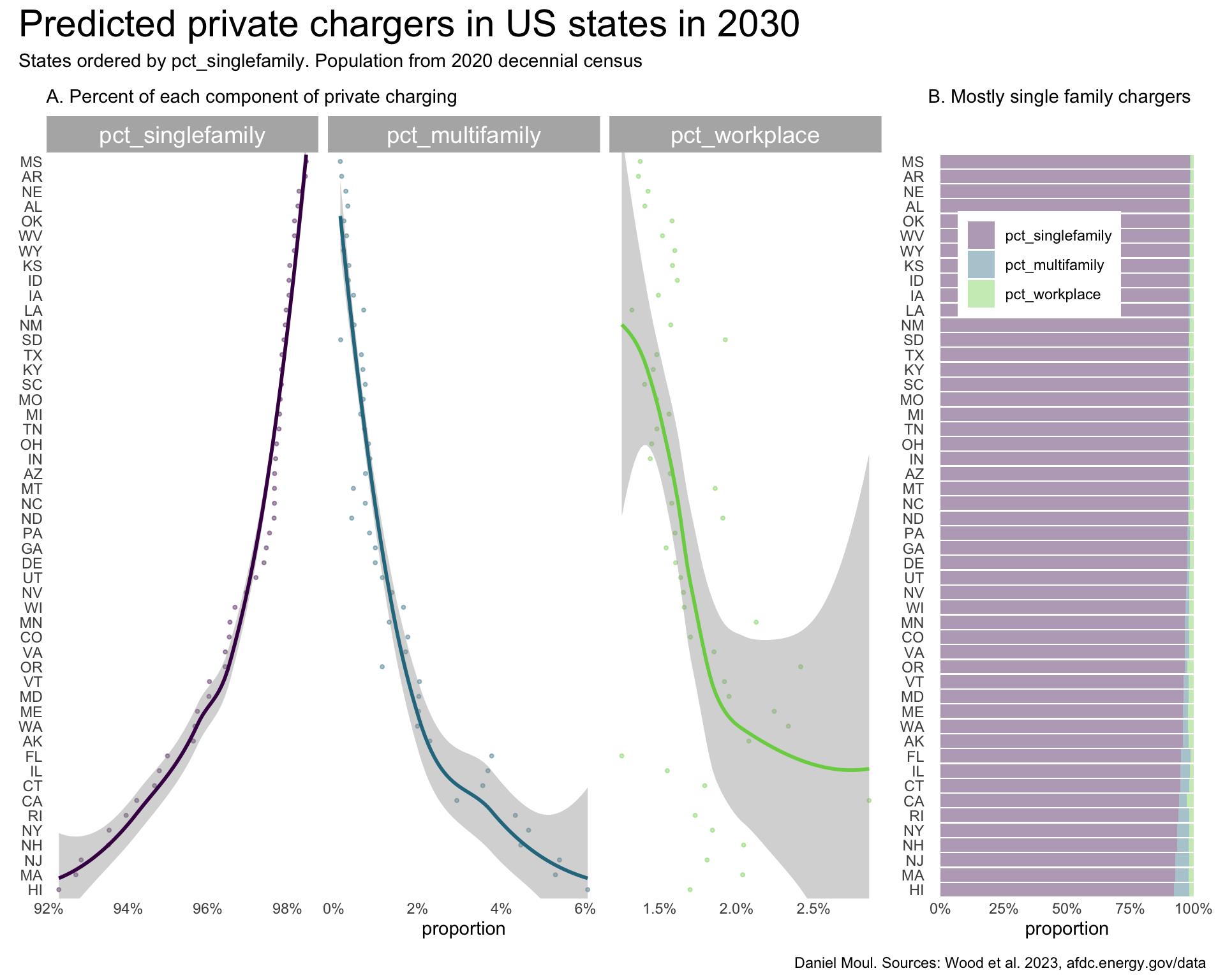
There is a surprisingly linear pattern (on the log-log scale) in number of private chargers by state population (Figure 5.3 panel A). Thus in panel B when states are ordered by people_per_charger and people_per_pev, the curves are similar.
The proportions of private chargers by population range from about 7 to over 20. Louisiana and Mississippi are outliers with the least density of private EV chargers.
dta_for_plot <- sim_2030_private |>
  select(state, pevs, total) |>
  left_join(
    state_pop_2020 |>
      select(state, pop2020 = pop),
    by = join_by(state)
  ) |>
  mutate(
    people_per_pev = pop2020 / pevs,
    people_per_charger = pop2020 / total,
    pevs_per_charger = pevs / total,
    chargers_per_pev = total / pevs
  )

p1 <- dta_for_plot |>
  ggplot(aes(pop2020, total)) +
  geom_point(
    color = "firebrick",
    fill = "firebrick",
    size = 0.75,
    alpha = 0.4) +
  geom_smooth(
    method = 'loess',
    formula = 'y ~ x') +
  scale_x_log10(labels = label_number(scale_cut = cut_short_scale())) +
  scale_y_log10(labels = label_number(scale_cut = cut_short_scale())) +
  guides(color = "none") +
  labs(
    subtitle = glue("A. Chargers by state population"),
    x = "State population (log10 scale)",
    y = "Number of private chargers (log10 scale)"
  )

p2 <- dta_for_plot |>
  select(state, pop2020, people_per_pev, people_per_charger, pevs_per_charger) |>
  mutate(state = fct_reorder(state, people_per_pev)) |>
  pivot_longer(cols = c(people_per_pev, people_per_charger, pevs_per_charger),
               names_to = "metric",
               values_to = "value") |>
  mutate(metric = factor(metric, levels = c("people_per_pev", "people_per_charger", "pevs_per_charger"))) |>
  ggplot(aes(value, state, color = metric, group = metric)) +
  geom_point(
    size = 0.75,
    alpha = 0.4) +
  geom_smooth(
    method = 'loess',
    formula = 'y ~ x') +
  facet_wrap( ~ metric, scales = "free_x") +
  scale_color_viridis_d(end = 0.8) +
  guides(color = "none") +
  coord_cartesian(ylim = c(1, 51)) +
  labs(
    subtitle = glue("B. Ratios"),
    x = "Ratio",
    y = NULL
  )

my_layout <-
c("
ABBB")

p1 + p2 +
  plot_annotation(
    title = "Predicted private chargers in US states in 2030",
    subtitle = "Population from 2020 decennial census",
    caption = my_caption_2030_wood
  ) +
  plot_layout(design = my_layout)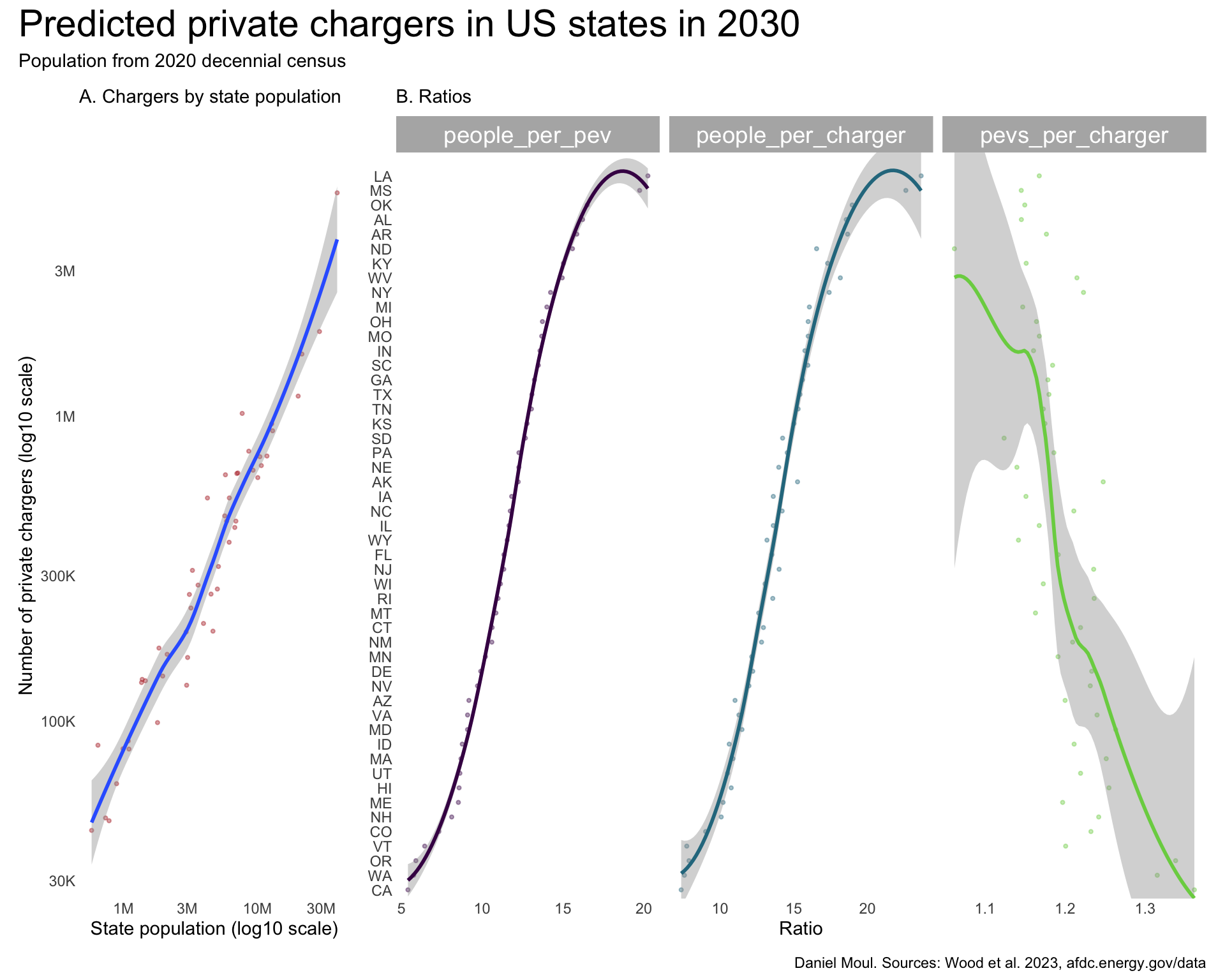
In Figure 5.5 Panels A and B I see the relationships between PEVs and population and chargers and populations are strong \(R^2 > 0.8\). But the relationship between PEVs and chargers is remarkably strong \(R^2 > 0.99\). The fact that it’s this strong suggests that investors are using the same formula to decide how many chargers to install (perhaps using the same tools from NREL).
dta_for_plot <- sim_2030_private |>
  select(state, pevs, total) |>
  left_join(
    state_pop_2020 |>
      select(state, pop2020 = pop),
    by = join_by(state)
  )

dta_for_model <- dta_for_plot |>
  mutate(pevs_scaled = scale(pevs, center = FALSE),
         pop2020_scaled = scale(pop2020, center = FALSE),
         total_scaled = scale(total, center = FALSE),
         pev_k = round(pevs / 1000),
         pop2020_k = round(pop2020 / 1000),
         total_k = round(total / 1000)
         )

mod1 <- dta_for_model |>
  lm(pev_k ~ pop2020_k,
     data = _)
mod1_r2 <- summary(mod1)$r.squared
# or use glance(mod2)$r.squared

mod2 <- dta_for_model |>
  lm(total_k ~ pop2020_k,
     data = _)
mod2_r2 <- summary(mod2)$r.squared

mod3 <- dta_for_model |>
  lm(total_k ~ pev_k,
     data = _)
mod3_r2 <- summary(mod3)$r.squared

p1 <- dta_for_plot |>
  ggplot(aes(pop2020, pevs)) +
  geom_point(
    color = "firebrick",
    fill = "firebrick",
    size = 0.75,
    alpha = 0.4) +
  geom_smooth(
    method = 'loess',
    formula = 'y ~ x') +
  scale_x_log10(labels = label_number(scale_cut = cut_short_scale())) +
  scale_y_log10(labels = label_number(scale_cut = cut_short_scale())) +
  guides(color = "none") +
  labs(
    subtitle = glue("A. PEVs by state population\nR2 = {round(mod1_r2, digits = 3)}"),
    x = "State population (log10 scale)",
    y = "Number of PEVs (log10 scale)"
  )

p2 <- dta_for_plot |>
  ggplot(aes(pop2020, total)) +
  geom_point(
    color = "firebrick",
    fill = "firebrick",
    size = 0.75,
    alpha = 0.4) +
  geom_smooth(
    method = 'loess',
    formula = 'y ~ x') +
  scale_x_log10(labels = label_number(scale_cut = cut_short_scale())) +
  scale_y_log10(labels = label_number(scale_cut = cut_short_scale())) +
  guides(color = "none") +
  labs(
    subtitle = glue("B. Chargers by state population\nR2 = {round(mod2_r2, digits = 3)}"),
    x = "State population (log10 scale)",
    y = "Number of private chargers (log10 scale)"
  )

p3 <- dta_for_plot |>
  ggplot(aes(pevs, total)) +
  geom_point(
    color = "firebrick",
    fill = "firebrick",
    size = 0.75,
    alpha = 0.4) +
  geom_smooth(
    method = 'loess',
    formula = 'y ~ x') +
  scale_x_log10(labels = label_number(scale_cut = cut_short_scale())) +
  scale_y_log10(labels = label_number(scale_cut = cut_short_scale())) +
  guides(color = "none") +
  labs(
    subtitle = glue("C. Chargers by PEVs\nR2 = {round(mod3_r2, digits = 3)}"),
    x = "Number of PEVs (log10 scale)",
    y = "Number of chargers (log10 scale)"
  )

my_layout <- c("ABC")

p1 + p2 + p3 +
  plot_annotation(
    title = "Ratios related to private chargers in US states in 2030",
    subtitle = "Population from 2020 decennial census",
    caption = my_caption_2030_wood
  ) +
  plot_layout(design = my_layout)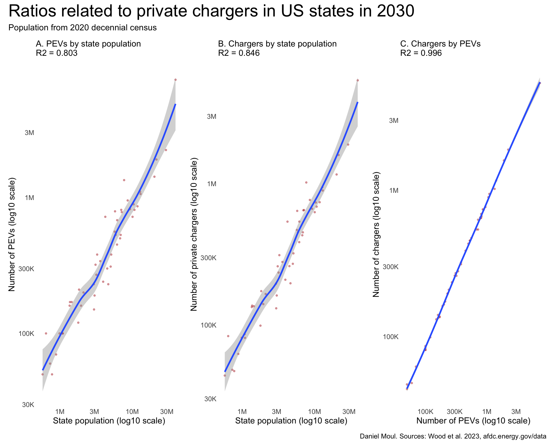
Using pct_neighborhood to sort the data in Figure 5.6, I note the following:
pct_neighborhood and pct_office except for some outliers in the Midwest (Nebraska, Kansas, South Dakota, North Dakota).pct_retail and pct_neighborhood or pct_office.pct_other is higher than any of the other data columns, limiting the conclusions we can draw form the relationships noted above.dta_for_plot <- sim_2030_public_l2 |>
left_join(
state_pop_2020 |>
select(state, pop2020 = pop),
by = join_by(state)
) |>
mutate(
pct_neighborhood = neighborhood / total,
pct_office = office / total,
pct_retail = retail / total,
pct_other = other / total
) |>
mutate(state = fct_reorder(state, pct_neighborhood))
dta_for_plot_long <- dta_for_plot |>
pivot_longer(
cols = starts_with("pct_"),
names_to = "metric",
values_to = "proportion"
) |>
mutate(metric = factor(metric, levels = c("pct_neighborhood", "pct_office", "pct_retail", "pct_other")))
p1 <- dta_for_plot_long |>
ggplot(aes(proportion, state, color = metric, group = metric)) +
geom_point(
size = 0.75,
alpha = 0.4) +
geom_smooth(
method = 'loess',
formula = 'y ~ x',
span = 0.95) +
scale_x_continuous(labels = label_percent()) +
scale_color_viridis_d(end = 0.8) +
guides(color = "none") +
coord_cartesian(ylim = c(1, 50)) +
facet_wrap( ~ metric, scales = "free_x", nrow = 1) +
labs(
subtitle = glue("A. Proportions in neighborhood, office, retail, other"),
y = NULL
)
p2 <- dta_for_plot_long |>
mutate(metric = fct_rev(metric)) |>
ggplot(aes(proportion, state, fill = metric)) +
geom_col(
alpha = 0.4,
color = NA) +
scale_x_continuous(labels = label_percent()) +
# scale_color_viridis_d(end = 0.8) +
scale_fill_viridis_d(end = 0.8,
direction = -1) +
guides(fill = guide_legend(position = "inside",
reverse = TRUE)) +
theme(legend.position.inside = c(0.4, 0.85)) +
labs(
subtitle = glue("B. Same data as (A) in bar chart"),
y = NULL,
fill = NULL
)
my_layout <-
c("
AAAB
AAAB")
p1 + p2 +
plot_annotation(
title = "Predicted public L2 chargers in US states in 2030",
subtitle = "State ranking by percent of chargers in neighborhoods. Population from 2020 decennial census",
caption = my_caption_2030_wood
) +
plot_layout(design = my_layout)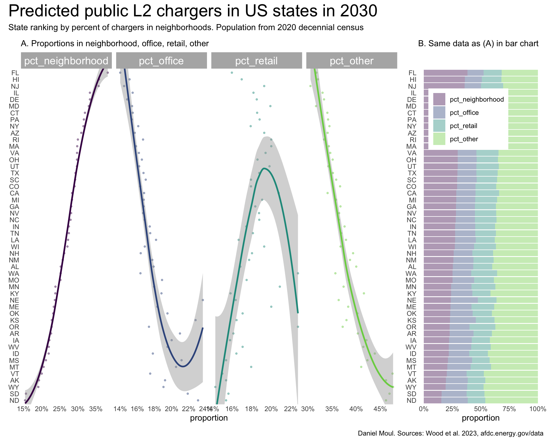
The shapes of the plots for public L2 chargers (Figure 5.7) are surprisingly similar to the private chargers (Figure 5.4) with the exception of pevs_per_charger.
dta_for_plot <- sim_2030_public_l2 |>
  select(state, pevs, total) |>
  left_join(
    state_pop_2020 |>
      select(state, pop2020 = pop),
    by = join_by(state)
  ) |>
  mutate(
    people_per_pev = pop2020 / pevs,
    people_per_charger = pop2020 / total,
    pevs_per_charger = pevs / total,
    chargers_per_pev = total / pevs,
    state = fct_reorder(state, people_per_charger)
  )

min_y = min(dta_for_plot$total)
max_y = max(dta_for_plot$total)

p1 <- dta_for_plot |>
  ggplot(aes(pop2020, total)) +
  geom_point(
    color = "firebrick",
    fill = "firebrick",
    size = 0.75,
    alpha = 0.4) +
  geom_smooth(
    method = 'loess',
    formula = 'y ~ x') +
  scale_x_log10(labels = label_number(scale_cut = cut_short_scale())) +
  scale_y_log10(labels = label_number(scale_cut = cut_short_scale())) +
  guides(color = "none") +
  coord_cartesian(ylim = c(min_y + 1, max_y + 1)) +
  labs(
    subtitle = glue("A. L2 chargers by state population"),
    x = "State population (log10 scale)",
    y = "Number of public L2 chargers (log10 scale)"
  )

p2 <- dta_for_plot |>
  select(state, pop2020, people_per_pev, people_per_charger, pevs_per_charger) |>
  mutate(state = fct_reorder(state, people_per_pev)) |>
  pivot_longer(cols = c(people_per_pev, people_per_charger, pevs_per_charger),
               names_to = "metric",
               values_to = "value") |>
  mutate(metric = factor(metric, levels = c("people_per_pev", "people_per_charger", "pevs_per_charger"))) |>
  ggplot(aes(value, state, color = metric, group = metric)) +
  geom_point(
    size = 0.75,
    alpha = 0.4) +
  geom_smooth(
    method = 'loess',
    formula = 'y ~ x') +
  facet_wrap( ~ metric, scales = "free_x") +
  scale_color_viridis_d(end = 0.8) +
  guides(color = "none") +
  coord_cartesian(ylim = c(1, 51)) +
  labs(
    subtitle = glue("B. Ratios"),
    y = NULL
  )

my_layout <-
c("
ABBB")

p1 + p2 +
  plot_annotation(
    title = "Predicted public L2 chargers in US states in 2030",
    subtitle = "State ranking by people per PEV. Population from 2020 decennial census",
    caption = my_caption_2030_wood
  ) +
  plot_layout(design = my_layout)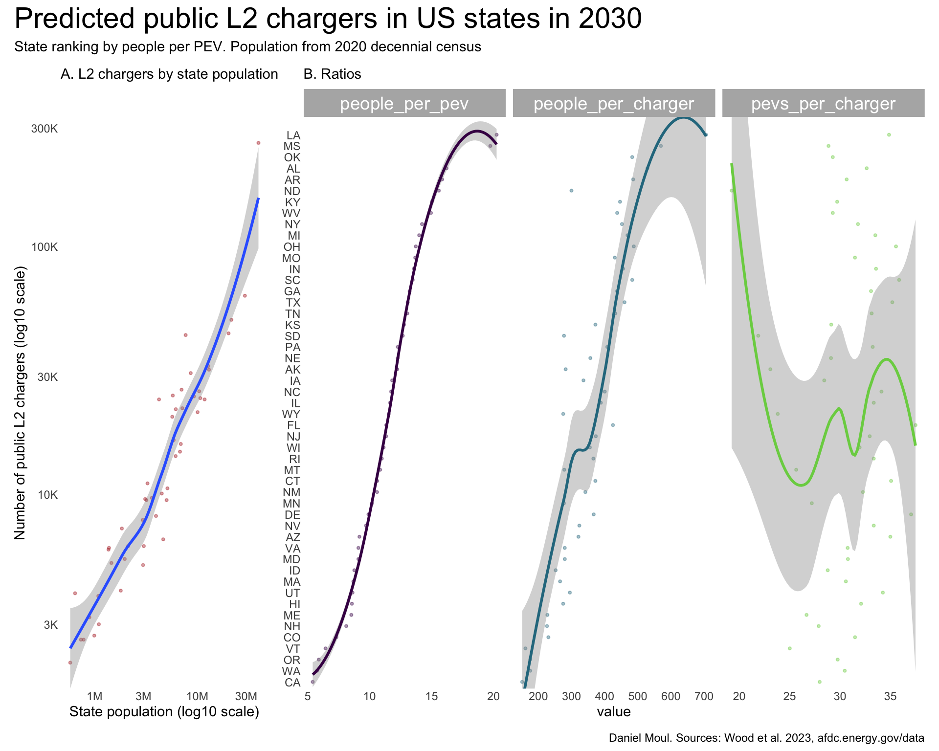
Comparing public L2 chargers (Figure 5.8) and private chargers (Figure 5.5):
dta_for_plot <- sim_2030_public_l2 |>
  select(state, pevs, total) |>
  left_join(
    state_pop_2020 |>
      select(state, pop2020 = pop),
    by = join_by(state)
  )

dta_for_model <- dta_for_plot |>
  mutate(pevs_scaled = scale(pevs, center = FALSE),
         pop2020_scaled = scale(pop2020, center = FALSE),
         total_scaled = scale(total, center = FALSE),
         pev_k = round(pevs / 1000),
         pop2020_k = round(pop2020 / 1000),
         total_k = round(total / 1000)
         )

mod1 <- dta_for_model |>
  lm(pev_k ~ pop2020_k,
     data = _)
mod1_r2 <- summary(mod1)$r.squared
# or use glance(mod2)$r.squared

mod2 <- dta_for_model |>
  lm(total_k ~ pop2020_k,
     data = _)
mod2_r2 <- summary(mod2)$r.squared

mod3 <- dta_for_model |>
  lm(total_k ~ pev_k,
     data = _)
mod3_r2 <- summary(mod3)$r.squared

p1 <- dta_for_plot |>
  ggplot(aes(pop2020, pevs)) +
  geom_point(
    color = "firebrick",
    fill = "firebrick",
    size = 0.75,
    alpha = 0.4) +
  geom_smooth(
    method = 'loess',
    formula = 'y ~ x') +
  scale_x_log10(labels = label_number(scale_cut = cut_short_scale())) +
  scale_y_log10(labels = label_number(scale_cut = cut_short_scale())) +
  guides(color = "none") +
  labs(
    subtitle = glue("A. PEVs by state population\nR2 = {round(mod1_r2, digits = 3)}"),
    x = "State population (log10 scale)",
    y = "Number of PEVs (log10 scale)"
  )

p2 <- dta_for_plot |>
  ggplot(aes(pop2020, total)) +
  geom_point(
    color = "firebrick",
    fill = "firebrick",
    size = 0.75,
    alpha = 0.4) +
  geom_smooth(
    method = 'loess',
    formula = 'y ~ x') +
  scale_x_log10(labels = label_number(scale_cut = cut_short_scale())) +
  scale_y_log10(labels = label_number(scale_cut = cut_short_scale())) +
  guides(color = "none") +
  labs(
    subtitle = glue("B. Chargers by state population\nR2 = {round(mod2_r2, digits = 3)}"),
    x = "State population (log10 scale)",
    y = "Number of private chargers (log10 scale)"
  )

p3 <- dta_for_plot |>
  ggplot(aes(pevs, total)) +
  geom_point(
    color = "firebrick",
    fill = "firebrick",
    size = 0.75,
    alpha = 0.4) +
  geom_smooth(
    method = 'loess',
    formula = 'y ~ x') +
  scale_x_log10(labels = label_number(scale_cut = cut_short_scale())) +
  scale_y_log10(labels = label_number(scale_cut = cut_short_scale())) +
  guides(color = "none") +
  labs(
    subtitle = glue("C. Chargers by PEVs\nR2 = {round(mod3_r2, digits = 3)}"),
    x = "Number of PEVs (log10 scale)",
    y = "Number of chargers (log10 scale)"
  )

my_layout <- c("ABC")

p1 + p2 + p3 +
  plot_annotation(
    title = "Ratios related to public L2 chargers in US states in 2030",
    subtitle = "Population from 2020 decennial census",
    caption = my_caption_2030_wood
  ) +
  plot_layout(design = my_layout)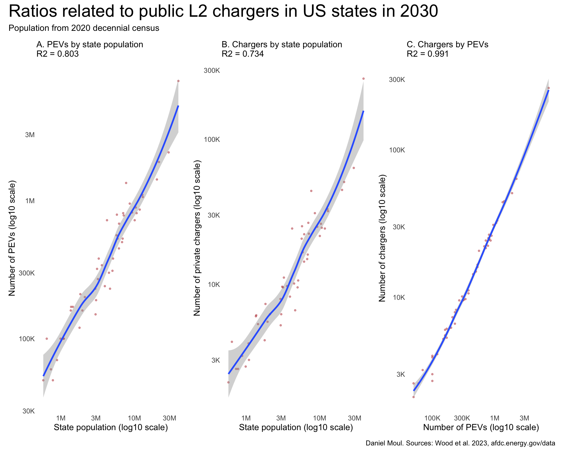
Direct charging moves more electrons than L1 and L2 chargers to achieve faster charging times. This is especially desirable when charging in the middle of a journey. The western states New Mexico, Wyoming, Nevada, and Utah have the highest proportion of the 350 kW chargers (Figure 5.9). While pct_dc150 and pct_dc250 are correlated (Panels A and B), they are inversely correlated with pct_dc350plus.
dta_for_plot <- sim_2030_public_dc |>
  left_join(
    state_pop_2020 |>
      select(state, pop2020 = pop),
    by = join_by(state)
  ) |>
  mutate(
    pct_dc150 = dc150 / total,
    pct_dc250 = dc250 / total,
    pct_dc350plus = dc350plus / total
  ) |>
  mutate(state = fct_reorder(state, pct_dc350plus))

dta_for_plot_long <- dta_for_plot |>
  pivot_longer(
    cols = starts_with("pct_"),
    names_to = "metric",
    values_to = "proportion"
  ) |>
  mutate(metric = factor(metric, levels = c("pct_dc150", "pct_dc250", "pct_dc350plus")))

p1 <- dta_for_plot_long |>
  ggplot(aes(proportion, state, color = metric, group = metric)) +
  geom_point(
    size = 0.75,
    alpha = 0.4) +
  geom_smooth(
    method = 'loess',
    formula = 'y ~ x',
    span = 0.95) +
  scale_x_continuous(labels = label_percent()) +
  scale_color_viridis_d(end = 0.8) +
  guides(color = "none") +
  coord_cartesian(ylim = c(1, 50)) +
  facet_wrap( ~ metric, scales = "free_x", nrow = 1) +
  labs(
    subtitle = glue("A. TODO: Add subtitle"),
    y = NULL
  )

p2 <- dta_for_plot_long |>
  mutate(metric = fct_rev(metric)) |>
  ggplot(aes(proportion, state, fill = metric)) +
  geom_col(
    alpha = 0.4,
    color = NA) +
  scale_x_continuous(labels = label_percent()) +
  scale_color_viridis_d(end = 0.8) +
  scale_fill_viridis_d(end = 0.8) +
  guides(fill = guide_legend(position = "inside",
                             reverse = TRUE)) +
  theme(legend.position.inside = c(0.4, 0.85)) +
  labs(
    subtitle = glue("B. TODO: Add subtitle"),
    y = NULL,
    fill = NULL
  )

my_layout <-
c("
AAAB
AAAB")

p1 + p2 +
  plot_annotation(
    title = "Predicted public DC chargers in US states in 2030",
    subtitle = "State ranking by highest proportion `pct_dc350plus`. Population from 2020 decennial census",
    caption = my_caption_2030_wood
  ) +
  plot_layout(design = my_layout)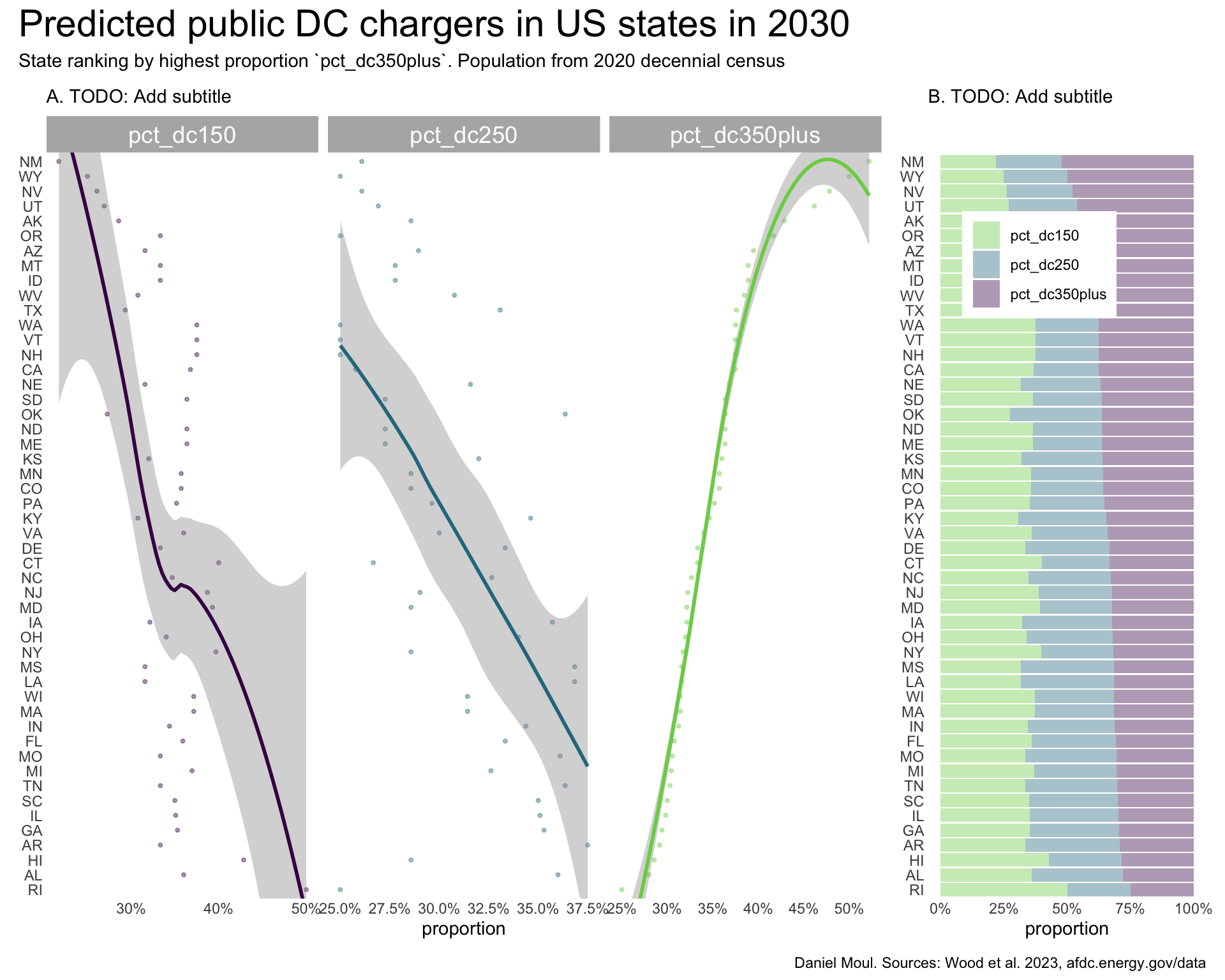
While the public DC fast chargers per state population plot (Figure 5.10 panel A) is similar to the other plots, unlike the others, there is no relationship between people_per_pev and people_per_charger (panel B).
dta_for_plot <- sim_2030_public_dc |>
  select(state, pevs, total) |>
  left_join(
    state_pop_2020 |>
      select(state, pop2020 = pop),
    by = join_by(state)
  ) |>
  mutate(
    people_per_pev = pop2020 / pevs,
    people_per_charger = pop2020 / total,
    pevs_per_charger = pevs / total,
    chargers_per_pev = total / pevs,
    state = fct_reorder(state, people_per_charger)
  )

min_y = min(dta_for_plot$total)
max_y = max(dta_for_plot$total)

p1 <- dta_for_plot |>
  ggplot(aes(pop2020, total)) +
  geom_point(
    color = "firebrick",
    fill = "firebrick",
    size = 0.75,
    alpha = 0.4) +
  geom_smooth(
    method = 'loess',
    formula = 'y ~ x') +
  scale_x_log10(labels = label_number(scale_cut = cut_short_scale())) +
  scale_y_log10(labels = label_number(scale_cut = cut_short_scale())) +
  guides(color = "none") +
  coord_cartesian(ylim = c(min_y + 1, max_y + 1)) +
  labs(
    subtitle = glue("A. DC chargers by state population"),
    x = "State population (log10 scale)",
    y = "Number of public DC chargers (log10 scale)"
  )

p2 <- dta_for_plot |>
  select(state, pop2020, people_per_pev, people_per_charger, pevs_per_charger) |>
  mutate(state = fct_reorder(state, people_per_pev)) |>
  pivot_longer(cols = c(people_per_pev, people_per_charger, pevs_per_charger),
               names_to = "metric",
               values_to = "value") |>
  mutate(metric = factor(metric, levels = c("people_per_pev", "people_per_charger", "pevs_per_charger"))) |>
  ggplot(aes(value, state, color = metric, group = metric)) +
  geom_point(
    size = 0.75,
    alpha = 0.4) +
  geom_smooth(
    method = 'loess',
    formula = 'y ~ x') +
  facet_wrap( ~ metric, scales = "free_x") +
  scale_color_viridis_d(end = 0.8) +
  guides(color = "none") +
  coord_cartesian(ylim = c(1, 51)) +
  labs(
    subtitle = glue("B. Ratios"),
    y = NULL
  )

my_layout <-
c("
ABBB")

p1 + p2 +
  plot_annotation(
    title = "Predicted public DC chargers in US states in 2030",
    subtitle = "State ranking by people per PEV. Population from 2020 decennial census",
    caption = my_caption_2030_wood
  ) +
  plot_layout(design = my_layout)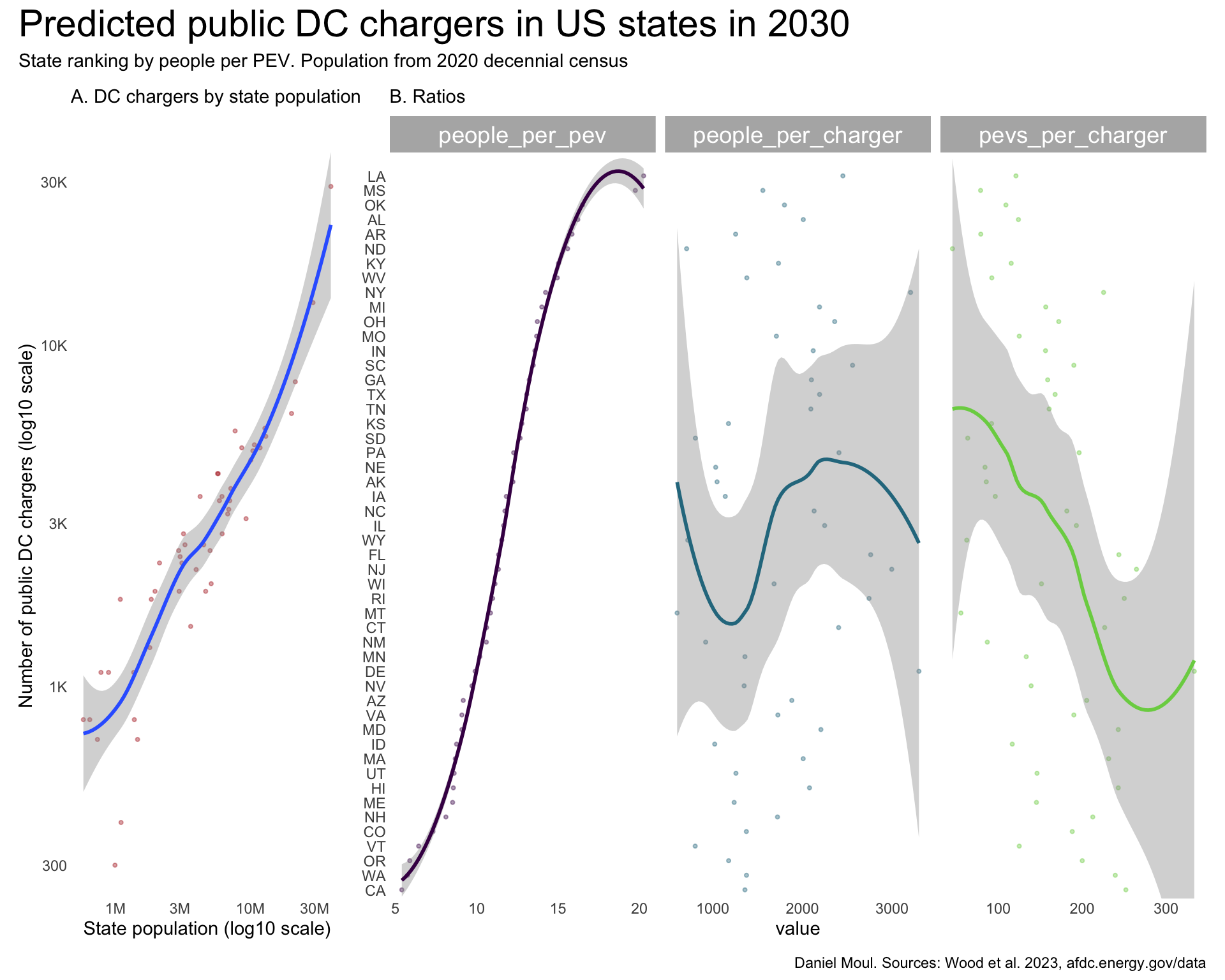
TODO: Add commentary
dta_for_plot <- sim_2030_public_dc |>
  select(state, pevs, total) |>
  left_join(
    state_pop_2020 |>
      select(state, pop2020 = pop),
    by = join_by(state)
  )

dta_for_model <- dta_for_plot |>
  mutate(pevs_scaled = scale(pevs, center = FALSE),
         pop2020_scaled = scale(pop2020, center = FALSE),
         total_scaled = scale(total, center = FALSE),
         pev_k = round(pevs / 1000),
         pop2020_k = round(pop2020 / 1000),
         total_k = round(total / 1000)
         )

mod1 <- dta_for_model |>
  lm(pev_k ~ pop2020_k,
     data = _)
mod1_r2 <- summary(mod1)$r.squared
# or use glance(mod2)$r.squared

mod2 <- dta_for_model |>
  lm(total_k ~ pop2020_k,
     data = _)
mod2_r2 <- summary(mod2)$r.squared

mod3 <- dta_for_model |>
  lm(total_k ~ pev_k,
     data = _)
mod3_r2 <- summary(mod3)$r.squared

p1 <- dta_for_plot |>
  ggplot(aes(pop2020, pevs)) +
  geom_point(
    color = "firebrick",
    fill = "firebrick",
    size = 0.75,
    alpha = 0.4) +
  geom_smooth(
    method = 'loess',
    formula = 'y ~ x') +
  scale_x_log10(labels = label_number(scale_cut = cut_short_scale())) +
  scale_y_log10(labels = label_number(scale_cut = cut_short_scale())) +
  guides(color = "none") +
  labs(
    subtitle = glue("A. PEVs by state population\nR2 = {round(mod1_r2, digits = 3)}"),
    x = "State population (log10 scale)",
    y = "Number of PEVs (log10 scale)"
  )

p2 <- dta_for_plot |>
  ggplot(aes(pop2020, total)) +
  geom_point(
    color = "firebrick",
    fill = "firebrick",
    size = 0.75,
    alpha = 0.4) +
  geom_smooth(
    method = 'loess',
    formula = 'y ~ x') +
  scale_x_log10(labels = label_number(scale_cut = cut_short_scale())) +
  scale_y_log10(labels = label_number(scale_cut = cut_short_scale())) +
  guides(color = "none") +
  labs(
    subtitle = glue("B. Chargers by state population\nR2 = {round(mod2_r2, digits = 3)}"),
    x = "State population (log10 scale)",
    y = "Number of private chargers (log10 scale)"
  )

p3 <- dta_for_plot |>
  ggplot(aes(pevs, total)) +
  geom_point(
    color = "firebrick",
    fill = "firebrick",
    size = 0.75,
    alpha = 0.4) +
  geom_smooth(
    method = 'loess',
    formula = 'y ~ x') +
  scale_x_log10(labels = label_number(scale_cut = cut_short_scale())) +
  scale_y_log10(labels = label_number(scale_cut = cut_short_scale())) +
  guides(color = "none") +
  labs(
    subtitle = glue("C. Chargers by PEVs\nR2 = {round(mod3_r2, digits = 3)}"),
    x = "Number of PEVs (log10 scale)",
    y = "Number of chargers (log10 scale)"
  )

my_layout <- c("ABC")

p1 + p2 + p3 +
  plot_annotation(
    title = "Ratios related to public DC chargers in US states in 2030",
    subtitle = "Population from 2020 decennial census",
    caption = my_caption_2030_wood
  ) +
  plot_layout(design = my_layout)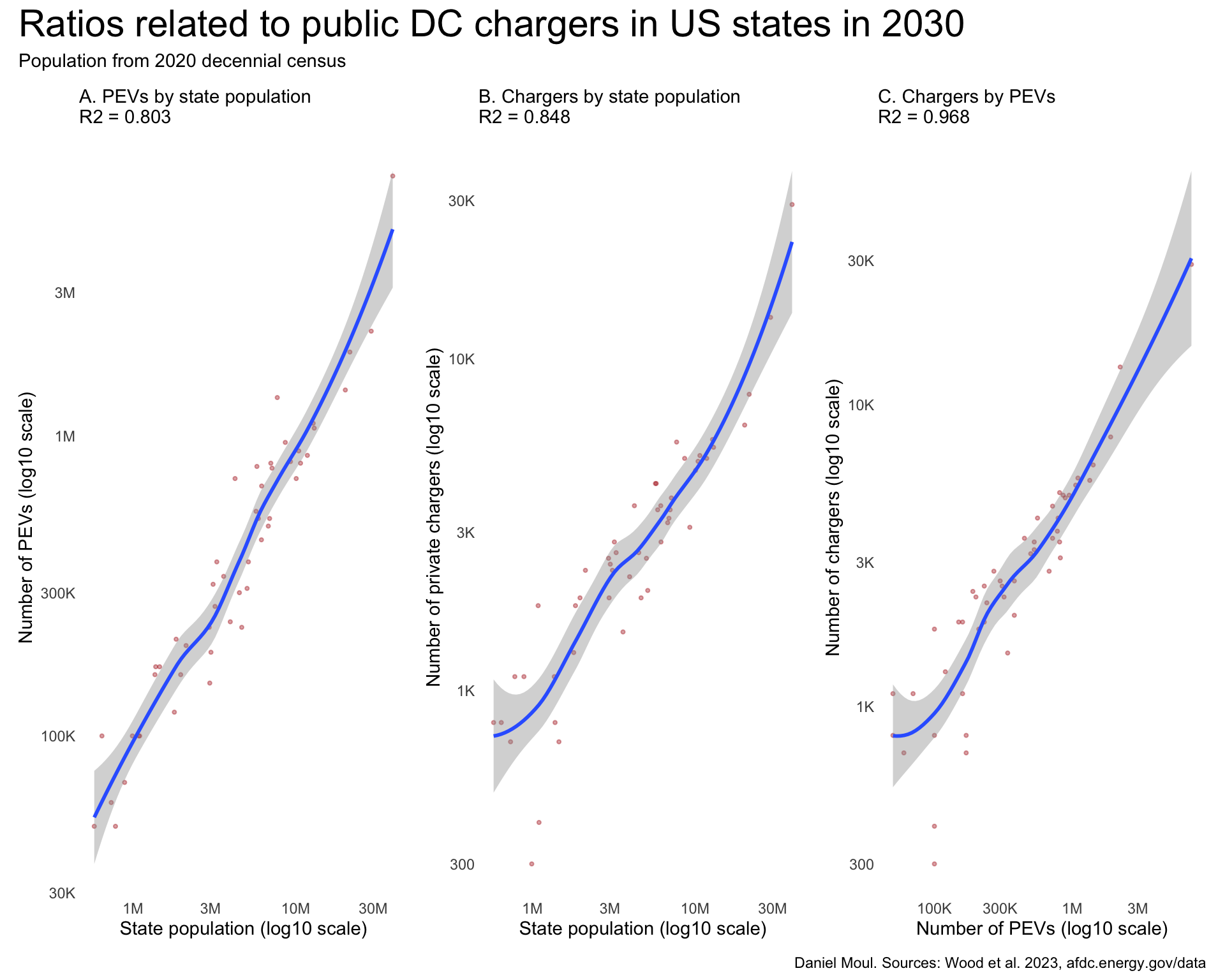
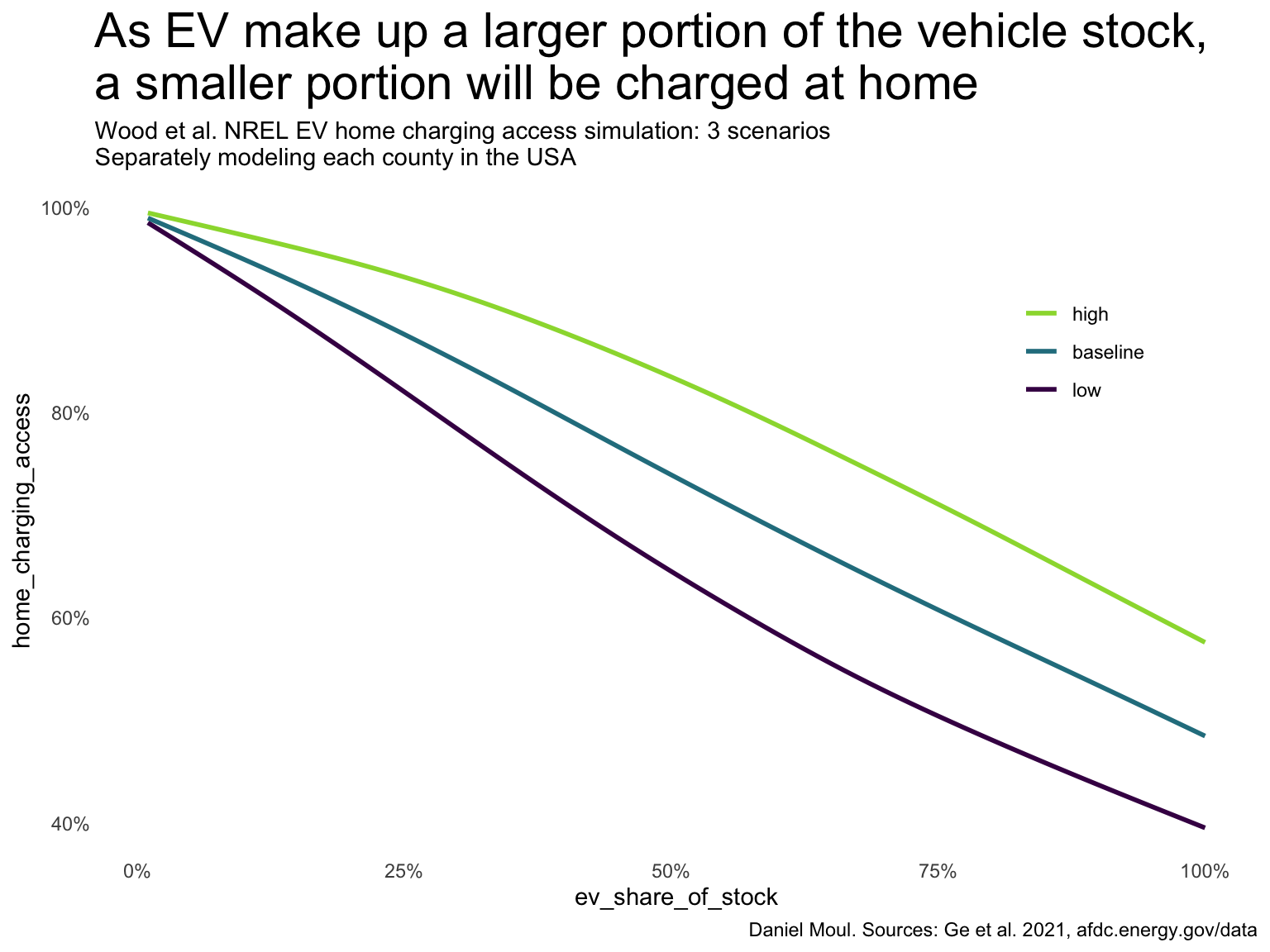
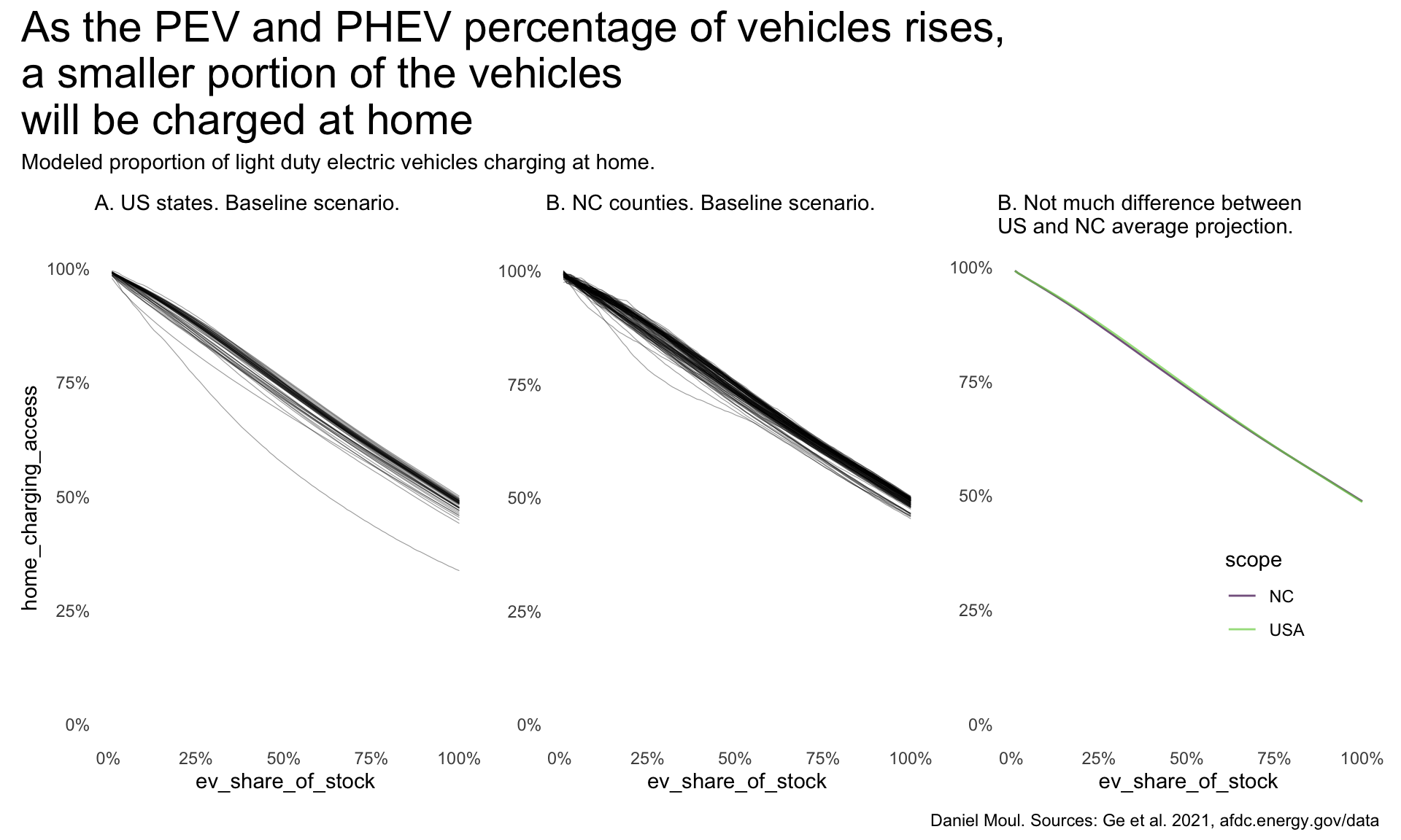
Ge et al. Ge (2021) project that as PEVs make up a larger portion of the vehicle stock, a smaller portion will be charged at home (Figure 5.12).
home_ev_charging_all |>
  slice_sample(prop = 0.1) |> # to reduce rendering time
  mutate(home_access_scenario = factor(home_access_scenario, levels = c("low", "baseline", "high"))) |>
  ggplot(aes(ev_share_of_stock, home_charging_access, color = home_access_scenario)) +
  geom_smooth(
    method = 'gam',
    formula = y ~ s(x, bs = "cs"),
    se = FALSE
  ) +
  scale_x_continuous(labels = label_percent()) +
  scale_y_continuous(labels = label_percent()) +
  scale_color_viridis_d(end = 0.85) +
  guides(color = guide_legend(position = "inside",
                              reverse = TRUE)) +
  theme(legend.position.inside = c(0.85, 0.75)) +
  labs(
    title = glue("As EV make up a larger portion of the vehicle stock,",
                 "\na smaller portion will be charged at home"),
    subtitle = glue("Wood et al. NREL EV home charging access simulation: 3 scenarios",
                    "\nSeparately modeling each county in the USA"),
    caption = my_caption_2030_ge,
    color = NULL
  )
Using the baseline scenario (Figure 5.13), the model projects that the USA and North Carolina (as part of the USA) will see nearly straight-line changes to the percentage of home charging as the percentage of vehicle stock that is electrified increases. Likely the constant rates (resulting in straight lines) are a simplification in the model. Hawaii is the outlier in panel A; it is projected to have only 44% of vehicles charged at home.
p1 <- home_ev_charging_baseline |>
  summarize(
    home_charging_access = mean(home_charging_access),
    .by = c(state, ev_share_of_stock)
  ) |>
  ggplot() +
  geom_line(
    aes(ev_share_of_stock, home_charging_access, group = state),
    linewidth = 0.2,
    alpha = 0.4) +
  scale_x_continuous(labels = label_percent()) +
  scale_y_continuous(labels = label_percent()) +
  guides(color = "none") +
  expand_limits(y = 0) +
  labs(
    subtitle = glue("A. US states. Baseline scenario."),
    # x = NULL,
    # y = NULL
  )

p2 <- home_ev_nc |>
  ggplot() +
  geom_line(
    aes(ev_share_of_stock, home_charging_access, group = county),
    linewidth = 0.2,
    alpha = 0.4) +
  scale_x_continuous(labels = label_percent()) +
  scale_y_continuous(labels = label_percent()) +
  guides(color = "none") +
  expand_limits(y = 0) +
  labs(
    subtitle = glue("B. NC counties. Baseline scenario."),
    # x = NULL,
    y = NULL,
  )

dta_for_plot3 <-
  bind_rows(
    home_ev_charging_baseline |>
  summarize(
    home_charging_access = mean(home_charging_access),
    .by = ev_share_of_stock
  ) |>
  mutate(scope = "USA"),
  home_ev_nc |>
  summarize(
    home_charging_access = mean(home_charging_access),
    .by = ev_share_of_stock
  ) |>
  mutate(scope = "NC")
  )

p3 <- dta_for_plot3 |>
  ggplot() +
  geom_line(
    aes(ev_share_of_stock, home_charging_access, color = scope),
    linewidth = 0.5,
    alpha = 0.7) +
  scale_x_continuous(labels = label_percent()) +
  scale_y_continuous(labels = label_percent()) +
  scale_color_viridis_d(end = 0.8) +
  guides(color = guide_legend(position = "inside")) +
  expand_limits(y = 0) +
  theme(legend.position.inside = c(0.7, 0.3)) +
  labs(
    subtitle = glue("B. Not much difference between\nUS and NC average projection."),
    # x = NULL,
    y = NULL,
  )

p1 + p2 + p3 +
  plot_annotation(
    title = glue("As the PEV and PHEV percentage of vehicles rises,",
                 "\na smaller portion of the vehicles",
                 "\nwill be charged at home"),
    subtitle = "Modeled proportion of light duty electric vehicles charging at home.",
    caption = my_caption_2030_ge
  )
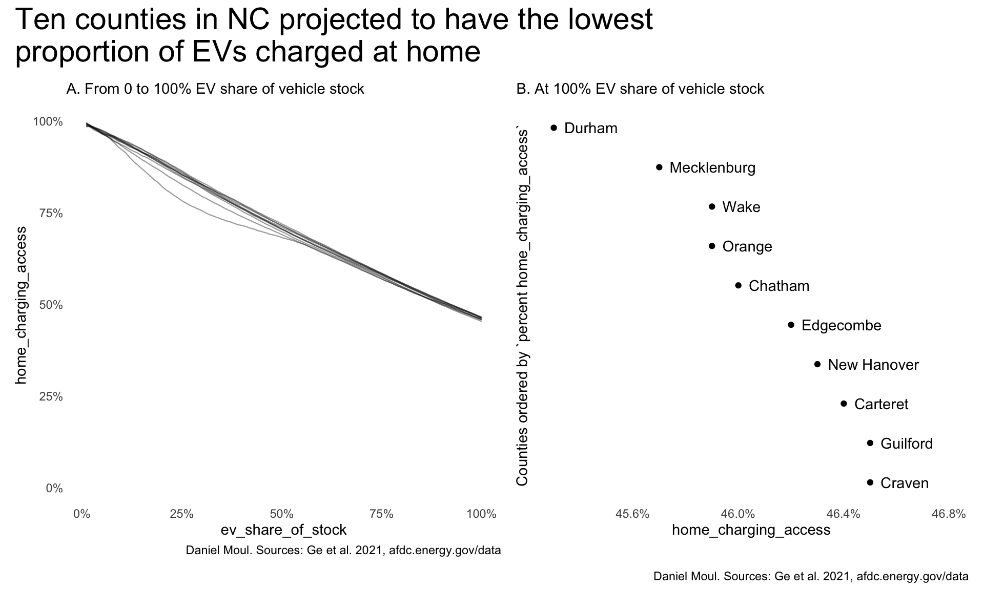
In North Carolina (as well as nationally), the urban counties are the ones with the lowest proportion charged at home. I assume these are also the counties with the highest proportion of renters in multi-family dwellings. Figure 5.14 shows the projection for the extreme case of 100% EV stock; the pattern also holds at lower proportions of EV stock.
nc_lowest <- home_ev_nc |>
  filter(ev_share_of_stock == 1) |>
  arrange(home_charging_access) |>
  head(10)

p1 <- home_ev_nc |>
  inner_join(nc_lowest |>
              select(county),
             by = join_by(county)) |>
  mutate(county = fct_reorder(county, -home_charging_access)) |>
  ggplot(aes(home_charging_access, ev_share_of_stock)) +
  geom_line(
    aes(ev_share_of_stock, home_charging_access, group = county),
    linewidth = 0.4,
    alpha = 0.4) +
  scale_x_continuous(labels = label_percent()) +
  scale_y_continuous(labels = label_percent()) +
  guides(color = "none") +
  expand_limits(y = 0) +
  labs(
    subtitle = "A. From 0 to 100% EV share of vehicle stock",
    caption = my_caption_2030_ge
  )

p2 <- nc_lowest |>
  mutate(county = fct_reorder(county, -home_charging_access)) |>
  ggplot(aes(home_charging_access, county)) +
  geom_point() +
  geom_text(aes(label = county),
            nudge_x = 0.0004,
            hjust = 0) +
  scale_x_continuous(labels = label_percent()) +
  guides(color = "none") +
  coord_cartesian(xlim = c(0.453, 0.468)) +
  theme(plot.title.position = "plot") +
  theme(#axis.title.y = element_blank(),
        axis.text.y = element_blank()) +
  labs(
    subtitle = "B. At 100% EV share of vehicle stock",
    y = "Counties ordered by `percent home_charging_access`"
  )

p1 + p2 +
  plot_annotation(
    title = "Ten counties in NC projected to have the lowest\nproportion of EVs charged at home",
    caption = my_caption_2030_ge
  )
https://www.esfi.org/electric-vehicle-charging-survey/ and https://www.esfi.org/wp-content/uploads/2023/09/ESFI-Electric-Vehicle-Charging-Survey-Infographic.pdf ↩︎
https://theicct.org/record-electric-vehicle-sales-show-american-demand-will-us-automakers-deliver-or-retreat-nov25/ ↩︎
Assuming the survey results are representative, and the rate of at-home chargers remained constant 2023-2025. The US Government does not track at-home EV chargers.↩︎