1  Brands and models

1.1 What’s in the data set?

The data set includes passenger vehicles in Finland comprising 307 models from 35 brands in model years 2007 - 2019 which were inspected during 2022. There are 1107322 passenger vehicles in the data set. Each row of data is a unique combination of (model_year, brand, model). The data set include the following data columns:

Show the code
##| column: page-right

dta_working_set |> 
  select(model_year, brand, model, inspection_count, failure_rate, ends_with("driven")) |>
  sample_n(5) |>
  gt() |>
  tab_header(md("**Sample rows of data: primary data fields**")) |>
  tab_options(table.font.size = 10)
Table 1.1: Sample data - primary data fields
Sample rows of data: primary data fields
model_year brand model inspection_count failure_rate average_km_driven median_km_driven
2012 Hyundai IX35 434 0.3203 167000 163000
2018 Kia SPORTAGE 285 0.0632 73000 70000
2011 Skoda SUPERB 1586 0.2207 273000 260000
2015 Volvo XC60 1689 0.0669 162000 158000
2009 Volvo V70 2536 0.2066 318000 305000


The data set includes reasons for failure in many cases: the most common reason, second most common, and third most common:

Show the code
##| column: page-right

dta_working_set |> 
  select(model_year, brand, model, contains("reason")) |>
  sample_n(5) |>
  gt() |>
  tab_header(md("**Sample rows of data: failure reason data fields**")) |>
  tab_options(table.font.size = 10)
Table 1.2: Sample data - failure reason data fields
Sample rows of data: failure reason data fields
model_year brand model failure_reason_1 failure_reason_2 failure_reason_3
2017 Kia SORENTO Not provided Not provided Not provided
2017 Skoda FABIA Brakes Not provided Not provided
2013 Audi A6 Suspension Front axle Brakes
2018 Citroen C3 Steering joints and rods Not provided Not provided
2014 BMW 1 Not provided Not provided Not provided


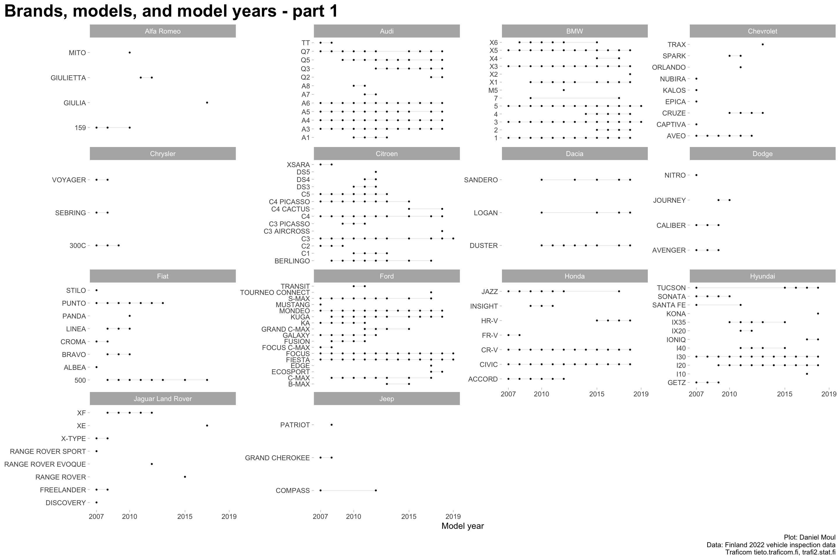
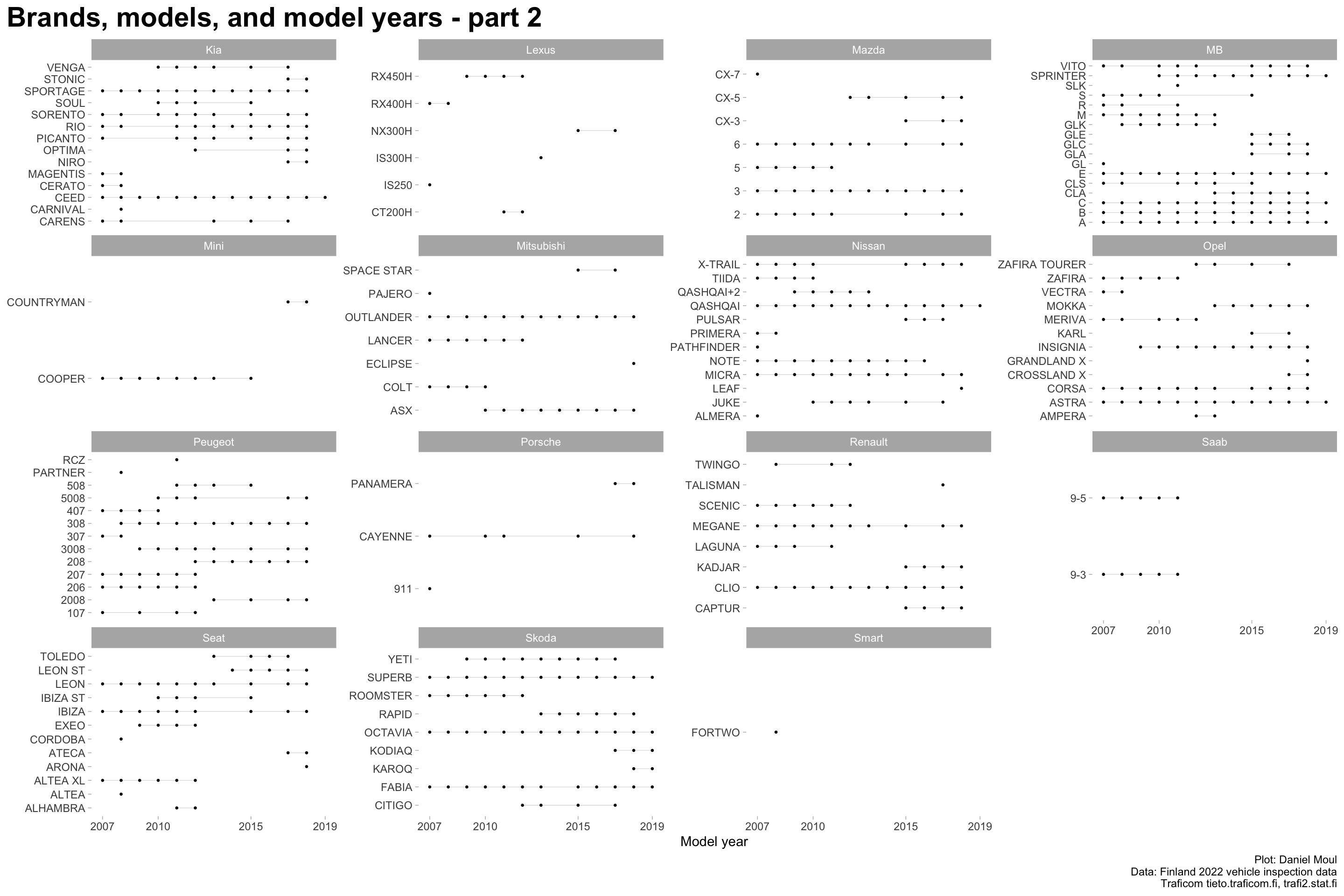
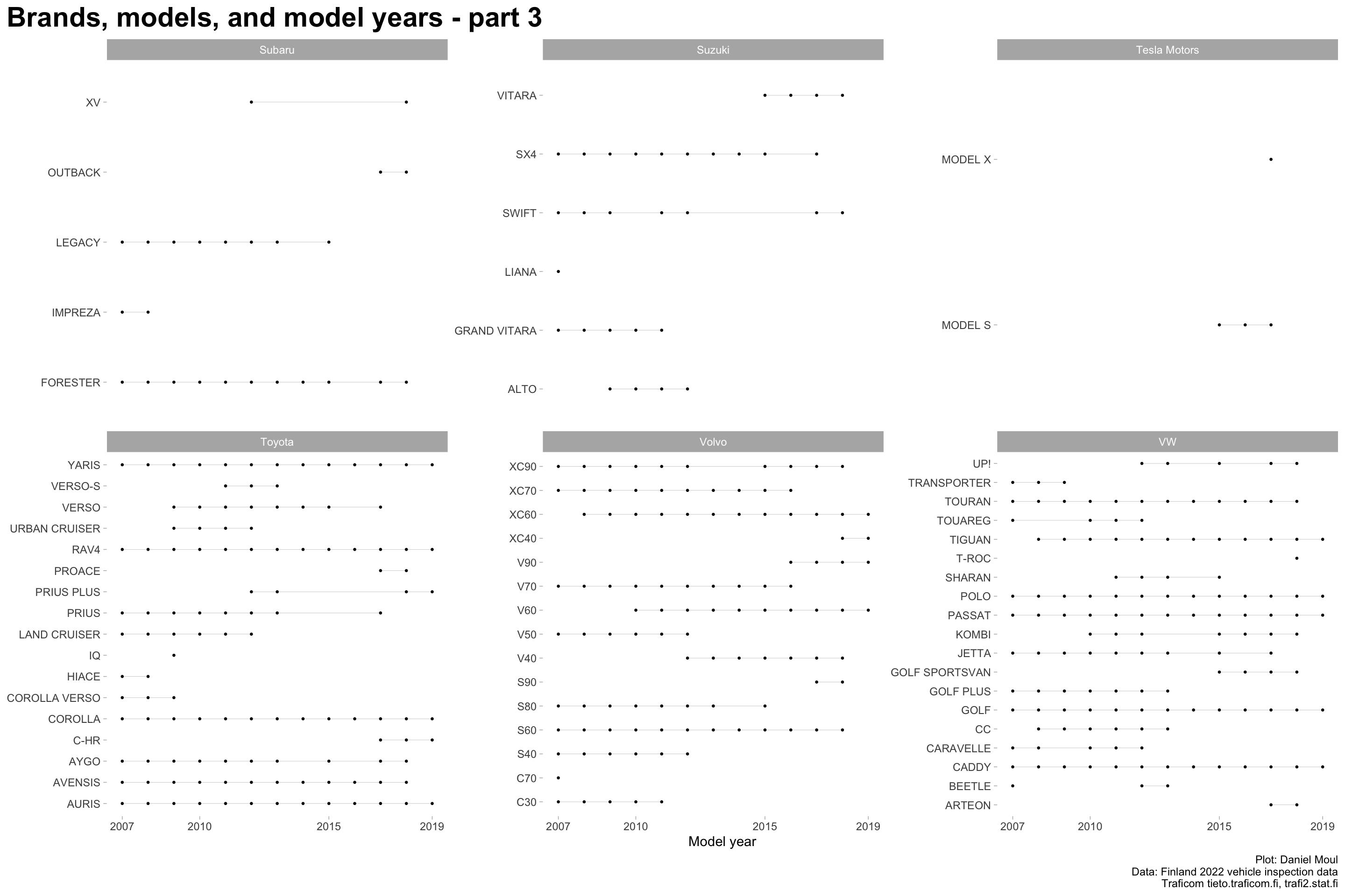
Over the years, brands introduce and cease production of models. Even when manufactured, in some years models may not have been purchased or imported and registered in Finland, or were not inspected in 2022. Thus models appear in the data for various periods of years:


Show the code
data_for_plot <- dta_2022 |>
  filter(model != "All models",
         brand != "All brands",
         model_year != "All model years") |>
  mutate(model_year = as.numeric(model_year)) |>
  mutate(model_year_min = min(model_year),
          model_year_max = max(model_year),
          n_model_year = n_distinct(model_year),
          .by = c(brand, model, brand_model)
  ) |>
  mutate(brand_model = fct_reorder(brand_model, model_year, min)) %>%
  left_join(. |>
              distinct(brand) |>
              arrange(brand) |>
              mutate(idx = row_number(),
                     plot_group = floor(idx / 15) + 1
              ) |>
              select(-idx),
            by = join_by(brand))

data_for_plot_segments <- data_for_plot |>
  reframe(model_year_min = min(model_year),
          model_year_max = max(model_year),
          n_model_year = n_distinct(model_year),
          .by = c(brand, model, brand_model)
  ) |>
  left_join(data_for_plot |>
              distinct(brand_model, plot_group),
            by = join_by(brand_model))
            
            
min_model_year = as.numeric(min(dta_2022$model_year))
max_model_year = max(as.numeric(dta_2022$model_year), na.rm = TRUE)

my_breaks = dta_2022 |>
  filter(model_year %in% 2001:2023,
         model != "All models",
         brand != "All brands",
         model_year != "All model years") |>
  mutate(model_year = as.numeric(model_year)) |>
  distinct(model_year) |>
  filter(model_year %% 5 == 0 | model_year == min_model_year | model_year == max_model_year)

plot_brands_models_years <- function (tbl, pg) {
  tbl |>
    filter(plot_group == pg) |>
    ggplot() +
    geom_segment(data = data_for_plot_segments |>
                   filter(plot_group == pg),
                 aes(x = model_year_min, xend = model_year_max, y = model, yend = model),
                 linewidth = 0.15, alpha = 0.25) +
    geom_point(aes(x = model_year, y = model), size = 0.5) +
    scale_x_continuous(breaks = my_breaks$model_year) +
    facet_wrap(~ brand, scales = "free_y") +
    theme(plot.title = element_text(size = rel(2.0), face = "bold"),
          plot.title.position = "plot") +
    labs(
      title = glue("Brands, models, and model years - part {pg}"),
      x = "Model year",
      y = NULL,
      caption = my_caption
    )
}

data_for_plot |>
  plot_brands_models_years(pg = 1)

Figure 1.1: Models and model years - part 1


Show the code
data_for_plot |>
  plot_brands_models_years(pg = 2)

Figure 1.2: Models and model years - part 2


Show the code
data_for_plot |>
  plot_brands_models_years(pg = 3)

Figure 1.3: Models and model years - part 3


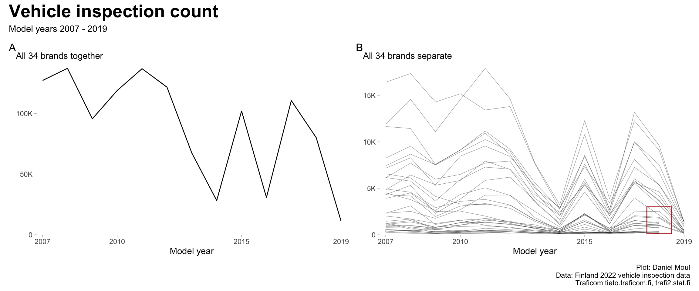
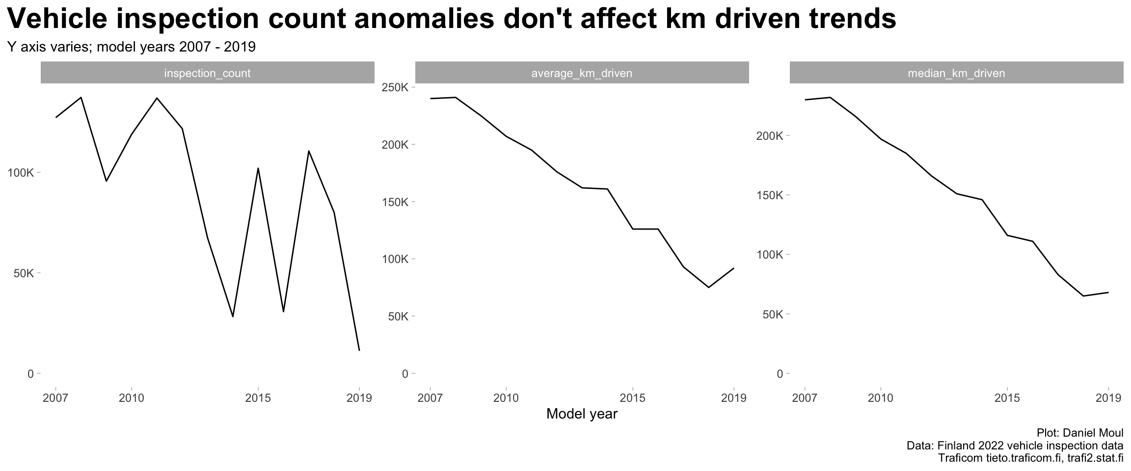
inspection_count seems to be depressed in 2014, 2016 and 2019 when considered together (Figure 1.4 panel A), and this seems to be consistent for most brands (panel B). Is this a data reporting or data management issue?

Show the code
data_for_plot <- dta_2022 |>
  filter(model_year %in% 2001:2023,
         model_year != "All model years",
         model == "All models",
         brand == "All brands",
         ) |>
  mutate(model_year = as.numeric(model_year))

min_model_year_all <- min(data_for_plot$model_year)
max_model_year_all <- max(data_for_plot$model_year)

model_year_range_all <- glue("{min_model_year_all} - {max_model_year_all}")

# my_breaks = data_for_plot |>
#   filter(model_year %% 5 == 0 | model_year == min_model_year_all | model_year == max_model_year_all)

p1 <- data_for_plot |>
  ggplot() +
  geom_line(aes(model_year, inspection_count, group = brand)) +
  scale_x_continuous(breaks = my_breaks$model_year,
                     expand = expansion(mult = c(0.02, 0.02))
                     ) +
  scale_y_continuous(labels = label_number(scale_cut = cut_short_scale()),
                     expand = expansion(mult = c(0, 0.02))
                     ) +
  expand_limits(y = 0) +
  labs(
    subtitle = glue("All {n_brands} brands together"),
    x = "Model year",
    y = NULL,
    tag = "A"
  )

p2 <- dta_2022 |>
  filter(model_year %in% 2001:2023,
         model_year != "All model years",
         model == "All models",
         brand != "All brands",
         ) |>
  mutate(model_year = as.numeric(model_year)) |>
  ggplot() +
  geom_line(aes(model_year, inspection_count, group = brand), #
            linewidth = 0.25, alpha = 0.4) +
  annotate("rect", xmin = 2017.5, xmax = 2018.5, ymin = 100, ymax = 3000,
           fill = NA, color = "firebrick") +
  scale_x_continuous(breaks = my_breaks$model_year,
                     expand = expansion(mult = c(0.02, 0.02))
                     ) +
  scale_y_continuous(labels = label_number(scale_cut = cut_short_scale()),
                     expand = expansion(mult = c(0, 0.02))
                     ) +
  expand_limits(y = 0) +
  labs(
    subtitle = glue("All {n_brands} brands separate"),
    x = "Model year",
    y = NULL,
    tag = "B"
  )

p1 + p2 + 
  plot_annotation(
    title = "Vehicle inspection count",
    subtitle = glue("Model years {model_year_range_all}"),
    caption = my_caption
    
  )

Figure 1.4: Inspection by year: all brands


The good news is that trends in km_driven (Figure 1.5) and failure_rate (Figure 2.1) seem mostly unaffected.

Show the code
data_for_plot <- dta_2022 |>
  filter(model_year %in% 2001:2023,
         model_year != "All model years",
         model == "All models",
         brand == "All brands",
         ) |>
  mutate(model_year = as.numeric(model_year))

# my_breaks = data_for_plot |>
#   filter(as.numeric(model_year) %% 5 == 0)

model_year_range <- glue("{min(data_for_plot$model_year)} - {max(data_for_plot$model_year)}")

data_for_plot |>
  pivot_longer(cols = c(inspection_count, ends_with("driven")),
               names_to = "variable",
               values_to = "value") |>
  mutate(variable = fct_relevel(variable, "inspection_count")) |> #, after = Inf
  ggplot() +
  geom_line(aes(model_year, value, group = brand)) +
  scale_x_continuous(breaks = my_breaks$model_year) +
  scale_y_continuous(labels = label_number(scale_cut = cut_short_scale())) +
  expand_limits(y = 0) +
  facet_wrap(~ variable, scales = "free_y", nrow = 1) +
  labs(
    title = "Vehicle inspection count anomalies don't affect km driven trends",
    subtitle = glue("Y axis varies; model years {model_year_range}"),
    x = "Model year",
    y = NULL,
    caption = my_caption
  )

Figure 1.5: Inspection by year: all brands


1.2 Defining the working data set

Given the above, I exclude the following from the working data set:

  • Brands that don’t show up in the data at least 3 times. Each row of data is one combination of (model_year, brand, model). This filter excludes the Smart brand.
  • Model year 2019, since many brands are missing
  • Campervans, since they are not “normal” passenger vehicles

I inherit the following filters in the source data set:

  • A model is included for a model_year if inspection_count >= 100
  • Inspection failure reasons are provided if at least 10% of the inspections for a model and model year have that reason (I assume this is calculated separately for first, second and third most common reasons)

That leaves 306 models in 34 brands over 13 model years (2007 - 2019) with 1588 rows of data remaining in the 2022 inspections data set and 1100203 vehicles. This constitutes 99.4% of the original data.

1.3 Most common brands and models

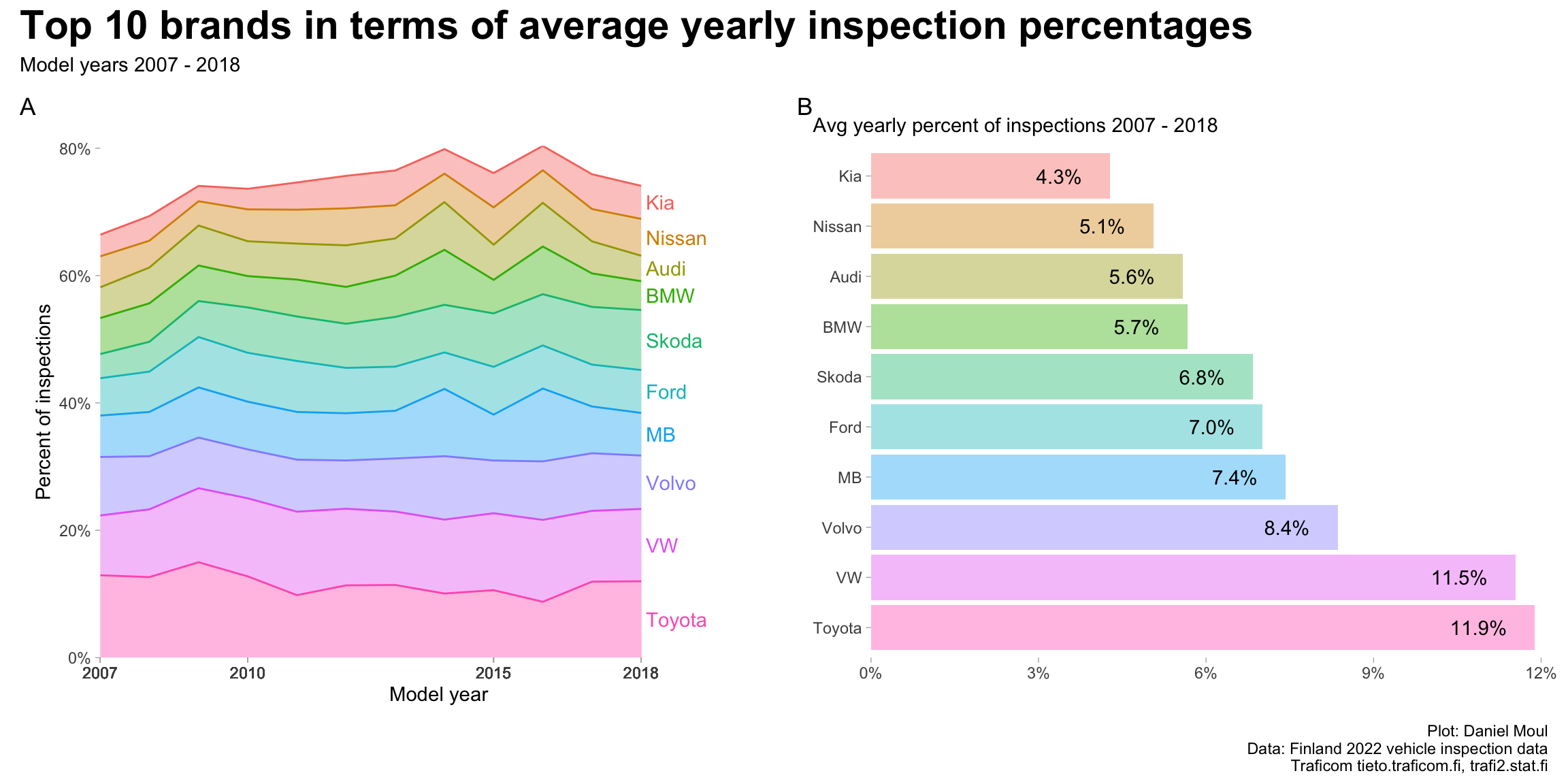
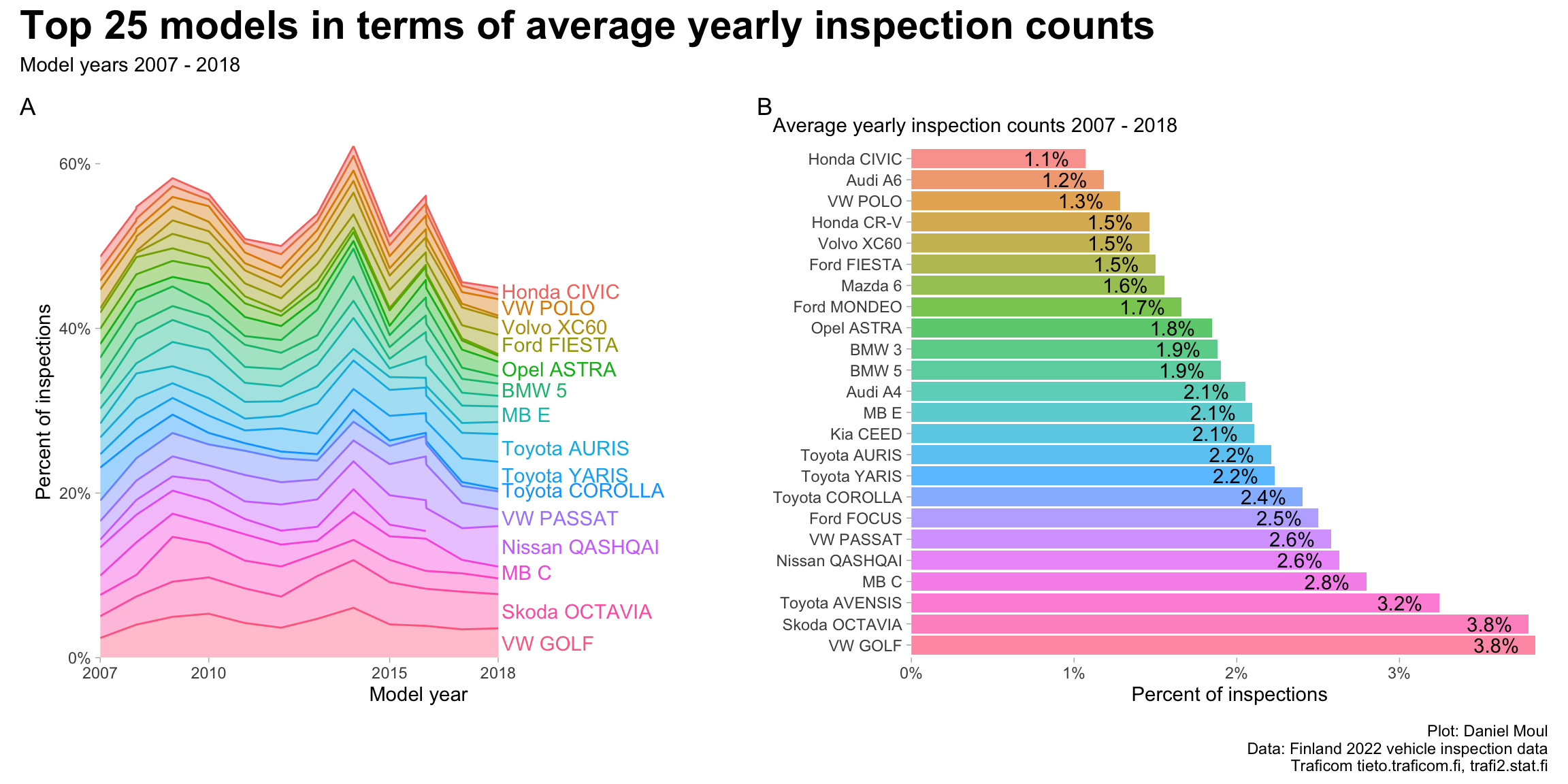
The ten most popular brands provide about 75% percent of the inspected vehicles (Figure 1.6) while the top 25 models provide about half (Figure 1.7).

Show the code
data_for_plot <- all_models_yearly |>
  mutate(model_year = as.numeric(model_year)) |>
  filter(brand != "All brands",
         model_year < 2019) |>
  complete(model_year, brand,
           fill = list(inspection_count = 0, model = "All models")
  ) |>
  mutate(brand = fct_lump(brand, n = brand_cutoff_n, w = inspection_count)) |>
  mutate(pct_count_model_year = inspection_count / sum(inspection_count),
         .by = model_year) |>
  reframe(inspection_count = sum(inspection_count),
          pct_count_model_year = sum(pct_count_model_year),
          .by = c(model_year, brand)
  ) |>
  mutate(avg_inspection_count = mean(inspection_count),
         .by = brand)

min_model_year <- min(data_for_plot$model_year)
max_model_year <- max(data_for_plot$model_year)

plot_breaks = data_for_plot |>
  filter(model_year %% 5 == 0 | model_year == min_model_year | model_year == max_model_year)

model_year_range <- glue("{min_model_year} - {max_model_year}")

data_for_label_tmp <- data_for_plot |>
  mutate(avg_inspection_count = mean(inspection_count),
         .by = brand) |>
  filter(model_year == max(model_year)) |>
  arrange(avg_inspection_count) |>
  mutate(pct_avg_inspection_count = avg_inspection_count / sum(avg_inspection_count),
         idx = row_number(),
         brand = as_factor(brand))

brand_levels <- data_for_label_tmp |>
  mutate(brand = fct_reorder(brand, pct_avg_inspection_count)) |>
  pull(brand)

data_for_label <- data_for_label_tmp |>
  mutate(brand_label = glue("{brand} {percent(pct_count_model_year, accuracy = 0.1)}"),
         brand_label = fct_reorder(brand_label, pct_avg_inspection_count),
         brand = fct_reorder(brand, pct_avg_inspection_count)
  )

p1 <- data_for_plot |>
  mutate(brand = factor(brand, levels = brand_levels),
         ) |>
  filter(brand != "Other") |>
  ggplot() +
  geom_area(aes(model_year, pct_count_model_year, group = brand, color = brand, fill = brand),
            na.rm = TRUE, alpha = 0.4, show.legend = FALSE) + #, fill = NA
  geom_text(aes(model_year + 0.1, pct_count_model_year, color = brand,
                label = ifelse(model_year == max(model_year),
                               as.character(brand), 
                               "")
                ),
            position = position_stack(vjust = 0.5), hjust = 0,
            show.legend = FALSE) +
  scale_x_continuous(breaks = plot_breaks$model_year,
                     expand = expansion(mult = c(0, 0.02))) +
  scale_y_continuous(labels = label_percent(),
                     expand = expansion(mult = c(0, 0))) +
  expand_limits(y = 0) +
  coord_cartesian(xlim = c(min(data_for_plot$model_year), max(data_for_plot$model_year) + 2.5)) +
  theme(panel.border = element_blank()) +
  labs(
    #subtitle = "Stacked area plot",
    x = "Model year",
    y = "Percent of inspections",
    tag = "A"
  )

p2 <- data_for_label |>
  filter(brand != "Other") |>
  mutate(brand = fct_rev(brand)) |>
  ggplot(aes(pct_avg_inspection_count, brand, fill = brand_label)) + 
  geom_col(na.rm = TRUE, alpha = 0.4, show.legend = FALSE) +
  geom_text(aes(label =  percent(pct_avg_inspection_count, accuracy = 0.1)),
            hjust = 1, nudge_x = -0.005) + #
  scale_x_continuous(labels = label_percent(),
                     expand = expansion(mult = c(0, 0.02))) +
  expand_limits(x = 0) +
  theme(panel.border = element_blank()) +
  labs(
    subtitle = glue("Avg yearly percent of inspections {model_year_range}"),
    x = NULL,
    y = NULL,
    tag = "B"
  )

p1 + p2 + 
  plot_annotation(
    title = glue("Top {brand_cutoff_n} brands in terms of average yearly inspection percentages"),
    subtitle = glue("Model years {model_year_range}"),
    caption = my_caption
  )

Figure 1.6: Inspections by brand


Show the code
data_for_plot <- dta_working_set |>
  # TODO: is this working? weighted.mean(), because zero values shouldn't affect mean (should it?)
  mutate(avg_inspection_count = weighted.mean(inspection_count, w = inspection_count), 
         .by = brand_model) |>
  mutate(brand_model = fct_reorder(brand_model, avg_inspection_count)) |>
  mutate(brand_model = fct_lump(brand_model, n = model_cutoff_n, w = avg_inspection_count),
         brand_model = if_else(as.character(brand_model) == "Other",
                         "Various",
                         brand_model),
         brand = if_else(as.character(brand_model) == "Various",
                         "Various",
                         brand)
         ) |>
  reframe(inspection_count = sum(inspection_count),
          .by = c(model_year, brand, brand_model)
  ) |>
  mutate(pct_count_model_year = inspection_count / sum(inspection_count),
         .by = model_year) |>
  mutate(avg_inspection_count = weighted.mean(inspection_count, w = inspection_count),
         .by = brand_model) |>
  # it's a reasonable assumption that every model will have a unique avg_inspection_count
  mutate(pct_avg_inspection_count = avg_inspection_count / sum(unique(avg_inspection_count))) |>
  mutate(brand_model = fct_reorder(brand_model, avg_inspection_count),
         brand = fct_reorder(brand, avg_inspection_count))

min_model_year <- min(data_for_plot$model_year)
max_model_year <- max(data_for_plot$model_year)

plot_breaks = data_for_plot |>
  distinct(model_year) |>
  filter(model_year %% 5 == 0 | model_year == min_model_year | model_year == max_model_year)

model_year_range <- glue("{min(data_for_plot$model_year)} - {max(data_for_plot$model_year)}")

data_for_label_tmp <- data_for_plot |>
  filter(model_year == max_model_year) |>
  distinct(brand_model, .keep_all = TRUE) |>
  arrange(pct_avg_inspection_count) 

data_for_label <- data_for_label_tmp |>
  mutate(brand_model = fct_reorder(brand_model, avg_inspection_count))

p1 <- data_for_plot |>
  filter(brand_model != "Various") |>
  ggplot() +
  geom_area(aes(model_year, pct_count_model_year, color = brand_model, fill = brand_model, group = brand_model),
            alpha = 0.4, show.legend = FALSE, ) +
  geom_text(data = data_for_label |>
              filter(brand_model != "Various"),
            aes(model_year + 0.1, pct_count_model_year, color = brand_model,
                label = ifelse(model_year == max(model_year),
                               as.character(brand_model),
                               "")
                ),
            position = position_stack(vjust = 0.5), hjust = 0, #vjust = 0.5,
            check_overlap = TRUE,
            show.legend = FALSE) +
  scale_x_continuous(breaks = plot_breaks$model_year,
                     expand = expansion(mult = c(0, 0.1))) +
  scale_y_continuous(labels = label_percent(),
                     expand = expansion(mult = c(0, 0))) +
  coord_cartesian(xlim = c(min_model_year, max_model_year + 5),
                  ylim = c(0, NA)) +
  theme(panel.border = element_blank()) +
  labs(
    x = "Model year",
    y = "Percent of inspections",
    tag = "A"
  )

p2 <- data_for_label |>
  mutate(brand_model = fct_rev(brand_model)) |>
  filter(pct_count_model_year > 0) |>
  filter(brand_model != "Various") |>
  ggplot(aes(pct_avg_inspection_count, brand_model, fill = brand_model)) +
  geom_col(na.rm = TRUE, alpha = 0.7, show.legend = FALSE) +
  geom_text(aes(label =  percent(pct_avg_inspection_count, accuracy = 0.1)),
            hjust = 1, nudge_x = -0.001) + #
  scale_x_continuous(labels = label_percent(),
                     expand = expansion(mult = c(0, 0.02))) +
  scale_fill_hue(direction = -1) +
  expand_limits(x = 0) +
  theme(panel.border = element_blank()) +
  labs(
    subtitle = glue("Average yearly inspection counts {model_year_range}"),
    x = "Percent of inspections",
    y = NULL,
    tag = "B"
  )

p1 + p2 + 
  plot_annotation(
    title = glue("Top {model_cutoff_n} models in terms of average yearly inspection counts"),
    subtitle = glue("Model years {model_year_range}"),
    caption = my_caption
  )

Figure 1.7: Inspections by model


1.4 Distance driven and model year

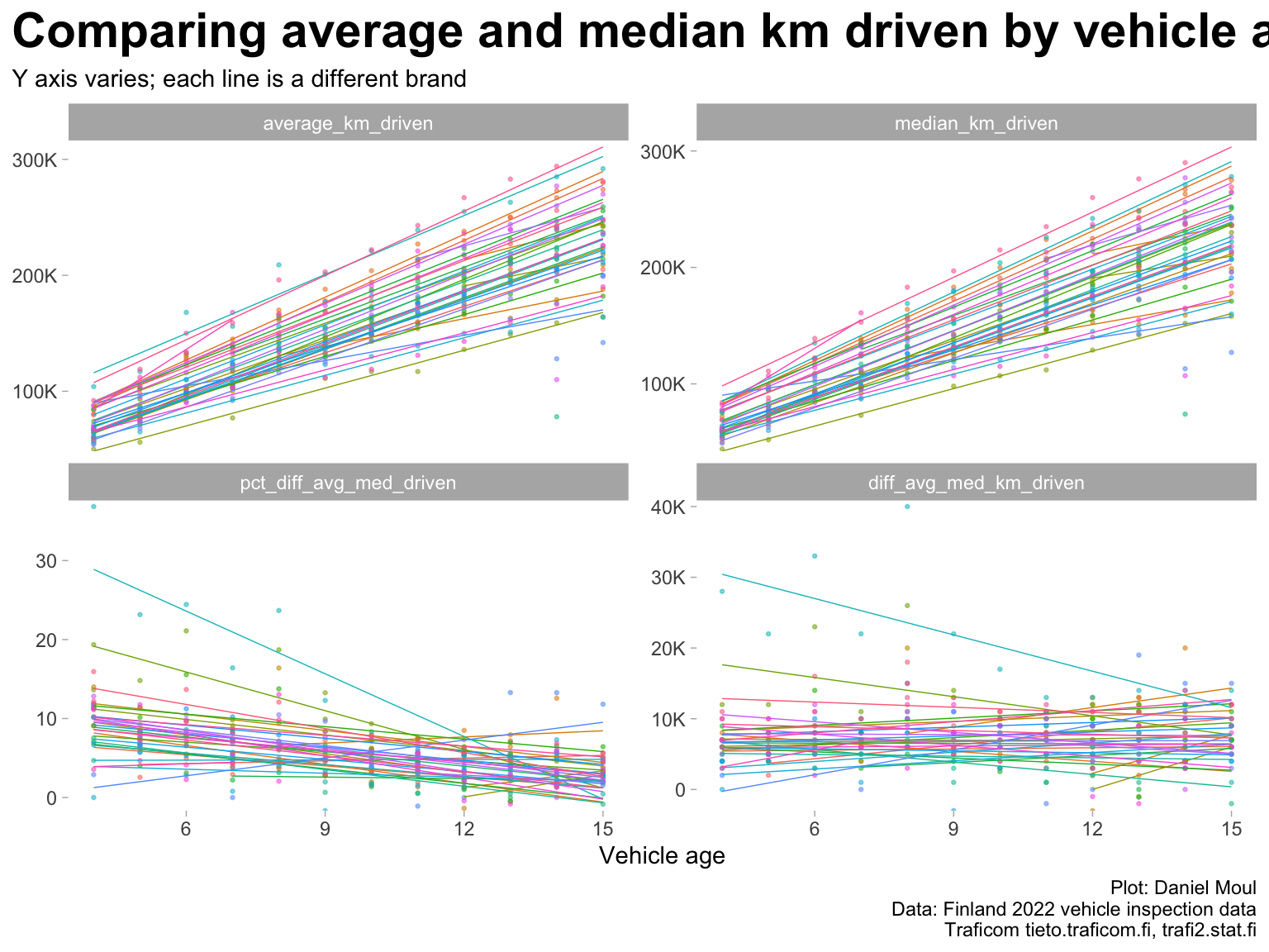
The data set includes median_km_driven and average_km_driven. Over time the values of these two summary statistics converge within 10% (Figure 1.8). Here I start using vehicle_age instead of model_year, because it’s a more natural way of thinking about vehicles over time being driven more and experiencing more failures.

Show the code
data_for_plot <- all_models_yearly |>
  mutate(model_year = as.numeric(model_year),
         vehicle_age = 2022 - model_year) |>
  filter(brand != "All brands",
         model_year < 2019) |>
  complete(model_year, brand,
           fill = list(inspection_count = 0, model = "All models")
  )

data_for_plot |>
  select(vehicle_age, model_year, brand, ends_with("driven")) |>
  mutate(diff_avg_med_km_driven = average_km_driven - median_km_driven,
         pct_diff_avg_med_driven = 100 * (average_km_driven / median_km_driven - 1)) |>
  pivot_longer(cols = ends_with("driven"),
               names_to = "variable",
               values_to = "value") |>
  mutate(variable = fct_relevel(variable, "diff_avg_med_km_driven", after = Inf)) |>
  ggplot() +
  geom_point(aes(vehicle_age, value, group = brand, color = brand), 
            na.rm = TRUE, size = 0.5, alpha = 0.5,
            show.legend = FALSE) +
  geom_smooth(aes(vehicle_age, value, group = brand, color = brand),
            na.rm = TRUE, method = "lm", formula = 'y ~ x', se = FALSE,
            linewidth = 0.25, alpha = 0.5,
            show.legend = FALSE) +
  scale_y_continuous(labels = label_number(scale_cut = cut_short_scale()),
                     expand = expansion(mult = c(0, 0.02))) +
  facet_wrap(~ variable, scales = "free_y") +
  labs(
    title = "Comparing average and median km driven by vehicle age",
    subtitle = "Y axis varies; each line is a different brand",
    x = "Vehicle age",
    y = NULL,
    caption = my_caption
  )

Figure 1.8: Average and median km driven by model year for the brands


As implied in Figure 1.8 above, there is a very strong correlation among vehicle_age, average_km_driven, and median_km_driven. Thus to avoid collinearity, when doing regressions in Chapter 3 Modeling failure rate, I use median_km_driven or vehicle_age in a regression model (but not both).

Show the code
dta_working_set |>
  select(vehicle_age, median_km_driven, average_km_driven) %>%
  cor() |>
  as.data.frame() %>%
  rownames_to_column(var = "variables") |>
  gt() |>
  tab_header(md("**Correlations**")) |>
  fmt_number(decimals = 3) |>
  tab_source_note(md("*cor(vehicle_age, median_km_driven, average_km_driven)*"))
Table 1.3: High correlation among vehicle_age, median_km_driven, and average_km_driven
Correlations
variables vehicle_age median_km_driven average_km_driven
vehicle_age 1.000 0.708 0.700
median_km_driven 0.708 1.000 0.996
average_km_driven 0.700 0.996 1.000
cor(vehicle_age, median_km_driven, average_km_driven)


1.4.1 Models most and least driven

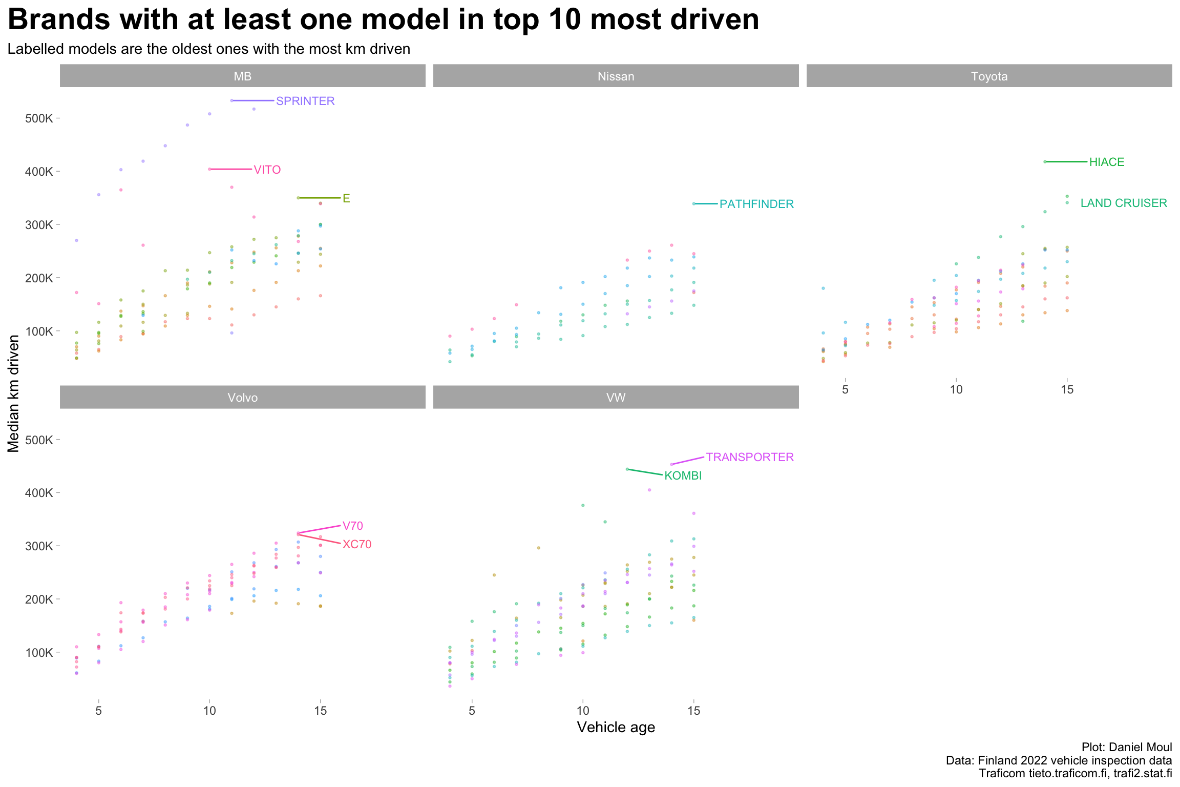
Half the 10 models driven the farthest are light commercial vans (Figure 1.9):

  • Mercedes-Benz Sprinter and Vito
  • Volkswagen Kombi and Transporter
  • Toyota HiAce

Two are SUVs:

  • Nisan Pathfinder
  • Toyota Land Cruiser

The remainder include one sedan and two wagons:

  • Mercedes-Benz E, which is frequently used as a taxi [wikipedia]
  • Volvo V70 and XC70
Show the code
data_for_plot <- dta_working_set |>
  mutate(median_km_driven_k = median_km_driven / 1000)

data_for_plot_labels <- data_for_plot |>
  filter(median_km_driven_k == max(median_km_driven_k),
         .by = model) |>
   slice_max(order_by = median_km_driven_k, n = brand_cutoff_n)
  
data_for_plot %>%
  inner_join(.,
             data_for_plot_labels |>
              distinct(brand),
            by = join_by(brand)
            ) |>
  ggplot(aes(vehicle_age, median_km_driven_k, color = model, group = model)) +
  geom_point(size = 0.5, alpha = 0.4,
             show.legend = FALSE) +
  geom_text_repel(data = data_for_plot_labels,
                  aes(vehicle_age, median_km_driven_k, label = model, color = model, group = model),
                  size = 3, hjust = 0, nudge_x = 2,
                  show.legend = FALSE) +
  scale_y_continuous(labels = label_number(suffix = "K")) +
  coord_cartesian(xlim = c(NA, 19)) +
  facet_wrap( ~ brand) +
  theme(legend.position = "bottom") +
  labs(
    title = glue("Brands with at least one model in top {brand_cutoff_n} most driven"),
    subtitle = "Labelled models are the oldest ones with the most km driven",
    x = "Vehicle age",
    y = "Median km driven",
    caption = my_caption
  )

Figure 1.9: Distance driven by model year for brands with at least one model among the most driven


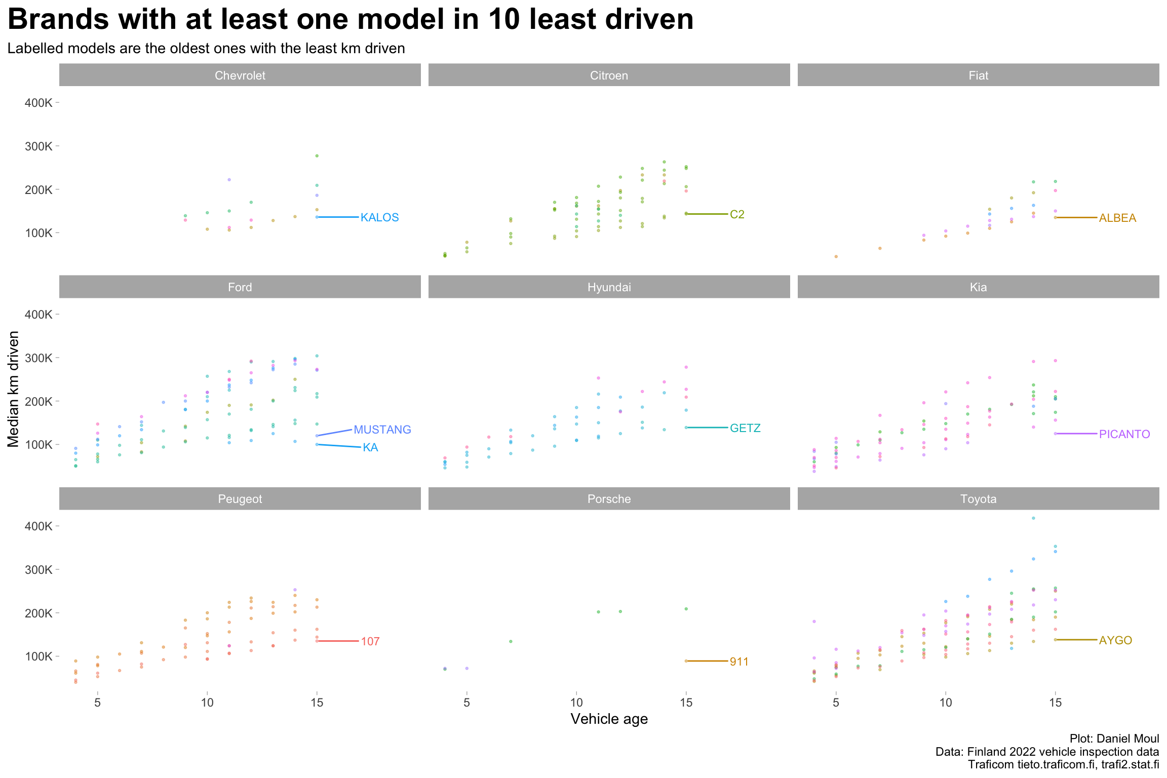
Most of the 10 models driven the least are city cars (Figure 1.10):

Supermini cars for city use:

  • Chevrolet Kalos
  • Citroen C2
  • Hyundai Getz

City cars

  • Ford Ka
  • Kia Picanto
  • Peugeot 107
  • Toyota Aygo

Subcompact

  • Fiat Albea, which was produced in Turkey for developing markets; allegedly not sold in Western Europe [wikipedia])

Two are sports cars

  • Ford Mustang
  • Porsche 911
Show the code
data_for_plot <- dta_working_set |>
  mutate(median_km_driven_k = median_km_driven / 1000)

data_for_plot_labels <- data_for_plot |>
  filter(model_year == min(model_year)) |>
  filter(median_km_driven_k == min(median_km_driven_k),
         .by = model) |>
   slice_min(order_by = median_km_driven_k, n = brand_cutoff_n)
  
data_for_plot %>%
  inner_join(.,
             data_for_plot_labels |>
              distinct(brand),
            by = join_by(brand)
            ) |>
  ggplot(aes(vehicle_age, median_km_driven_k, color = model, group = model)) +
  geom_point(size = 0.5, alpha = 0.4,
             show.legend = FALSE) +
  geom_text_repel(data = data_for_plot_labels,
                  aes(vehicle_age, median_km_driven_k, label = model, color = model, group = model),
                  size = 3, hjust = 0, nudge_x = 2,
                  show.legend = FALSE) +
  scale_y_continuous(labels = label_number(suffix = "K")) +
  coord_cartesian(xlim = c(NA, 19)) +
  facet_wrap( ~ brand) +
  theme(legend.position = "bottom") +
  labs(
    title = glue("Brands with at least one model in {brand_cutoff_n} least driven"),
    subtitle = "Labelled models are the oldest ones with the least km driven",
    x = "Vehicle age",
    y = "Median km driven",
    caption = my_caption
  )

Figure 1.10: Distance driven by model year for brands with at least one model among the least driven