5  Pocket summary comparisons among PICTs

The Pacific Community makes available “pocket summary” statistics on the Pacific Data Hub.1

Show the code
library(here)
library(tidyverse)
library(janitor)
library(scales)
library(glue)
library(patchwork)
library(ggrepel)
library(ggridges)
library(gt)

theme_set(theme_light() +
            theme(panel.grid.major = element_blank(),
                  panel.grid.minor = element_blank()))

options(scipen = 5)

my_caption <- "Plot: Daniel Moul; Source: South Pacific Community"
Show the code
d_pocket <- read_csv(here("./data/raw/pocket-summary/SPC_DF_POCKET_3.0_all.csv"),
               show_col_types = FALSE) |>
  clean_names() |>
  remove_empty(which = "cols") |>
  remove_constant() |>
  # rename(place = pacific_island_countries_and_territories) |>
  mutate(place = case_match(
    pacific_island_countries_and_territories,
    "Micronesia (Federated States of)"  ~ "Micronesia (FSM)",
    "Northern Mariana Islands"          ~ "N Mariana Is",
    .default = pacific_island_countries_and_territories
  ))

5.1 Population

The population and land area of the PICTs vary over four orders of magnitude. Population density is highest on some of the smallest PICTs.

Show the code
d_pop_and_density <- d_pocket |>
  filter(indicator_2 %in% c("Land area", "Mid-year population estimate")) |>
  arrange(desc(time_period)) |>
  distinct(geo_pict, indicator_2, .keep_all = TRUE) |>
  select(-c(time_period, unit_mult, unit_multiplier, data_year)) |>
  pivot_wider(id_cols = c(geo_pict, place), 
              names_from = indicator_2, values_from = obs_value) |>
  clean_names() |>
  rename(pop = mid_year_population_estimate) |>
  mutate(pop_density = pop / land_area)

d_pop_and_density |>
  ggplot(aes(land_area, pop)) +
  geom_hline(yintercept = 10^c(3:6),
             lty = 2, linewidth = 0.15, alpha = 0.3) +
  geom_point(aes(size = pop_density), 
             color = "firebrick", alpha = 0.3) +
  geom_smooth(se = FALSE, method = "lm", formula = 'y ~ x',
              alpha = 0.05) +
  geom_text_repel(aes(label = place),
                  force = 2,
                  hjust = 0, vjust = 1) +
  scale_x_log10(labels = label_number(scale_cut = cut_short_scale()),
                ) +
  scale_y_log10(labels = label_number(scale_cut = cut_short_scale()),
                breaks = 10^c(3:7)) +
  scale_size_continuous(range = c(1, 10),
                        breaks = c(10, 100, 300, 600)
                        ) +
  expand_limits(x = 1e7) +
  guides(size = guide_legend(position = "inside"),
         color = "none") +
  theme(legend.position.inside = c(0.8, 0.3)) +
  labs(
    title = glue("Fiji is among the largest PICTs in population and land area",
                 "\nand is typical in population density for its land area"),
    subtitle = "Pacific island population 2023, land area, and population density",
    x = "Land area km2 (log10 scale)",
    y = "Population estimate (log10 scale)",
    size = "Density\n(people/km2)",
    caption = my_caption
  )
Figure 5.1: Population, land area, and population density


Show the code
knitr::include_graphics(here("images/IMG_1818-in-traffic-near-usp-cropped.png"))
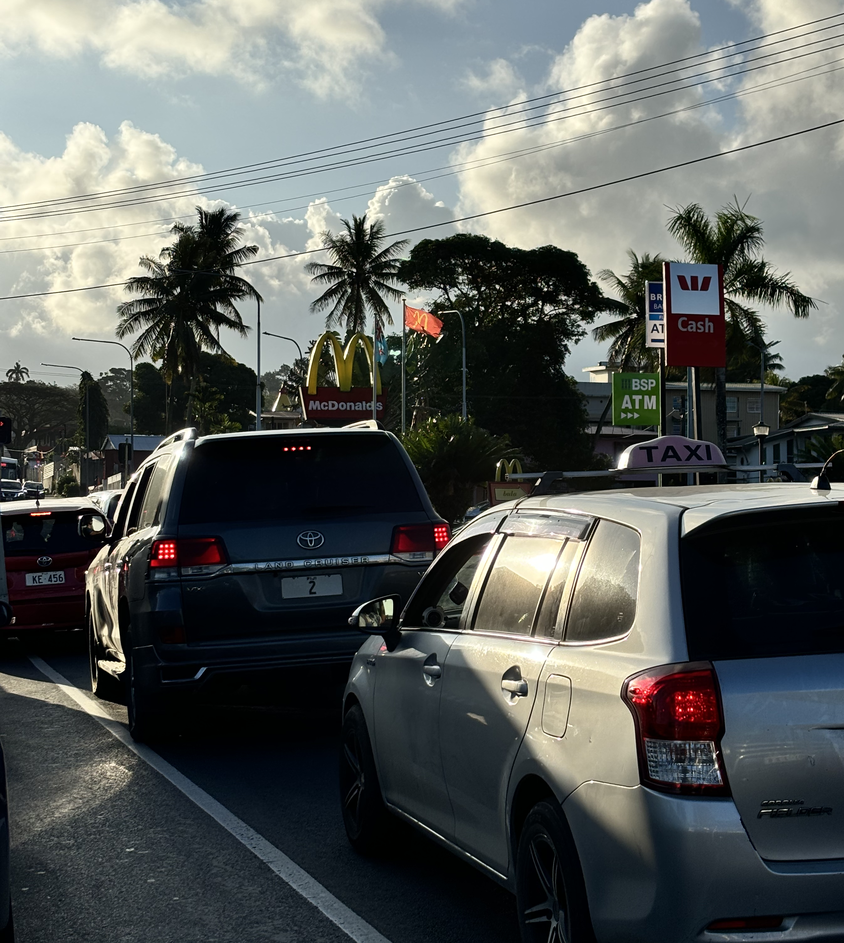
Figure 5.2: Urban life: waiting at a traffic light near the University of the South Pacific, Suva, Fiji. Photo by Daniel Moul.


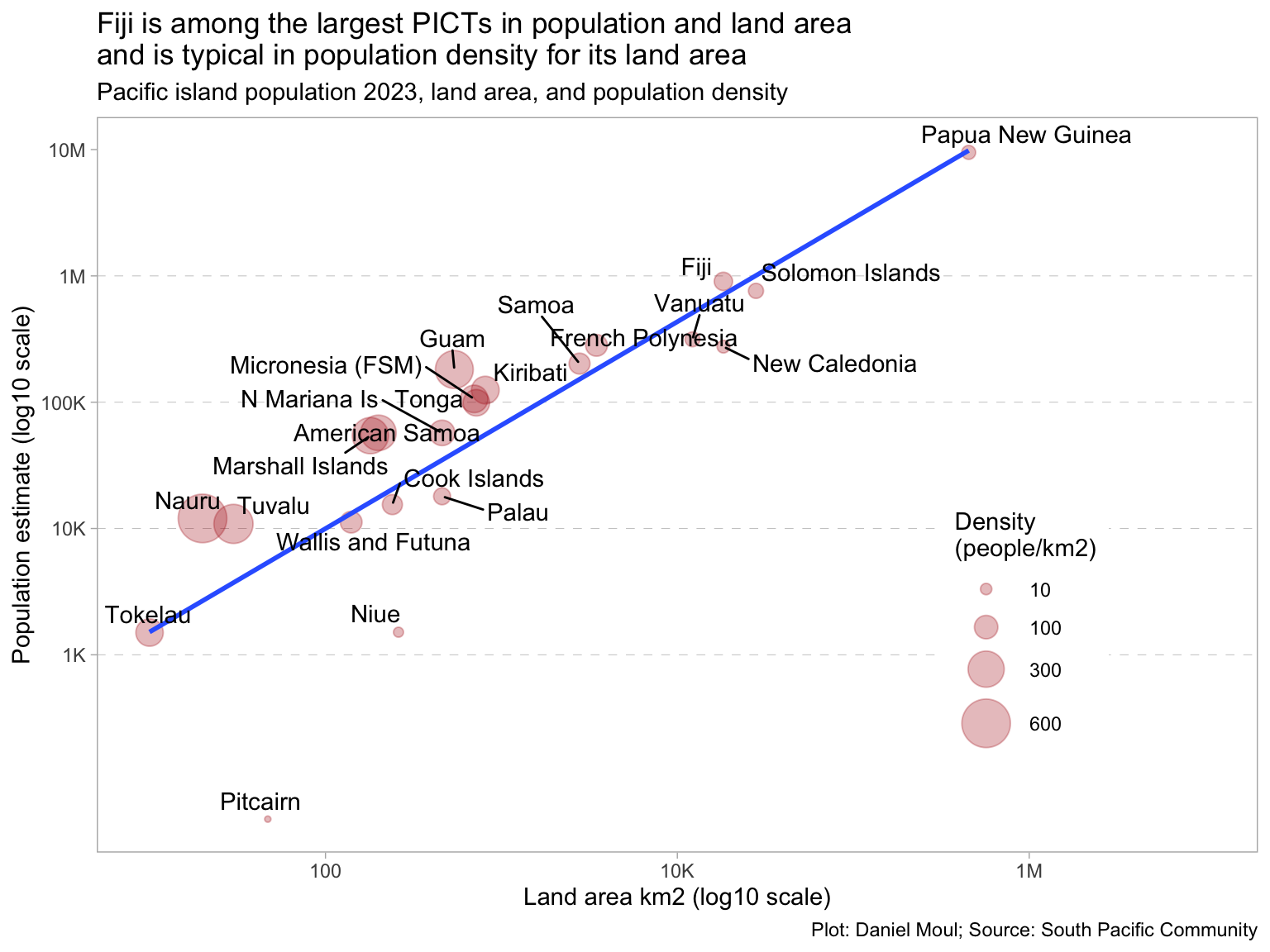
Figure 5.1 above visualizes the data in this table:

Show the code
d_pop_and_density |>
  arrange(desc(pop_density)) |>
  mutate(rank = row_number()) |>
  gt() |>
  tab_header(md(glue("**Pacific Island land area, population, and population density**",
                     "<br>Ranked by population density (people per km2)"))) |>
  tab_options(table.font.size = 10) |>
  fmt_number(columns = c(land_area, pop, pop_density),
             decimals = 0)

Pacific Island land area, population, and population density
Ranked by population density (people per km2)

geo_pict place land_area pop pop_density rank
NR Nauru 20 12,017 601 1
TV Tuvalu 30 10,876 363 2
GU Guam 540 181,468 336 3
MH Marshall Islands 180 54,366 302 4
AS American Samoa 200 57,225 286 5
KI Kiribati 810 124,742 154 6
FM Micronesia (FSM) 700 106,194 152 7
TK Tokelau 10 1,500 150 8
TO Tonga 720 99,026 138 9
MP N Mariana Is 460 57,154 124 10
PF French Polynesia 3,471 281,811 81 11
WF Wallis and Futuna 140 11,231 80 12
WS Samoa 2,780 202,100 73 13
CK Cook Islands 240 15,470 64 14
FJ Fiji 18,270 904,590 50 15
PW Palau 460 17,989 39 16
SB Solomon Islands 27,990 761,215 27 17
VU Vanuatu 12,190 314,653 26 18
PG Papua New Guinea 452,860 9,501,006 21 19
NC New Caledonia 18,280 275,315 15 20
NU Niue 260 1,510 6 21
PN Pitcairn 47 50 1 22


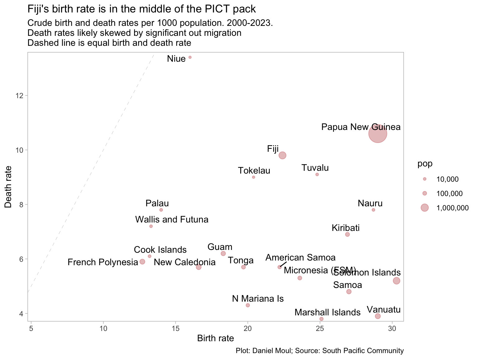
5.2 Birth and death rates

Show the code
d_rates <- d_pocket |>
  filter(indicator_2 %in% c("Crude birth rate", "Crude death rate", "Mid-year population estimate")) |>
  arrange(desc(time_period)) |>
  distinct(geo_pict, indicator_2, .keep_all = TRUE) |>
  select(-c(time_period, unit_mult, unit_multiplier, data_year)) |>
  pivot_wider(id_cols = c(geo_pict, place), 
              names_from = indicator_2, values_from = obs_value) |>
  clean_names() |>
  rename(pop = mid_year_population_estimate)

d_rates |>
  ggplot(aes(crude_birth_rate, crude_death_rate)) +
  geom_abline( lty = 2, linewidth = 0.15, alpha = 0.3) +
  geom_point(aes(size = , size = pop), 
             color = "firebrick", alpha = 0.3,
             na.rm = TRUE) +
  geom_text_repel(aes(label = place),
                  force = 2,
                  hjust = 0, vjust = 1,
                  na.rm = TRUE) +
  scale_x_continuous(
    expand = expansion(mult = c(0.01, 0.02))
  ) +
  scale_y_continuous(
    expand = expansion(mult = c(0.01, 0.02))) +
  scale_size_continuous(range = c(1, 10),
                        labels = comma,
                        breaks = c(1e4, 1e5, 1e6)
  ) +
  expand_limits(x = 5, y = 5) +
  labs(
    title = "Fiji's birth rate is in the middle of the PICT pack",
    subtitle = glue("Crude birth and death rates per 1000 population. 2000-2023.",
                    "\nDeath rates likely skewed by significant out migration",
                    "\nDashed line is equal birth and death rate"),
    x = "Birth rate",
    y = "Death rate",
    caption = my_caption
  )
Figure 5.3: Crude birth and death rates


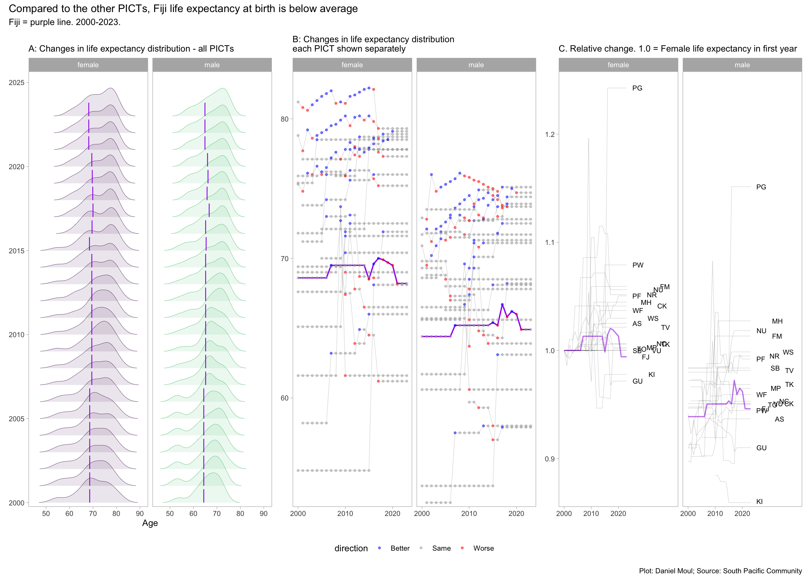
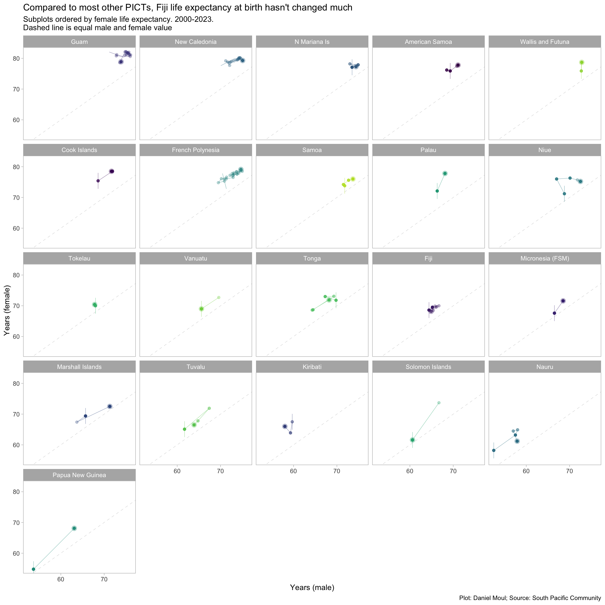
5.3 Life expectancy at birth

Among PICTs life expectancy varies considerably, and changes since 2000 have not been universally positive–even before considering the impact of COVID-19.

Show the code
d_life_expectancy <- d_pocket |>
  filter(indicator_2 %in% c("Life expectancy at birth - Male", 
                            "Life expectancy at birth - Female")) |>
  pivot_wider(id_cols = c(geo_pict, place, time_period), 
              names_from = indicator_2, values_from = obs_value) |>
  clean_names() |>
  rename(male = life_expectancy_at_birth_male,
         female = life_expectancy_at_birth_female) |>
  mutate(place = fct_reorder(place, -female, max))

p1 <- d_life_expectancy |>
  pivot_longer(cols = c(male, female),
               names_to = "metric",
               values_to = "obs_value") |>
  ggplot() +
  geom_density_ridges(aes(x = obs_value, y = time_period, color = metric, fill = metric, group = time_period),
                      rel_min_height = 0.005,
                      na.rm = TRUE,
                      linewidth = 0.15,
                      alpha = 0.1) +
  geom_segment(aes(x = if_else(geo_pict == "FJ",
                               obs_value,
                               NA),
                   xend = if_else(geo_pict == "FJ",
                                  obs_value,
                                  NA),
                   y = time_period,
                   yend = time_period + 0.8), #
               color = "purple",
               na.rm = TRUE,
               alpha = 1) +
  scale_color_viridis_d(end = 0.7) +
  scale_fill_viridis_d(end = 0.7) +
  scale_y_continuous(expand = expansion(mult = c(0.01, 0.04))) +
  guides(color = "none",
         fill = "none") +
  facet_wrap( ~ metric) +
  labs(
    subtitle = "A: Changes in life expectancy distribution - all PICTs",
    x = "Age",
    y = NULL
  )

p2 <- d_life_expectancy |>
  pivot_longer(cols = c(male, female),
               names_to = "metric",
               values_to = "obs_value") |>
  mutate(direction = case_when(
    obs_value > lag(obs_value, default = NA)   ~ "Better",
    obs_value == lag(obs_value, default = NA)  ~ "Same",
    obs_value < lag(obs_value, default = NA)   ~ "Worse"),
    .by = c(geo_pict, metric),
    direction = if_else(is.na(direction),
                        "Same",
                        direction)
    ) |>
  ggplot() +
  geom_line(aes(time_period, obs_value, group = place),
            linewidth = 0.15, alpha = 0.3) +
  geom_line(aes(time_period, 
                if_else(geo_pict == "FJ",
                        obs_value,
                        NA),
                group = place),
            linewidth = 0.75, alpha = 1, color = "purple") +
  geom_point(aes(time_period, obs_value, color = direction, group = place),
            size = 1, alpha = 0.5,
            na.rm = TRUE) +
  scale_color_manual(values = c("blue", "darkgrey", "red")) +
  scale_x_continuous(breaks = c(2000, 2010, 2020)) +
  scale_y_continuous(expand = expansion(mult = c(0.01, 0.04))) +
  theme(legend.position = "bottom") +
  facet_wrap( ~ metric) +
  labs(
    subtitle = "B: Changes in life expectancy distribution\neach PICT shown separately",
    x = NULL,
    y = NULL
  )

dta_for_p3 <- d_life_expectancy |>
  pivot_longer(cols = c(male, female),
               names_to = "metric",
               values_to = "obs_value") |>
  mutate(relative_obs = obs_value / obs_value[time_period == min(time_period, na.rm = TRUE) & metric == "female"],
         .by = geo_pict)

dta_for_p3_label <- dta_for_p3 |>
  filter(time_period == max(time_period),
         .by = geo_pict)

p3 <- dta_for_p3 |>
  ggplot() +
  geom_line(aes(time_period, relative_obs, group = place),
            linewidth = 0.15, alpha = 0.3) +
  geom_line(aes(time_period, 
                if_else(geo_pict == "FJ",
                        relative_obs,
                        NA),
                group = place),
            linewidth = 0.75, alpha = 0.5, color = "purple") +
   geom_text_repel(data = dta_for_p3_label,
            aes(x = time_period + 1, 
                y = relative_obs,
                label = geo_pict),
            hjust = 0, size = 3,
            direction = "x",
            max.overlaps = 20,
            min.segment.length = 100, # don't draw segments
            xlim = c(2024, 2040)
            # check_overlap = TRUE
  ) +
  scale_x_continuous(breaks = c(2000, 2010, 2020)) +
  scale_y_continuous(expand = expansion(mult = c(0.01, 0.04))) +
  expand_limits(x = 2040) +
  facet_wrap( ~ metric) +
  labs(
    subtitle = "C. Relative change. 1.0 = Female life expectancy in first year",
    x = NULL,
    y = NULL
  )

p1 + p2 + p3 +
  plot_annotation(
    title = "Compared to the other PICTs, Fiji life expectancy at birth is below average",
    subtitle = glue("Fiji = purple line. 2000-2023."),
    caption = my_caption
  )
Figure 5.4: Life expectancy at birth


Show the code
dta_label <- d_life_expectancy |>
  filter(time_period == max(time_period, na.rm = TRUE),
         .by = geo_pict)

d_life_expectancy |>
  ggplot(aes(male, female)) +
  geom_abline( lty = 2, linewidth = 0.15, alpha = 0.3) +
  geom_path(aes(color = geo_pict, group = geo_pict), 
            linewidth = 0.25, alpha = 0.5,
            arrow = arrow(angle = 90,
                          length = unit(4, "mm"), 
                          type = "open",
                          ends = "first"),
            na.rm = TRUE,
            show.legend = FALSE
            ) +
  geom_point(aes(color = geo_pict, group = geo_pict), 
             alpha = 0.3,
             na.rm = TRUE,
            show.legend = FALSE) +
  geom_point(data = dta_label,
             aes(color = geo_pict, group = geo_pict), 
             alpha = 0.3, size = 3,
             na.rm = TRUE,
            show.legend = FALSE) +
  scale_color_viridis_d(end = 0.9) +
  # scale_fill_viridis_d(end = 0.9) +
  facet_wrap( ~ place) + #, scales = "free") +
  labs(
    title = "Compared to most other PICTs, Fiji life expectancy at birth hasn't changed much",
    subtitle = glue("Subplots ordered by female life expectancy. 2000-2023.", 
                    "\nDashed line is equal male and female value"),
    x = "Years (male)",
    y = "Years (female)",
    caption = my_caption
  )
Figure 5.5: Life expectancy at birth


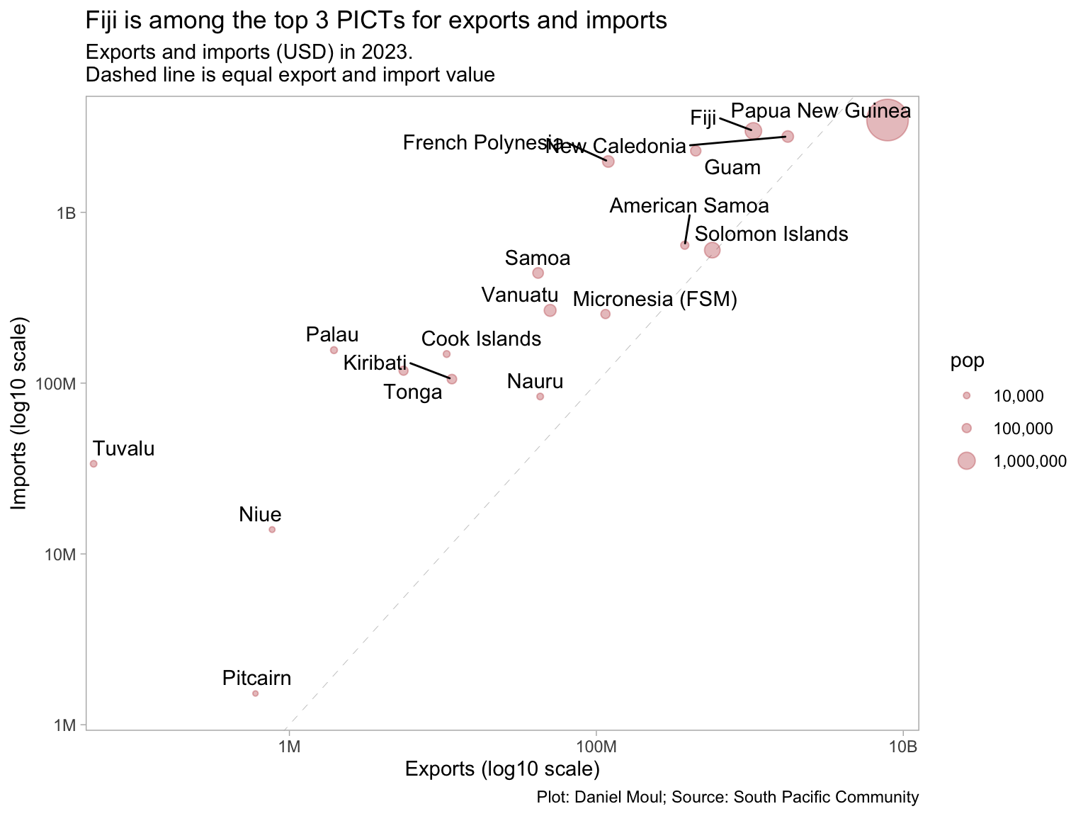
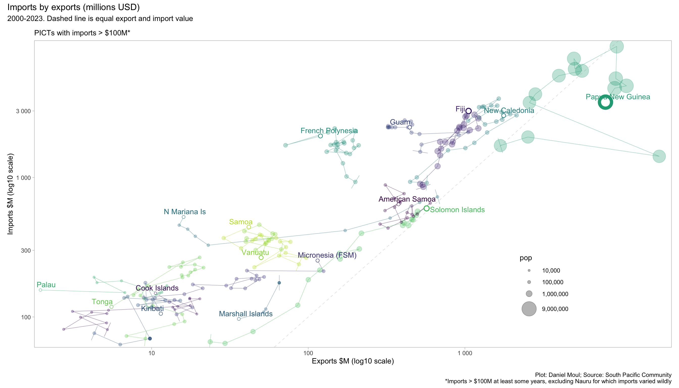
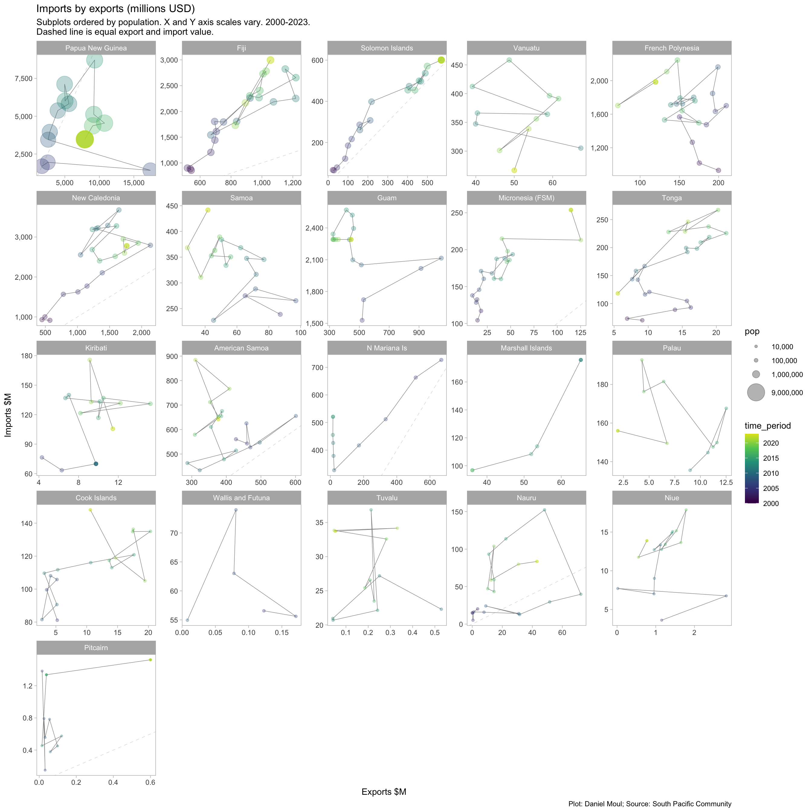
5.4 Exports and imports

Most PICTs import significantly more than they export; the biggest exceptions (PNG, Solomon Islands) export a lot of natural resources.

Show the code
d_export_import_latest_year <- d_pocket |>
  filter(indicator_2 %in% c("Exports", "Imports", "Mid-year population estimate")) |>
  arrange(desc(time_period)) |>
  distinct(geo_pict, indicator_2, .keep_all = TRUE) |>
  select(-c(unit_mult, unit_multiplier, data_year)) |>
  pivot_wider(id_cols = c(geo_pict, place, time_period), 
              names_from = indicator_2, values_from = obs_value) |>
  clean_names() |>
  rename(pop = mid_year_population_estimate) |>
  mutate(across(c(exports, imports), function(x) na_if(x, 0)),
         time_period = factor(time_period),
         # data repair
         exports = if_else(geo_pict == "AS" & time_period %in% c(2017, 2018, 2019),
                          exports * 1000,
                          exports),
         imports = if_else(geo_pict == "AS" & time_period %in% c(2017, 2018, 2019),
                          imports * 1000,
                          imports),
         ) |>
  filter(geo_pict != "TK") # no data

d_export_import_latest_year |>
  ggplot(aes(1000 * (exports + 1), 1000 * (imports + 1))) +
  geom_abline( lty = 2, linewidth = 0.15, alpha = 0.3) +
  geom_point(aes(size = , size = pop), 
             color = "firebrick", alpha = 0.3,
             na.rm = TRUE) +
  geom_text_repel(aes(label = place),
                  force = 2,
                  hjust = 0, vjust = 1,
                  na.rm = TRUE) +
  scale_x_log10(
    label = label_number(scale_cut = cut_short_scale()),
    expand = expansion(mult = c(0.01, 0.04))
  ) +
  scale_y_log10(
    label = label_number(scale_cut = cut_short_scale()),
    expand = expansion(mult = c(0.01, 0.04))) +
  scale_size_continuous(range = c(1, 10),
                        labels = comma,
                        breaks = c(1e4, 1e5, 1e6)
  ) +
  expand_limits(x = 1e6, y = 1e6) +
  labs(
    title = "Fiji is among the top 3 PICTs for exports and imports",
    subtitle = glue("Exports and imports (USD) in 2023.",
                    "\nDashed line is equal export and import value"),
    
    x = "Exports (log10 scale)",
    y = "Imports (log10 scale)",
    caption = my_caption
  )
Figure 5.6: Exports and imports in USD - latest year available

Most PICTs importing good worth at least USD100M annually, import and export value (or rate of growth) varies within a small range. The big exceptions (see the long trails in Figure 5.7) are the following:

  • Papua New Guinea, where petroleum and mining are the source of most export value.

  • The Northern Mariana Islands, where the significant drop in exports likely is due to the garment industry drying up.2

  • Solomon Islands, where imports and exports grew dramatically, possible due to foreign investment in mining and other resource extractive industries.3

Show the code
set1_geo_pict <- c("NU", "NR", "PN", "WF", "TV")

d_export_import_all_years <- d_pocket |>
  filter(indicator_2 %in% c("Exports", "Imports", "Mid-year population estimate")) |>
  pivot_wider(id_cols = c(geo_pict, place, time_period), 
              names_from = indicator_2, values_from = obs_value) |>
  clean_names() |>
  filter(exports != 0,
         imports != 0) |>
  rename(pop = mid_year_population_estimate) |>
  mutate(exports = if_else(geo_pict == "AS" & time_period %in% c(2017, 2018, 2019),
                          exports * 1000,
                          exports),
         imports = if_else(geo_pict == "AS" & time_period %in% c(2017, 2018, 2019),
                          imports * 1000,
                          imports),
         ) |>
  filter(geo_pict != "TK") # no data

dta_label <- d_export_import_all_years |>
  filter(time_period == max(time_period, na.rm = TRUE),
         .by = geo_pict)

dta_last_point <- d_export_import_all_years |>
  filter(time_period == max(time_period, na.rm = TRUE),
         .by = geo_pict)

p2 <- d_export_import_all_years |>
  filter(!geo_pict %in% set1_geo_pict) |>
  ggplot(aes(exports, imports)) +
  geom_abline( lty = 2, linewidth = 0.15, alpha = 0.3) +
  geom_path(aes(color = geo_pict), 
            linewidth = 0.25, alpha = 0.5,
            arrow = arrow(angle = 90,
                          length = unit(4, "mm"), 
                          type = "open",
                          ends = "first"),
            na.rm = TRUE,
            show.legend = FALSE
            ) +
  geom_point(aes(size = pop, color = geo_pict, group = geo_pict),
             alpha = 0.3,
             na.rm = TRUE,
            show.legend = TRUE) +
  geom_point(data = dta_last_point |>
               filter(!geo_pict %in% set1_geo_pict),
             aes(color = geo_pict, group = geo_pict, size = pop), 
             # alpha = 0.3,
             na.rm = TRUE,
            show.legend = FALSE) +
  geom_point(data = dta_last_point |>
               filter(!geo_pict %in% set1_geo_pict),
             aes(group = geo_pict, size = pop * 0.25), 
             color = "white", #alpha = 0.3, 
             na.rm = TRUE,
            show.legend = FALSE) +
  geom_text_repel(data = dta_label|>
                    filter(!geo_pict %in% set1_geo_pict),
                  aes(color = geo_pict, label = place),
                  hjust = 0, vjust = 1,
                  force = 2,
                  na.rm = TRUE,
            show.legend = FALSE) +
  scale_x_log10(
    label = label_number(scale = 1e-3),
    expand = expansion(mult = c(0.01, 0.02)),
    breaks = 1000* 10^c(-1:3)
  ) +
  scale_y_log10(
    label = label_number(scale = 1e-3),
    expand = expansion(mult = c(0.01, 0.02))
    ) +
  scale_size_continuous(range = c(1, 10),
                        labels = comma,
                        breaks = c(1e4, 1e5, 1e6, 9e6)
  ) +
  scale_color_viridis_d(end = 0.9) +
  guides(size = guide_legend(position = "inside"),
         color = "none") +
  theme(legend.position.inside = c(0.8, 0.2)) +
  labs(
    subtitle = "PICTs with imports > $100M*",
    x = "Exports $M (log10 scale)",
    y = "Imports $M (log10 scale)"
  )

p2 +
  plot_annotation(
    title = "Imports by exports (millions USD)",
    subtitle = glue("2000-2023. Dashed line is equal export and import value"),
    caption = glue(my_caption,
                   "\n*Imports > $100M at least some years, excluding Nauru for which imports varied wildly")
  )
Figure 5.7: Exports and imports in USD


Figure 5.8 presents the same data faceted by PICT, which makes each PICT’s pattern of exports and imports over the years more visible.

Show the code
d_export_import_all_years <- d_pocket |>
  filter(indicator_2 %in% c("Exports", "Imports", "Mid-year population estimate"),
         obs_value != 0) |>
  pivot_wider(id_cols = c(geo_pict, place, time_period), 
              names_from = indicator_2, values_from = obs_value) |>
  clean_names() |>
  rename(pop = mid_year_population_estimate) |>
  mutate(across(c(exports, imports), function(x) na_if(x, 0)),
         # data repair
         exports = if_else(geo_pict == "AS" & time_period %in% c(2017, 2018, 2019),
                          exports * 1000,
                          exports),
         imports = if_else(geo_pict == "AS" & time_period %in% c(2017, 2018, 2019),
                          imports * 1000,
                          imports),
         ) |>
  filter(geo_pict != "TK",
         !is.na(exports),
         !is.na(imports),
         !is.na(pop)) |> # no data
  mutate(place = fct_reorder(place, -pop, max))

d_export_import_all_years |>
  ggplot(aes(exports, imports)) +
  geom_abline(lty = 2, linewidth = 0.15, alpha = 0.3) +
  geom_path(linewidth = 0.25, alpha = 0.5,
             na.rm = TRUE) +
  geom_point(aes(color = time_period, size = pop, group = geo_pict), 
             alpha = 0.3,
             na.rm = TRUE) +
  scale_x_continuous(
    label = label_number(scale = 1e-3,
                         big.mark = ","),
  ) +
  scale_y_continuous(
    label = label_number(scale = 1e-3,
                         big.mark = ","),
    ) +
  scale_size_continuous(range = c(1, 10),
                        labels = comma,
                        breaks = c(1e4, 1e5, 1e6, 9e6)
  ) +
  scale_color_viridis_c(end = 0.95) +
  facet_wrap(~ place, scales = "free") + #
  labs(
    title = "Imports by exports (millions USD)",
    subtitle = glue("Subplots ordered by population. X and Y axis scales vary. 2000-2023.", 
                    "\nDashed line is equal export and import value."),
    x = "Exports $M",
    y = "Imports $M",
    caption = my_caption
  )
Figure 5.8: Exports and imports in USD


5.5 Available metrics

The pocket summary includes metrics I did not explore here. I list them all below, in case you wish to dig into them yourself:

Show the code
d_pocket |>
  summarize(
    n_countries = n_distinct(geo_pict),
    .by = c(indicator, indicator_2)
  ) |>
  arrange(indicator) |>
  mutate(idx = row_number()) |>
  gt() |>
  tab_header(md("**Metrics in 'pocket summary' dataset from the SPC**")) |>
  tab_options(table.font.size = 10)

Metrics in ‘pocket summary’ dataset from the SPC

indicator indicator_2 n_countries idx
CBR Crude birth rate 21 1
CDR Crude death rate 21 2
DEPRATIO Dependency Ratio (15-59) 21 3
EEZ EEZ area 22 4
EXPUSD Exports 22 5
GDPCDOM GDP, current prices, in local currency units 22 6
GDPCPCUSD GDP, per capita, in USD 22 7
GDPCUSD GDP, current price, in USD 22 8
GOVEXPGDPC Goverment revenue as percent of GDP (current prices) 18 9
GOVREVGDPC Goverment expenditure as percent of GDP (current prices) 20 10
HGT Max height above sea level 22 11
IMPUSD Imports 22 12
IMR Infant mortality rate 21 13
INFRATE Inflation rate 21 14
LAR Land area 22 15
LEBF Life expectancy at birth - Female 21 16
LEBM Life expectancy at birth - Male 21 17
MEDIANAGE Median age 21 18
MIDYEARPOPEST Mid-year population estimate 22 19
OSV Overseas Visitors 21 20
POPCHILD Children (<14) 21 21
POPDENS Population density 22 22
POPELDER Elderly (60+) 21 23
POPYGR Annual growth rate 22 24
POPYOUTH Youth (15-24) 21 25
TFR Total fertility rate 21 26
TNFR Teenage fertility rate (15-19) 21 27
TRADEBALUSD Trade balance 22 28


  1. The pocket summary presents a consolidated view of a set of key figures for Pacific island countries and territories (PICTs). Pocket summary (latest available value per year). Identifier: SPC:DF_POCKET(3.0), Modified: 2023-12-20, Temporal Coverage From: 2000-01-01, Temporal Coverage To: 2023-12-31, Publisher Name: SPC https://pacificdata.org/data/dataset/pocket-summary-latest-available-value-per-year-df-pocket Downloaded 2024-06-16↩︎

  2. https://en.wikipedia.org/wiki/Economy_of_the_Northern_Mariana_Islands ↩︎

  3. https://en.wikipedia.org/wiki/Economy_of_Solomon_Islands ↩︎