The World Health Organization tracks many health indicators at the country and region level and makes the data available at the Global Health Observatory. Below I look at healthy life expectancy and some aspects of non-communicable diseases (NCDs), which disproportionally affect the people of Fiji.
6.1 Healthy life expectancy at birth (HALE)
Healthy life expectancy at birth is the “average number of years that a person can expect to live in ‘full health’ from birth.”1.
There are some common patterns across countries
Women have a longer HALE than men in most countries.
The COVID-19 pandemic reduced HALE for most countries and both sexes.
“Worldwide, healthy life expectancy at birth (years) has improved by 3.57 years from 58.3 years in 2000 to 61.9 years in 2021.”2.
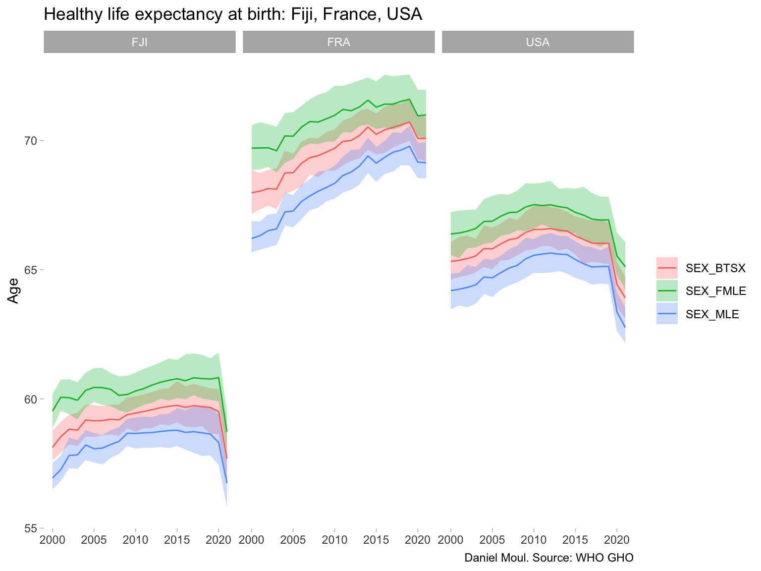
Unfortunately Fiji did not experience the same level of improvements. These patterns are visible in Figure 6.2, which compares Fiji, France and USA.
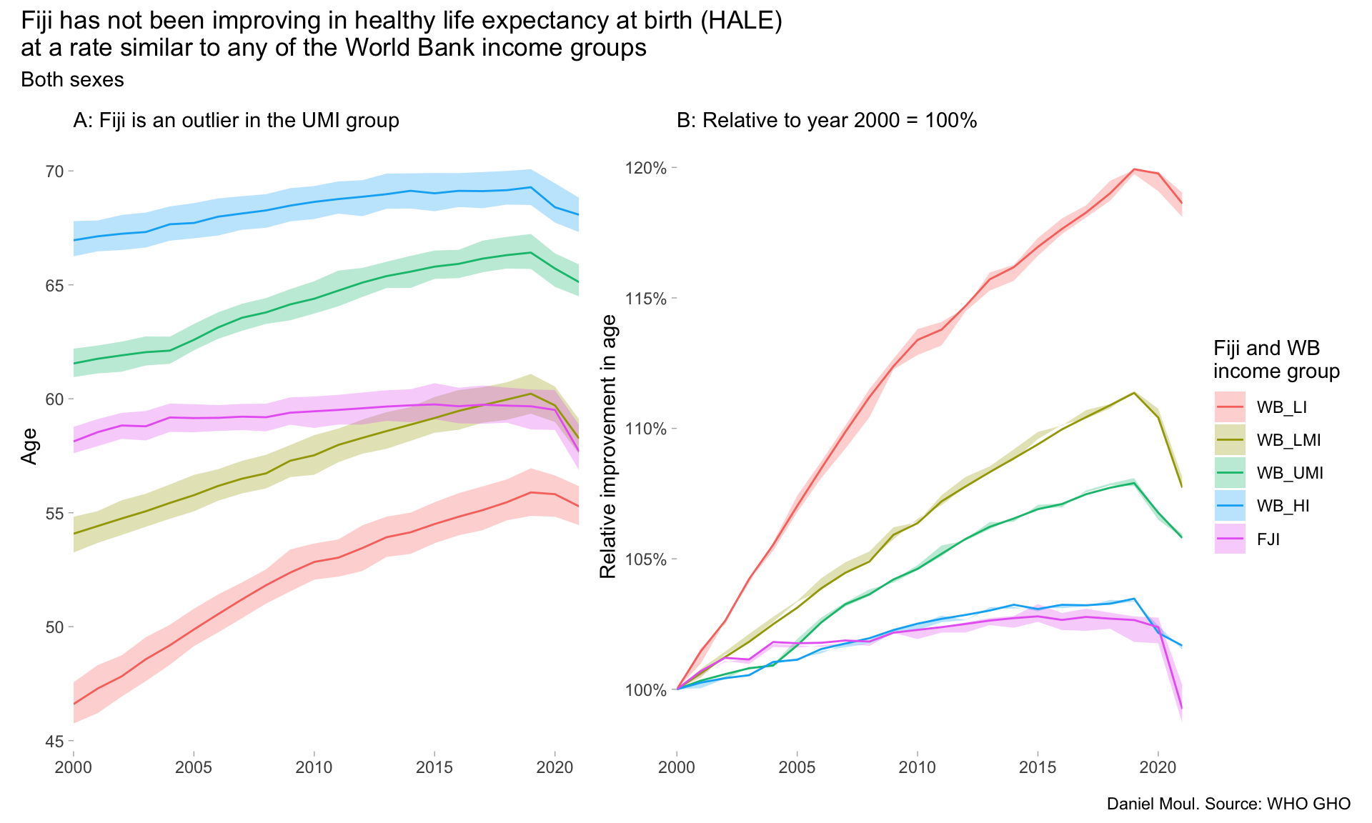
Fiji is in the upper middle income group as defined by the World Bank (WB_UMI: GNI per capita USD 4,516 TO 14,005 in 2023).3 In 2000, Fiji was already a lagging HALE outlier, and while the upper middle income group improved over two decades, Fiji’s HALE remained essentially unchanged, making the gap even larger (Figure 6.1).
Show the code
dta_for_plot <- hale |>filter(spatial_dim_type =="WORLDBANKINCOMEGROUP"| (spatial_dim_type =="COUNTRY"& spatial_dim =="FJI"), dim1 =="SEX_BTSX") |>mutate(spatial_dim =factor(spatial_dim, levels =c("WB_LI", "WB_LMI", "WB_UMI", "WB_HI", "FJI"))) |>mutate(numeric_value_norm = numeric_value / numeric_value[time_dim ==2000],low_norm = low / low[time_dim ==2000],high_norm = high / high[time_dim ==2000],.by = spatial_dim)p1 <- dta_for_plot |>ggplot() +geom_ribbon(aes(x = time_dim, ymin = low, ymax = high, fill = spatial_dim),alpha =0.3) +geom_line(aes(x = time_dim, y = numeric_value, color = spatial_dim)) +scale_x_continuous(expand =expansion(mult =c(0, 0))) +labs(subtitle ="A: Fiji is an outlier in the UMI group",x =NULL,y ="Age",color ="Fiji and WB\nincome group",fill ="Fiji and WB\nincome group", )p2 <- dta_for_plot |>ggplot() +geom_ribbon(aes(x = time_dim, ymin = low_norm, ymax = high_norm, fill = spatial_dim),alpha =0.3) +geom_line(aes(x = time_dim, y = numeric_value_norm, color = spatial_dim)) +scale_x_continuous(expand =expansion(mult =c(0, 0))) +scale_y_continuous(labels =label_percent()) +labs(subtitle ="B: Relative to year 2000 = 100%",x =NULL,y ="Relative improvement in age",color ="Fiji and WB\nincome group",fill ="Fiji and WB\nincome group" )p1 + p2 +plot_annotation(title =glue("Fiji has not been improving in healthy life expectancy at birth (HALE)","\nat a rate similar to any of the World Bank income groups"),subtitle ="Both sexes",caption ="Daniel Moul. Source: WHO GHO" ) +plot_layout(guides ="collect")# TODO: Possibly plot other WB_UMI countries together with Fiji# TODO: Possibly plot other PICTs together with Fiji
Figure 6.1: HALE: Fiji and World Bank income groups
On average, women in France have about ten more years of healthy life compared to women in Fiji (Figure 6.2).
Show the code
hale |>filter(spatial_dim %in%c("FJI", "USA", "FRA")) |>ggplot() +geom_ribbon(aes(x = time_dim, ymin = low, ymax = high, fill = dim1),alpha =0.3) +geom_line(aes(x = time_dim, y = numeric_value, color = dim1)) +facet_wrap(~spatial_dim) +labs(title ="Healthy life expectancy at birth: Fiji, France, USA",x =NULL,y ="Age",color =NULL,fill =NULL,caption ="Daniel Moul. Source: WHO GHO" )
Figure 6.2: Comparing Fiji’s Healthy life expectancy at birth (HALE) to France and USA
6.2 Non-communicable disease (NDC) mortality rate
Non-communicable diseases (NDC) are chronic diseases, and many have behavioral factors. The WHO publishes a useful overview here.
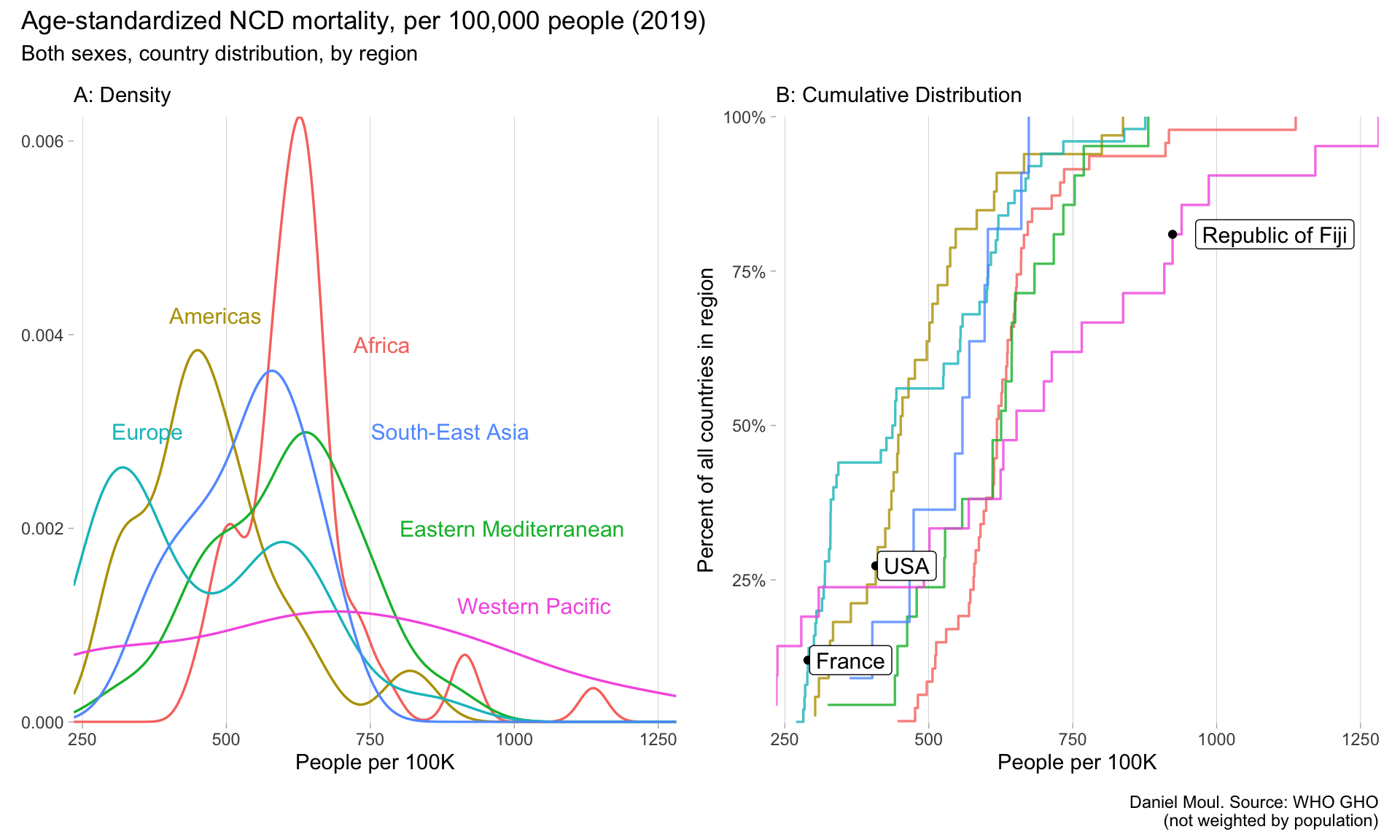
At the regional level (Figure 6.3), the western Pacific suffers the worst NCD mortality rates (panel A), and Fiji has one of the highest rates (panel B).
Show the code
dta_for_plot <- ncd_long |>filter(spatial_dim_type =="COUNTRY", sex_value =="SEX_BTSX", time_dim ==2019)dta_for_plot_labels <-tribble(~parent_location, ~x, ~y,"Africa", 720, 0.0039,"Americas", 400, 0.0042,"Eastern Mediterranean", 800, 0.002,"Europe", 300, 0.003,"South-East Asia", 750, 0.003,"Western Pacific", 900, 0.0012,)ecdf_fun <-ecdf( dta_for_plot |>filter(parent_location =="Western Pacific") |>pull(numeric_value))fiji_value <- dta_for_plot |>filter(parent_location =="Western Pacific", spatial_dim =="FJI") |>pull(numeric_value)fiji_percentile <-ecdf_fun(fiji_value)ecdf_fun_americas <-ecdf( dta_for_plot |>filter(parent_location =="Americas") |>pull(numeric_value))usa_value <- dta_for_plot |>filter(parent_location =="Americas", spatial_dim =="USA") |>pull(numeric_value)usa_percentile <-ecdf_fun_americas(usa_value)ecdf_fun_europe <-ecdf( dta_for_plot |>filter(parent_location =="Europe") |>pull(numeric_value))fra_value <- dta_for_plot |>filter(parent_location =="Europe", spatial_dim =="FRA") |>pull(numeric_value)fra_percentile <-ecdf_fun_europe(fra_value)p1 <- dta_for_plot |>ggplot() +geom_density(aes(x = numeric_value, color = parent_location),linewidth =0.6, alpha =0.8,show.legend =FALSE) +geom_text(data = dta_for_plot_labels,aes(x, y, label = parent_location, color = parent_location),hjust =0, nudge_x =1, size =4,show.legend =FALSE) +scale_x_continuous(expand =expansion(mult =c(0, 0))) +scale_y_continuous(#labels = label_percent(),expand =expansion(mult =c(0.002, 0))) +theme(panel.grid.major.x =element_line(linewidth =0.03)) +labs(subtitle ="A: Density",x ="People per 100K",y =NULL )p2 <- dta_for_plot |>ggplot() +stat_ecdf(aes(x = numeric_value, color = parent_location),linewidth =0.6, alpha =0.8,pad =FALSE,show.legend =FALSE) +annotate("point", x = fiji_value, y = fiji_percentile) +annotate("label", x = fiji_value +40, y = fiji_percentile, label ="Republic of Fiji",hjust =0, size =4) +annotate("point", x = usa_value, y = usa_percentile) +annotate("label", x = usa_value +3, y = usa_percentile, label ="USA",hjust =0, size =4) +annotate("point", x = fra_value, y = fra_percentile) +annotate("label", x = fra_value +3, y = fra_percentile, label ="France",hjust =0, size =4) +scale_x_continuous(expand =expansion(mult =c(0, 0))) +scale_y_continuous(labels =label_percent(),expand =expansion(mult =c(0.002, 0))) +guides(color =guide_legend(override.aes =list(linewidth =3))) +theme(panel.grid.major.x =element_line(linewidth =0.03)) +labs(subtitle ="B: Cumulative Distribution",x ="People per 100K",y ="Percent of all countries in region" )p1 + p2 +plot_annotation(title =glue("Age-standardized NCD mortality, per 100,000 people (2019)"),subtitle =glue("Both sexes, country distribution, by region"),caption =glue("Daniel Moul. Source: WHO GHO","\n(not weighted by population)") )
Figure 6.3: NCD mortaility 2019 by region
Show the code
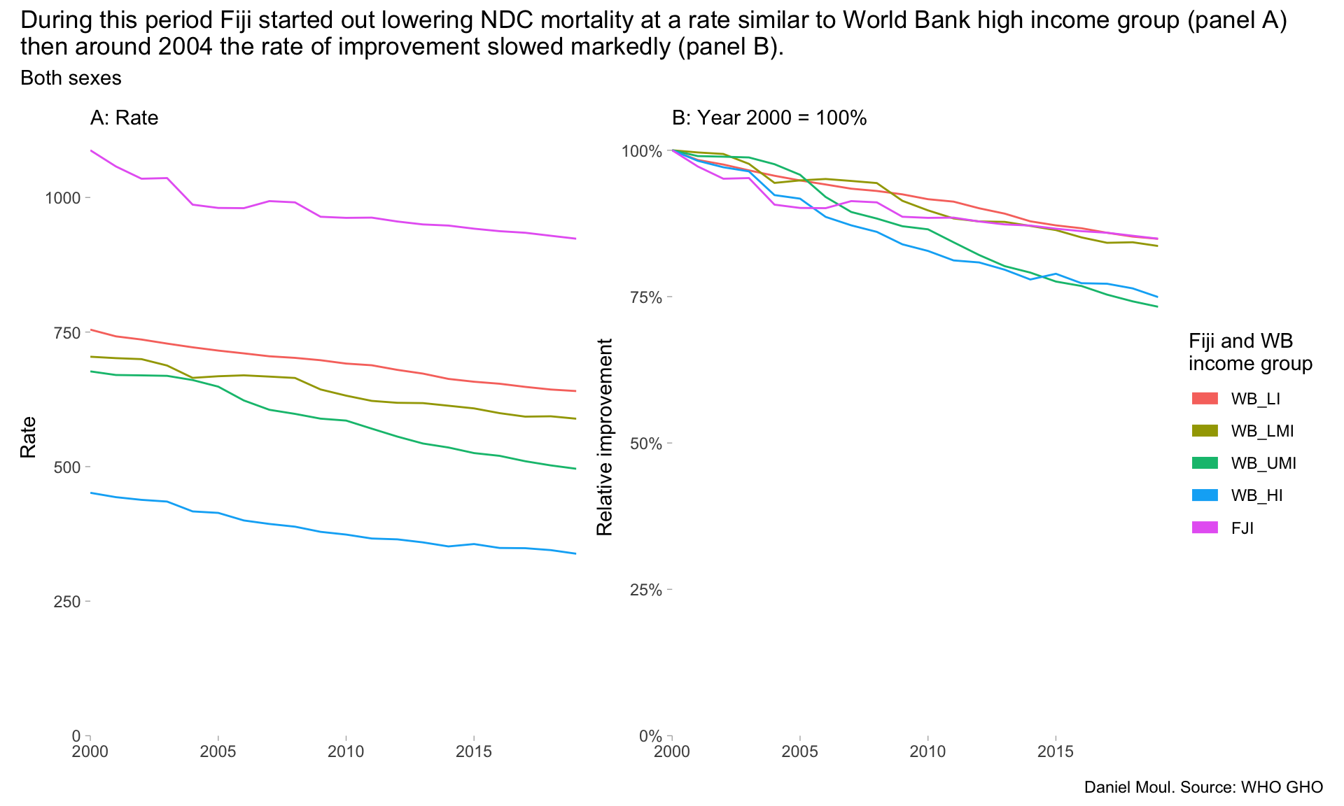
dta_for_plot <- ncd_mortality |>filter(spatial_dim_type =="WORLDBANKINCOMEGROUP"| (spatial_dim_type =="COUNTRY"& spatial_dim =="FJI"), dim1 =="SEX_BTSX") |>mutate(spatial_dim =factor(spatial_dim, levels =c("WB_LI", "WB_LMI", "WB_UMI", "WB_HI", "FJI"))) |>mutate(numeric_value_norm = numeric_value / numeric_value[time_dim ==2000],low_norm = low / low[time_dim ==2000],high_norm = high / high[time_dim ==2000],.by = spatial_dim)p1 <- dta_for_plot |>ggplot() +geom_line(aes(x = time_dim, y = numeric_value, color = spatial_dim),show.legend =FALSE) +scale_x_continuous(expand =expansion(mult =c(0, 0))) +scale_y_continuous(expand =expansion(mult =c(0, 0.02))) +expand_limits(y =0) +labs(subtitle ="A: Rate",x =NULL,y ="Rate",color ="Fiji and WB\nincome group",fill ="Fiji and WB\nincome group" )p2 <- dta_for_plot |>ggplot() +geom_line(aes(x = time_dim, y = numeric_value_norm, color = spatial_dim)) +scale_x_continuous(expand =expansion(mult =c(0, 0))) +scale_y_continuous(labels =label_percent(),expand =expansion(mult =c(0, 0.02))) +guides(color =guide_legend(override.aes =list(linewidth =3))) +expand_limits(y =0) +labs(subtitle ="B: Year 2000 = 100%",x =NULL,y ="Relative improvement",color ="Fiji and WB\nincome group",fill ="Fiji and WB\nincome group" )p1 + p2 +plot_annotation(title =glue("During this period Fiji started out lowering NDC mortality at a rate similar to World Bank high income group (panel A)","\nthen around 2004 the rate of improvement slowed markedly (panel B)."),subtitle ="Both sexes",caption ="Daniel Moul. Source: WHO GHO" ) +plot_layout(guides ="collect")
Figure 6.4: Non-communicable disease mortality rates: Fiji and World Bank income groups
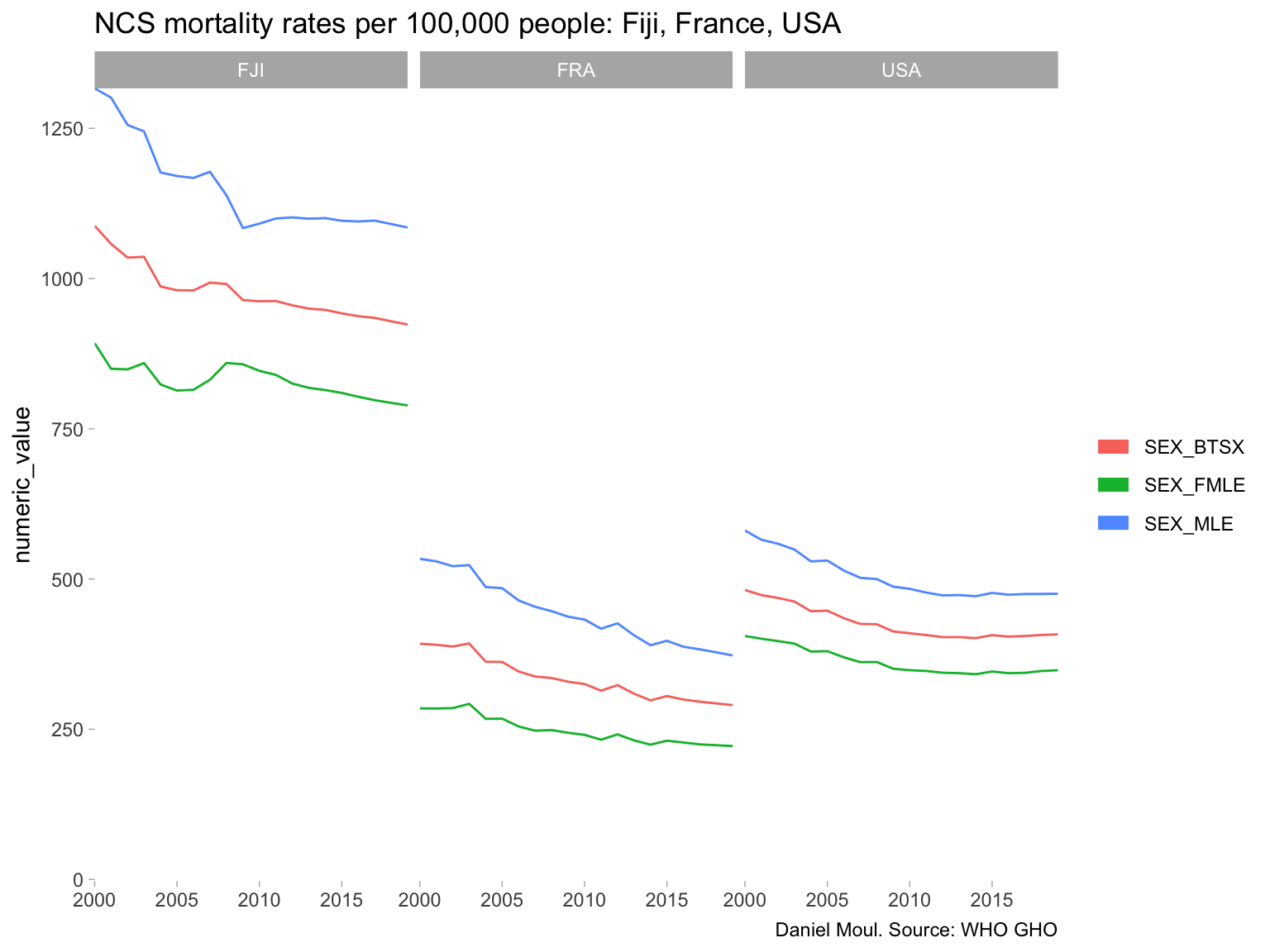
The NCD rate for males in Fiji has been the most stubborn (Figure 6.5).
Show the code
ncd_mortality |>filter(spatial_dim %in%c("FJI", "USA", "FRA")) |>ggplot() +geom_line(aes(x = time_dim, y = numeric_value, color = dim1)) +scale_x_continuous(expand =expansion(mult =c(0, 0))) +scale_y_continuous(expand =expansion(mult =c(0.002, 0))) +guides(color =guide_legend(override.aes =list(linewidth =3))) +expand_limits(y =0) +facet_wrap(~spatial_dim) +labs(title ="NCS mortality rates per 100,000 people: Fiji, France, USA",x =NULL,# y = "Age",color =NULL,fill =NULL,caption ="Daniel Moul. Source: WHO GHO" )
Figure 6.5: Comparing Fiji’s NDC mortality rate to France and USA
The following uses 2004 data, which was the latest year available in the GHO data (at least, it’s the latest I could find).
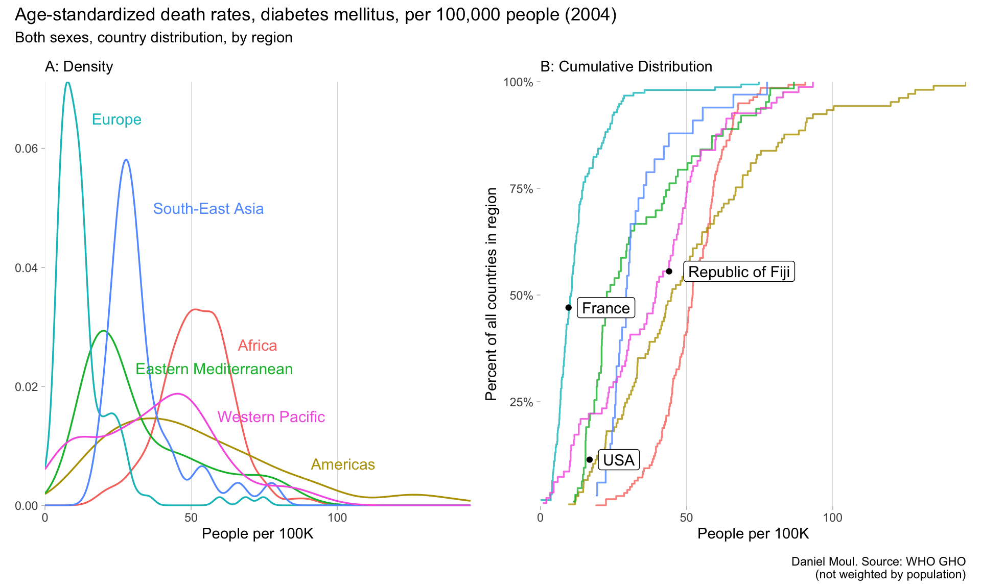
At the regional level, Africa is the only region in which the bulk of the countries are suffering a higher rate than the western Pacific (Figure 6.6 panel A), while the Americas have the widest range and the worst rates world-wide (panel B).
Show the code
dta_for_plot_labels <-tribble(~parent_location, ~x, ~y,"Africa", 65, 0.027,"Americas", 90, 0.007,"Eastern Mediterranean", 30, 0.023,"Europe", 15, 0.065,"South-East Asia", 36, 0.05,"Western Pacific", 58, 0.015,)dta_for_plot <- diabetes_long |>filter(sex_value =="SEX_BTSX")ecdf_fun <-ecdf( dta_for_plot |>filter(parent_location =="Western Pacific") |>pull(numeric_value) )fiji_value <- dta_for_plot |>filter(spatial_dim =="FJI") |>pull(numeric_value)fiji_percentile <-ecdf_fun(fiji_value)ecdf_fun_americas <-ecdf( dta_for_plot |>filter(parent_location =="Americas") |>pull(numeric_value))usa_value <- dta_for_plot |>filter(spatial_dim =="USA") |>pull(numeric_value)usa_percentile <-ecdf_fun_americas(usa_value)ecdf_fun_europe <-ecdf( dta_for_plot |>filter(parent_location =="Europe") |>pull(numeric_value))fra_value <- dta_for_plot |>filter(parent_location =="Europe", spatial_dim =="FRA") |>pull(numeric_value)fra_percentile <-ecdf_fun_europe(fra_value)p1 <- diabetes_long |>ggplot() +geom_density(aes(x = numeric_value, color = parent_location),linewidth =0.6, alpha =0.8,show.legend =FALSE) +geom_text(data = dta_for_plot_labels,aes(x, y, label = parent_location, color = parent_location),hjust =0, nudge_x =1, size =4, show.legend =FALSE) +scale_x_continuous(expand =expansion(mult =c(0, 0))) +scale_y_continuous(expand =expansion(mult =c(0.002, 0))) +theme(panel.grid.major.x =element_line(linewidth =0.03)) +labs(subtitle ="A: Density",x ="People per 100K",y =NULL )p2 <- diabetes_long |>ggplot() +stat_ecdf(aes(x = numeric_value, color = parent_location),linewidth =0.6, alpha =0.8,pad =FALSE,show.legend =FALSE) +annotate("point", x = fiji_value, y = fiji_percentile) +annotate("label", x = fiji_value +5, y = fiji_percentile, label ="Republic of Fiji",hjust =0, size =4) +annotate("point", x = usa_value, y = usa_percentile) +annotate("label", x = usa_value +3, y = usa_percentile, label ="USA",hjust =0, size =4) +annotate("point", x = fra_value, y = fra_percentile) +annotate("label", x = fra_value +3, y = fra_percentile, label ="France",hjust =0, size =4) +scale_x_continuous(expand =expansion(mult =c(0, 0))) +scale_y_continuous(labels =label_percent(),expand =expansion(mult =c(0.002, 0))) +guides(color =guide_legend(override.aes =list(linewidth =3))) +theme(panel.grid.major.x =element_line(linewidth =0.03)) +labs(subtitle ="B: Cumulative Distribution",x ="People per 100K",y ="Percent of all countries in region" )p1 + p2 +plot_annotation(title =glue("Age-standardized death rates, diabetes mellitus, per 100,000 people (2004)"),subtitle =glue("Both sexes, country distribution, by region"),caption =glue("Daniel Moul. Source: WHO GHO","\n(not weighted by population)") )# TODO: Why isn't the USA point actually on the Americas line?
Figure 6.6: Diabetes 2004 by region
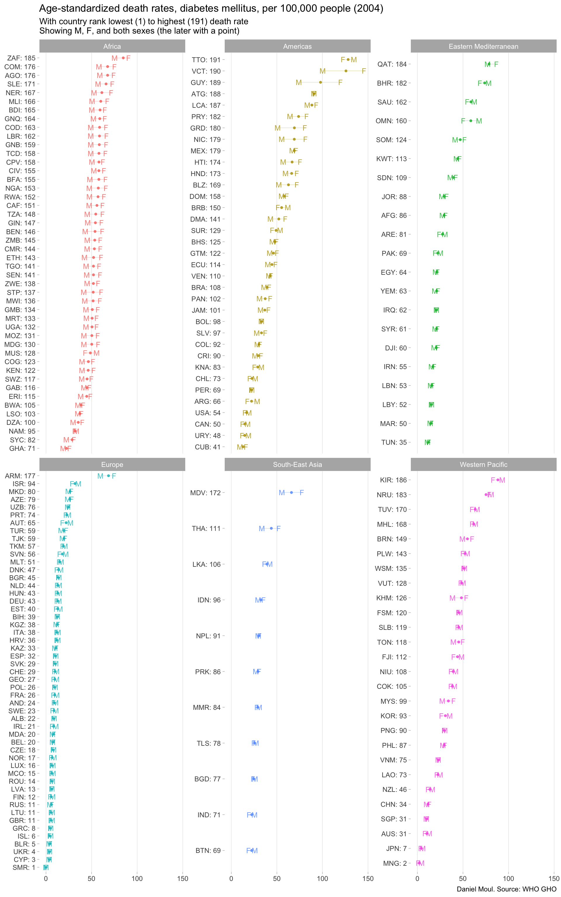
Fiji ranked 112 out of 191 countries (59th percentile) in death from diabetes (Figure 6.7). The three-letter country codes used below are listed in Section 10.12.
Show the code
rank_min <-min(diabetes_wide$rank_val)rank_max <-max(diabetes_wide$rank_val)diabetes_wide |>ggplot() +geom_errorbarh(aes(y = spatial_dim_label, xmin = SEX_MLE, , xmax = SEX_FMLE, color = parent_location),linewidth =0.1, height =0, alpha =0.8,show.legend =FALSE) +geom_point(aes(y = spatial_dim_label, x = SEX_BTSX, color = parent_location),size =1, alpha =0.8,show.legend =FALSE) +geom_point(aes(y = spatial_dim_label, x = SEX_MLE, color = parent_location),size =3, alpha =0.8, shape ="M",show.legend =FALSE) +geom_point(aes(y = spatial_dim_label, x = SEX_FMLE, color = parent_location),size =3, alpha =0.8, shape ="F",show.legend =FALSE) +facet_wrap(~parent_location, scales ="free_y") +theme(panel.grid.major.x =element_line(linewidth =0.03)) +labs(title =glue("Age-standardized death rates, diabetes mellitus, per 100,000 people (2004)"),subtitle =glue("With country rank lowest (1) to highest ({rank_max}) death rate","\nShowing M, F, and both sexes (the later with a point)"),x =NULL,y =NULL,caption ="Daniel Moul. Source: WHO GHO" )
Figure 6.7: Diabetes 2004
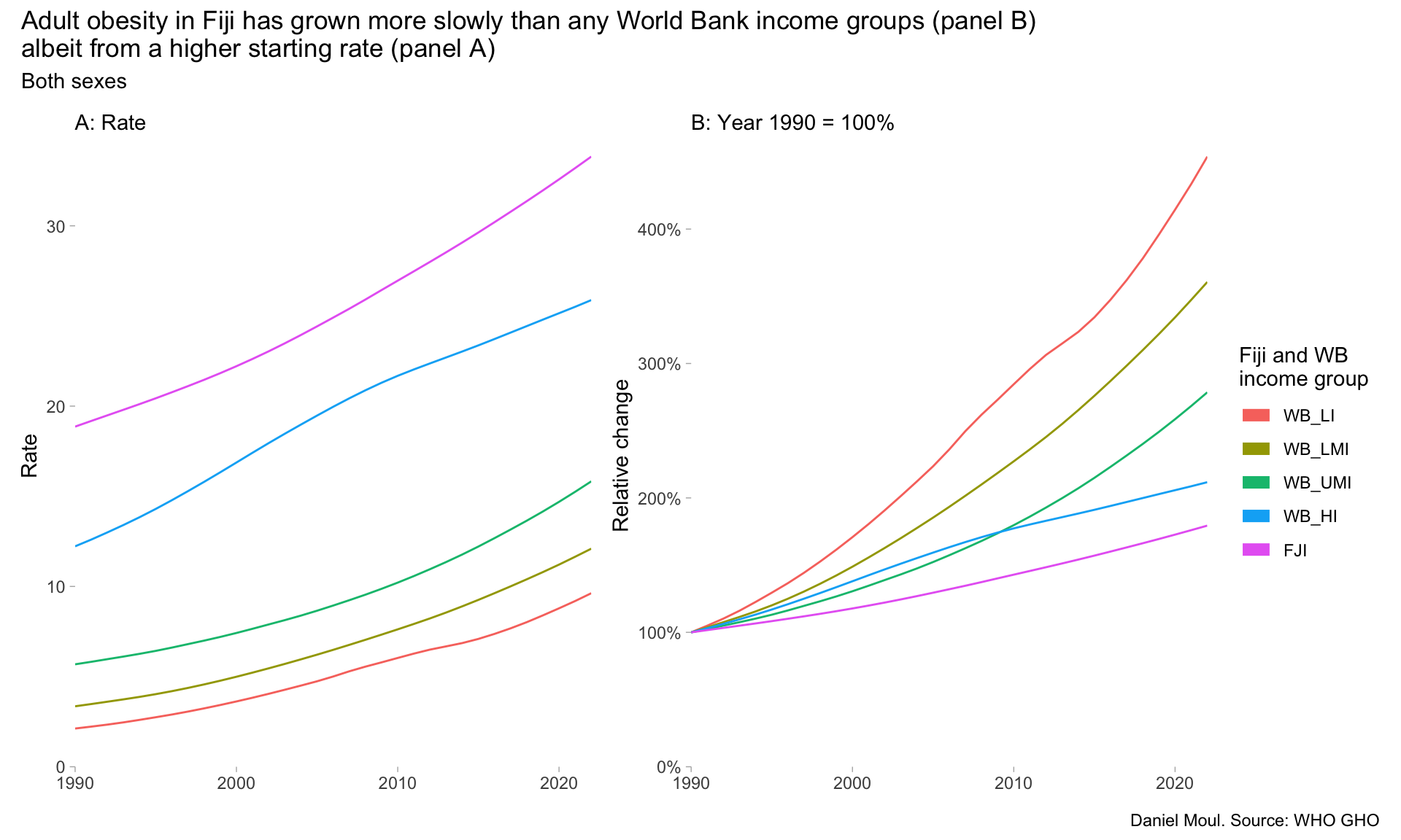
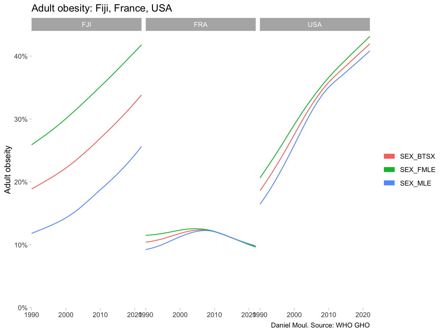
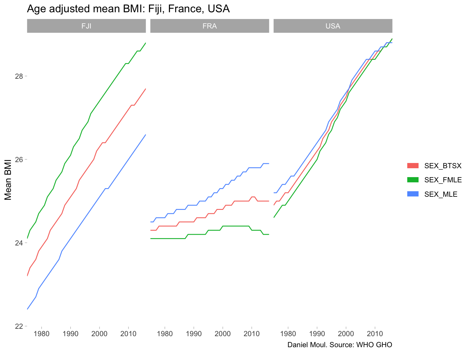
6.4 Prevalence of obesity among adults
The Body Mass Index4, despite it deficiencies, is a useful indicator for comparing population health. A BMI of 30 and above is defined as obese.